Weekend links 507

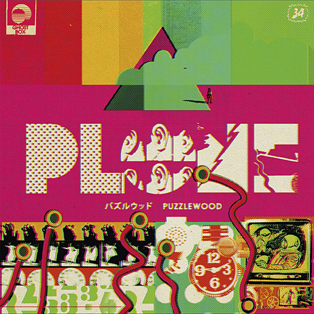
plone.jpg

The next release on the Ghost Box label will be Puzzlewood by Plone, “unironically joyful and melodic electronica; informed by library music, music for children’s TV and a deep passion for the history of music technology”. The album will be available in April. Design, as always, is by Julian House.

• “With his panting breath and dripping sweat infused in each page of his memoir, Patrick Cowley describes himself on his knees, bending over and ‘worshipping Phallus.'” Maxwell Shand on Dark Entries‘ “holy trinity” of Patrick Cowley’s Mechanical Fantasy Box, Hot Rod To Hell by Roy Garrett & Man Parrish, and Maxx Mann’s gay synth-pop.

• “We’re gonna do economic activity—without money!”: Inside the criminal glamour of the San Francisco Diggers with Kent Minault. The third installment of a verbal history of the hippie anarchists by Jay Babcock.

• “Susanna Hoffs and friends remember David Roback, who stayed creative, and enigmatic, to the end.” By Randall Roberts.

My connection with [raga] was not to be able to duplicate or emulate it but to learn from it. I combined it with the electronics and the harmonizer and things like that. But I would have a line that was being drawn. You’re thinking about it like a shape that’s being drawn on a canvas. It’s a line that’s being drawn and another. You’re holding three pencils at once while you’re drawing on the wall. So, you’re able to get the shapes. This was my thing with it, because I was into the harmony that it would make. So, it was an easy and natural thing to do, was to go and move into the electronics. Then we had equipment that was doing transposition and all that kind of thing. So that’s one little part of it.

Jon Hassell talking to Aquarium Drunkard about his first album, Vernal Equinox, which is reissued later this month

• Published next month by Strange Attractor Press: Rated SavX: The Savage Pencil Skratchbook.

• They came from outer Finland: the town where everyone saw UFOs, as photographed by Maria Lax.

• Mix of the week: Through A Landscape Of Mirrors Vol. VI – Sweden II by David Colohan.

Moonstrips Empire News (1967) by Eduardo Paolozzi.

• At Dennis Cooper’s: Shelley Duvall Day.

Graham Massey‘s favourite albums.

Phallus Dei (1969) by Amon Düül II | Wrong Eye (1990) by Coil | Red Scratch (1994) by ELpH

Weekend links 300

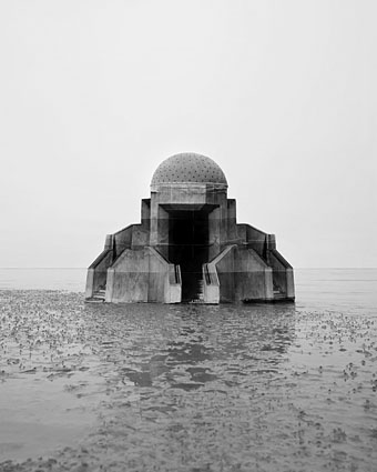
goudal.jpg

Observatoire IX from the Observatoires series by Noemie Goudal.

• “Before Lady Raglan’s intervention, this figure had been anonymous. She gave him a name: the Green Man.” Josephine Livingstone on the persistence of a supposed figure from pagan folklore.

Ben Wheatley: “Financing a film as crazy as [High-Rise] takes good casting”. Related (in a Ballardian sense): the abandoned hotels of the Sinai Desert.

• “We were in danger of becoming full-time, paid up musicians…” Drew Daniel and Martin “MC” Schmidt of Matmos look back over their career.

Fahey didn’t make many new friends with his scything dismissal of the folk revival. He distrusted the way that folkies regarded music as a carrier for the correct political messages of the moment. As Lowenthal puts it: “To him, the student idealists had naïve worldviews and dreamed of unrealistic political utopias,” whereas Fahey “attempted to channel darkness and dread through his music.” For Woody Guthrie and Pete Seeger devotees, the ideological message came first, with musical tone or trickery a distant second. As Fahey saw it, the dizzyingly strange source music they borrowed from and then built their careers on emerged as little more than a scrubbed-up ventriloquist’s doll, all the coarse grain and troubling metaphysic of its original voices jettisoned. He also detected high condescension and low reverse racism in how the folk-revival people preferred their old blues guys barefoot and wearing dungarees—even if they now usually dressed in sharp suits and often preferred to play amplified, electric urban blues.

Ian Penman on John Fahey

• “It’s amazing how quickly a sound can lose its moorings and float off into this kind of unchartered territory,” says Robin The Fog.

• Mixes of the week: FACT Mix 540 by Via App, and Secret Thirteen Mix 178 by BlackBlackGold.

Oliver Wainwright on Edward Johnston, designer of the typeface for the London Underground.

• At Dennis Cooper’s: DC’s: Spotlight on…The Free-Lance Pallbearers (1967) by Ishmael Reed.

Each drop of Hennessy X.O is an Odyssey: Nicolas Winding Refn makes an alcohol ad.

Wayne Shorter & Herbie Hancock pen an open letter to the next generation of artists.

Japan’s scariest manga artist (Junji Ito) loves Japan’s creepiest cosplayer (Ikura).

• “He was a sexual outlaw.” Jack Fritscher‘s love affair with Robert Mapplethorpe.

Peter De Rome: the RAF pilot who became “the grandfather of gay porn”.

The Strange Case of Mr William T. Horton

• RIP Big George Martin and Ken Adam.

Shortwave Radio World

Viriconium FAQ

Nine Feet Underground (1971) by Caravan | Green Bubble Raincoated Man (1972) by Amon Düül II | Betyárnóta (Outlaw Song, 1989) by Muzsikás

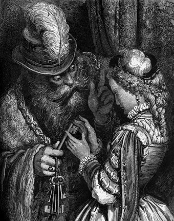
Gustave Doré’s Fairy Tales of Charles Perrault

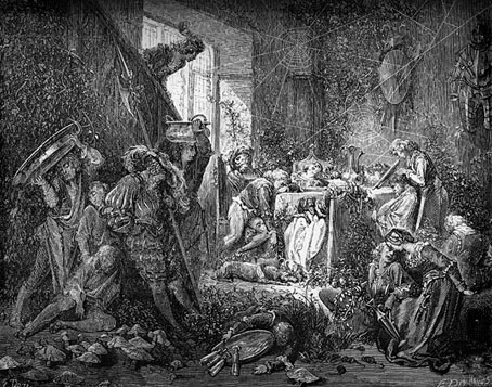
dore01.jpg

La Belle au bois dormant (The Sleeping Beauty in the Wood).

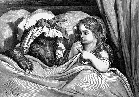
More illustrated Perrault. Gustave Doré’s intention to produce definitive illustrations for his editions certainly paid off when he turned his attention to the French fairy tales. Doré’s work may lack the light touch required for some of these stories but a couple of the engravings—Red Riding Hood in bed with the wolf, Puss-in-Boots—are reproduced endlessly whenever picture editors need a suitable illustration. Doré’s characters can be rather wooden at times but the expressions on the face of the wolf and the girl are perfect.

dore02.jpg

Le Petit Chaperon rouge (Little Red Riding Hood).

Elsewhere Doré contributes some original details: the court in Sleeping Beauty is usually shown besieged by thorns or bracken but Doré has giant fungi growing all over the floor; in Little Tom Thumb the children are described as knocking on the door of the ogre’s house then being let inside but Doré shows the ogre’s wife greeting them with a shaft of lamplight. These illustrations were published in several editions throughout the 1860s which makes that lamplight beam a very advanced pictorial effect. Incidentally, for those who read the Amon Düül II cover art post a couple of days ago, the figure of Tom Thumb stealing the ogre’s seven-league boots may be glimpsed outside the spacecraft window in the centrespread of Dance of the Lemmings.

Wikimedia Commons has more of the Doré illustrations; there’s also a set at Gallica although the quality of their scans isn’t always so good.

dore03.jpg

La Barbe bleue (Blue Beard).

Continue reading “Gustave Doré’s Fairy Tales of Charles Perrault”

Falk-Ulrich Rogner album covers

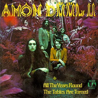
duul00.jpg

All The Years Round (7-inch single, 1972).

I mentioned earlier that Falk-Ulrich Rogner’s cover art for Amon Düül II was worthy of a post so here you are. Amon Düül II were slightly ahead of the pack in the German music scene of the 1970s, starting earlier and (arguably) finishing their prime period earlier. They were also closer in musical style and group ethos to the psychedelic/early prog groups in Britain and America, especially Hawkwind with whom they shared a record label and a bass player. Other German groups were often psychedelic to some degree but Amon Düül II went all-out for a German take on psych rock, with extended guitar-heavy jams played against oil-on-water projections.

Falk-Ulrich Rogner was one of the longer lasting members of the group’s shifting personnel, playing organ and electronics, writing lyrics and creating artwork that’s a perfect match for what I always think of as Amon Düül II’s Gothic Surrealism: a blend of lyrics and themes running through songs titled like Max Ernst paintings: Flesh-Coloured Anti-Aircraft Alarm, Archangel’s Thunderbird, Stumbling Over Melted Moonlight, Green Bubble Raincoated Man. The cover art is generally a collage of photographs, old paintings and other graphics, a familiar technique for psychedelic album covers. What gives Rogner’s work an edge is the way he blends multiple collages together by either photographic exposure or the photographing of projected transparencies. This has the effect of softening hard edges and transitions, and makes the resulting images all the more hallucinatory and dream-like. Effects like this are easy to achieve today with Photoshop but in the early 1970s they required a considerable effort.

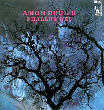
duul01.jpg

Phallus Dei (1969).

At first glance the cover of the gloriously titled debut album looks like a painting but it’s a photograph of a tree silhouette juxtaposed against some vague collage business. This doesn’t really communicate the lysergic intensity of the music within which may explain why the cover was changed to something more typically psychedelic for its UK release.

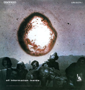
duul02.jpg

The back cover inaugurates a pattern of placing the band on the back of the album, a reversal of the usual state of affairs even today.

duul03.jpg

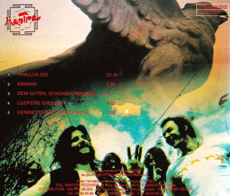
The first CD release of Phallus Dei on the Mantra label featured what may be another Rogner photomontage, one that I’ve not seen anywhere else.

Continue reading “Falk-Ulrich Rogner album covers”

The kosmische design of Peter Geitner

geitner07.jpg

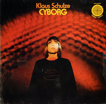
Cyborg (1973) by Klaus Schulze.

More German music design. Once you start delving into the music produced in Germany between 1969 and 1975 you eventually notice that a) the good albums generally have decent cover designs, and b) there are many justly forgotten albums with astonishingly tasteless artwork. Most of the well-known names were smart enough to craft a visual identity: Kraftwerk’s efforts have been explored here recently but there was also the Gothic Surrealism of Falk-U Rogner’s photo montages for Amon Düül II (worthy of a post in themselves); Neu! followed the lead of Kraftwerk with strikingly minimal presentation; Faust’s debut album was released on transparent vinyl in a clear sleeve while their second album was an all-black sleeve with a series of strange pictures inside, one for each song. Can are a notable exception in having no clear identity.

geitner23.jpg

Peter Geitner is unique in this scene in being the only graphic designer you can find who was creating any kind of consistent identity for a label and a group of artists. Almost all the work here is for Rolf-Ulrich Kaiser’s short-lived Kosmische Musik which replaced the earlier Die Kosmischen Kuriere. Both labels were offshoots of Ohr Records (Tangerine Dream’s original home), and catered mostly to the musicians based in Berlin, with a later detour to Switzerland. All the releases feature Geitner’s recurrent motifs of radiating stars and sunburst graphics. I think one of the reasons I like Geitner’s design is because I have a tendency to use similar spiky sunbursts in my own work. Whatever Geitner did after the collapse of Kosmische Musik I’ve yet to discover.

geitner22.jpg

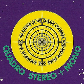
The standard design for the vinyl labels. Many of the albums were released as quadrophonic mixes so the star logo also signifies multi-directional sound. Klaus Schulze’s album is nothing if not cosmic, four sides of treated strings and swirling synth noise.

geitner03.jpg

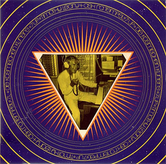
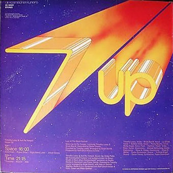
Seven Up (1973) by Timothy Leary & Ash Ra Tempel.

This is a reissue design that replaces the more common sleeve with its Walter Wegmüller doodles and poor layout. I didn’t used to like the music very much either, two sides of bluesy jams with Tim Leary and cohorts bellowing over the top. But it’s a historical oddity, a rare connection between the US psychedelic scene and the German music which took psychedelia in new directions.

geitner04.jpg

Continue reading “The kosmische design of Peter Geitner”