The Nose, a film by Alexandre Alexeieff & Claire Parker

nose.jpg

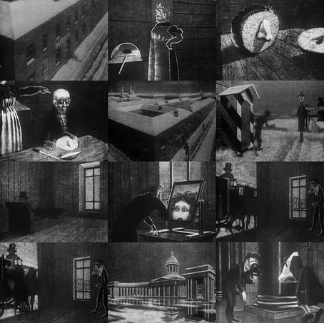
The last time I wrote about the animated films of Alexandre Alexeieff & Claire Parker the only copies available were low-grade things on YouTube which have long-since vanished (one of many reasons I don’t embed YT players in these posts). Happily a new copy of The Nose (1963) has appeared that’s not only better quality but isn’t split into two as was the case earlier.

The Nose is based on the Gogol story of the same name, a tale of a St Petersburg official who wakes to find his nose has left his face and is masquerading as a civil servant. I’ve not read Gogol’s story but I do have Nabokov’s book about Gogol which dwells not only on the prominent nose of the author, but also his traumatic death which was hastened in part by a quack physician who treated Gogol by applying leeches to his nose. Neither story or film contain anything as horrific. The film version is a wordless animation made using the pinscreen technique which Alexeieff & Parker developed in order to create greyscale animated films without recourse to smudgy materials like pencil, pastel, charcoal, etc. As I’ve mentioned before, the most notable application of this technique is the prologue the pair created for Orson Welles’ film of The Trial (1962). What’s striking about the Alexeieff & Parker use of the pinscreen is how skilfully they use it to manipulate light and shade. Where other animators like Jacques Drouin used the technique more impressionistically, Alexeieff & Parker’s films at times give the impression of watching an animated engraving. The Nose is one of their finest pieces. (Thanks to Gabe for the tip!)

Previously on { feuilleton }
Alexandre Alexeieff and Claire Parker
Kafkaesque

kafkaesque1.jpg

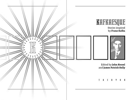
Another book design of mine (interiors only) which I completed last September for Tachyon and about which I had this to say at the time:

Kafkaesque [is] edited by John Kessel and James Patrick Kelly. It’s a collection of short stories either inspired by Franz Kafka, or with a Kafka-like atmosphere, and features a high calibre of contributions from writers including JG Ballard, Jorge Luis Borges, Carol Emshwiller, Jeffrey Ford, Jonathan Lethem and Philip Roth, and also the comic strip adaptation of The Hunger Artist by Robert Crumb.

The book gained a positive review at SF Site recently, reminding me that I hadn’t written anything about the design. As with some of my other Tachyon work the interiors take their cue from a pre-determined cover by another designer, in this case Josh Beatman. I followed Josh’s type choices (Senator for the titles and headings) and also extended his use of an insect as a recurrent motif. Before I saw the contents I was fairly determined to avoid any further insect imagery but it became apparent that Kafka’s Metamorphosis is a repeated reference in many of the stories.

kafkaesque2.jpg

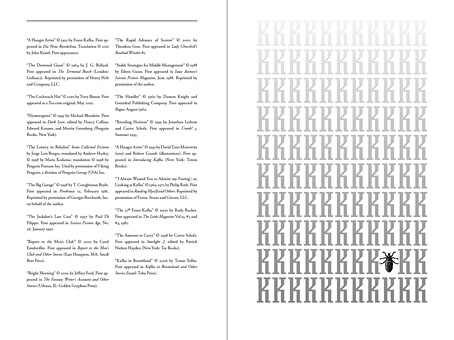
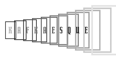
As for the recurrent “K”, that seemed inevitable given Kafka’s own use of the letter as well as its presence not only in Kafka’s own name but in the names of the editors. The frames were an idea borrowed from (and referring to) Steven Berkoff’s stage adaptation of The Trial in which portable frames serve on the stage as doorways, windows, corridors, picture frames and so on. I was hoping to do more with this idea but (as is often the case) ran out of time to develop it further.

kafkaesque3.jpg

And while we’re on the subject of Tachyon designs, I don’t seem to have mentioned my interiors for a Joe R Lansdale collection, Crucified Dreams, which also appeared last year. This is a hard-boiled anthology of Lansdale’s favourite stories for which I supplied suitably rough-and-tough graphics comprising scanned scalpel blades and lettering assembled from torn newspaper pages. I’m due to start on some new work for Tachyon this week. More about that at a later date.

Continue reading “Kafkaesque”

Screening Kafka

kafka1.jpg

Kafka (1991).

This week I completed the interior design for a new anthology from Tachyon, Kafkaesque, edited by John Kessel and James Patrick Kelly. It’s a collection of short stories either inspired by Franz Kafka, or with a Kafka-like atmosphere, and features a high calibre of contributions from writers including JG Ballard, Jorge Luis Borges, Carol Emshwiller, Jeffrey Ford, Jonathan Lethem and Philip Roth, and also the comic strip adaptation of The Hunger Artist by Robert Crumb. When I knew this was incoming I rewatched a few favourite Kafka-inspired film and TV works, and belatedly realised I have something of a predilection for these things. What follows is a list of some favourites from the Kafkaesque dramas I’ve seen to date. IMDB lists 72 titles crediting Kafka as the original writer so there’s still a lot more to see.

wellestrial.jpg

The Trial (1962), dir: Orson Welles.

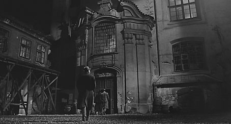
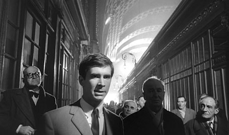
Orson Welles in one of his Peter Bogdanovich interviews describes how producer Alexander Salkind gave him a list of literary classics to which he owned the rights and asked him to pick one. Given a choice of Kafka titles Welles says he would have chosen The Castle but The Trial was the only one on the list so it’s this which became the first major adaptation of a Kafka novel. Welles always took some liberties with adaptations—even Shakespeare wasn’t sacred—and he does so here. I’m not really concerned whether this is completely faithful to the book, however, it’s a first-class work of cinema which shows Welles’ genius for improvisation in the use of the semi-derelict Gare d’Orsay in Paris as the main setting. (Welles had commissioned set designs but the money to pay for those disappeared at the last minute.) As well as scenes in Paris the film mixes other scenes shot in Rome and Zagreb with Anthony Perkins’ Josef K frequently jumping across Europe in a single cut. The resulting blend of 19th-century architecture, industrial ruin and Modernist offices which Welles called “Jules Verne modernism” continues to be a big inspiration for me when thinking about invented cities. Kafka has been fortunate in having many great actors drawn to his work; here with Perkins there’s Welles himself as the booming and hilarious Advocate, together with Jeanne Moreau, Romy Schneider and Akim Tamiroff.

Continue reading “Screening Kafka”

Designs on Kafka

kafka.jpg

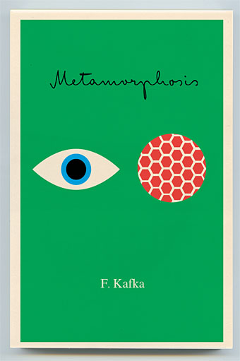
Book covers of the week are a series of new Kafka designs by Peter Mendelsund for Schocken, a set comprising eight paperbacks which will be out this summer in the US. What’s notable about these designs aside from their minimal style is the way they dispense with the visual clichés which have accumulated around Kafka’s work. So no sombre author photos, ominous shadows or views of Prague, just bold colours and simple shapes to create a beautiful collection. The script typeface is Mister K by Julia Sysmäläinen, a design based on Kafka’s handwriting. Peter Mendelsund has the rest of the covers and some words about their design on his blog. Via Coudal.

Elsewhere on { feuilleton }
The book covers archive

Previously on { feuilleton }
Kafka’s porn unveiled
A postcard from Doctor Kafka
Alexandre Alexeieff and Claire Parker
Hugo Steiner-Prag’s Golem
Steven Soderbergh’s Kafka
Kafka and Kupka

Tetragram for Enlargement

tetragram.jpg

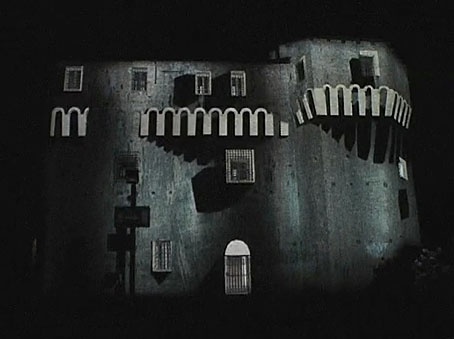
A stunning architectural video installation produced by Apparati Effimeri for last month’s Itinerario Festival, in which the stolid Rocca Malatestiana in Cesena, Italy, is painted with stripes, then mutated, melted and finally blown apart in slow motion. I’d love to see this effect applied to large city-centre buildings but the results are so striking they’d probably create no end of traffic accidents.

Via Further.

Previously on { feuilleton }
Alexandre Alexeieff and Claire Parker