Weekend links 642

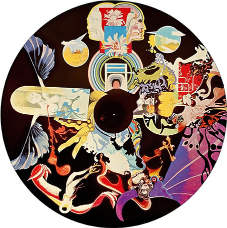
wheel.jpg

A light wheel. Via.

• “Part of the instrument’s draw is its fallibility. Famously, or perhaps infamously, every Rhodes is different: some freakishly responsive, some with keys that stick like glue, and all with uneven registers, darker corners, and sweet spots.” Hugh Morris on the delicate art of reinventing the Fender Rhodes.

Rambalac’s YouTube channel of first-person walks through Japanese locations is a vicarious pleasure, especially on a big screen. It’s not all city streets but if you like urban meandering then Tokyo walk from day to rainy night – Higashi-Ikebukuro, Mejiro, Ikebukuro is a good place to start.

• At Igloomag: Chang Terhune interviews Stephen Mallinder in a gratifyingly lengthy piece which covers Mallinder’s recent solo recordings and collaborations, his work with students on his sound-art course, and (unavoidably) the late Richard H. Kirk and Cabaret Voltaire.

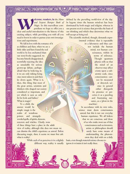
What I think might be a useful approach—perhaps impractical, but bear me out—I think that if we were to reconnect magic and art as a starting point, because they’re practically the same thing anyway, make art the product of your magical experiments, the way that Austin Spare did for example, then that would give magic an enormous sense of purpose and I think it would also lend art the vision that it seems to be lacking at present. A lot of modern art seems rather empty and hollow conceptualism that lacks any real vision or substance or power. A linking of magic and art would help both of those fields. Then, once you’ve done that, maybe linking art and science. There’s plenty of work already done in that regard.

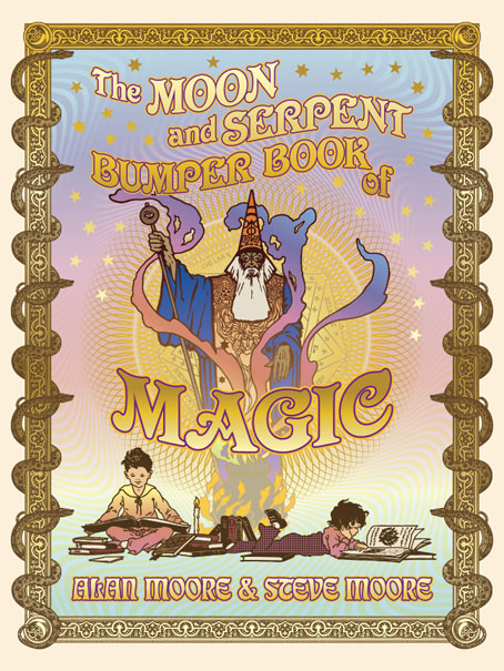
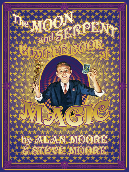
Alan Moore talking to Miles Ellingham about the usual concerns plus his new story collection, Illuminations

Wheels of Light: Designs for British Light Shows 1970–1990 is a book by Kevin Foakes (aka DJ Food) which will be published later this month by Four Corners Books. The author talks about his book here.

• “The Sandjak of Novi Pazar always sounded as if it were a title, like the Sultan of Zanzibar or the Dame of Sark…” Mark Valentine on discovering outdated maps in forgotten books.

• “My brief was to find tracks that had been left by the wayside or disregarded.” Lenny Kaye on 50 years of his influential garage-rock compilation Nuggets.

• Mixes of the week: XLR8R Podcast 768 by Lawrence English, and King Scratch (Musical Masterpieces from the Upsetter Ark-ive) by Aquarium Drunkard.

• At Dennis Cooper’s: Spotlight on Shirley Jackson The Haunting of Hill House (1959).

• Steven Heller’s font of the month is Slag.

• This Wheel’s On Fire (1968) by Julie Driscoll, Brian Auger & The Trinity | Cosmic Wheels (1973) by Donovan | Wheels On Fire (1985) by Haruomi Hosono

Resurrecting R’lyeh

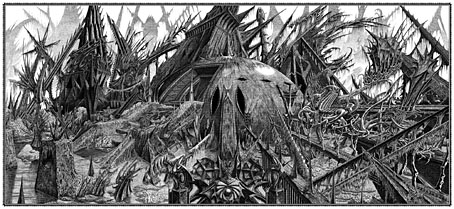
rlyeh-2021.jpg

Then, driven ahead by curiosity in their captured yacht under Johansen’s command, the men sight a great stone pillar sticking out of the sea, and in S. Latitude 47°9′, W. Longitude 126°43′, come upon a coastline of mingled mud, ooze, and weedy Cyclopean masonry which can be nothing less than the tangible substance of earth’s supreme terror—the nightmare corpse-city of R’lyeh, that was built in measureless aeons behind history by the vast, loathsome shapes that seeped down from the dark stars. There lay great Cthulhu and his hordes, hidden in green slimy vaults and sending out at last, after cycles incalculable, the thoughts that spread fear to the dreams of the sensitive and called imperiously to the faithful to come on a pilgrimage of liberation and restoration.

HP Lovecraft, The Call of Cthulhu (1928)

Behold the fruits of a more benevolent pilgrimage of liberation and restoration. It was just over a year ago that I decided to draw an exact replica of the R’lyeh triple-spread from my comic-strip adaptation of The Call of Cthulhu, the intention being to make the picture available as a poster-sized print once I had a print-ordering system in place. The picture may now be purchased here as a giclée print on Hahnemüle Pearl art paper. This is a big picture (870.46 x 401.15 mm or 34.27 x 15.793 ins), and unlike my other Etsy prints I’m afraid there won’t be a half-size version which means the price will remain relatively high. I’m also keeping it as a black-and-white piece despite the temptation to create a tinted version.

And so to the obvious question: why did I want to redraw a large and very detailed piece of art in the first place? Pull up a weed-festooned Cyclopean bollard and I’ll explain…

starrywisdom.jpg

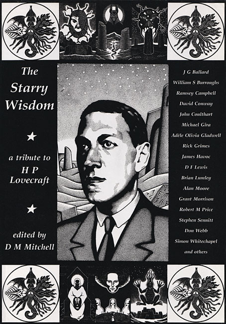
Creation Books, 1994. Cover art by Peter Smith.

I spent 17 months drawing The Call of Cthulhu, from January 1987 to May 1988, using my preferred media of the time, a 0.2 mm Rotring Variant pen on A3 sheets of Daler cartridge paper. The story took its time getting into print but it was eventually published in 1994 by Creation Books as part of The Starry Wisdom, a collection of Lovecraftian fiction edited by DM Mitchell. I was very pleased to be represented in the book but the pleasure turned to dismay when it transpired that all the artwork had vanished after the printing was done. Or almost all the artwork… To this day I don’t know whether the drawings by other artists suffered the same fate, but my Cthulhu pages disappeared along with the anatomical cross-section and the Yuggoth collage that I created specially for the collection. I still don’t know what really happened either, whether the drawings were stolen (possible), thrown away deliberately (unlikely), or thrown away accidentally (also possible). The lack of resolution to the whole business is partly my fault. Losing all that art was a painful thing to consider, and I couldn’t accuse the printer of anything when nobody could say what had happened (I was in the Creation office during one of the phone conversations between publisher and printer). The printer was also located in the middle of a rural county somewhere so journeying there would have been difficult for this non-driver, as well as being pointless if they could only tell me what I knew already. Time passed and I did my best to put the whole episode behind me.

pens.jpg

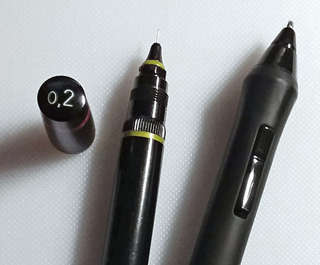
Drawing technology then and now: the Variant pen I used throughout the 1980s and the Wacom stylus I use today. That Variant nib is so fine that I have a faint ink dot tattooed on one of my knuckles from where I accidentally stabbed it into my hand. The Wacom pen looks stubby in comparison but is capable of drawing equally fine lines and much more besides.

On the plus side (there was one), the printer had done a good job of half-toning the artwork, so even though the Starry Wisdom pages are rather small the detail in the drawings is still evident. And I also had a complete set of photocopies of the A3-sized originals. I’d been working for Savoy Books since 1989 during which time making photocopies of new drawings had become second nature. Since 1994 this set of copies has become the original art for the Call of Cthulhu strip, rather like the surviving prints of Murnau’s Nosferatu which are all that anyone can see of his film today. The analogy is an apt one since it also extends to picture quality. Just as silent films always look their best when they’ve been restored from the camera negative, my Rotring drawings really need to be reproduced from the originals. The 0.2 mm pen that I insisted on using throughout the 1980s was too fine for the photocopy machines of the time, especially when my shading was so densely rendered that I might as well have been using a pencil. This isn’t so much of a problem if the pages are being reduced in size but it became one last year when I had the idea of making a print of the R’lyeh panorama that would be the same size as the original drawings. Giclée printing is an ink-jet process that reproduces fine detail with great accuracy, so while I could make full-size prints of the Cthulhu pages they’d never look better than what they were, photocopies that hadn’t fully captured the fine lines of the drawings. This wasn’t the only problem.

Continue reading “Resurrecting R’lyeh”

Weekend links 591

entangled.jpg

Ghost Box 39. Design, as always, is by Julian House.

Entangled Routes by Pye Corner Audio will be the next album on the Ghost Box label, due for release on 26th November. This will be Pye Corner Audio’s fourth album for Ghost Box, and one which forms the final part of a trilogy of imaginary soundtracks for science-fiction scenarios, “the latest installment of which plays with the idea of mycorrhizal networks and attempts by humans to listen in and communicate”.

• “…for every ten projects I start, nine will probably fall by the way side—they just don’t get made. Nothing happens, you can’t find the tapes, you can’t find the rights holders, the tapes were destroyed, no one’s interested.” Jonny Trunk interviewed at Aquarium Drunkard.

• At Unquiet Things: S. Elizabeth is celebrating the first anniversary of The Art Of The Occult (previously) by giving away a signed copy of her book to one of the commenters on this post.

• “Sand is not only temporary, it is also the most temporised form of matter.” Steven Connor on the dust that measures all our time.

• Mixes of the week: Autumn Hymnal: A Mixtape by Aquarium Drunkard, and In Estonia with Bart de Paepe by David Colohan.

• “Touched by the hand of Ithell: my fascination with a forgotten surrealist.” Stewart Lee on Ithell Colquhoun.

• Skin trade: a playlist of percussion at the outer limits; Valentina Magaletti surveys alternatives to the conventional kit.

• At Wormwoodiana: Mark Valentine reviews The Devil At Saxon Wall by Gladys Mitchell.

• “The Show: Alan Moore brings vaudevillian dazzle to Northampton noir,” says Phil Hoad.

• At Bandcamp: A Guide to the Eclectic Funk Music of Bernie Worrell by John Morrison.

• At Dennis Cooper’s: Spotlight on…Octave Mirbeau The Torture Garden (1899).

• At Spine: Vera Drmanovski on redesigning the novels of Hermann Hesse.

• New music: Music For Psychedelic Therapy by Jon Hopkins.

South To The Dust (1990) by Ginger Baker | Into Dust (1993) by Mazzy Star | Photon Dust (2020) by Pye Corner Audio

More shirts

skullprint-sephiroth.jpg

I’ve added a couple more shirt designs to the Skull Print page and I’ve also tweaked the ordering process a little. This was necessary when it became apparent that the PayPal purchase system no longer allows buyers to leave a note to the seller even though this option is still available when you create the code for a PayPal button. (I was surprised to discover that the button-creating area of PayPal still looks the way the site did about 20 years ago.) Thankfully WordPress allows you to add contact forms to posts so I’ve added these to each shirt design. It’s an awkward solution but the form does at least allow a buyer to send along details of their required shirt size and shirt colour. A better solution would be a shopping cart arrangement but this will have to wait for now. I’ve been so busy with work for the past few months it’s taken me all summer to even get this far.

promethea.jpg

Promethea 14, 2001. Art by JH Williams III.

The new designs are two versions of the perennially popular James Joyce design, plus the Kabbalah map which I created in 2000, and which subsequently made a cameo appearance in issue 14 of Alan Moore’s Promethea. This has always been popular as a print at CafePress but people also like to have it on a shirt. I’d suggest white shirts only for this design but the decision is for the purchaser.

Previously on { feuilleton }
T-shirts by Skull Print

Serious houses: The Lud Heat Tapes, 1979

ludheat.jpg
Goldmark hardcover, 1987.

The old maps present a sky-line dominated by church towers; those horizons were differently punctured, so that the subservience of the grounded eye, & the division of the city by nome-wound, was not disguised. Moving now on an eastern arc the churches of Nicholas Hawksmoor soon invade the consciousness, the charting instinct. Eight churches give us the enclosure, the shape of the fear; – built for early century optimism, erected over a fen of undisclosed horrors, white stones laid upon the mud & dust. In this air certain hungers were activated that have yet to be pacified; no turning back, as Yeats claims: “the stones once set up traffic with the enemy.”
—Iain Sinclair, Lud Heat

A serious house on serious earth it is
—Philip Larkin, Church Going

“Serious” is a word with many meanings. The Oxford English Dictionary gives one of these as “attended with danger; giving cause for anxiety”, a definition that wouldn’t suit Philip Larkin’s poem describing a visit to a moribund country church, but which is easily applied to a longer cycle of poems by Iain Sinclair. Lud Heat: A Book of the Dead Hamlets is the collection of writings that lifted Sinclair’s authorial profile out of the poetry ghetto in which he’d been situated throughout the 1970s. He published the first edition through his own Albion Village Press in 1975 but it wasn’t until the arrival of Peter Ackroyd’s Hawksmoor a decade later that wider public attention began to turn in Sinclair’s direction. Lud Heat set out for the first time a series of observations concerning the peculiar and sinister qualities of the churches built by Nicholas Hawksmoor in 18th-century London: Christ Church, Spitalfields; St George’s, Bloomsbury; St Mary Woolnoth; St George in the East; St Anne’s, Limehouse; St Alfege Church, Greenwich; plus those built in collaboration with John James: St Luke Old Street, and St John Horsleydown. The book separates the poetry with prose pieces—diary extracts, accounts of a film viewing and an art exhibition—that anticipate the author’s subsequent explorations of London’s margins and esoterica. Like many of Sinclair’s later writings, the texts in the early editions are accompanied by a variety of illustrations: engravings, contemporary photographs, and a map of London drawn by Brian Catling that posits a network of “lines of influence…invisible rods of force” connecting the churches with each other and with significant locations such as William Blake’s house, Cleopatra’s Needle and so on. Paperback reprints omitted the illustrations* but retained the map which was redrawn by Dave McKean. The new version gave greater emphasis to the Egyptian symbols that Sinclair and Catling had scattered across the city: jackal-headed Anubis as the presiding deity of the Isle of Dogs.

christchurch.jpg

Photo by Charles Latham from London Churches of the XVIIth and XVIIIth Centuries (1896) by George H. Birch.

Lud Heat is a beguiling and potent book; it’s also a book that’s of its time in its suggestion of malefic “rods of force” scored across the capital. Sinclair’s map may be the earliest artistic development of a process begun in 1969 when John Michell published The View Over Atlantis, an elaboration of ideas set forth in another of his books, The Flying Saucer Vision. Michell’s free-wheeling speculations gave new life to the innocuous studies of Alfred Watkins, inflating amateur archaeological ruminations into full-blown Aquarian metaphysics. Where Watkins considered that “ley lines” (a term of his own invention) might have been ancient trading routes, Michell’s enthusiasm for the full range of Fortean phenomena transmuted the alleged paths into channels of unspecified “Earth energy”, flying-saucer guides, and the axes of a sacred geometry. Other crank scholars were eager to follow Michell’s lead, leaving an opening for Sinclair to adopt the conceit for its poetic resonances; the New Age trappings were inverted to reveal a darker pattern more suited to London’s history of plague, murder and mass destruction. (The Hawksmoor churches had been built to compensate for the devastations of the Great Fire of 1666; two of them were hit by bombs during the Blitz, with one being damaged beyond repair.)

This isn’t to suggest that Sinclair was borrowing directly from Watkins and Michell; in an interview he mentions an earlier precursor of both his map and Watkins’ ley lines in Prehistoric London: Its Mounds and Circles (1914) by Elizabeth O. Gordon. But something was in the air in the 1970s. Lud Heat appeared shortly before the release of a pair of albums that borrowed heavily from Michell’s books—Green (1978) by Steve Hillage, and Blake’s New Jerusalem (1978) by Tim Blake—while two TV serials exploited the idea of ley lines as channels of Earth energy, Children of the Stones (1977) and Nigel Kneale’s Quatermass (1979). Lud Heat stands apart from these works by concentrating on urban structures rather than isolated monoliths and ancient pathways. The suggestion that the city of London could be home to mysterious “rods of force” is an especially intriguing one, hence the appropriation of the idea by Peter Ackroyd in Hawksmoor and Alan Moore in From Hell. Any church of a sufficient size or age is a kind of time machine, maintaining in its appearance and its grounds a pocket of history separated from the changes that take place around it. The churches in Lud Heat are also batteries of stone, impregnated with the unspent energies of the dead who lie in their crypts. These latent forces overflow their containers, spilling into the streets beyond the church walls. Sinclair has always been adamant that his Lud Heat map is a fabrication; the degree to which he believes in the rest of his thesis is for the reader to decide. It is a fact that St George in the East is close to the location of the Ratcliffe Highway Murders of 1811 (Sinclair includes a illustration of the murderer’s corpse in Lud Heat), while Christ Church, Spitalfields, sits at the centre of maps of the Jack the Ripper murders; the fifth and most brutal of these occurred a short distance from that colossal porch on the opposite side of Commercial Street. “Dead Hamlets” also has many meanings.

Continue reading “Serious houses: The Lud Heat Tapes, 1979”