Alan Moore interview, 1988

32luc.jpg

Originally published in Strange Things Are Happening, vol. 1, no. 2, May/June 1988. Note: “Vincent Eno” was Richard Norris, later one half of dance/ambient outfit The Grid with Dave Ball. See also the Watchmen round table discussion on this site.

Vincent Eno and El Csawza meet
comics megastar ALAN MOORE

Amidst smouldering heaps of superlatives flung in the direction of the comic genre of late, one name stands head and shoulders above the crowd: ALAN MOORE. But don’t just trust the gushing blurbs on the back of Moore’s works (‘Alan Moore has reinvented the comic book genre’ and so on), take it from your pals at Strange Things – Alan Moore is beezer!

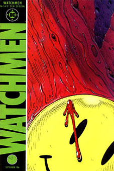
With Watchmen the comic book format legitimately became what the media manipulators were attempting to tell us all about – the graphic novel. Watchmen is a work to be read and re-read, loved and cherished. Poetry, Cinema, narrative, music… they’re all here. The advent of such a work is as exciting in literary terms as the publication of the earliest novels, and you’d better believe it. Because within the next two years, the work of Alan Moore and his contemporaries is going to eclipse Watchmen and zoom into overdrive. As Alan says, ‘the next two years are going to be good for comics.’ Some understatement.

Turning into the first true comic megastar wasn’t an easy ride for Alan.

‘After school I did a variety of awful horrifying jobs,’ he recalls. ‘They look great on the dust jacket of your first novel, but were shit to actually live through! I started off by working at the skin division of the local Co-operative society. We’d go to work at seven thirty in the morning, drag these blood-sodden sheepskins out of vats of cold water and urine, chop off extraneous testicles or hooves and throw them at each other in this concentration camp gaiety we’d established to cope with the grimness of our surroundings. People there were splattered with this chemical for removing wool from hide, these blue marks all over them.

‘Then I climbed up the social ladder and became a toilet cleaner for a hotel. After that I went through a number of grindingly tedious office jobs; finally I had to make the jump into writing because we’d got a kid on the way and if I’d waited until after the baby was born I’d never have had the nerve. I decided that life being as short as it is, and as far as I know us getting only one crack at it, it just seemed important that I shouldn’t spend any of it doing something I didn’t want to do.’

Continue reading “Alan Moore interview, 1988”

Strange Things Are Happening, 1988–1990

strange_things.jpg

A NOTICE TO OUR PUBLIC…………
It’s now a shade over twenty years since Rolling Stone was launched, complete with a brave new broadside on its interests and purposes.

So we too now announce our aims and prejudices and strive to clear a path laying bare our hopes and inspirations. Strange Things will deal from the heart and feature items that we would wish to find on offer. Music, from whatever era, will always be the core, with in-depth studies of a sound or an individual, or a laugh and a picture whenever the situation arises. There will be discographies, reviews, rare photographs; there will be threads or themes across several issues or even, instead, a one off appreciation.

That aside, there will be literature, film and television; cult curiosities or mainstream geniuses. In short, the boundaries are limitless. Over the next few issues the tale of Greenwich Village will unfold; so too the life and work of Richard Brautigan. Frantic new pop will sit beside English folk-rock, the Silver Surfer will meet the San Franciscan scene and white Chicago Blues will rock with Thunderbirds. “Whatever Fits” is our new motto – we’re there wherever strange things are happening.

Continue reading “Strange Things Are Happening, 1988–1990”

The lost art of sleeve design

stickyfingers.jpg

Listening to the Rolling Stones’ Sticky Fingers recently had me musing about the great cover design by Andy Warhol, probably his most well-known after the first Velvet Underground album. The music may sound better than it ever did in the Seventies but CD reissues can’t reproduce the brilliant sleeve which included a real metal zipper on the front of the jeans. The Seventies were the golden age of cover design, popular music had evolved considerably since Sgt. Pepper and the “album as artform” meant that bands were searching continually for new ways to exploit the medium of the record sleeve. Gatefold sleeves became commonplace, then expanded into multiple foldout affairs; expensive gimmicks like the Stones’ zipper arrived pretty swiftly and there were other striking novelties like the first Faust album, a clear vinyl record, in a clear plastic sleeve.

Significantly, Warhol’s Velvet Underground design was also a) gimmicky, with its peel-able banana skin, and b) similarly phallic-oriented, as the banana beneath the skin was a pink one. (Original copies of this album are easy to spot in shops since they’re nearly always missing the skin). Joe Dallesandro is supposed to be filling out the trousers on the Stones’ album, a refreshingly homoerotic moment in the often resolutely sexist world of rock graphics. Nice of the Stones to be so daring but then Jagger at least didn’t mind dancing along the boundaries of sexuality in Performance and it was about this time that they were playing their scurrilous rent boy song, Cocksucker Blues. It’s also quite a macho image, of course, and aggressively sexual, so they get to have their cock cake, and eat it, as it were.

Fancy album sleeves fell out of fashion somewhat when punk came in but there were still things like the first Durutti Column album with its sandpaper sleeve intended to destroy the records it was stored with. I was fortunate to be able to do some vinyl design when I was starting out in the early eighties, even if I wasn’t allowed to design anything quite so elaborate. Some of the designs for the Alan Moore and Tim Perkins CDs take advantage of different booklet arrangements but it’s not the same as having all that space to play with. Now that music is thoroughly digital the visual component is reduced even further. A 300 x 300 pixel image in iTunes is a poor substitute for the tactile (and erotic…) pleasures of the album as artefact.

Elsewhere on { feuilleton }
The album covers archive