Hipgnosis interview

hipgnosis1.jpg

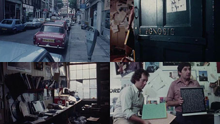
This is a frustratingly short piece of film—a mere 16 minutes—but it’s fascinating all the same for the brief views it gives inside the London studio of the Hipgnosis design partnership at the tail end of their golden decade, the 1970s. Being an occasional album cover designer as well as a minor Hipgnosis obsessive I like to see where so many of the team’s album covers originated. The two Hipgnosis founders, Aubrey Powell and Storm Thorgerson are both interviewed; the third member of the partnership, Peter Christopherson, is absent. The film is also undated but the discussion of the cover photo for Look Hear? by 10cc puts the year at around 1980. The views of the studio aren’t much different from the rather murky shots of the place in the first Hipgnosis book, An ABC of the Work of Hipgnosis: Walk Away René (1978), but the film gives a better sense of the dishevelled actuality: those stairs that Thorgerson runs up at the opening are the same ones that form the background to the melting Peter Gabriel photo used on the cover of Gabriel’s third album. Powell and Thorgerson are such engaging interviewees they really ought to have been profiled at greater length by the BBC or ITV, not given a few minutes to discuss some of their more notable creations by a small French film crew.
hipgnosis2.jpg

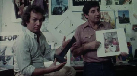
Aubrey Powell shows off the mystery object from the Presence album by Led Zeppelin.

The Hipgnosis studio occupied two floors of a building in Denmark Street, a minor thoroughfare off the Charing Cross Road that used to be a home to music publishers, rehearsal rooms and many of London’s musical instrument vendors. For a few years it was also home to the original and equally dishevelled Forbidden Planet book and comic shop, a place I first visited shortly after it opened in 1978. I always used to visit Forbidden Planet when I was in the capital but the Hipgnosis team had gone their separate ways by the time I found out they’d been based in the same street. Had I known about this earlier I probably would have wandered around for a while wondering which door led to their rooms. With its clutter and blithe disregard for client-flattering furnishings (the reception room, said Thorgerson, had nowhere to sit down) the studio was a long way from anybody’s idea of a well-appointed design business. The place reminds me of the offices occupied for many years by Savoy Books in Deansgate, Manchester: ancient, first-floor rooms whose better days were long past, with tools of the trade littering every surface, recent works-in-progress on the walls and old stickers peeling off the door. In Walk Away René, Thorgerson also admits that the studio lacked a toilet so they had to resort to pissing in a sink, a disgraceful expediency also shared by the Savoy office. In such places was art once made.

Previously on { feuilleton }
Design as virus 16: Prisms
Storm Thorgerson, 1944–2013
Hipgnosis turkeys
Peter Christopherson, 1955–2010
Storm Thorgerson: Right But Wrong

Weekend links 476

kimura.jpg

Man’s body dish for Sashimi under the cherry blossom (2005) by Ryoko Kimura.

• Godley & Creme’s Consequences (1977) is reissued this month on CD and vinyl. Originally a three-disc concept album with a theme of climate disaster and the natural world’s revenge on humanity, Consequences was released at a time when punk and prog rock were fighting for the attention of music listeners. 1977 wasn’t the end of prog by any means (many of the vilified bands had some of their greatest successes at this time) but Godley & Creme’s transition from the smart pop songs of 10cc to extended instrumental suites was abrupt, and their concept, such as it was, lacked the drama and accessibility of Jeff Wayne’s The War of the Worlds, even with the addition of Peter Cook providing a multi-voice comic narrative between the musical pieces. (Kevin Godley ruefully referred to the album in later years as Con Sequences.) The album flopped, and has been a cult item ever since.

• “A word of caution, though. Once you do read it, it’s hard to let it go.” Philip Hoare on Herman Melville and Moby-Dick. Related: William T. Vollmann on how a voyage to French Polynesia set Herman Melville on the course to write Moby-Dick.

Samm Deighan on The “Faraway Forest” in Peter Strickland’s Katalin Varga, The Duke of Burgundy, and The Cobbler’s Lot.

Brian Eno, Roger Eno, and Daniel Lanois discuss the recording of Apollo: Atmospheres & Soundtracks.

John Boardley on the first fashion books, Renaissance pixel fonts and the invention of graph paper.

Melanie Xulu looks back at a time where major labels were releasing witchcraft rituals.

• “Tom Phillips’ A Humument is a completely novel project,” says Rachel Hawley.

John Foster on the evolution of Stereolab’s analogue-inspired record sleeves.

• At Dennis Cooper’s: a history of le Grand Guignol by Agnes Peirron.

Casey Rae on William S. Burroughs and the cult of rock’n’roll.

• An Austin Osman Spare image archive.

Consequences (1965) by John Coltrane | Moby Dick (1969) by Led Zeppelin | Consequence (1995) by Paul Schütze

Raising the roof

ramases1.jpg

Roger Dean’s album cover art extends further than his sleeve illustrations for Yes. His earlier designs for the Vertigo label showed his visual invention to good effect, and a couple of those designs have had their imitators. The cover art for Dedicated To You, But You Weren’t Listening by the Keith Tippett Group is one that I’ve seen copied although I forget where for the moment so you’ll have to take this on trust. (Ahem.)

ramases2.jpg

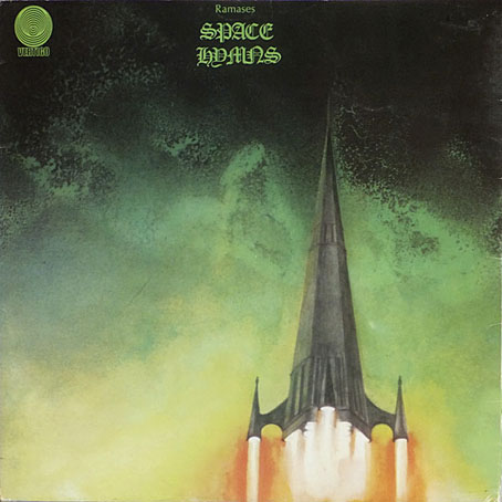
The church steeple blasting off from Space Hymns (1971) by Ramases is borrowed somewhat crudely in a 2011 ad for the Wien Museum which shows Vienna’s St Stephen’s cathedral undergoing a similar transformation. The Ramases idea is so eye-catching I’m surprised I’ve not seen it imitated before, although it wasn’t Dean’s invention; in his Views book he says that it was the group’s idea, and they gave him a thorough brief. I presume by this he means that they also wanted the spire as a cover detail, and looking sufficiently rocket-like to give a surprise when the sleeve is opened.

wien.jpg

“Ramases” was Martin Raphael Barrington Frost, an Egypt-obsessed British musician who recorded two albums and a single with wife, “Selket”. The single B-side, Mind’s Eye (1968), is a decent piece of psychedelia that turns up on compilations. The same can’t be said for Space Hymns, unfortunately; the presence of 10cc as backing band isn’t enough to rescue songs whose cosmic titles offer more than they deliver. But that’s still a great sleeve. Thanks to @weird_prophet for the Wien tip!

Elsewhere on { feuilleton }
The album covers archive

Previously on { feuilleton }
Roger Dean: artist and designer