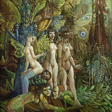
Lucifer (no date).
…I find nothing fantastic in so-called fantastic art, it is an aspect of reality in search of sanity beyond the normal bounds. I believe that fantastic art is related to the protective dream, that it prolongs the healing dream and finds symbols that change dread into wonder, strangeness and beauty.
As in all figurative art, fantastic art must of course be judged not only by its intentions but by the quality of the execution, and by standards that have been almost totally lost in the turbulence of changing fashions, movements and politics on the art market. This has led to a noticeable helplessness among the critics, who seem to ignore a growing tendency toward the fantastic in the hope that it will fade away and die. I do not believe it will.
Thomas Häfner
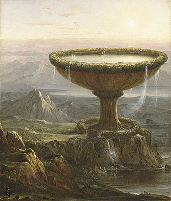
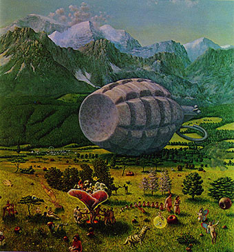
Who was Thomas Häfner? Good question, because he’s virtually invisible on the web. The painting above is scanned from David Larkin’s excellent Fantastic Art (Pan/Ballantine, 1973) and was also used as a cover image for an edition of Blaise Cendrars‘ scurrilous masterpiece, Moravagine. The Demon Woman below is a watercolour original for sale on eBay. Häfner was a member of a group of German artists who called themselves the Young Realists, formed in Düsseldorf in the mid-Fifties. Significantly, another group of young imaginative painters was active at the same time in Vienna, the Fantastic Realists, who included the great Ernst Fuchs among their number. “Realism” here can be considered as referring to a style that favoured the hard-edged realistic approach of Surrealism; Häfner’s content certainly wasn’t realistic.
These people remain neglected or unknown because art critics like to pretend there’s only one story being told in the development of art at any given time when there are usually several, often with conflicting agendas. So we’re always being informed that the dominant movement in fin de siècle Paris was Impressionism and hear little of the Symbolists who were equally—if not more—popular, productive and influential during that period.
(This laziness carries over to other areas; Debussy is continually described as “an Impressionist composer” when one of his most famous works, Prélude à l’après-midi d’un faune, was based on a Symbolist poem by Mallarmé. There are no fauns in Impressionist paintings.)
The prevailing trend in the mid-Fifties was the thin gruel of Abstract Expressionism, the complete antithesis of the kind of art being produced by Häfner, Fuchs and company. There’s a reason for the elevation of this type of work over others. Critics such as Clement Greenberg saw abstraction (which, ironically, grew out of Surrealism) as being a politically acceptable direction after the turmoil of the Second World War. The Nazis liked realism in their art, while the Soviets under Stalin and the Chinese under Mao had declared Socialist Realism to be the official art of the Communist Revolution, therefore realism of any variety was reactionary and bad. Further irony comes when the CIA agreed with this argument and secretly promoted Abstract Expressionism outside America. This has led us to the situation we have today where a Willem de Kooning painting, Woman III (1952–53), was recently sold for $137.5 million which means collecting this kind of work is now a game for billionaires. It really would be the final irony if the kind of realistic art that Clement Greenberg despised was elevated to a new popularity by over-priced Abstract Expressionism as collectors with fewer assets were forced to look elsewhere. Critics can protest all they like but these days it’s money that speaks with the loudest voice in the world of art.
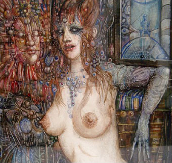
Demon Woman (no date).
Update: added some additional works:
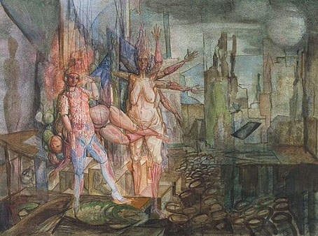
Marionetten (1964).
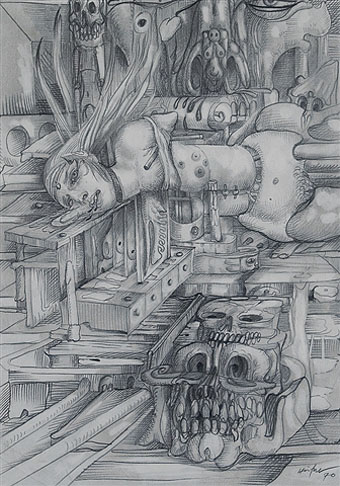
Szene mit Schädeln (1970).
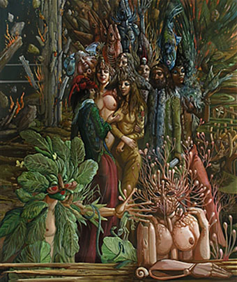
Phantastische Waldszene (1971).
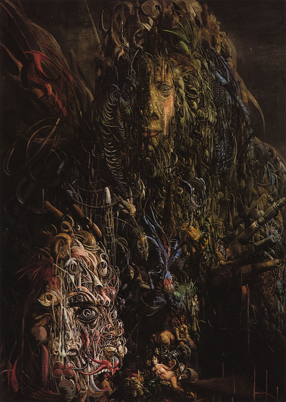
Masken in zerfallener Umgebung (1974).

Die Harpye (no date).
Elsewhere on { feuilleton }
• The fantastic art archive