Layering Buddha by Robert Henke

henke_buddha.jpg

Layering Buddha on CD and limited vinyl.

The Fm3 Buddha Machine is a low-fi loop playing device containing nine pre-recorded loops which cannot be changed by the user. Due to manufacturing imperfections, individual machines play the loops with a slightly different sound, pitch and duration. The built-in playback circuit, with its low sampling rate and bit resolution, produces a very rough sound, similar to ancient computer games or talking toys. Rich, spacious textures and moving echoes occur when many of these machines are played at the same time.

I recorded the sound of one single buddha machine at 96 kHz, using a state of the art A/D converter. The recording contains audio information up to 48 kHz, which makes it possible to transpose the loops down and expose otherwise inaudible hidden details. The pieces on this CD have been created by granulating, filtering, pitching and layering either the original loops, or new loops which were re-assembled out of parts of the originals. Most pieces are based on one single source loop. The pieces as they live within my computer are set up as continuously permutating structures and theoretically could go on forever, just as the loops do within the buddha machines.

I made quite long renderings of these permutations and later decided which excerpt of each structure to put on this CD. Therefore, the tracks are not closed works, but views onto a perpetual machinery.

The art of Shinro Ohtake

queer.jpg

Shinro Ohtake is always on the attack. Whether it’s against misguided art education, against the cold treatment and economic constraints Japan puts on anyone who could dare to live differently, against the contemporary art establishment that can’t be bothered to even disguise its own incomprehension—his fight as an artist continues. Ohtake is prodigious, original, and a trouble-maker—in the sense that the work of the artist is always to create difference.

William Burroughs

Two disparate things had me looking for Shinro Ohtake‘s work this week: I’ve been doing a short interview about album cover design (more about that at a later date) in which I mentioned his collage for the cover of Seven Souls by Material (1989), then an editorial in the latest Wire describes his current retrospective exhibition at the Museum of Contemporary Art in Tokyo.

seven_souls.jpg

The Material cover is one I picked as a favourite design. It’s difficult trying to pin-point why I think this works so well without it being at all illustrational. (I’m guessing, but it’s likely that Bill Laswell picked it out of one of Ohtake’s collage books, rather than it being specially commissioned.) It may be the collage aspect that works here. The album features readings by William Burroughs set to music and for me is the best of all the Burroughs recordings (Dead City Radio being a close second). Burroughs’ work, of course, involved literary collage via his own cut-up process, and the musical content can also be seen as a collage in the way it mixes different styles and musicians—Simon Shaheen, Shankar, Rammellzee, Foday Musa Suso, Fahiem Dandan and samples of the famous Brian Jones recordings of the Jajouka pipers. It’s a shame that when the CD was reissued in 1997 (in a superior mastering, it should be noted), the original artwork was largely junked in favour of a lot of muddy Photoshop work from the usually excellent Russell Mills. I’ve a huge respect for Mills but this treatment was a serious mistake.

Elsewhere on { feuilleton }
The album covers archive

Previously on { feuilleton }
William Burroughs book covers

High Priorities

high_priority.jpg

In which your humble narrator enters a contest…

Speak Up, in collaboration with New York magazine, is proud to announce the first-ever open contest to design the visually acclaimed, graphically exhilarating, by-invitation-only “High Priority” feature illustration in the magazine’s year-end, December 18, 2006 double issue.

High Priority highlights five activities, suggested by New York writers, that are not to be missed. Every week designers and illustrators from around the world are invited to create an interpretive typographic illustration to open “The Week” – the listings section of New York Magazine. New York readers place great weight on these five recommendations, and this page is a regular destination for many.

For examples of past editions of High Priority please visit:
New York‘s High Priority archive
Design Observer’s Variations on a Theme: New York‘s High Priorities

I knew about this listings feature from having read the Design Observer piece (I’ve never seen a copy of New York), and liked the idea for what amounts to the design equivalent of a “standard” in jazz, with different designers having to present a riff on the same brief in each issue. The restrictive nature of the problem is part of its appeal; only two colours are allowed (red and black), the box must be the shape it always is, and the design has to incorporate five categories—Movies, Theater (sic), Art, Nightlife and Restaurants—with the date, the words “High Priority” visible somewhere, and the accompanying critics’ recommendation for each category. Aside from that, anything goes.

My attempt can be seen above. I was going to do a couple of different designs then pick the best one but in the end I ran out of time. The initial idea was to do something along the lines of the cover for Physical Graffiti by Led Zeppelin (below) but—as is often the case with first ideas—making it work wasn’t so easy.

led_zep.jpg

Led Zeppelin’s building is a great photograph of a New York brownstone (the original vinyl sleeve had slots cut in the windows through which the lettering and various pictures on the inner sleeves could be seen); mine had to be pieced together from separate pictures of New York in the 1930s. It doesn’t quite work because there’s not much justification for having the category lettering arranged like rows of birthday cards on the window sills. But maybe I’m being too hasty in pulling it apart when the winner won’t be announced until December 4th. Until then you can browse the 186 other entries. I have to say that the quality of these is really exceptional, if I were one of the judges I’d have a hard time choosing only one. Most of the time I wouldn’t give a second glance to an online contest but this one was fun and the high standard of the other entries has made it worthwhile.

The Brothers Quay on DVD

quays.jpg

A very welcome release, these are some of my favourite films (I reviewed Street of Crocodiles for Horror: the Definitive Guide to the Cinema of Fear earlier this year). Most of the early ones can be found on the Region 1 release from Kino International but that collection is poorly transferred and the interface has a fault that renders it almost unusable on a computer. The supplementary material on this new collection seems especially good.

Quay Brothers – The Short Films 1979-2003
UK 1979-2003. Dir Quay Brothers. Colour and b&w. cert 12
Disc 1: 134 mins + 60 mins commentary Disc 2: 121 mins. Ratio 1.33:1
Buy now on DVD (£24.99)

The BFI has collaborated with the inimitable Quay Brothers to release a truly comprehensive compilation of their short films on DVD; a world first. The Quays were extensively involved with the preparation of the DVD, personally supervising the transfers, recording commentaries on selected titles, and contributing an exclusive 20-minute illustrated video interview.

This two-disc set, in deluxe packaging, collects 13 of the Quay Brothers’ short films, spanning 24 years, in brand new restored and re-mastered editions (six of them with new Quay commentaries), plus a collection of ‘footnotes’ including interviews, alternative versions, unrealised pilot projects and more. An accompanying illustrated colour booklet features an encyclopaedic guide to the Quays’ universe, plus the original illustrated treatment for their best-known film Street of Crocodiles.

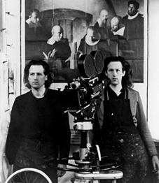
Born in Philadelphia and based in London, but with a creative sensibility derived from the remoter corners of Eastern Europe, identical twin animators the Quay Brothers have produced a unique body of work, and have also made a major contribution towards establishing the puppet film as a serious adult art form.

Filtering a huge range of literary, musical, cinematic and philosophical influences through their own utterly distinctive sensibility, each Quay film is a dialogue-free and usually non-narrative experience, riveting the attention through hypnotic control of décor, music and movement. With a grasp of the uncanny that rivals Luis Buñuel and Lewis Carroll, their films evoke half-remembered dreams and long-suppressed childhood memories, fascinating and deeply unsettling by turns.

The collection ranges from their very first puppet film Nocturna Artificialia (1979) to the recent The Phantom Museum (2003). In between there are all the classics: The Cabinet of Jan Svankmajer (1984), a tribute to their great Czech counterpart; This Unnameable Little Broom (1985), a reduction of the Epic of Gilgamesh into a ten-minute frenzy; their acknowledged masterpiece Street of Crocodiles (1986), a visualisation of the labyrinthine world of Polish author Bruno Schulz; the tantalisingly suggestive Rehearsals for Extinct Anatomies (1987) and The Comb (1990); the playful documentary Anamorphosis (1991), uncovering hidden meanings in outwardly conventional paintings; the Stille Nacht quartet (1988-94) of twisted music videos, and In Absentia (2000), their acclaimed collaboration with composer Karlheinz Stockhausen.

The second disc, ‘Footnotes’, contains numerous extras including a newly commissioned filmed interview, distinctive idents for the BFI and BBC2, the satirical short The Summit (1995) and a rare ‘acting’ appearance (albeit in stills) in a clip from Peter Greenaway’s The Falls.

The DVD has been produced by the BFI’s Michael Brooke, Content Developer for Screenonline, the BFI’s extensive online resource dedicated to the history of British film and television. To tie in with the release, Screenonline will be providing extensive background material for each individual title, together with a biography and filmography of the Quays.

Disc 1 – The Films

The Cabinet of Jan Svankmajer (1984)
*This Unnameable Little Broom (1985)
*Street of Crocodiles (1986)
Rehearsals for Extinct Anatomies (1987)
*Stille Nacht I – Dramolet (1988)
The Comb (1990)
Anamorphosis (1991)
*Stille Nacht II – Are We Still Married? (1992)
*Stille Nacht III – Tales From Vienna Woods (1993)
Stille Nacht IV – Can’t Go Wrong Without You (1994)
*In Absentia (2000)
The Phantom Museum (2003)

Disc 2 – Footnotes

Filmed introduction by the Quays
Nocturna Artificialia (1979)
The Calligrapher (1991)
The Summit (1995)
Archive Interview (2000)
The Falls (1980)
BFI ident
Alternative versions
*With new commentary by the Quay Brothers recorded for this DVD.

Elsewhere on { feuilleton }
The Quay Brothers archive