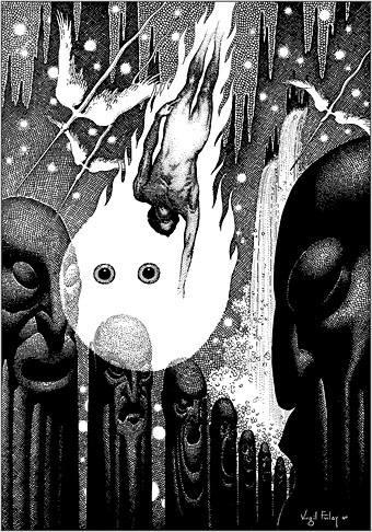
Illustration by Virgil Finlay for The Face in the Abyss by A. Merritt; Famous Fantastic Mysteries, October 1940.
• “The pier was completely outside of the gallery system, which David loved of course. People were just working on the walls, nothing was for sale, nothing could really be bought, although people were coming in and trying to chip things off the walls.” Cynthia Carr on the love letters and legacy of David Wojnarowicz.
• “In pursuit of Pure Form, the Polish artist known as “Witkacy” would consume peyote, cocaine, and other intoxicants before creating pastel portraits.” Juliette Bretan on the artful intoxications of Stanislaw Ignacy Witkiewicz.
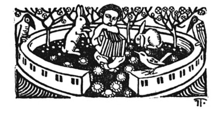
• Kino Kyiv: Christopher Silvester compiles a list of notable Ukrainian films. I’ve not seen all of these but Shadows of Our Forgotten Ancestors is a great favourite.
Onscreen for nearly the entire runtime, [Laura Dern] pulls off the remarkable feat of being in total control of a scenario organized by undermining her identity, obliterating her characterization, and so scrambling the distinction between Nikki and Susan that one eventually comes to view Inland Empire not as a maze to exit, a puzzle to solve, an ouroboros to gawk at, but rather as both a generalized treatise on the enigma of acting and a very specific, exquisitely perverse mash note to one of Lynch’s most formidable collaborators.
Nathan Lee on Laura Dern, David Lynch and Inland Empire. I’ve always thought Dern’s exceptional performance might have been recognised more widely if Lynch hadn’t filmed most of it on low-grade video.
• New music: Golden Air by Sun’s Signature, a new project from Elizabeth Fraser and Damon Reece.
• Miranda Remington explores The Strange World of…Stomu Yamash’ta.
• Steven Heller’s font of the month is Boucan.
• At Dennis Cooper’s: Labyrinthine.
• Labyrinth (2010) by Chrome Hoof | Labyrinths (2018) by Jonathan Fitoussi / Clemens Hourrière | The Seventh Labyrinth (2019) by Pye Corner Audio