Weekend links 619

schulze.jpg

A Moog on the Moon by P. Praquin, 1977. And a space helmet reflection to add to the list being accumulated by 70s Sci-Fi Art.

• RIP Klaus “Quadro” Schulze. I’ve owned many of his solo albums over the years, and while they’re historically important for the part they played in developing the kosmische sound in the 1970s I’ve never been very enthusiastic about the music. The albums I prefer are the ones where he was working with others, whether as a drummer in Ash Ra Tempel, an inadvertent member of the fake Cosmic Jokers supergroup, or part of the genuine Cosmic Couriers supergroup that made Tarot. The Tonwelle album credited to “Richard Wahnfried” benefits considerably from the presence of Manuel Göttsching and Michael Schrieve (also a rumoured Carlos Santana); I recommend it. For a taste of the synth-doodling Schulze, here he is in analogue heaven.

• Next month, Luminous Procuress, a film by Steven Arnold (previously), is released for the first time on blu-ray by Second Run: “Exploding out of San Francisco’s vibrant late-60s counter-culture, Luminous Procuress is a psychedelic odyssey of unabashed hedonism. The only feature film by artist, mystic and polymath Steven Arnold, the film celebrates gender-fluidity and pan-sexuality in a voyeuristic phantasmagorical journey towards spiritual ecstasy.”

• “Whereas [Bernard] Herrmann worked predominantly with strings and [John] Carpenter with synths, Anderson wanted to evoke a similar atmosphere with guitars.” Greg “The Lord” Anderson talks to Dan Franklin about making an album of night music.

I am troubled by how often people talk about likability when they talk about art.

I am troubled by how often our protagonists are supposed to live impeccable, sin-free lives, extolling the right virtues in the right order—when we, the audience, do not and never have, no matter what we perform for those around us.

I am troubled by the word “problematic,” mostly because of how fundamentally undescriptive it is. Tell me that something is xenophobic, condescending, clichéd, unspeakably stupid, or some other constellation of descriptors. Then I will decide whether I agree, based on the intersection of that thing with my particular set of values and aesthetics. But by saying it is problematic you are saying that it constitutes or presents a problem, to which my first instinct is to reply: I hope so.

Art is the realm of the problem. Art chews on problems, turns them over, examines them, breaks them open, breaks us open against them. Art contains a myriad of problems, dislocations, uncertainties. Doesn’t it? If not, then what?

Jen Silverman on the new moralisers

• “The website is colorful and anarchic, evoking the chaotic sensory experience of exploring a crammed, dusty shop.” Geeta Dayal explores the Syrian Cassette Archives.

• New music: The Last One, 1970 by Les Rallizes Dénudés; Untitled 3 by Final; Blinking In Time (full version) by Scanner.

• Why was erotic art so popular in ancient Pompeii? Meilan Solly investigates.

• You’ve been reframed: Anne Billson explores the history of split-screen cinema.

• At Spoon & Tamago: Japanese era names illustrated as logos.

• Mix of the week: XLR8R Podcast 745 by Wilted Woman.

Fun type

Split, Pt. 4 (1971) by The Groundhogs | Split Second Feeling (1981) by Cabaret Voltaire | Splitting The Atom (2010) by Massive Attack


The art of John Duncan, 1866–1945

duncan09.jpg

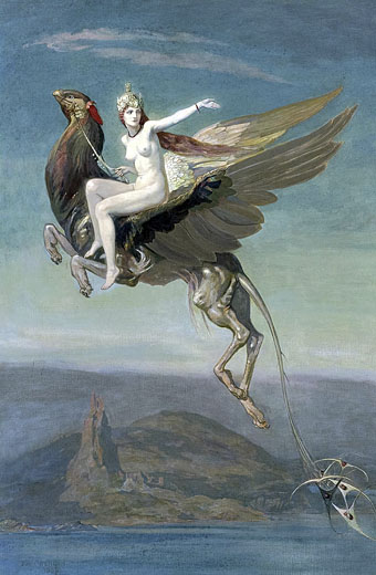
Heptu Bidding Farewell to the City of Obb (1909). Another of those paintings that provide a link between 19th-century art and 20th-century fantasy illustration.

Scotland isn’t a nation commonly associated with Symbolist painting, or with what The Studio magazine called “mystic subjects” when writing about John Duncan’s painting of Heptu on her hippogriff. There were a handful of Scottish artists in the late 1800s whose work suits the description, mostly the members of the Glasgow School, although some of these would be considered marginal cases compared to their Continental contemporaries. In the Anglophone countries Symbolist art is so thin on the ground that Michael Gibson in Symbolism (1995) puts Great Britain and the United States into a single chapter, and even there many of the artists he highlights—people such as Thomas Cole and the Pre-Raphaelites—are more like precursors, being too early to be considered an active part of a movement that only established itself in the 1880s.

duncan08.jpg

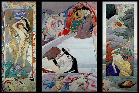
The Legend of Orpheus (1895).

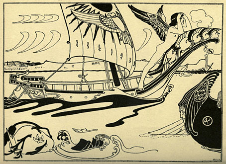
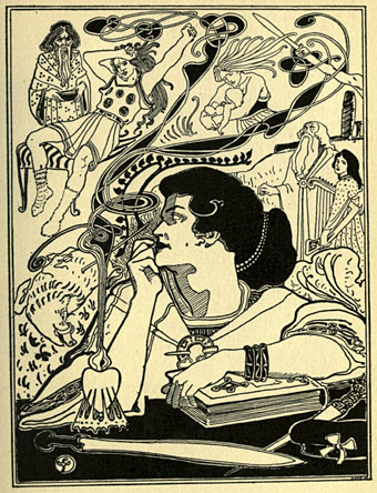
John Duncan does fit the bill, however, more so than I would have expected until I started looking at his paintings. Duncan’s career oscillated between Dundee and Edinburgh so he avoided the Arts and Crafts tendencies of the Glasgow School. His work is closer to French artists like Alexandre Séon, especially in the sculptural treatment of his figures. Familiar subjects and motifs abound: the riddle of the Sphinx, peacocks, Wagner, sorcery, and a variety of myths and legends, from Scotland to ancient Greece. The ink drawings here are from The Evergreen, A Northern Seasonal, a small art and literature magazine published in Edinburgh that managed four issues from 1895 to 1896. In Duncan’s later work he avoided the upheavals of Modernism by keeping to safe religious subjects. If the date is accurate for that Sphinx it must have seemed very old-fashioned in 1934.

duncan11.jpg

Out-Faring (1895).

duncan12.jpg

Anima Celtica (1895).

duncan04.jpg

A Sorceress (1898).

Continue reading “The art of John Duncan, 1866–1945”

Needful Things

needful1.jpg

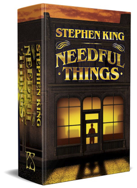
This is the first time I’ve mentioned this doorstop volume but it won’t be the last. I’ll be writing at greater length about last year’s heavy-duty illustration project once the book is in print. Needful Things is the latest in an ongoing series of reprints of Stephen King books from PS Publishing, each volume being limited to 1000 cased, hardback copies. Each book showcases the work of a different illustrator who also signs a tipped-in bookplate. There’s a thriving international market for deluxe reprints of King’s books so these things always sell out fast. This post serves as an alert to let interested purchasers know that the pre-ordering queue will open on the publisher’s website this Friday.

needful2.jpg

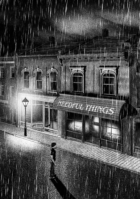
It was just over a year ago when PS asked if I’d like to illustrate Needful Things. I agreed with some trepidation, having already started work on another major illustration/design project (still in progress). The request from PS was for a cover design and 30 full-page interior illustrations; that’s only a little more than the amount of work I had to do when illustrating Dracula a couple of years ago, but those illustrations were mostly digital collages which took two or three days each to complete. A full-page drawing with this level of accuracy and detail takes me the best part of a week so I could see nine months of frantic plate-spinning ahead. Everything worked out, anyway, and I’m very pleased with the end results. So is Stephen King, which is good to know.

needful3.jpg

I’m afraid I don’t have price details for this one but the PS edition of Cujo was priced at £90. Anyone wanting to join the pre-order stampede is advised to first join the publisher’s mailing list. The most recent PS mail has some additional information about the ordering process. I’ll write a little more about the illustrations once the dust has settled.

Previously on { feuilleton }
Long Live the New Flesh: The Films of David Cronenberg
Berni Wrightson in The Mist

Weekend links 618

anderson.jpg

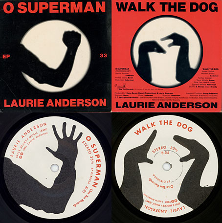
O Superman (1981), a seven-inch single on One Ten Records. Design by Laurie Anderson and Perry Hoberman.

• “…I was painting a picture of a garden at night. It had a lot of black and this green kind of coming out of the black, and I sat back, probably to take a smoke, looking at this painting, and I suddenly heard a wind coming from the painting, and the green started to move. And I thought, ‘Oh, a moving painting.’ And that experience led to cinema.” David Lynch talking to Josh Hitchens about living in Philadelphia.

• “This is the time and this is the record of the time.” Big Science, the album that propelled Laurie Anderson from performance artist to pop star, is 40 years old this month. Mat Colegate recalls his confused impression that the album was the work of a West Country folk singer, while Studs Terkel talked to Laurie Anderson about the album shortly after its release.

• At Public Domain Review: Kensy Cooperrider explores a millennium of “hand mnemonics”, “the variety of techniques practised by Buddhist monks, Latin linguists, and Renaissance musicians for remembering what might otherwise elude the mind.”

Ghosts in the Machine is an exhibition being hosted by Bower Ashton Library, Bristol, for World Book Night, 2022. 93 participants contributed ghost-related images for an accompanying artist’s book [PDF].

• “Sixty years after Seattle’s Century 21 Exposition, world’s fairs have largely fallen out of fashion in the US.” Grant Wong charts the rise and fall of world’s fairs.

• A trailer for Ennio: The Maestro, a feature-length documentary about Ennio Morricone by Giuseppe Tornatore.

• “The film Putin doesn’t want the world to see: Firebird, a gay love story about fighter pilots.”

• At Dennis Cooper’s: Andrei Tarkovsky Day.

• New music: Intersections by Specimens.

Schöne Hände (1977) by Cluster & Eno | Hands 2 Take (1981) by The Flying Lizards | Red Hand (1996) by Paul Schütze

Pavonine pattern play

pattern1.jpg

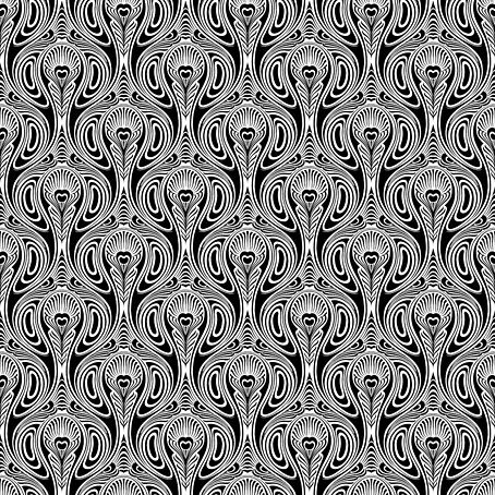
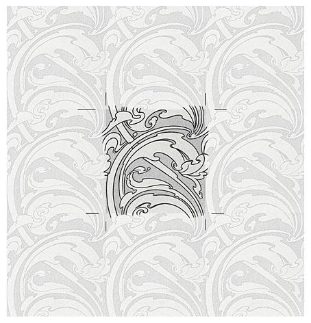
One of the projects I’ve been working on recently contains a large quantity of Art Nouveau design. I can’t discuss this any further for the usual embargo reasons, but I can show off this pattern which has been generated as a by-product of the main work. This is one of those fin-de-siècle designs that looks like it might have originated in the 1960s, a decade which saw a revival of interest in Art Nouveau graphics. Those sinuous lines would work well on a psychedelic poster, and there’s even a touch of Op art in the melting ovals that separate the peacock feathers.

pattern7.jpg

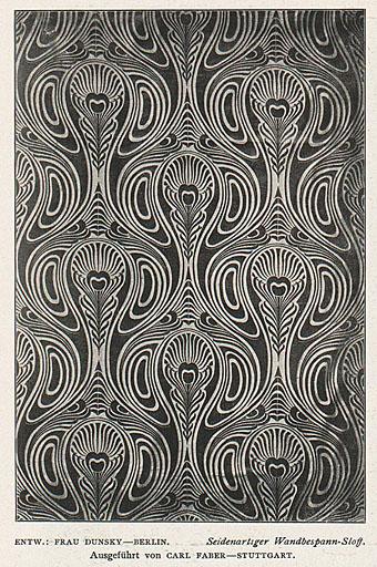
But this isn’t a design from 1970, it actually dates from 1900, the source being a small wallpaper sample that I spotted some years ago in issue 7 of Deutsche Kunst und Dekoration. “Frau Dunsky, Berlin” is named as the designer although there’s no further information about her design in the text. After seeing this I thought I’d have a go at copying the pattern in order to create a digital version but I soon gave up when it became apparent that too much work was required to convert the indistinct image into a sharp outline. I didn’t have a graphics tablet at the time, and my printer had broken down, so the only way to draw an outline was the hard way, using a mouse pointer.

pattern2.jpg

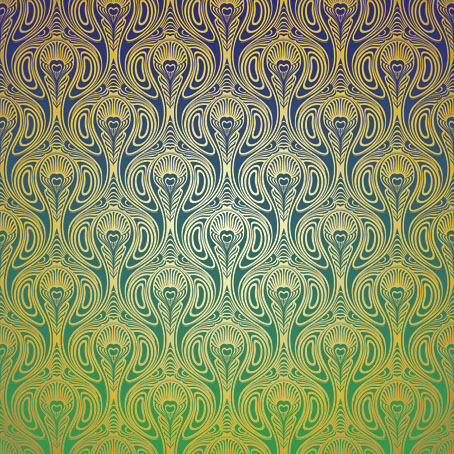
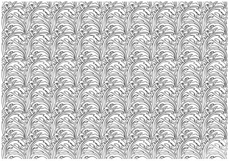
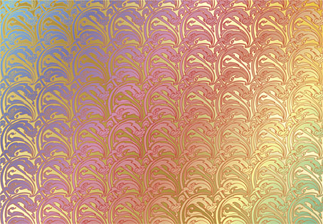
Vectorised and coloured.

A few days ago I pulled out the copy I’d been working on and, since I now have a graphics tablet, decided to try again. Even though creating the outline was easier this time I still wasn’t sure whether a repeatable pattern would be possible. The magazine sample is slightly warped, and the repeated elements don’t match exactly when overlaid, but I was able to compensate for the flaws with some stretching and redrawing in Photoshop. It’s very satisfying getting something like this to work, even more so when it’s a 120-year-old design that you’ve managed to resurrect. I also feel a little familial continuity with this kind of pattern making. My mother worked as a textile designer for a few years in the 1950s, although she never worked on anything like this, the designs produced by her studio were generally chintz-like floral patterns.

pattern3.jpg

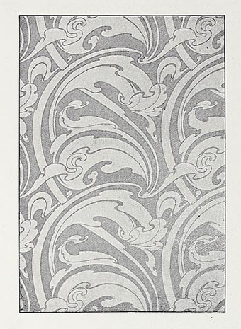
Prior to redrawing the peacock design I’d resurrected another wallpaper design from the same period. This is one of several examples by a French designer, André Morisset, that appeared in issue 15 of L’Art Decoratif. Monsieur Morisset’s design was easier to work into a digital version, being a better reproduction, while the design itself is a square that tiles vertically and horizontally so it’s easier to build into a pattern.

pattern4.jpg

Drawing the outline.

pattern5.jpg

A tessellated tiff.

pattern6.jpg

A coloured vector version.

I’ll be doing a few more things like this when I get the chance. I’m not sure yet whether they’ll find a place in the things I’m working on, but once you have a satisfactory vector outline you can file the art away until you need it later.

Previously on { feuilleton }
Louis Rhead’s peacocks
Peacocks
Rene Beauclair
Whistler’s Peacock Room
Beardsley’s Salomé