A Penrose pentagram

hofstadter.jpg

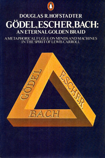
A classic text although that cover art always looks a little off. I’m sure MC Escher would have insisted on the triangle being equilateral.

Most people are familiar with the Penrose triangle by sight even if they don’t know who “Penrose” was. (Psychiatrist Lionel, together with his son, Roger, the celebrated mathematician and physicist.) I’ve been playing with these things for years, most notably on the cover art I created for Zones by Hawkwind, although the triangle also formed the basis for the robot pathways I created a couple of years ago when illustrating Bruce Sterling’s Robot Artists and Black Swans.

pentagram.jpg

Earlier this week it occurred to me that I hadn’t tried applying the Penrose effect to a pentagram. For a fleeting moment I thought the idea might be a novel one but a quick web search disabused me of this; plenty of similar examples exist already. Here it is anyway, after 20 minutes or so in Illustrator. I’m tempted to try a few more things like this when I have the time. Many possibilities present themselves.

Previously on { feuilleton }
More Swans and Robots

Jan Parker’s witches

parker01.jpg

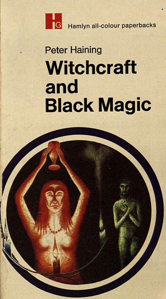
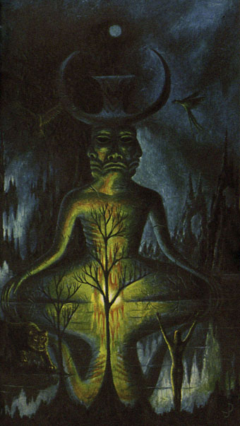
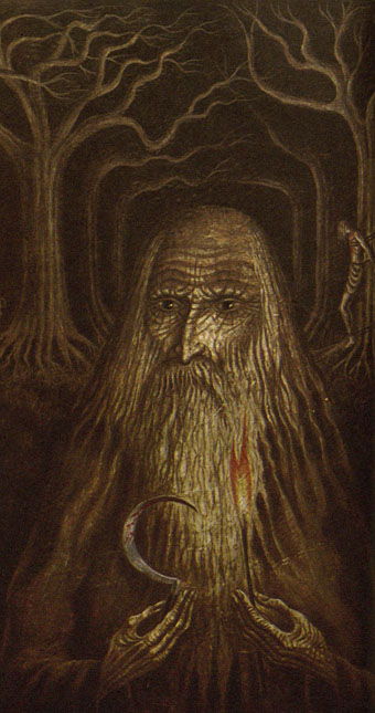
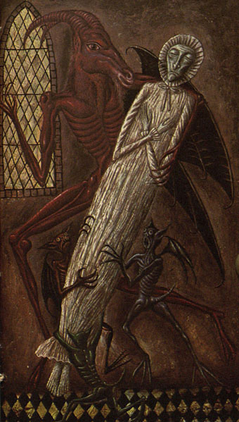
Also witch-finders, demons, magi, and a skeletal Adolf Hitler clutching a glowing crystal ball… Jan Parker is a British artist who was working as an illustrator in the early 1970s, during which time he produced a small number of covers for SF and fantasy titles. One of these, The Worlds of Frank Herbert, is a book I used to see a lot on the secondhand shelves although I never owned a copy. As with Victor Valla’s cover art, the 70s was a decade when idiosyncratic imagery of the type created by Parker and co. was a more common sight on genre covers than it is today. Witchcraft and Black Magic, published by Hamlyn in 1971, brought Parker’s brand of naïve weirdness to a Peter Haining history of the more lurid forms of occultism. This is a book that I did own for a while until someone borrowed it and never returned it, a persistent hazard for the books in my not-very-extensive occult library. Haining’s study is the kind of thing that publishers often call a pocket guide, although this suggests something you’d carry around to be used as an identification tool during chance encounters; you wouldn’t want to encounter most of the people (never mind the creatures) in these paintings.

parker02.jpg

A handful of Parker’s illustrations turned up some years ago at the now-defunct Front Free Endpaper, then were reblogged at Monster Brains and elsewhere. The copies here are from another recent upload at the Internet Archive where the book is part of a sub-archive of titles scanned from Indian libraries. The very tight binding evidently presented difficulties for the scanner, hence the appearance of fingers holding open most of the pages. It’s good to see this one again; I always valued the book more for the artwork than the text which isn’t bad but was simply another commission for the very prolific Haining, a writer who was a better anthologist than a historian. If you want a general history of the occult there are more authoritative options elsewhere.

parker03.jpg

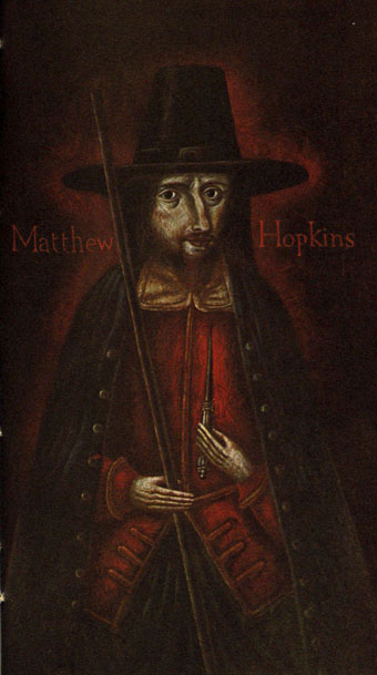
As for the artwork, I wonder now how long it took Parker to paint all these pictures. There are about 80 original illustrations plus a number of others taken from antique books or from artists such as Frans Hals and Goya; that’s a lot of original art for a book of only 160 pages. Many of Parker’s pieces are copies of pre-existing portraits or of familiar illustrations like the perennially popular demons from de Plancy’s Dictionnaire Infernal. This makes me wonder why Hamlyn commissioned copies from Parker rather than simply paying a picture library for the original images as Marshall Cavendish were doing in 1971 with their multi-part encyclopedia, Man, Myth and Magic. Whatever the reason I’m pleased they gave Parker so much free reign. His depictions of historical figures wouldn’t be out of place in the portrait gallery in Dance of the Vampires, while some of his other pieces stray into outright Surrealism; the picture of people being menaced by flying eyeballs was used for the cover art of the US reprint from Bantam.

parker04.jpg

Haining’s book had at least one reprint in the UK before going out of print. The early 1970s saw the peak of the occult revival which had begun in the previous decade, and which made room in publishers’ lists for odd little books like this one. Secondhand copies are still floating around although they’re seldom cheap. If you do find one just be careful who you lend it to.

parker05.jpg

Continue reading “Jan Parker’s witches”

Dreyer’s dark dreams

vampyr00.jpg

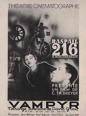
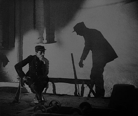
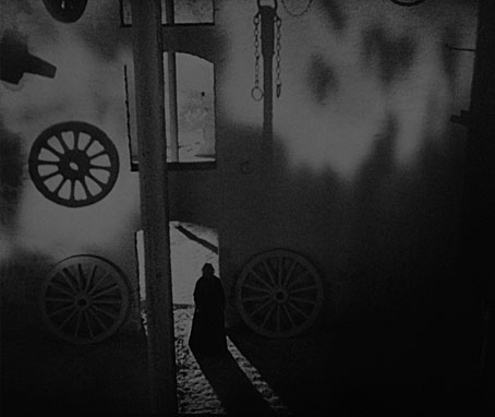
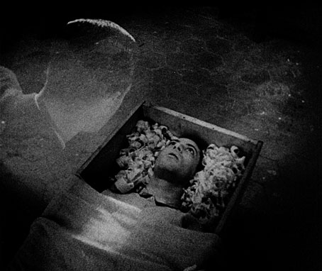
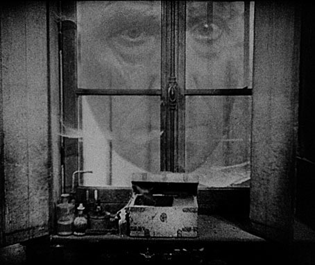
“Almost every time one takes a closer look at a film that is world-famous one has to face the sad fact that the film does not really exist in a form that seems acceptable.” Martin Koerber discussing the physical condition of Vampyr. Carl Dreyer’s film is now 90 years old, and has suffered more than most from the ravages of time and censorship, but after several years of restoration (or should that be resurrection?) by Koerber and others it looks as good today as it’s likely to get; not perfect, when many excisions remain lost, but still the best print I’ve seen.

vampyr01.jpg

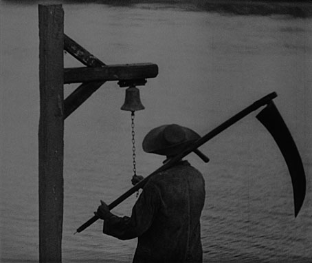
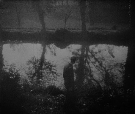
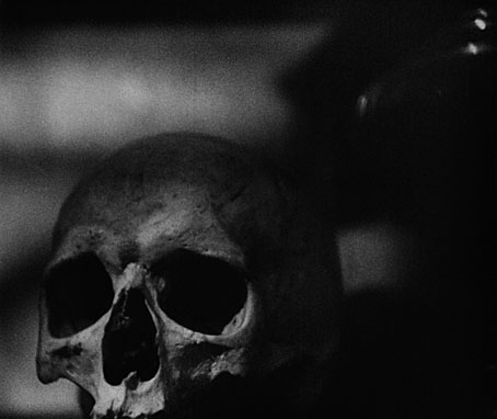
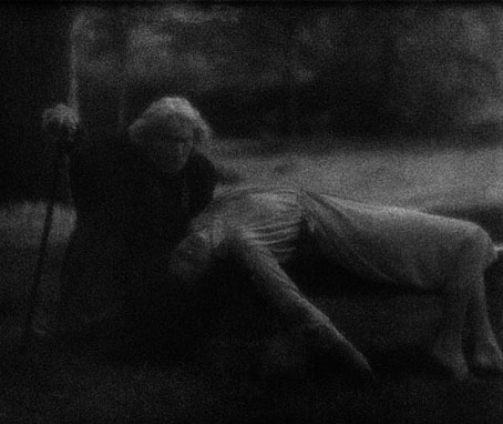
Watching this again I’d forgotten how deeply strange it all is, a sketch of conventional horror motifs borrowed from Sheridan Le Fanu’s In a Glass Darkly, overlaid with inexplicable events from the imaginations of Dreyer and screenwriter Christen Jul. “Surreal” is the word that comes to mind, not least because the film was being shot in locations around Paris while the Surrealists were busy creating their aesthetic scandals inside the city; the Surrealist quest for “the marvellous” and the iconography of dreams is fully realised in Dreyer’s revenants and ambulatory shadows. Vampyr manages to look as primitive as an early silent film—the diffuse photography and stilted acting—while also being sophisticated in its visual style and directorial technique; something else I’d forgotten was the restlessness of Rudolph Maté’s camera, continually moving about the actors or roaming the rooms and corridors. Dreyer’s shoot was almost finished when the Tod Browning version of Dracula was going into production, a film which is equally stilted but with few redeeming features. Where Browning’s film is inert and devoid of atmosphere Vampyr is thoroughly cinematic, with a startling, original score by Wolfgang Zeller that’s nothing like the classical pastiches of Hollywood in the 1930s.

vampyr02.jpg

Kim Newman compares Dreyer’s actors to the hypnotised cast of Werner Herzog’s Heart of Glass, an astute observation. I’ve never regarded the somnolent performances as a flaw, not when they suit the mood so well. More of a deficiency is Vampyr‘s title which raises expectations of a traditional tale of the undead that Dreyer never delivers. The English and French versions were originally titled The Strange Adventure of David Gray but it’s the German version that provides most of the materials for the restored print, and this was retitled Vampyr: The Strange Dream of Allan Gray. (The dual name of the central character is another complication.) The distributors held over the release in Germany until Universal’s Dracula and Frankenstein had opened there which must have pressured them to present the film (unsuccessfully as it turned out) as a conventional horror story. “Strange Dream” is evasive but also more accurate. It reminds me of the only description that David Lynch would provide when asked what Eraserhead was all about: “A dream of dark and troubling things”.

vampyr03.jpg

vampyr04.jpg

vampyr05.jpg

vampyr06.jpg

vampyr07.jpg

vampyr08.jpg

Previously on { feuilleton }
Universal horror
Undead visions
David Rudkin on Carl Dreyer’s Vampyr

Weekend links 624

griffiths.jpg

An alphabet designed by Ben Griffiths. Via.

• “From the cellular to the galactic, via Paleolithic cave markings to the trace impressions left by drone photography on our mind’s eye, incorporating dancing plagues, communist psychedelic witches, hyper-sexual fungi, chthonic descents, and skyward ascents, The Neon Hieroglyph weaves together a series of painterly and poetic considerations on a feminized history of the rye fungus Ergot, the chemical basis of LSD.” Coming soon from Strange Attractor: The Neon Hieroglyph, a book, LP and folio of prints by Tai Shani.

• “3rd From The Sun was the last album of Chrome’s imperial phase, and it cemented their status as one of the most inhuman and superhuman rock bands that America ever produced. More people need to recognize.” Agreed. (previously)

• “People often say, ‘How can you be so disciplined?’ It’s easy. Otherwise, I would have to go work for somebody else!” John Waters (again). Also here.

I’ve always thought that literature should be entertaining as well as instructive—a very old-fashioned idea but one that I adhere to. When I set out to write in this way—particularly in this way, a political way, if you want to call it that—I intend to make a donation, to try to give something. There doesn’t seem to me to be any point in giving more misery or exacerbating unhappiness through some kind of hyper-intellectual, pyrotechnical writing about unhappiness and the shit that we all find ourselves in. That’s been done plenty. I think first of all that it doesn’t need to be done any more and second of all there’s a kind of reactionary aspect to it which is that the emphasizing of misery without any anti-pessimism, as you put it, would be simply seduction into inactivity and political despair. In other words, to do politics at all on any level, especially on a revolutionary or on an insurrectionary level, there has to be some anti-pessimism—I won’t say optimism because that sounds so fatuous, futile; but anti-pessimism is a nice phrase. And there’s a deliberate attempt at that in the writing. Then again it’s a matter of my personality, I guess, inclined towards the notion of the healing laugh to some extent. We have an anarchist thinker in America, John Zerzan, who wrote an essay against humour which maybe is one of the things I was reacting against. Even if irony is counter-revolutionary which I think it might be to a certain extent I don’t see any way in which you could say that laughter itself is counter-revolutionary. This doesn’t make any sense to me unless you mean to get rid of language and thought altogether, which is just another form of nihilism. So as long as you’re going to accept culture on some level you’re certainly going to have to accept humour. And as long as you’re going to have to accept humour you might as well see humour as potentially revolutionary.

Peter Lamborn Wilson aka Hakim Bey, who died last month. Many of Wilson’s writings are available at The Anarchist Library. From 2008: A poem for Leonora Carrington

• “It’s such a fundamental question,” says Midori Takada, “why do humans need to make rhythm, and the space that structure creates?”

• “14 Warning Signs That You Are Living in a Society Without a Counterculture” by Ted Gioia.

• A trailer for Earwig, the new film from Lucile Hadzihalilovic, based on a story by Brian Catling.

• New music: Aura by Hatis Noit, and Warmth Of The Sun by Pye Corner Audio.

• At Dennis Cooper’s: Spotlight on…SE Hinton Rumble Fish (1975).

• “Hear tracks from the 1980s Peruvian electronic underground”.

Intermittent Eyeball Fodder at Unquiet Things.

West Tulsa Story (1983) by Stewart Copeland | Kála/Assassins Of Hakim Bey (1997) by Coil | Neon Lights (2000) by Señor Coconut Y Su Conjunto
All the Things

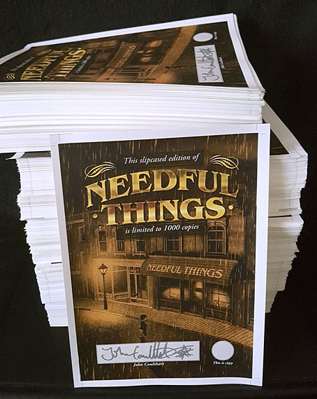
needful.jpg

Over the weekend I braved repetitive strain injury and solvent delirium from the fumes emitted by metallic markers while autographing this stack of signing sheets. The weighty pile is now on its way back to PS Publishing which means that the forthcoming illustrated edition of Needful Things is closer to being with its needful purchasers.