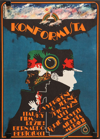
Czech poster for Bernardo Bertolucci’s The Conformist. Art and design by Miroslav Pechánek, 1972.
• “Acknowledgements are not part of the novel; in fact, they break the spell the author has spent 200 or more pages weaving. We should take a book on its merits, knowing as little about the author as possible. As one reader put it to me, ‘the end of a book is time for thinking about the book, not for an acceptance speech’.” John Self on dedications and acknowledgements.
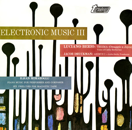
• Mixes of the week: a Power Ambient mix by A Strangely Isolated Place, and a mix for The Wire by Nexcyia.
• At Spoon & Tamago: 3D-scanned stones create vessel for human-made interventions.
Weeks turned into months. Slowly it dawned on me that I was performing the role of Boswell for a man who might be: a) a put-on maestro or arcane troll; b) a fiction writer slash performance artist; or c) a lunatic. But by his own admission King had tagged me with a familiar spirit. Whether or not he was telling the truth was irrelevant at this point. I could feel something squatting on my soul. I needed to see what it was.
Kent Russell on looking for demons in a disenchanted world
• A trailer for Mad God, Phil Tippett’s 30-years-in-the-making animated feature.
• New music: Vesta by Azu Tiwaline, and Right, Right, Right by Nils Frahm.
• At Dennis Cooper’s: Max Hattler Day.
• “Marcel Duchamp was not a thief.”
• RIP Jean-Louis Trintignant.
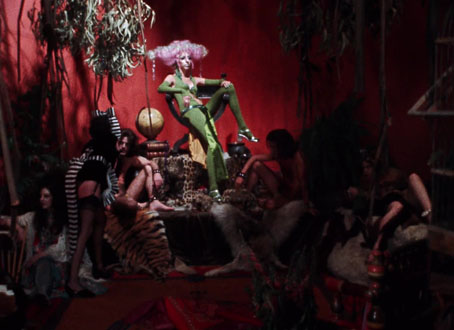
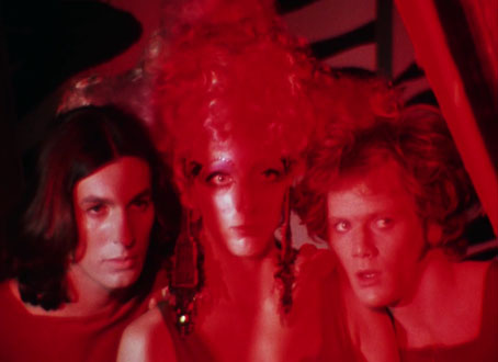
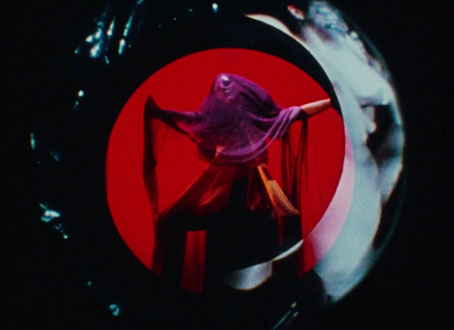
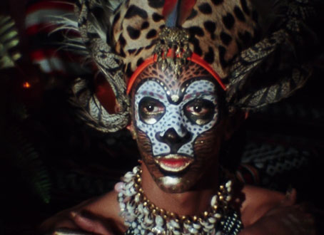
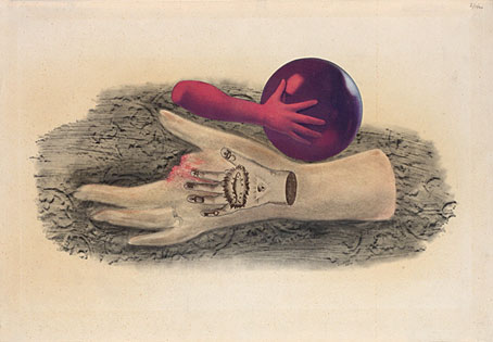
• Demons Of Rage (1972) by Nik Raicevic | Shall Come Forth The Demons (1991?) by Yuri Morozov | Angels Of Darkness, Demons Of Light (2011) by Earth