I’ve been taking advantage of the Spook Season to finally watch some of the horror films that I’ve known about for decades but never managed to see until now. Among the collection has been Ishiro Honda’s fungal nightmare, Matango (1963), and the Poe-themed Spirits of the Dead (1968), one of those Italian anthology films that proliferated in the 1960s, this one featuring episodes directed by Roger Vadim, Louis Malle and Federico Fellini. Still to come is Ugetsu Monogatari (1953), Kenji Mizoguchi’s ghost film.
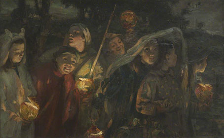
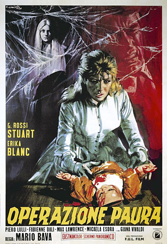
Topping the list was Curse of the Dead (1966), another ghost film directed by Mario Bava. Ten years ago I wrote a post about a black-and-white still from Bava’s film (see above) which has proved surprisingly popular, finding its way onto a number of book and record covers. The still is one of many that fill the pages of Denis Gifford’s A Pictorial History of Horror Movies (1973), and had intrigued me long before I started to notice its use elsewhere. Gifford, however, wasn’t much help when trying to find out more about the film itself. Curse of the Dead is one of the few films that he doesn’t discuss in his book, and its title compounded the mystery when nothing with that name was listed in film guides. The problem turned out to be one that plagues horror films, especially the older variety, whereby a film’s title changes each time it crosses a national border. Gifford was using the British name given to something originally released in Italy as Operazione Paura (Operation Fear). Curse of the Dead is rather vague—it would suit any number of other films—but it’s preferable to the Italian one, which makes it sound like a spy thriller, and far better than the other alternatives. Since America dominates the film business it’s usually the American title, Kill, Baby, Kill, that you see this one listed under, a typical piece of overkill (so to speak) from US distributors AIP. In Germany it was released as The Thousand Eyes of Dr Dracula, a ridiculous play on Fritz Lang’s final Dr Mabuse film.
Curse of the Dead.
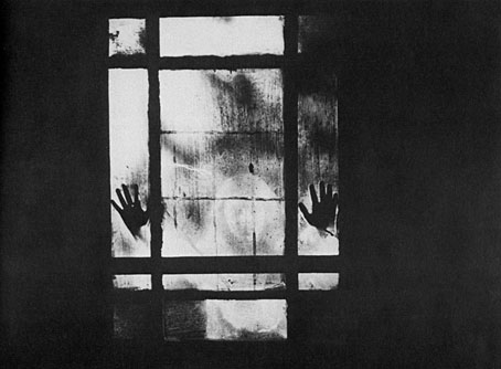
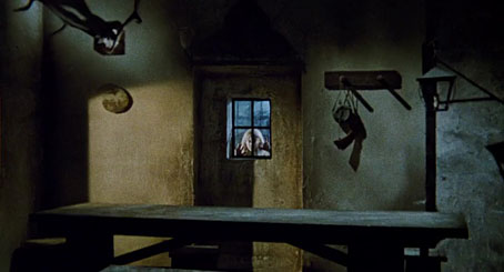
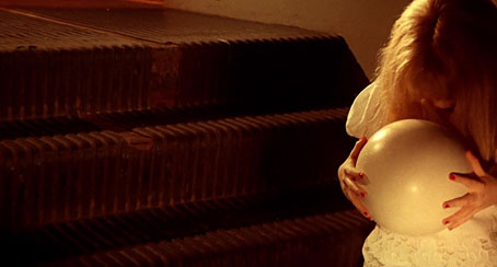
Whatever the title, Bava’s film is well worth seeking out. The story concerns a doctor who arrives at a small Carpathian village to perform an autopsy on a young woman who has died in mysterious circumstances. The death is one of several that have blighted the village, all caused by a blonde ghost girl whose appearance at night—always dressed in white, and playing with a bouncing white ball—seals the doom of anyone who encounters her. A story that in other hands might be rote and predictable (hello, Hammer Films) is anything but, thanks to Bava’s visual artistry and inventiveness in the face of a severely limited budget. Halfway through the film the narrative logic dissolves into an extended nocturnal investigation punctuated by remarkable dreamlike moments, notably a scene in which the doctor ends up chasing himself through a succession of doors in identical rooms twenty-five years before Agent Cooper did something similar in Twin Peaks. The “Carpathian” exteriors are mostly Italian countryside, filmed in a mountain village whose ruined nature adds a great deal to the atmosphere. As for the intriguing hands-at-the-window moment, I was prepared to be disappointed by its eventual appearance but Bava makes it a key moment after teasing us with other shots like the one above, showing spectral hands and faces at windows.
Toby Dammit.
Bava’s ghost (or a version of her) reappeared two years later in the Fellini episode of Spirits of the Dead, a detail I’d forgotten about until this week. Fellini’s Toby Dammit is the best part of the anthology feature but the Poe story he was adapting, Never Bet the Devil Your Head, doesn’t involve any blonde ghost girls. Terence Stamp is the title character, playing an actor rather like himself who succumbs to an alcohol-fuelled breakdown while being flattered and harassed by fans, paparazzi and a gallery of grotesques from the Italian film business. The ghost haunting him for inexplicable reasons is less a homage than an outright theft (she even has a bouncing white ball), something that apparently dismayed Mario Bava, understandably so after the problems he had to get his own film made. That said, Toby Dammit still carries a spooky charge even if Fellini’s spectre is a poor relation to Bava’s, with the whole episode playing like a particularly nightmarish out-take from 8 1/2.
Previously on { feuilleton }
• Juliet of the Spirits
• A Pictorial History of Horror Movies by Denis Gifford
• Design as virus 14: Curse of the Dead