The Teletrips of Alala (1970).
The imaginative landscapes of childhood were always close at hand in the psychedelic culture of the 1960s, more so in Britain than the USA, and especially where music was concerned. Grace Slick may have given the world White Rabbit but there’s a whole sub-genre of British psychedelic song-writing devoted to children’s games, children’s dreams, sweetshops, fairy tales and the like. Rob Chapman in his essential study of the form, Psychedelia and Other Colours, refers to this tendency as “infantasia”. With psychedelic art being so vivid and playful it’s a small step from lysergic wonderlands to children’s books styled in a quasi-psychedelic manner, which is what we have here. There was a lot of this around in the early 1970s, not all of it very memorable. Some of the best examples were published by Harlin Quist, a US/French imprint who specialised in beautiful books illustrated by exceptional talents. A few of these may be seen at The Peculiar Manicule.
Gertrude and the Mermaid (1968)
by Richard Hughes, illustrated by Nicole Claveloux.
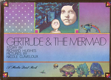
“This is the story a little girl, her doll named Gertrude, and a mysterious mermaid-child.” The first of several books by Nicole Claveloux for Harlin Quist.
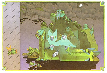
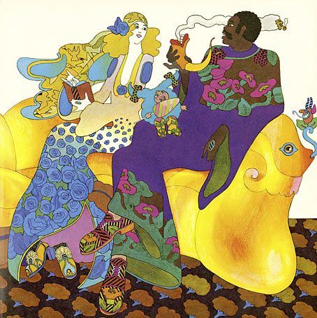
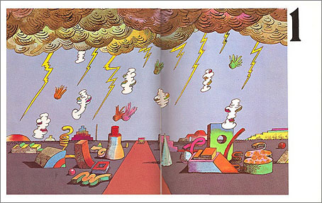
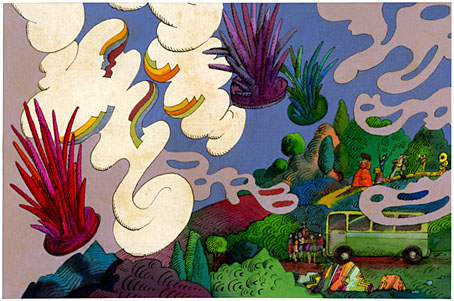
Help, Help, the Globolinks! (1970)
by Gian Carlo Menotti, translated and adapted by Leigh Dean, illustrated by Milton Glaser.
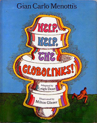
“Recounts the events following the landing of the outer-space Globolinks on Earth.” A German comic opera from 1968 in which a group of children encounter an alien invasion.
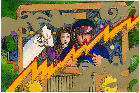
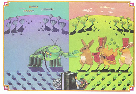
The Teletrips of Alala (1970)
by Guy Monreal, illustrated by Nicole Claveloux.
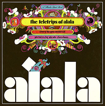
“With her unique power to enter the television set and change the course of the programs, Alala creates havoc in the world.” Nicole Claveloux puts her own twist on the Yellow Submarine art style. A few years after this she was creating comic strips for Métal Hurlant. Her more recent work includes erotic retellings of fairy tales. (more pages)
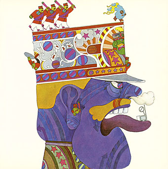
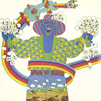
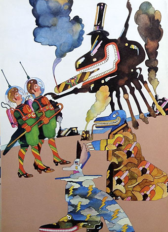
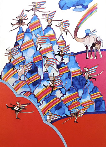
Andromedar SR1 (1971)
by Martin Ripkens & Hans Stempel, illustrated by Heinz Edelmann.
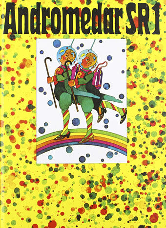
“Two astronauts under the spell of an evil octopus are ordered to steal the cobalt-blue flowers from the Martian Mice.” Ripkens and Stempel were better known for their work as cinema critics and film-makers. (more pages)
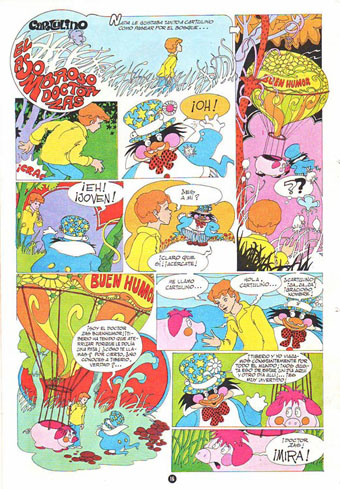
Cartulino: El asombroso doctor Zas (1971)
by Miguel Agustí, illustrated by Alberto Solsona.
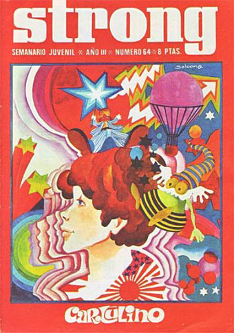
A comic strip from a Spanish title, Strong. Alberto Solsona also drew Agar-Agar, the grooviest strip in the short-lived Dracula comic. Cartulino had a number of different adventures but online examples are scarce.
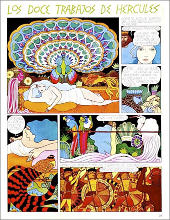
Los Doce Trabajos de Hércules (1973)
by Miguel Calatayud.
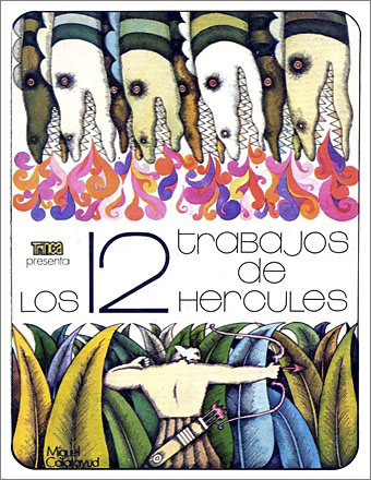
“Serie de episodios sobre la penitencia llevada a cabo por Hércules el mayor de los héroes griegos.” A comic adaptation rather than a story book but the art style is a good example of the general trend.

Update: Added Alberto Solsona.
Previously on { feuilleton }
• Glaser goes POP
• Return to Pepperland
• The groovy look
• The psychedelic art of Nicole Claveloux
• Psychedelia and Other Colours by Rob Chapman
• David Chestnutt’s psychedelic fairy tales