Weekend links 20

wulfing.jpg

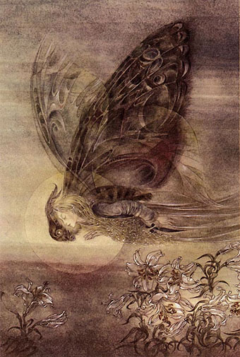
Transfiguration (1952) by Sulamith Wülfing.

• Observatory posted photos of its Lovecraft art exhibition; see if you can spot my pics. Related: Write Club has more photos. Also, A Word From Our Sponsor.

Taking the broooooaaaaad view of things: A Conversation with James Grauerholz on William S. Burroughs and Magick. Related: Beat Memories—The Photographs of Allen Ginsberg.

• Adam Curtis on BP and the Axis of Evil; how the the Anglo-Iranian Oil Company became British Petroleum and helped give Iran over to the Ayatollahs.

• The Quietus interviews Peter Christopherson (TG, Coil, etc) and Dr John.

The Strange World of Adolf Hoffmeister at A Journey Round My Skull.

An Artists’ Dialogue On CocoRosie’s Grey Oceans at Stereogum.

Werner Herzog and David Lynch combine their talents.

Jon Savage on The Residents versus The Beatles.

• BUTT magazine interviews James Bidgood.

• The Daily Drop Cap.

The Gay Rub.

Can on German TV in 1971.

Edinburgh, 1929

edinburgh1.jpg

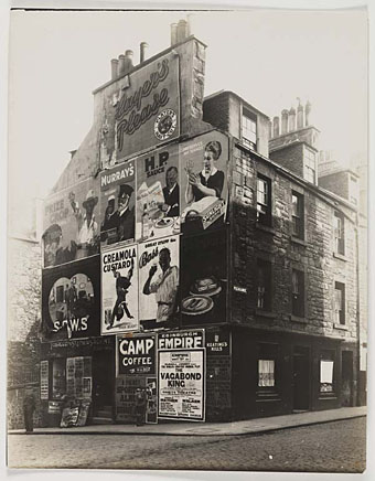
2A Arthur Street.

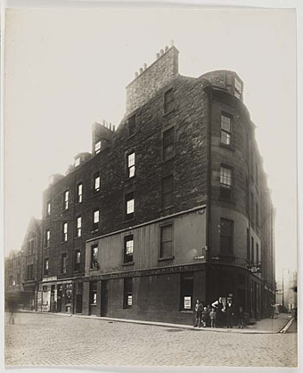
Samples from a collection of photographs by Alfred Henry Rushbrook at the National Library of Scotland’s Flickr pages showing the St Leonards area of Edinburgh. These were taken in 1929 but the age of the buildings and the curiously fogged appearance of the prints makes them seem a lot older. The City of Edinburgh Improvement Trust commissioned Rushbrook to record views of the area before slum clearances took place. In that respect his photos are like a Scots equivalent of the famous views of Paris taken by Atget before Hausmann’s demolition teams set to work.

edinburgh2.jpg

2–4 Lothian Street and 3–5–7 Potterow.

Previously on { feuilleton }
Old Bunker Hill
Inondations 1910
Berenice Abbott
Jessie M King’s Grey City of the North
Eugene de Salignac
Luther Gerlach’s Los Angeles
The temples of Angkor
The Bradbury Building: Looking Backward from the Future
Edward Steichen
Karel Plicka’s views of Prague
Atget’s Paris
Downtown LA by Ansel Adams

The recurrent pose 36

gaetano.jpg

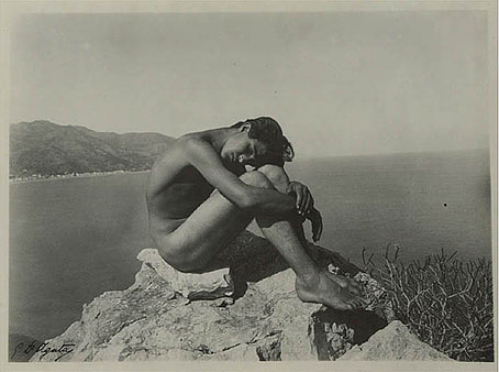
Another antique example of the Flandrin pose. Are you bored yet? Gaetano D’Agata (1883–1949) was one of the photographers who continued a tradition begun by Wilhelm von Gloeden for capturing the youth of Taormina, Sicily, in order to create tasteful prints for those who preferred their erotica to arrive with the vague excuse of Classical allusion. I’ve noted before that von Gloeden was possibly the first photographer to copy Flandrin’s painting, and his example led later photographers to copy him in turn, even borrowing his title, Cain, which reads into the painter’s work a Biblical meaning that seems misplaced. This picture comes from a Flickr selection which includes a similar rendering in postcard form, and also this rather cramped variation.

Elsewhere on { feuilleton }
The recurrent pose archive

New work: Two forms of darkness

darkness.jpg

Darkness: half-title page.

I’m still behind with site updates but here are two recent design jobs come to cast a shadow over the summer. Darkness is another fiction anthology from Tachyon, edited by Ellen Datlow and subtitled Two Decades of Modern Horror. Ann Monn’s cover design has a snake writhing through shadow so I carried the serpentine motif into the interior design. The book runs to 478 pages and, as the title implies, features lots of big names including Clive Barker, Joyce Carol Oates and Stephen King.

darkness2.jpg

Darkness: title spread.

dark-matter.jpg

Dark Matter, on the other hand, is a double-CD compilation of singles from Bristol’s Multiverse label which is released this month. If you need a descriptor then many of the tracks here would be classed as dubstep, and a few are doomy enough to serve as soundtracks for urban horror. Skream is one of the featured artists, and his Trapped In A Dark Bubble on Tectonic’s Plates 2 collection (which I designed last year) has a great sinister ambience.

dark-matter2.jpg

The design is very minimal with silver ink on a matt black digipak. The label requested graphics that mixed esoteric symbols with references to modern physics or astronomy without any of the allusions being too specific as to their origin or meaning. For the fonts I used the Fell types which take the design back to grimoires and old manuscripts.

The Book of Ornamental Alphabets

ornamental.jpg

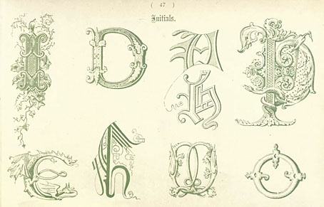
Another short but sweet Internet Archive upload, The Book of Ornamental Alphabets (1914) by Freeman Delamotte. The designs are a variety of capitals and alphabets from medieval and later manuscripts. At least one page of this I recognise from a Pepin Press collection of similar ornamental types.

Previously on { feuilleton }
Paul Franck’s calligraphy
Gramato-graphices
John Bickham’s Fables and other short poems
Letters and Lettering
Studies in Pen Art
Flourishes