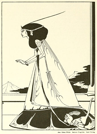
Salomé: Der Wunsch.
Back in March I wrote something about Alex Koch’s art periodical, Deutsche Kunst und Dekoration, a guide to German arts, crafts and architecture founded in Darmstadt in 1897. The Internet Archive has a nearly complete run of these and I’ve recently been working my way through their scans, a process which takes a while as there’s more than 10,000 pages to be looked at. When I find the time I’ll be posting some of the finds from this wonderful publication, the early issues of which are devoted to the best examples of the Art Nouveau style in Germany and elsewhere.
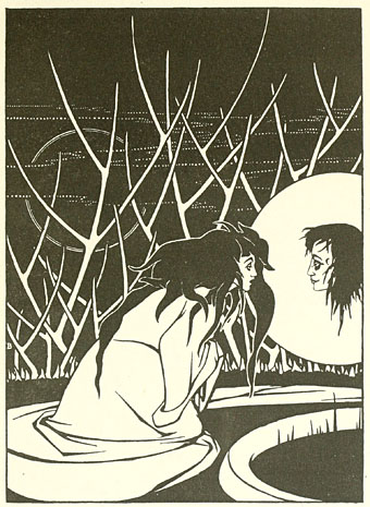
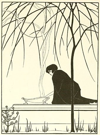
Salomé: Die Erfüllung.
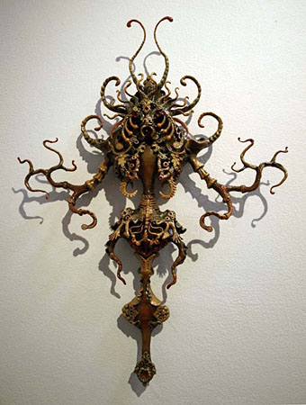
For now, however, I can’t resist posting these pictures from volume 18 (April–Spetember 1906) which form part of a feature about German illustrator Marcus Behmer. I’ve only seen one or two of Behmer’s drawings before and they didn’t really show him at his best. What’s immediately apparent is the great debt his work owed at this point to Aubrey Beardsley, right down to the treatment of foliage and a deliberately grotesque approach to character. It’s also good to find another treatment of the Salomé theme in black-and-white, and the pictures here are credited as being based on Wilde’s play.
Salomé: Das Opfer.
Wikipedia has a page about the artist but it’s all in German, unfortunately, so a crude translation has to suffice. As with Beardsley, the grotesquerie extended to the sexual sphere and it would be nice to know more about the byways of Behmer’s career if only to see where his curious erotic drawings pieces come from. Wikipedia notes that “Behmer was already since 1903 member in the first homosexual organization of the world in Berlin” so I assume that means he was part of Adolf Brand’s circle, and may have contributed to Brand’s publication Der Eigene. A few examples of the erotic work can be found here and here. Further examples from Deutsche Kunst und Dekoration follow.
Continue reading “The art of Marcus Behmer, 1879–1958”