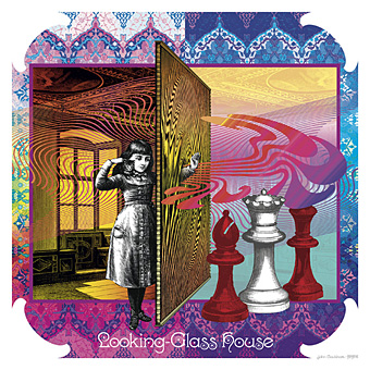
Looking-Glass House.
So here it is at last, this year’s much-delayed calendar design, the sequel to last year’s well-received Psychedelic Wonderland. I’ll get the business stuff out of the way first: would-be purchasers should go to the CafePress shop here while for a better preview of all the artwork look here.
Update: This calendar is now available again.
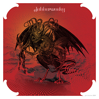
Jabberwocky.
“Seeing Alice’s adventures through the psychotropic prism of the late Sixties showed me the way into Wonderland,” I wrote last year, “What’s needed now is to do the same next year for Looking-Glass Land.” Where the first design was a pleasure to work on—and somehow only took me three weeks—this one turned into a considerable chore. It was my fault, I got started too late, hadn’t really thought what I was going to do (although the earlier design was completely improvised) and, worst of all, was trying to get this done whilst engaged with a stack of far more important work at the same time. As a result it’s a relief to have finished it at all since I nearly abandoned things on more than one occasion.
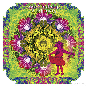
The Garden of Live Flowers.
Another problem was the nature of the two Alice books. Wonderland is a lot easier to illustrate than Looking-Glass although I didn’t quite realise this until I’d begun. The chapters of the first book are very distinctive scenes, each with a differing flavour from those that precede them. The second book either repeats settings—there are many woodland encounters since the chessboard across which Alice moves is a landscape—or the chapters are wholly confused, as in Wool and Water which begins in a train carriage, switches to a shop then ends up in a rowing-boat. As you’ll see below, I opted to illustrate the boat.
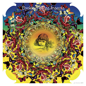
Looking-Glass Insects.
Excuses and complaints aside, I’m very pleased with a couple of these pictures; the Jabberwock came out better than I expected considering I was working at a rate of knots while the Wasp in a Wig (from the book’s lost chapter) could be given a Whistlerian title like Arrangement in Yellow and Black. As with the previous calendar design, the Alice figures change dramatically since they’re all taken from 19th century illustration or advertising art. And I’m now rather tired of looking at insipid pictures of Victorian children… If I do a calendar next year I think I’ll return to compiling earlier work unless inspiration and free time miraculously coincide. For now I hope that everyone who enjoyed the earlier calendar appreciates this one to the same degree.
Continue reading “Through the Psychedelic Looking-Glass: the 2011 calendar”

