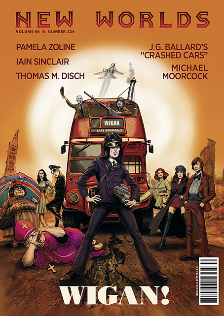
New Worlds 224

NW-224-1.jpg
Illustration by Mark Reeve.

New issues of New Worlds magazine have been rare things in recent years so the announcement last week of issue number 224 was a special moment:

New Worlds Vol. 66 No. 224, ed. Michael Moorcock (to commemorate the sixtieth anniversary of his taking over editorship of the title), 09/’24, 978-0-9575764-6-9, a new full-colour A4 stapled outsized paperback/magazine, 72pp., illustrated by John Coulthart, Mal Dean, Herbert Sydney Foxwell, Allan Kausch, Mark Reeve, Julius Stafford-Baker; fiction/non-fiction anthology, contributors: John Clute, Coulthart, John Davey, Thomas M. Disch, Kausch, Roz Kaveney, Moorcock (a brand-new Cornelius story), Iain Sinclair, John Sladek, Pamela Zoline; first edition: £20.00 (for pre-ordered signed copies [while stocks last]).

N.B. This title is published on 30th September, 2024. Pre-ordered copies will be signed by Michael Moorcock and the magazine’s publisher.

See: https://jaydedesign.com/products_new.php

Copies in the U.S.A. will soon be available via www.ziesings.com @ $25 (for pre-ordered signed copies [while stocks last]).

If you’re in the mood for a spoilerish review you can see the entire issue leafed through and described here. In addition there’s also the New Worlds Annex which I’m hosting on these pages, a small repository of supplementary material.

There’s no need for me to recount the history of New Worlds, you can read about it in detail here. If you do know the history then you’ll know that the magazine under Michael Moorcock’s editorship acquired a considerable reputation in the late 1960s, upsetting politicians, the proprietors of WH Smiths, and the more conservative readers and writers of science fiction while publishing many important stories. In the 1970s New Worlds became a paperback series for a few years, managing ten numbers before resuming magazine format and increasingly sporadic publication.

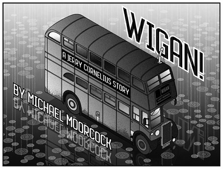
NW-224-3.jpg

Mike Moorcock’s Jerry Cornelius story is a Holiday on the Buses scenario set in the usual Cornelius landscape of geo-political chaos. Mark Reeve and Allan Kausch also illustrated this one. I think my piece may be the first time I’ve ever had reason to draw a bus despite being a regular user of public transport. In order to create a contrast with the other illustrations I opted for something in the isometric manner of George Hardie. Not as severely styled as Hardie’s drawings often are but it’s heading in that direction.

The last Moorcock-edited number prior to the present one was in 1996, an issue which included a drawing of mine from the Reverbstorm comic series. The new issue sees Moorcock returning to the editor’s chair for what he insists will be the final time so I feel fortunate to be able to contribute more substantially to this issue than I did in 1996. As well as designing the magazine I’ve illustrated four of the stories, and also wrote a page about the hundredth anniversary of Surrealism which provides a loose theme for the issue as a whole. In a reversal of the usual state of affairs the writing was commissioned first, the design having been offered to other parties earlier this year. This didn’t work out, however, so Mike asked if I could take over, something I was more than happy to do. Rather than follow any pre-existing layouts I started with a blank slate, something I prefer in these situations. The erratic nature of the magazine schedule has meant that many of the recent issues have been standalone items even though each one bears an issue and volume number. The issues that followed the paperback series in the 1970s differed widely from one another, a trend that continued up to 1996; consequently I didn’t have to worry about retaining any attributes of the previous issues.

Continue reading “New Worlds 224”

Weekend links 744

borges-stamp.jpg

Postage stamp design by Dario Canovas celebrating Argentina as guest of honour at the 2010 Frankfurt Book Fair.

Sideways Through Time, Joe Banks’ book of Hawkwind interviews, was initially available as an exclusive supplement with the special edition of Days of the Underground, Joe’s essential history of Hawkwind’s first decade. From the end of October both books will be available as separate editions from Strange Attractor, with the interview collection being republished in a revised and expanded edition.

• “Two heads are better than one”: Another extract from Two-Headed Doctor: Listening For Ghosts In Dr John’s Gris-Gris by David Toop.

• “Rammellzee was an electric presence”: Thurston Moore on NYC’s graffiti-writing hip-hop pioneer.

• New music: Long Tail Of The Quiet Gong by Robert Rich, and Neostalgia by Heiko Maile, Julian Demarre.

• At Colossal: Postage stamp designs by Tùng Nâm showing portraits of endangered animals.

• At Public Domain Review: Edwin D. Babbitt’s Principles of Light and Color (1878).

• At Print magazine: An interview with design anthropologist Keith Murphy.

• At Unquiet Things: Tristan Elwell’s visual spellcraft.

• Mix of the week: Bleep mix 287 by Sarah Davachi.

Mariam Rezaei’s favourite music.

Over Under Sideways Down (1966) by The Yardbirds | Stepping Sideways (2003) by John Foxx & Harold Budd | Trip Sideways (2010) by The Time And Space Machine

Magic Lantern: A Film about Prague

prague1.jpg

There are many documentary films about the city of Prague but Magic Lantern is the only one written and presented by playwright Michael Frayn. Very good it is too, a personal view of the city’s political and cultural history which takes in the usual names and subjects: Rabbi Loew and his Golem, Emperor Rudolf II, Rudolf’s alchemists, artists and scholars, photographer Josef Sudek, the ubiquitous Franz Kafka, puppets, automata, and so on. While Frayn discusses the Communist and post-Communist periods there’s a brief clip of Jan Svankmajer’s The Death of Stalinism in Bohemia.

prague2.jpg

Frayn’s film was directed by Dennis Marks, and broadcast in 1993 as part of the BBC’s long-running Omnibus strand. (There’s a further Svankmajer connection in the person of executive producer Keith Griffiths whose Koninck company produced this film at a time when they were also helping Svankmajer make his features.) Magic Lantern wasn’t the only film that Marks and Frayn made together, and not their first metropolitan essay either. Imagine a City Called Berlin (1974) is a portrait of the former capital of Germany during its Cold War isolation; there’s also The Mask of Gold: A Film about Vienna (1977), and Jerusalem: A Personal History (1984), all of which may be seen at The Dennis Marks Archive. My complaints about YouTube are copious enough to paper the walls of the Hradcany, but the site is at its best when it provides this kind of haven for television history that would be impossible to find elsewhere.

Previously on { feuilleton }
Le Golem, 1967
Gustav Meyink’s Prague
Stone Glory, a film by Jirí Lehovec
The Face of Prague
Josef Sudek
Liska’s Golem
Das Haus zur letzten Latern
Hugo Steiner-Prag’s Golem
Karel Plicka’s views of Prague

MacKellar, Smiths & Jordan’s mortised card cuts

cut01.jpg

This one is partly intended as an aide-memoire for my future self should I need to recall where these particular illustrations are located. The Internet Archive has a good collection of specimen books created by type foundries, most of them American volumes although there are a few from Britain, France and Germany. The bulk of these books comprise typeface samples which I usually ignore, my interest being in the sections near the end which contain all manner of decorative detail: borders, ornaments and the small illustrations (“cuts”) that today would be classed as clip art. A few of these books have proved very useful when I’ve been working on a design that requires imitation of the decoration found in 19th-century print design (my cover for The Atropine Tree is a recent example) but I don’t always remember which book contains the elements I might want, hence this post.

cut02.jpg

Another of those cannibalistic advertising animals.

If you’re looking for antique print decoration then the catalogues published by the Johnson Type Foundry of Philadelphia (later MacKellar, Smiths & Jordan) are the ones to go for. I’ve copied or adapated ornaments and decorative details from this book on many occasions over the past ten years. The Internet Archive had a more substantial MSJ catalogue in their collection but it was a bad scan, one that was poor enough to receive some rare complaining comments from other Archive users. Happily another copy of the same book, The Eleventh Book of Specimens of Printing Types (1878), arrived there recently. The Johnson/MSJ catalogues are a much better source of decorative material than those created by their competitors, with a wider variety of combination ornaments (tiny details which could be pieced together to create unique borders or other peripheral decorations) and, in the eleventh volume, a larger stock of illustrations for advertising purposes. Before discovering these scanned catalogues I’d been relying on books from Dover and Pepin Press as source material for antique design. Pepin published a book/CD-ROM collection in 1999, Graphic Frames, which reproduces a number of the advertising cuts from the eleventh MSJ catalogue, including a couple of the ones shown here. The scans are seldom ideal in their raw state, I usually end up tracing the required design as a new version which I then convert to a vector shape. But they’re valuable in being the actual print decoration from the period, not modern reconstructions (or interpretations) of “Victorian” design.

cut12.jpg

The “Mortised Card Cuts” and “Mortised Comic Cuts” in the MSJ catalogue were comic illustrations intended for advertising purposes, although any “comic” quality is more likely to appear grotesque to our eyes. Shouting figures with very large, yawning mouths are popular in these kinds of drawings, as are dogs with singularly ugly faces. You can even see a forerunner of the “Kilroy” graffiti in the figure with a nose poking over the advert. I used a few of these faces for my Alice in Wonderland picture series in 2009: the top half of the smoking figure appears in “Advice from a Caterpillar” while other faces may be seen in the background of “Who Stole the Tarts?”.

cut07.jpg

Sondheim enthusiasts may recognise this particular figure as the origin of the razor-wielding character on the poster for the original Broadway run of Sweeney Todd – The Demon Barber of Fleet Street. Designer Frank Verlizzo (aka “Fraver”) shows how easily an old illustration can be made to slip from the comic to the sinister.

cut14.jpg

And from the comic to the plain bizarre… The past is often revealed to be a weirder place than you’d imagine once you start rummaging in its ephemera. The illustrations in most print catalogues are seldom this peculiar but until you go looking you don’t know what else might be out there.

cut13.jpg

Continue reading “MacKellar, Smiths & Jordan’s mortised card cuts”

Weekend links 743

whale.jpg

Icebergs and the aurora borealis in the Arctic. From the Illustrated London News, 13 October 1849.

• The week in award-winning photographs: Winners and finalists from the Ocean Photographer of the Year Awards; and winners and finalists from the Astronomy Photographer of the Year.

• A new layer of mystery is added to The Voynich Manuscript with the discovery of additional writings revealed by multispectral imaging. Lisa Fagin Davis explains.

• At Swan River Press: Helen Grant talks to John Kenny about her new collection of stories, Atmospheric Disturbances, a book whose cover design I discussed here.

Some in Hollywood were taken aback by Huston’s screenwriting choice to bring Melville to the big screen. After all, to adapt a profoundly complex literary novel, he had given the nod to a man known for writing science fiction. Perhaps no one was more surprised by Huston’s choice than Bradbury himself. Huston had read the most recent book Bradbury had sent him, The Golden Apples of the Sun, and the lead story was all it took.

“The Fog Horn” is a tale about two lighthouse keepers who, late one November night, are paid a visit by a beast that has surfaced from the depths after hearing the lonely call of the lighthouse’s foghorn. Bradbury’s love of dinosaurs had led him to write the story, and it was this love that led Huston to believe he was the right man to adapt Moby-Dick. In reading “The Fog Horn,” Huston stated in his 1980 autobiography An Open Book, he “saw something of Melville’s elusive quality.”

Sam Weller on how Ray Bradbury came to write the screenplay for John Huston’s adaptation of Moby-Dick

• At Public Domain Review: Kirsten Tambling on the life and art of Gottfried Mind (1768–1814), a Swiss artist known as “The Raphael of Cats”.

• At Spoon & Tamago: Tentacle-inspired leather accessories handcrafted by Cokeco.

• Mix of the week: DreamScenes – September 2024 at AmbientBlog.

• Steven Heller’s font of the month is Rig Solid.

Solid State Survivor (1979) by Yellow Magic Orchestra | All That Was Solid (1996) by Paul Schütze | From A Solid To A Liquid (2006) by Biosphere