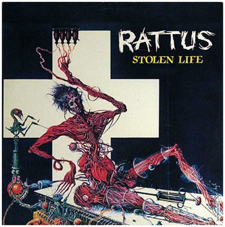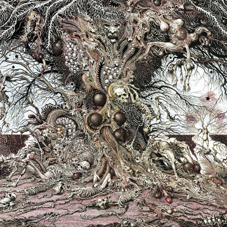
Stolen Life (1988) by Rattus.
Continuing an occasional series about artists or designers whose work has appeared on record sleeves. Ian Miller’s career, which dates back to the early 1970s, has encompassed book-cover illustration, art for magazines and role-playing games, also the occasional film design. His credits in the music world, however, are limited to this handful of covers plus a few interiors, most of them for punk bands or metal outfits of one type or another. I still prefer CDs for my music listening but the 12-inch vinyl sleeve has always been the best showcase for cover art, especially the hyper-detailed renderings that are Miller’s speciality.

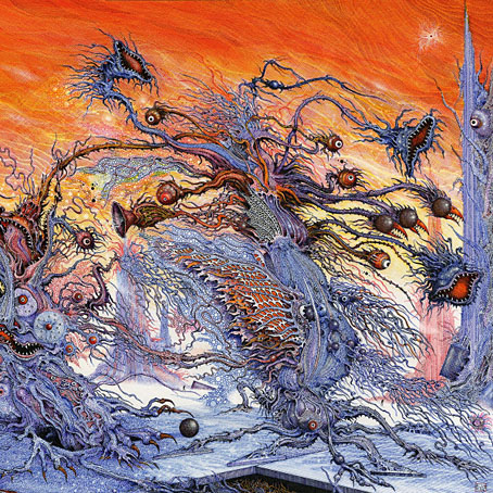
Cosmovore (2018) by Ulthar.
Lovecraftian metal band Ulthar seem to have adopted Miller recently as their regular cover artist. Their Cosmovore album uses a third (?) version of Miller’s cover for the 1974 Panther Mountains of Madness paperback. (See The Art of Ian Miller for the second version.) The original is still one of my favourite Lovecraft illustrations of all, not least for the way he turns one of the relatively small and placid Elder Things into a towering kaiju—the scale can be gauged by the tiny human figures in the background—battling what appears to be an equally gigantic and frenzied shoggoth. Or maybe they’re both shoggoths since these are shape-shifting creatures? I’ve never been sure, but whatever they may be, they’re more than a match for the frenzy unleashed at the end of Lovecraft’s story.

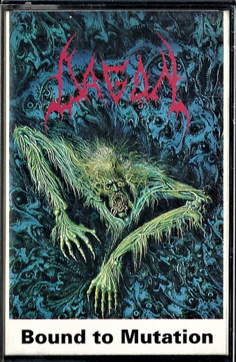
Bound To Mutation (1991) by Dagon.

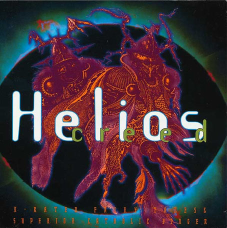
X-Rated Fairy Tales / Superior Catholic finger (1994) by Helios Creed.
A CD reissue of two Creed albums on Cleopatra Records. This one isn’t listed on Discogs because Miller receives no art credit.

Providence (2020) by Ulthar.
Continue reading “Ian Miller album covers”

