Ralf and Florian

randf.jpg

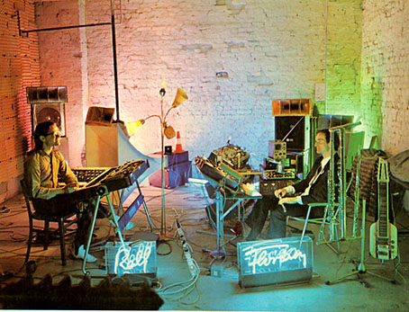
Ralf and Florian, 1973. Back cover photo by Barbara Niemöller.

Kraftwerk’s third album, Ralf and Florian, is forty years old this year. It was recorded and mixed from May to July, 1973, and released three months later. As with the first two Kraftwerk albums, it still hasn’t been given an official CD reissue. When so many albums by the big names of the 1970s have been reissued multiple times Kraftwerk are pretty much unique in suppressing part of their catalogue.

raf.jpg

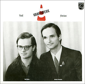
Photo by Robert Franck.

The reason usually given for this is that the fourth album, Autobahn (1974), was the first to adopt the conceptual style that became a hallmark of the group’s output. Well, yes and no. The celebrated sleeve design for Autobahn went through several variations, and the motoring theme only applies to the first side of the album. The second side doesn’t match the theme at all, and with its melodies and instrumentation (Florian was still using his flute) is much closer to the previous albums, especially the third one, than those that came after. What Kraftwerk prefer to see as a clean break is really more of a gradual evolution.

randf.jpg

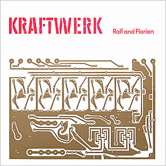
The sleeve for the first UK release. No designer credited.

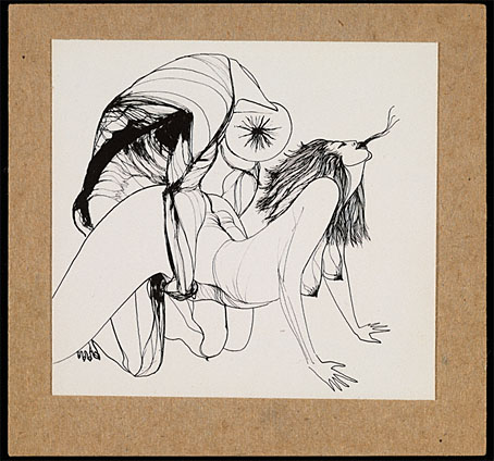
I’ve always liked the Ralf and Florian album, and don’t mind so much that it’s not been given a proper reissue. Bootleg copies circulate, and even the original vinyl isn’t so scarce. A couple of things related to the album are more difficult to find, however. The first German copies came with a large poster-insert illustrated by the group’s artist/designer Emil Schult. This item more than anything shows a charming, human side to Ralf and Florian which was later overshadowed by the machine-obsessed conceptualism. Large scans of the insert were recently posted at Mostly Retro.

kohoutek.jpg

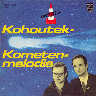
Then there’s Kohoutek – Kometenmelodie, a 7-inch single released in December 1973 which forms a bridge between the third and fourth albums. Kometenmelodie subsequently appeared in two versions on Autobahn but the single sleeve is very much in the R&F zone with the faces from the album cover, while the back of the sleeve sports Emil Schult’s Kling Klang Verlag logo from the album insert. Kohoutek was a comet visible in the night skies in 1973. This was Kraftwerk’s debut single, presenting two unique versions of Kometenmelodie. It’s never been reissued but both tracks can be heard here. Elsewhere on YouTube there’s a performance of the R&F track Tanzmusik on a German TV programme, a clip which features new group member, Wolfgang Flür, playing his electronic drum pads.

Previously on { feuilleton }
Reworking Kraftwerk
Autobahn animated
Sleeve craft
Who designed Vertigo #6360 620?
Old music and old technology
Aerodynamik by Kraftwerk

Tokyo details

tokyo01.jpg

Another enormous gigapixel panorama appeared this week, this one being a view from the Tokyo Tower by Jeffrey Martin. Some cities suit this detailed bird’s-eye view more than others. A similar panorama of Prague wasn’t as interesting for me as the view over London which appeared at the beginning of this year. Tokyo from this vantage may be an endless clutter of concrete and tarmac but it still yields some interesting details.

tokyo02.jpg

Tokyo’s Ginza district, and Chuo-dori Avenue, are locatable by these signs.

tokyo03.jpg

Further away there’s this cat-and-kitten sign.

tokyo04.jpg

While elsewhere Colonel Sanders proves inescapable. The Colonel’s Wikipedia entry contains this, er…nugget:

The Japanese Nippon Professional Baseball league has developed an urban legend of the “Curse of the Colonel”. A statue of Colonel Sanders was thrown into a river and lost during a 1985 fan celebration, and (according to the legend) the “curse” has caused Japan’s Hanshin Tigers to perform poorly since the incident.

Continue reading “Tokyo details”

Alas Vegas Tarot cards

alasvegasdevil.jpg

Back in February I bought a Wacom drawing tablet and said I’d show some proper results from its use later. For the past few months I’ve been working on this project using a combination of Wacom drawing and vector graphics. The initial brief from games designer James Wallis was for six Tarot-style card designs for his Alas Vegas role-playing game which has as its theme a fantasy extrapolation from Las Vegas and its gaudy mythology. The Kickstarter funding for the game turned out to be more successful than was anticipated so James asked me to expand the six cards idea into a full set of black-and-white Major Arcana designs.

This has been a fun series to work on although a number of the cards presented problems at first, the antique nature of the Tarot symbolism being a difficult thing to map across a very commercial American city. The symbolism from the Rider-Waite-Smith (RWS) deck was used as a rough guide although we deviated in a few places from the more traditional attributes. Las Vegas has changed over the years so rather than represent a single period of the city’s history there are references to different eras, from the huge casinos of today back to the buildings of the 50s and 60s with their distinctive “Googie” architecture. Notes for the cards follow below. The artwork can be seen at larger size here.

alasvegas00.jpg

The Fool is usually a young man about to step off a cliff edge with a dog barking a warning at his heels, hence the dog on the sign.

alasvegas01.jpg

Several of the cards convert the Tarot characters into cabaret acts. This one was pretty inevitable, and I’m sure it’s not the first time a stage conjuror has appeared on this card.

alasvegas02.jpg

The chair is based on the 1965 “Ball Chair” design by Eero Aarnio (as seen in The Prisoner TV series), adapted here to resemble the Priestess’s crescent moon.

alasvegas03.jpg

The style on this one is more 70s than 60s: patterned wallpaper (the hearts derive from the symbolism of The Empress, and from playing cards, of course), white rug, Kung Fu pyjamas.

Continue reading “Alas Vegas Tarot cards”

More Cameron

cameron3.jpg

Untitled (Peyote Vision), 1955, Cameron (from Semina journal, no. 1).

Thanks to Erik Davis for drawing my attention to a small online exhibition of Marjorie Cameron artwork and documentary material. Semina was the magazine founded by Cameron’s artist friend, Wallace Berman. The exhibition note tells us that:

Wallace Berman’s only exhibition at Ferus Gallery in 1957 was raided by the LAPD vice squad because of the small reproduction of this sexually graphic work by Cameron that was part of Berman’s assemblage, Temple.

Allen Ginsberg’s Howl successfully fought off an obscenity charge in the same year but the immediacy of visual art means it always fares less well with disapproving authorities. We can assume that Cameron had personal experience of peyote given some verse written by her husband, Jack Parsons, that Robert Anton Wilson quotes in Cosmic Trigger (1977):

I hight Don Quixote, I live on peyote,
marjuana, morphine and cocaine,
I never know sadness, but only a madness
that burns at the heart and the brain.

cameron4.jpg

On the same site is this wonderful still (or is it a location photo?) from the shooting of Curtis Harrington’s Night Tide in 1961. Seeing this makes me want to watch the film again.

Previously on { feuilleton }
The Wormwood Star
Street Fair, 1959
House of Harrington
Curtis Harrington, 1926–2007
The art of Cameron, 1922–1995

Weekend links 172

thielker.jpg

Complete Stop (2008), an oil painting by Gregory Thielker from his Under the Unminding Sky series.

• For Halloween last year I watched a very poor copy of a BBC Play For Today production, Robin Redbreast, a piece of rural horror by John Bowen which received a single screening in 1970. That poor copy—black-and-white, timecoded, multi-generation video—has been circulating for years, so it’s good to know that the BFI will be releasing Robin Redbreast on DVD in time for this year’s Halloween. This might be news enough but the following month the BFI also releases Leslie Megahey’s stunning adaptation of Schalcken the Painter in a dual DVD/Blu-ray edition. I wrote a short review of the latter film last October.

• Mixes of the week: August Sun High from The Advisory Circle, and John Wizards’ Quietus Mix “African music, R&B and chamber pop, filtered through gentle electronic arrangements that cross-pollinate with South African house, Shangaan electro and dub”.

• A trailer has surfaced for The Counselor, a film by Ridley Scott from an original screenplay by Cormac McCarthy. Trailers are too spoilerish so I’m refusing to watch it but for those interested Slate has the details.

Luckhurst makes an admirable attempt to link Lovecraft’s most frustrating writing tic to this theme of the unknown when he claims that Lovecraft’s “catachresis”—deliberate muddling of language through the use of mixed metaphors and the like—is a tool he uses to bolster the atmosphere of futility in the face of “absolute otherness.” The trauma of encountering something so far outside the realms of imagination triggers a collapse of logic in the language itself.

Cate Fricke reviews The Classic Horror Stories of HP Lovecraft, a collection from Oxford University Press edited by Roger Luckhurst.

• “Contemporary audiences found it too weird, too wonky and even borderline distasteful…” Xan Brooks goes looking for the locations from Powell & Pressburger’s 1943 film, A Canterbury Tale.

• Two songs from Julia Holter’s forthcoming album, Loud City Song: World and Maxim’s I. Also unveiled this week: Evangeline, a new track by John Foxx & Jori Hulkkonen.

• Have Ghost, Will Find: Colin Fleming on William Hope Hodgson’s Carnacki, The Ghost Finder.

• At PingMag: Urban Calligraphy: Turning the Streets into Big, Loud Canvases.

• Sex, Spirit, and Porn: Conner Habib talks to Erik Davis.

Serendip-o-matic: Let Your Sources Surprise You

The Pronunciation of European Typefaces

Twilight (2004) by Robin Guthrie & Harold Budd | Luminous (2009) by John Foxx & Robin Guthrie | Cling (2011) by Robin The Fog