Peeping Tom is a very tender film, a very nice one. Almost a romantic film. I was immediately fascinated by the idea: I felt very close to the hero, who is an “absolute” director, someone who approaches life like a director, who is conscious of and suffers from it. He is a technician of emotion. And I am someone who is thrilled by technique, always mentally editing the scene in front of me in the street, so I was able to share his anguish.
Michael Powell quoted in Powell, Pressburger and Others, edited by Ian Christie, 1978
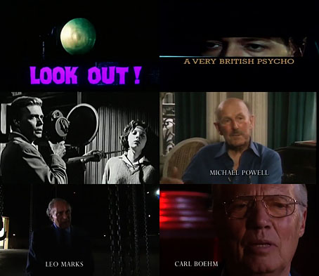
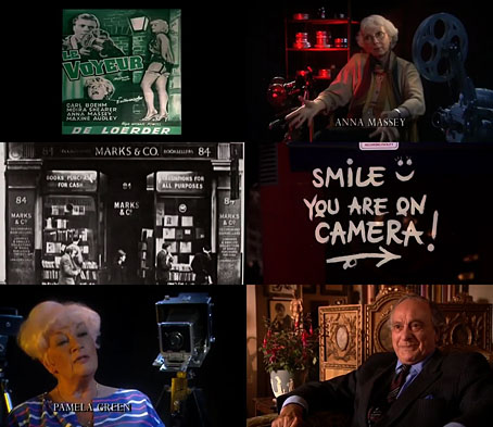
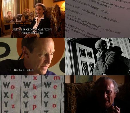
Michael Powell’s Peeping Tom (1960) has been released on disc several times in recent years, but Christopher Rodley’s Channel 4 TV documentary about the film and its writer, Leo Marks, has so far only been reissued on a Criterion DVD which appeared in 1999. A Very British Psycho, which was made in 1997, deserves to be paired with its subject more than most film documentaries since this is the only substantial film portrait of Leo Marks (1920–2001), a figure whose contribution to the film is often overshadowed by discussion of Michael Powell’s career. Marks was a fascinating character, the son of Benjamin Marks, owner of the famous bookshop at 84 Charing Cross Road, and a man obsessed with riddles and codes, a preoccupation that led to his employment at the Special Operations Executive during the Second World War. The years he spent devising codes for British spies, many of whom never returned from their missions, is explored at some length in Rodley’s film. After the war Marks turned to screenwriting. Peeping Tom came about when he and Powell were planning a film on the life of Freud which was pre-empted by John Huston’s film dealing with the same subject. Peeping Tom still contains a fair amount of Freudian symbolism—staircases, keys, ladders, psychoanalysts, not to mention the phallic camera/weapon that the killer uses—but the premise is much more interesting than a Freudian biopic would have been.

Rodley’s title—A Very British Psycho—explicitly pits Powell’s film against the more famous Hitchcock murder mystery that was released in its wake. Much as I like Hitchcock’s films, especially his own examination of the peeping tom theme, Rear Window, everything in Hitchcock is always subservient to the story. Peeping Tom has a storyline that’s satisfying enough but the script is self-conscious and cerebral in a way that Hitchcock never was. Marks and Powell undertake a psychosexual analysis of cinema itself, presented in the guise of a story about a film-obsessed killer whose impulses have been caused by the traumas induced by his psychoanalyst father. There was no precedent for this in British cinema, and there wouldn’t be much like it in cinema intended for a general audience for at least another ten years. A list of the film’s many cinematic allusions and in-jokes is beyond the remit of this post but allow me to mention: the comparison drawn between the red lights favoured by prostitutes, and the red lights of photographic darkrooms and film studios; the numerous references to vision and the lack of it, with a blind woman played by a sighted actress (Maxine Audley), and an inept film director played by a partially-sighted actor (Powell regular Esmond Knight); the jokey names: the inept director is “Arthur Baden” (a play on the founder of the Scout movement, Baden-Powell, which suggests that without a Powell this is what British cinema ends up with), while the cost-conscious studio boss, “Don Jarvis” is a reference to John Davis, the head of the Rank organisation. Powell and Marks implicate themselves in the cinematic crimes in a manner that Hitchcock never would have done, with the killer, Mark Lewis, having a name that’s a reversal of Leo Marks, while Powell himself appears in home-movie flashbacks as the traumatising father, with one of Powell’s own sons playing Lewis as a child.

The grown-up son, Columba Powell, is one of Rodley’s interviewees, together with actors Carl Boehm, Anna Massey and Pamela Green. Also interviewed are some of the British critics who condemned the film on its release, and thus ended Powell’s career in Britian. One of these, the often splenetic Alexander Walker, suggests that Hitchcock wisely avoided showing Psycho to the British press to avoid a similar scandal, but Hitchcock’s oeuvre was filled with psycho-killers all the way back to the silent era, which suggests to me that the reaction wouldn’t have been the same at all. The problem for Powell was that nothing in his career could have led anyone to expect a film as nasty as Peeping Tom, and he had the audacity to put himself into the picture as the prime cause of all the nastiness. Critics had often accused Powell and Emeric Pressburger of lapses in taste but the pair were highly regarded in the 1940s; A Matter of Life and Death was the first film to be screened at a Royal Film Performance in 1946. Powell and Marks discomforted the British press by showing pornography being created in a room above a typical corner newsagents, with the resulting photographs being sold in the shop downstairs while young girls are buying sweets. And that’s before you get to the more insidious discomfort induced in an audience watching a film about murders that features the killer watching his own films of the killings. French critics were fascinated by all of this but their enthusiasm wasn’t enough to save Powell’s career or even do much for the film itself. The reappraisal only began in 1978 with the first BFI retrospective of Powell’s work. As for Leo Marks, nothing else he worked on was this memorable. He had another stab (so to speak) at the psycho theme in 1968 with Twisted Nerve, directed by Roy Boulting, but the only good thing about that film is the score by Bernard Herrmann.
The copy of A Very British Psycho at YouTube is complete but slightly altered by having all the film clips reduced to sequences of stills, no doubt to avoid copyright complaints. The soundtrack is still intact, however. I don’t mind this too much since I dislike those disc extras that always start off by showing you several minutes of the film you’ve just been watching.
Previously on { feuilleton }
• Powell’s Bluebeard on blu-ray
• The South Bank Show: Michael Powell
• Powell & Pressburger: A Pretty British Affair
• The Rite of Spring and The Red Shoes
• Michael Powell’s Bluebeard revisited
• The Tale of Giulietta
