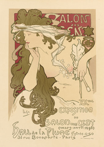
Alphonse Mucha.
Les Maîtres de l’Affiche was a multi-volume guide to the state of poster art in the 1890s, published in five volumes from 1896 to 1900. Being a French publication, the contents are mostly by French artists but other nations are represented—Britain, Germany, Italy, the United States—although fewer contributions than you might expect given the quantity of pages to be filled. The chief attraction of these books is the attention they give to each design, all of which are printed in colour on a full page, and the time of publication which coincides with the birth of Art Nouveau. In addition to the great Alphonse Mucha there are designs by Eugène Grasset, Henri Privat-Livemont, Georges de Feure, Will Bradley, Louis Rhead and others. There’s also a lot of cabaret stuff from Montmartre which has never been to my taste (although I like the Steinlen posters) but those designs were the typical ones of the period.
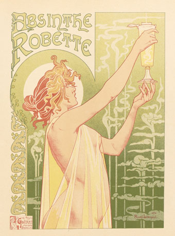
Henri Privat-Livemont.
The first four volumes in this set may be found at Gallica (Volume 1, Volume 2, Volume 3, Volume 4) but not the fifth volume—isn’t a national library supposed to be more thorough than this?—which may be seen at NYPL. For those who prefer paper reproductions, there’s a reprint in Dover Publications’ Pictorial Archive series, The Complete “Masters of the Poster”: All 256 Colour Plates from “Les Maîtres de l’Affiche”.
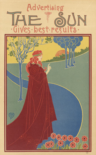
Louis Rhead.
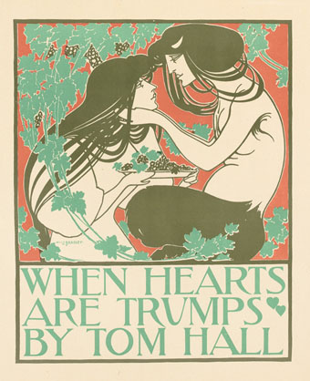
Will Bradley.
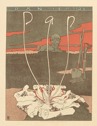
Joseph Sattler.