Weekend links 700

demorgan.jpg

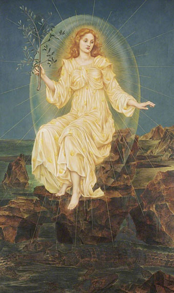
Lux in Tenebris (1895) by Evelyn De Morgan.

• “NASA celebrates the worm logo designer, Richard Danne“. Until I read this story (and this one) I wasn’t aware that the NASA logos were known as The Meatball and The Worm.

The Red Shoes: behind the scenes of the classic Powell and Pressburger film – in pictures. Related: Kings of the movies: Martin Scorsese on Powell & Pressburger.

• The 700th weekend post happens to arrive on Alan Moore’s 70th birthday. Many happy returns to the Northampton Magus.

Fundamentally, we face a choice. Either:

• it’s a coincidence that, of all the possible values that the finely tuned constants of physics may have had, they just happen to have the right values for life;

or:

• the constants have those values because they are right for life.

The former option is wildly improbable; on a conservative estimate, the odds of getting finely tuned constants by chance is less than 1 in 10-136. The latter option amounts to a belief that something at the fundamental level of reality is directed towards the emergence of life. I call this kind of fundamental goal-directedness ‘cosmic purpose’.

As a society, we’re somewhat in denial about fine-tuning, because it doesn’t fit with the picture of science we’ve got used to. It’s a bit like in the 16th century when we started getting evidence that our Earth wasn’t in the centre of the universe, and people struggled to accept it because it didn’t fit with the picture of the universe they’d got used to. Nowadays, we scoff at our ancestors’ inability to follow the evidence where it leads. But every generation absorbs a worldview it can’t see beyond. I believe we’re in a similar situation now with respect to the mounting evidence for cosmic purpose. We’re ignoring what is lying in plain view because it doesn’t fit with the version of reality we’ve got used to. Future generations will mock us for our intransigence.

Philip Goff, professor in philosophy at Durham University, making an argument for cosmic purpose

• At Spoon & Tamago: Exploring Japanese Hell through art from the 12th to 19th century.

• New music: Turning The Prism by Ben Frost, and Sanctuary Of Desire by Steve Roach.

• Mix of the week is DreamScenes – November 2023 at Ambientblog.

• DJ Food looks at Tomi Ungerer’s Electric Circus posters.

• At Dennis Cooper’s: Alain Resnais Day.

Strange Flowers visits the Villa Stuck.

Diet Of Worms (1979) by This Heat | Opera Of Worms (1981) by Van Kaye & Ignit| Wormhole (2002) by Cliff Martinez

Alastair’s Manon Lescaut

alastair01.jpg

The illustrated works of Alastair aren’t always easy to find, not when Hans Henning Voigt (as the artist was known to his German parents) chose a nom de l’art shared by a large portion of Scottish manhood, past and present. This 1928 edition of Manon Lescaut by the Abbé Prévost is a recent arrival at the Internet Archive. The publisher, John Lane, specialised in illustrated editions, and their Manon Lescaut gives an idea of what we might have seen from Aubrey Beardsley had he survived into the 20th century. John Lane had published collections of Beardsley’s drawings together with related works like Robert Ross’s memories of the artist. It was in their interest to continue the posthumous association, hence the pairing of Alastair with a novel that Beardsley himself might have illustrated. Alastair not only positioned himself as an inheritor of Beardsley’s filigreed drawing style but in photographs appears to be adopting the persona of one of Beardsley’s etiolated characters.

alastair02.jpg

This edition of the novel is an English translation by DC Moylan, with an introduction by Arthur Symons, Beardsley’s friend and collaborator when the pair were teamed as editor and art editor of the short-lived Savoy magazine. Symons was an astute critic, his essays are always worth reading; he remembers his friend here while stepping lightly around Alastair’s imitation of Beardsley’s decorations. As for Alastair himself, he did a good job with the illustrations. The figure-drawing isn’t as uncertain as in some of his earlier works, and each piece is printed in two colours (“the colour of fire and night” as Symons describes it), a process he favoured elsewhere. The leading study of Alastair’s art, Alastair: Illustrator of Decadence (1979) by Victor Arwas, reproduces five of the fourteen drawings, only one of which is shown in colour.

alastair03.jpg

alastair04.jpg

alastair05.jpg

Continue reading “Alastair’s Manon Lescaut”

Return to Square

ctg.jpg

“Media transformation through electronics” might be a description of the internet but the phrase here is the title of an exhibition of Japanese computer art by CTG, the Computer Technique Group, which took place in Tokyo in 1968. The image on the poster is Return to Square, an example of incremental transformation conceived by Masao Komura and programmed by Kunio Yamanaka which is the most well-known work produced by the group. Morton Subotnick used Yamanaka’s print a year later on the cover of his third album, Touch, which is where I first encountered it.

touch.jpg

After reading this recent interview with Subotnick I was listening again to some of his albums, Touch included, which in turn prompted me to go looking for more information about the cover art. Following Yamanaka’s history back to the CTG revealed two versions of Return to Square. The image on the exhibition poster and the Subotnick cover is the second version, Return to Square (b) which in both cases is printed in negative, or reversed-out to use the technical term that printers prefer. This version takes 30 incremental steps from the shape of the woman’s head to reach the central square.

yamanaka.jpg

The first version, Return to Square (a), is more densely printed inside the head, taking 50 steps to reach the central square. According to a description in the Cybernetic Serendipity catalogue (see below), the difference between the versions is also a result of the programming: version (a) is programmed with an arithmetic series, while version (b) uses a geometric progression. Return to Square (a) achieved some prominence of its own when it was reproduced in 1967 by Motif Editions, a British publisher of lithographs who made prints from several images derived from experiments with computer graphics. I can’t say where Subotnick first saw Yamanaka’s print but it’s a great choice for the cover of an album of avant-garde electronic music. You’ll only see it today, however, on old vinyl copies (or on 8-track cassettes) since Touch hasn’t been reissued as a standalone album since 1972. The whole composition runs for 30 minutes which means on CD (or audio-DVD, as with one of my discs) you only find it bundled with other Subotnick compositions.

vogue.jpg

Photo by William Klein.

While tracing the history of Yamanaka’s print I didn’t expect to find the source for the outline of the woman’s head but here it is, a spread from a 1964 issue of Vogue magazine. This detail comes from a short post by Zihou Ng which not only gives you the code that Yamanaka used to create Return to Square (a) but also has a small interactive rendering of the image which you can push around and distort: “media transformation through electronics”.

return.jpg

Less successful than Ng’s recreation is this attempt by myself to make a version of Return to Square (b) in Illustrator. I use Adobe’s vector-graphics application almost as much as I use Photoshop but some of the standard Illustrator tools I find to be of limited utility. The shape-blending tool is one of these but it’s what I used to make this recreation. The lack of accuracy is a result of its limited settings: you define the number of steps you want it to take then click on two shapes in succession and the tool fills the space between them with iterative transformations. Rather a blunt instrument but this took me all of 15 minutes to create, a fraction of the time that Yamanaka would have spent programming his original.

• Related reading: Cybernetic Serendipity, PDFs (high- and low-res) of a catalogue for an exhibition of computer art at the ICA, London, in 1968. Includes a profile of the Computer Technique Group with examples of their work. The low-res scan has a few extra pages at the end which include an ad for Motif Editions.

Previously on { feuilleton }
Gioconda of the Mausoleum
Golden apples and silver apples

Weekend links 699

gartside.jpg

November Evening (1955) by Brian Gartside.

• The next Jon Savage compilation for Caroline True Records will be Jon Savage’s Ambient 90s, a dive into the side of rave culture that I always preferred, even while disputing the use of the “A” word. Anything with beats isn’t ambient by my definition, but I’ve been complaining about the nomenclature since 1991 to no avail. It’s on pre-order anyway.

• “They produced in me an infinity of new images and feelings, that sometimes raised me to ecstasy, but more frequently sunk me into the lowest dejection.” Thus Frankenstein’s monster during his reading of three books that happen to be important texts for the Romantic imagination. Hunter Dukes looks at the syllabus of Frankenstein’s monster.

• “Figure on Led Zeppelin IV cover identified as Victorian Wiltshire thatcher”. Last year I discovered the source for the lyrics and credits lettering designs used on the same album’s inner sleeve. Not as newsworthy, obviously, but I thought it was a good piece of cultural detective work.

• At Aquarium Drunkard: An interview with Morton Subotnick, now 90 years old. “Pioneer” is an over-used label, especially in electronic music, but Subotnick really does warrant the description.

• At Wormwoodiana: Mark Valentine on Unburied Bane, an EP by The Heartwood Institute based on a story by “the enigmatic N. Dennett”.

• At Unquiet Things: Art and captions that didn’t make the print version of The Art of Fantasy by S. Elizabeth.

• “Hidden demon revealed in the shadows of a Joshua Reynolds painting.”

• New music: Polygon by Galya Bisengalieva, and Saor by Claire M. Singer.

• Steven Heller’s font of the month is Letraflex.

• At Dennis Cooper’s: Arthur Lipsett’s Day.

Martin Carthy’s favourite music.

Little Demon (1956) by Screamin’ Jay Hawkins | Ballad Of Maxwell Demon (1998) by Shudder To Think | On Demon Wings (2000) by Bohren And Der Club Of Gore

The art of Kato Teruhide, 1936–2015

teruhide17.jpg

Feeling of Autumn.

I’m still a little obsessed with ukiyo-e prints old and new, and with good reason when you find examples like these. Kato Teruhide was one of a number of 20th-century printmakers who subjected the traditional form to modern refinements, which in this case means vertical views of architectural structures or spaces, some of whose close-ups and unusual angles show how photography has helped expand the visual possibilties of the medium. Ishibi Koji Street is a winter scene that presents a view directly above the street, something I’ve never seen before in this medium. Other scenes constrain their narrow viewpoints even further by the framing of walls or, in the case of the print of Fushimi Inari, the path through the thousand torii gates that lead visitors to the famous shrine. Teruhide pushed his medium close to abstraction without ever being as stylised as some of his contemporaries. Kyoto Romance, a book of his prints, was published in 1992.

teruhide02.jpg

Ishibe Koji Street.

teruhide08.jpg

Bright Moonlight at Ryoan-ji Temple.

teruhide04.jpg

Nisonin Temple.

teruhide16.jpg

Harvest Moon.

Continue reading “The art of Kato Teruhide, 1936–2015”