Weekend links 719

rimmington.jpg

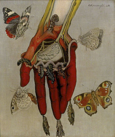
The Decoy (1948) by Edith Rimmington.

• “Among other things, [Dalí’s] storyboards involved [Ingrid] Bergman turning into a statue that would then break up into ants.” Tim Jonze talks to film scholar John Russell Taylor about the storyboards for Alfred Hitchcock’s films, including the ones for Spellbound which Taylor found in a bric-a-brac sale.

• “Of all the pop acts that proliferated in the early 80s, it was Soft Cell who retained punk’s sharp, provocative edges.” Matthew Lindsay on 40 years of Soft Cell’s This Last Night In Sodom.

• Coming soon from White Rabbit books: Futuromania: Electronic Dreams, Desiring Machines and Tomorrow’s Music Today by Simon Reynolds.

Anathema to many philosophical systems, or perhaps philosophy itself, Lovecraft’s philosophical project fundamentally holds that contemplations of higher reality or the nature of things can never be fully realised. Ultimately, the search for knowledge does not constitute some telos, some purpose, for humankind, but rather leads to the violent dissolution of the self. Higher reality is that which the limited human psyche can never fully comprehend.

Sam Woodward on the cosmic philosophy of HP Lovecraft

• At Public Domain Review: Grotesqueries at Gethsemane: Marcus Gheeraerts’ Passio Verbigenae (c.1580).

• “Here is a remarkable form of popular heraldry.” Mark Valentine on the mystique of old inn signs.

• At Bandcamp: Brad Sanders on where to begin with Lustmord’s cosmic ambient.

• New music: Eleven Fugues For Sodium Pentothal by Adam Wiltzie.

• At Aquarium Drunkard: Jason P. Woodbury talks to Roger Eno.

Gomorrha (1973) by Can | Sodom (1978) by Can | Spellbound (1981) by Siouxsie And The Banshees

Liber Artificiosus Alphabeti Maioris

merken01.jpg

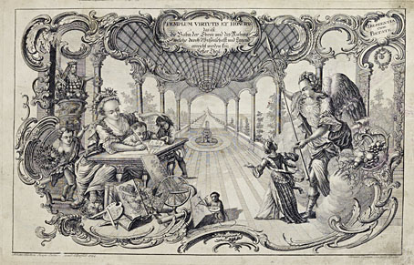
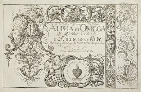
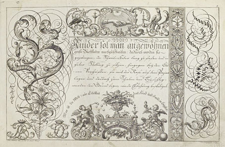
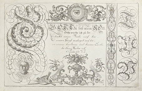
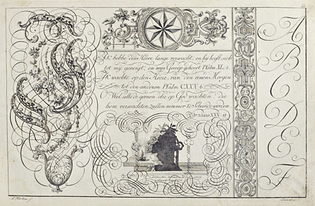
The previous post reminded me of this, one of my favourite examples of ornamented alphabets from the 18th century. Liber Artificiosus Alphabeti Maioris (“Artistic Book of the Major Alphabet”, 1782) was written and designed by Johann Merken, with the book’s 56 plates being engraved on copper by Heinrich H. Coentgen. I first saw these in a post at the now-defunct (and much missed) BibliOdyssey where Mr Peacay had found copies of the alphabet plates at some library archive or other. Happily, the Getty Research Institute made a scan of their own copy of the book a few years ago which includes all of the plates plus the accompanying German text.

merken02.jpg

The first part of Merken’s volume is unique in its combination of abecedarium with a variety of objects, emblems, symbols and other designs: silhouette figures, plants and flowers, ornamental gardens, coats of arms, calligraphic doodles, trophies (those accumulations of military paraphernalia), birds and animals (eg: a pair of monkeys playing the drums), monograms, mathematical figures, etc, etc, all festooned with the familiar swags and foliage of baroque decoration. In the second part of the book there’s more emphasis on science and technology, with plates devoted to astronomy, alchemy/chemistry, the orders of Classical architecture, and so on. The later pages are interesting but it’s those in the first section that really stand out. Many of the alphabet designs push their elaboration and embellishments to such a degree that the letters appear to be mutating to resemble their own decorations. The book as a whole is a curious blend of the 18th-century enthusiasm for taxonomy and categorisation combined with the baroque love of the grotesque and the arabesque. I wish there was more like it.

merken03.jpg

merken04.jpg

merken05.jpg

Continue reading “Liber Artificiosus Alphabeti Maioris”

Michael Baurenfeind’s extravagant calligraphy

baurenfeind01.jpg

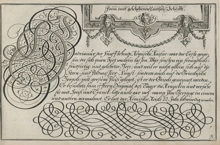
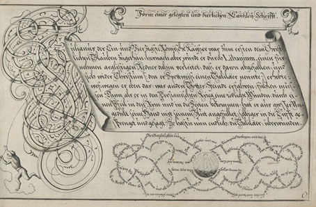
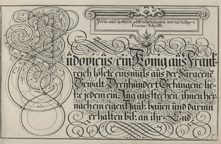
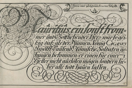
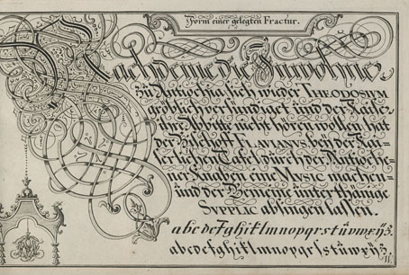
I like extravagant calligraphy, the more extravagant the better, as with these examples from Schreib-Kunst (1716) by Michael Baurenfeind (1680–1753). The book is a recent scan by the Getty Research Institute whose art and design collection includes many similar volumes, although finding the good ones usually means clicking hopefully on blank covers with promising titles. Baurenfeind’s book was published in the middle of the period that extends from the mid-1600s to the mid-1700s when this kind of maximal elaboration of lettering was at its height. Books published later in the 18th century are more devoted to the mastery of careful penmanship, although you still find depictions of calligraphic excess mixed with baroque decoration. These later studies can be very impressive but I prefer the books like Baurenfeind’s which is a demonstration of the calligraphic art pushed to extremes of elaboration and ornamentation. Some of the capitals in this volume are the most excessive examples I’ve seen outside Paul Franck’s Kunstrichtige Schreibart (1655), a book filled with elaborate letterforms which yet seems crude in comparison to many of Baurenfeind’s pages. Baurenfeind goes beyond Franck’s solid black curves to create shaded interlacings that are less examples of calligraphic formation than intricate knotworks that just happen to resemble capital letters.

baurenfeind02.jpg

There’s more of the same in a Baurenfeind book from 1736, also called Schreib-Kunst, which includes several plates that show the construction of the letterforms. Volumes like these are usually showcases rather than instruction guides so this is unusual; Baurenfeind even has a guide to cutting your goose quill before you begin. Having tried writing with a bird’s feather once or twice I wouldn’t recommend it unless you have no other choice. Metal nibs are always better.

baurenfeind03.jpg

baurenfeind04.jpg

baurenfeind05.jpg

Continue reading “Michael Baurenfeind’s extravagant calligraphy”

Weekend links 718

inagaki.jpg

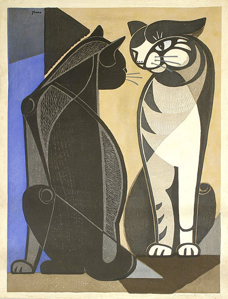
Chatting Cats (c.1960) by Tomoo Inagaki.

• New/old music: Follow The Light by Broadcast, a song which will appear on Spell Blanket—Collected Demos 2006–2009 in May. The album will be followed by another collection, Distant Call—Collected Demos 2000–2006, in September, with both releases being described as the last ever Broadcast albums. This was always going to happen eventually but I thought there might be a final collection of all the tracks the group recorded for compilations which have never been reissued.

• “Cats are all over Turkey. In Istanbul, which I visited before traveling to eastern Turkey, cats are welcome not just in cafes but in houses, restaurants, hotels, and bars.” Emily Sekine on the cats of Turkey.

• “El Shazly’s music is like a rush of new energy, a link between the past and present of Egyptian music that is fresh and vital.” Geeta Dayal on Egyptian singer and composer Nadah El Shazly.

• More werewolves: A trailer for Wulver’s Stane, a contemporary refashioning of werewolf lore. Director Joseph Cornelison is a reader of these pages. (Hi, Joseph!)

• Among the new titles at Standard Ebooks, the home of free, high-quality, public-domain texts: Ghost Stories by EF Benson.

• At Colossal: Sacred geometries and scientific diagrams merge in the metaphysical world of Daniel Martin Diaz.

• At The Quietus: What does dying sound like? Jak Hutchcraft on music and the near-death experience.

• At Unquiet Things: Languid Dreams and Unsettling Poetry: The Art of Jason Mowry.

• At Dennis Cooper’s: Spotlight on…Ronald Firbank Caprice (1917).

Ashkasha, a short animated film by Lara Maltz.

• New music: Chimet by Mining.

I’m The Wolf Man (1965) by Round Robin | The Werewolf (1972) by Barry Dransfield | Steppenwolf (1976) by Hawkwind

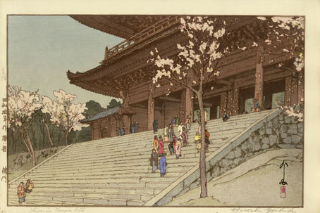
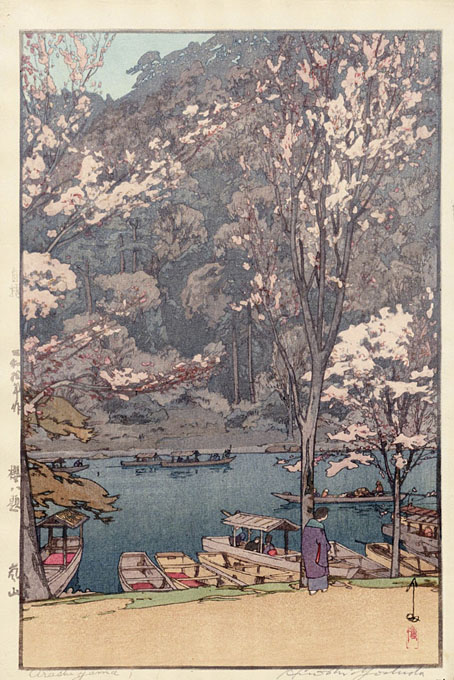
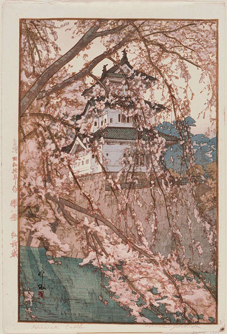
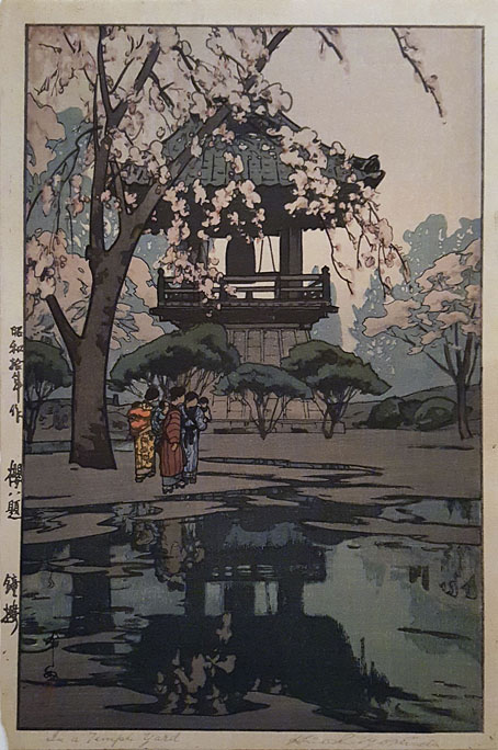
Eight Views of Cherry Blossom

yoshida1.jpg

Chion-in (Sanmon) Temple Gate.

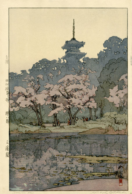
My favourite season is here at last although we haven’t had much spring sunshine here today, just a lot of rain. I like the spring, as do the Japanese who have good reason to celebrate when the cherry blossom is in bloom at this time of year. I had an idea of making of post of ukiyo-e prints devoted to cherry blossoms but this raised the question of where to begin…and where to stop when ukiyo-e.org lists nearly 1,800 prints on the subject. Instead of looking for a selection of prints by different artists this is a series by a single artist, the very adept Hiroshi Yoshida whose views of India were featured here last year. The Eight Views of Cherry Blossom date from 1935, and like most ukiyo-e prints there’s considerable tone and colour variation in each print in the series depending on the aging of the paper or the quality of the printing. All of these prints may be seen in lighter/darker copies on the print-selling sites.

yoshida2.jpg

Arashiyama.

yoshida3.jpg

Hirosaki Castle.

yoshida4.jpg

In a Temple Yard.

yoshida5.jpg

Sankeien Garden.

Continue reading “Eight Views of Cherry Blossom”