Pin culture

pins1.jpg

In the mail this week, a pair of new pins from the pin-maker and seller who made the exquisite Future Days pin. (eBay shop | Etsy shop) The Ege Bamyasi pin isn’t as effective as the earlier Can design but I feel compelled to encourage the effort, especially when most of the designs from this maker are for punk or post-punk bands. I also enjoy the novelty of seeing things like this at all. The years when I was discovering German music via secondhand releases (late 70s, early 80s) coincided with a period when I spent a lot of time scouring local shops for unusual badges. Growing up in a holiday resort gave me access to a greater quantity of cultural ephemera than you’d find in nearby towns, yet during this time I never saw any badges related to the German groups, not even Kraftwerk. As for prestige enamel items, you seldom saw these outside concert merchandise stalls where hardcore fans could be relied upon to pay more for their memorabilia.

pins2.jpg

Official pins from Hawkwind, Magma and Ghost Box Records.

The recent emergence of a cottage industry devoted to enamel pins means that these aren’t the only such items you’ll find on eBay or Etsy, but most of the others I’ve seen are either substandard (like another attempt to rework the Future Days cover) or are from North American sellers who want you to pay £25 or more for postage. Nein danke. But wherever the pin makers are located they all face the problem of how to create something related to groups who didn’t have a graphic identity that can easily be converted to metal and enamel. Where Can are concerned you could at least do this with their name as it appears on the Tago Mago cover. (Maybe such a thing exists already?) And I was amused to see that one pin maker has managed to reduce Manuel Göttsching’s chessboard cover for E2–E4 to pin size. What I’d really like now is a Neu! pin in black and white like the design on the cover of Neu! 75. Here’s hoping…

Previously on { feuilleton }
A Can pin
Rock shirts

The art of Yuhan Ito, 1882–1951

ito02.jpg

Sacred Bridge in Nikko.

Sunsets, mist and moonlight. Yuhan Ito painted watercolours devoted to these subjects, a technique which he endeavoured to replicate in the less subtle print medium seen here. Those remarkable nebulous effects were achieved by avoiding the use of a black line-block although darker lines are still used to emphasise foregound shapes. Ito wasn’t a very prolific artist—you won’t find many more prints than this handful from the 1930s—but what there is of his work stands out immediately from that of his contemporaries.

ito06.jpg

Pagoda at Nikko.

ito03.jpg

Ukimi-do in Biwa Lake.

ito08.jpg

Boats in the Sunset Glow.

ito04.jpg

Sarusawa Pond.

Continue reading “The art of Yuhan Ito, 1882–1951”

Weekend links 726

ferriss.jpg

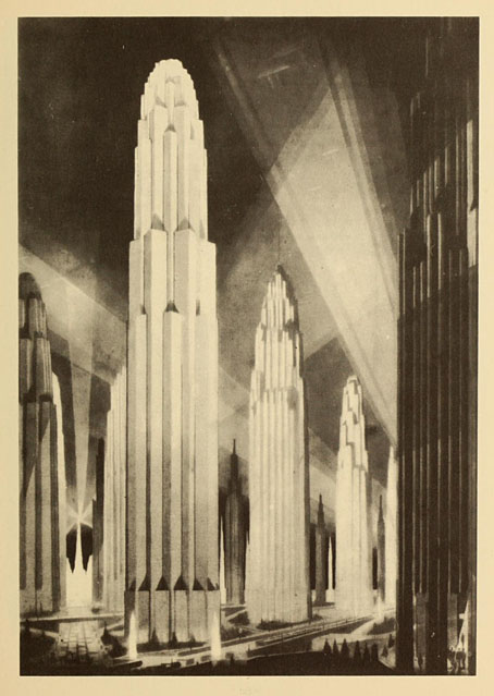
Verticals on Wide Avenues from The Metropolis of Tomorrow (1929) by Hugh Ferriss.

Megalopolis, the futuristic epic written and directed by Francis Ford Coppola, now has a trailer and a handful of mixed reviews. I recall Coppola saying years ago that he was the kind of director who would happily make films in any genre, science fiction included. I’ve wondered ever since what a full-on Coppola SF film might look like. (Captain EO and Peggy Sue Got Married don’t count). Now it seems we’re about to find out. Given his previous missteps I remain sceptical yet curious about this one. I’ve avoided his output since Bram Stoker’s Dracula but I’m still happy to see him being so ambitious while retaining his independence.

• And RIP Roger Corman who Coppola remembered as “my first boss, task-master, teacher, mentor, and role model. There is nothing about the practical matter of making movies I didn’t learn by being his assistant.” Related: It rained on the Sunday: a career interview with Roger Corman by Matthew Thrift.

• At Retro-Forteana: Fortean-themed music, from opera to metal. A difficult subject for a such short post, as the author admits. I’m amused to see one of my Hawkwind album covers in the list although the album itself doesn’t seem very Fortean to me.

• “Did you know that, if things had gone differently, the Pompidou Centre could have been an egg?” Oliver Wainwright on architecture that might have been.

• At Cartoon Brew: A closer look at great animated title sequences. I deplore the omission of Richard Williams’ titles for The Charge of the Light Brigade (1968).

• At Public Domain Review: Love Spells and Deadly Shrieks: Illustrations of Mandrakes (ca. 650–1927).

• At Wormwoodiana: “That Strange Little Book”: Ding Dong Bell by Walter de la Mare.

• At Unquiet Things: The latest collection of Intermittent Eyeball Fodder.

• Mix of the week: DreamScenes – May 2024 by Ambientblog.

Mandrake Root (1968) by Deep Purple | Mandrake (1975) by Gong | The Mandrake’s Hymn (2019) by Earth

Four short films by Vince Collins

collins0.jpg

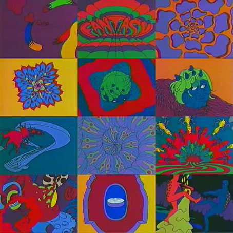
The expressions “psychedelic” and “surreal” are often so casually applied that they lose any useful definition, but in the case of these early films by American animator Vince Collins “psychedelic surrealism” is an accurate description. All have somehow managed to evade my weirdness radar until now, despite being superior examples of the endlessly mutating dream-landscape which animation can do so well. The last of them, Malice in Wonderland, is a breathless run through Lewis Carroll scenarios which Collins made in collaboration with his wife, Miwako Collins. That punning title has been overused in the music world but the pair ought to be given sole ownership of it, their bad-trip film is the most grotesquely nightmarish reworking of Alice themes that I’ve seen.

Vince Collins’ YouTube channel contains many more recent works done with computer animation. The hand-drawn films are more to my taste but it’s good to see him still being active and creative.

collins1.jpg

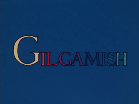
Gilgamish (1973).

collins2.jpg

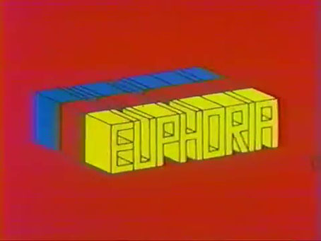
Euphoria (1974).

collins3.jpg

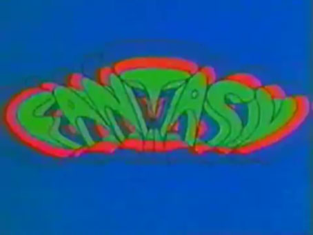
Fantasy (1976).

collins4.jpg

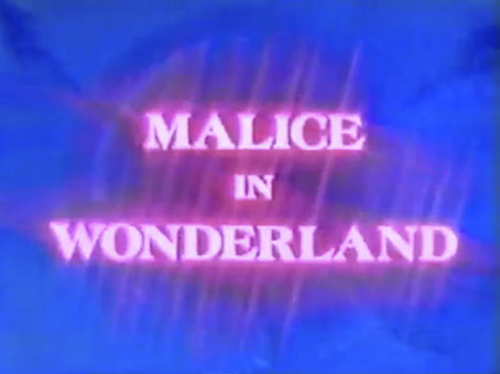
Malice in Wonderland (1982). (Or avoid YouTube’s adults-only policy by going here.)

Previously on { feuilleton }
The groovy video look

The Atropine Tree

atropine.jpg

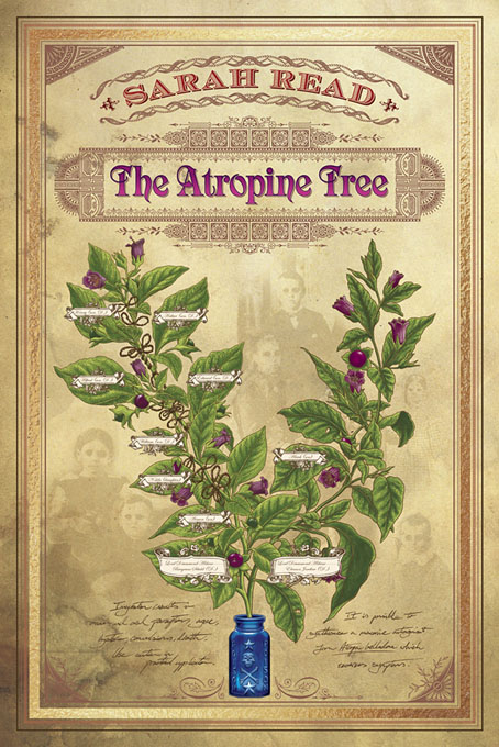
My latest piece of cover art is for Doug Murano’s new imprint, Bad Hand Books. I designed the cover for the Behold! collection that Doug edited a few years ago, a book which included the author of the present tale of Gothic horror, Sarah Read:

Aldane Manor is an ancient home of low-beamed ceilings, crumbling walls, poison gardens, and deadly secrets. When Alrick Aldane returns to his family’s house, he expects to simply inherit his father’s land and title. Instead, he discovers that he is also heir to the property’s disturbing history—one full of witchcraft—and a ghostly mystery that could condemn him to a fate worse than death.

The cover for this one had a specific brief which required a family tree presented as two flowering stalks of Atropa belladonna or Deadly Nightshade, with both stalks growing out of a blue-glass poison bottle. Other details follow from the author’s mood board samples: hollow-eyed ghost children and loops of hair. The medical tone of these elements sent me looking at old pharmacy labels which is what I’ve used as a basis for the general design. Old pharmacy labels and medical documents were often just as fancy as any other 19th-century print designs so all the fine details around the title lettering are what printers referred to as “combination ornaments”, tiny typographic embellishments that form detailed patterns when pieced together. The ones seen here have been copied by hand from an old page design. You can scan these things from books, or try working up a vector shape from an Internet Archive scan, but the results are never as sharp or as clear as those you create yourself. For anyone who runs across this post hoping to find a good collection of combination ornaments, the MacKellar, Smiths & Jordan type catalogue of 1892 is a favourite of mine.

The Atropine Tree will be published in July 2024.

Previously on { feuilleton }
BEHOLD! Oddities, Curiosities and Undefinable Wonders