Weekend links 573

strutt.jpg

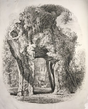
The Greendale Oak, Welbeck, Nottinghamshire, from Joseph George Strutt’s Sylva Britannica (1822/1830).

• “…a single page from Max Ernst’s collage novel Une semaine de bonté (A Week of Kindness, 1934) uncovers the weird brooding threat in Tenniel’s image of Alice in the railway carriage.” Mark Sinker reviewing the Alice: Curiouser and Curiouser exhibition at the Victoria and Albert Museum, London. I don’t know what Ernst page Sinker is referring to but I made the connection between an Ernst collage and Tenniel’s drawing here in 2010.

• At Wormwoodiana: “Calum Storrie’s 36 Elevations is a book of drawings of imaginary architecture, with the emphasis on towers, stairs, ladders, globes, oblique angles, gantries, finials etc.”

• At The Quietus: Jennifer Lucy Allen on The Strange World of…Don Cherry, and Dustin Krcatovich on Don and Moki Cherry’s Organic Music Theatre.

Call it the new orthodoxy of the digital middlebrow, “the rise of safely empowering stories with likeable protagonists who move through short sentence after short sentence towards uplifting conclusions in which virtue is rewarded.” The laudable goal of increasing the diversity of literary voices has somehow morphed into a series of purity tests designed to ensure that any artistic representation ticks the same boxes as its ostensible author. “On this,” Tyree writes, “conservative religious evangelicals secretly agree with their puritanical secularist enemies on a censorious attitude and checklist approach to art as either ‘acceptable’ or ‘offensive’ to whatever program one happens to prefer for cleansing all vileness from the world.” The result?

[A]rt is increasingly viewed by both the right and the left as a sub-branch of medicine, therapy, hygiene, or good manners. Art is no longer that which tells us the truth but rather that which makes us feel better—a deflated ideology that is spawning a sort of unofficial school of palatability.

And this, I fear, is what’s afflicting many of my students…

Justin St. Clair reviewing The Counterforce: Thomas Pynchon’s Inherent Vice by JM Tyree. Since I’m currently in the midst of a Pynchon reading binge this is all very timely

• “Researchers create self-sustaining, intelligent, electronic microsystems from green material“.

• From 2018: Ryuichi Sakamoto and David Toop live at The Silver Building.

• New weirdness: Catwalk Of The Phantom Baroque by Moon Wiring Club.

• Mix of the week:Episode #391 of Curved Radio by radioShirley & mr.K.

• At Dennis Cooper’s: Illegible autographs.

Elevation (1974) by Pharoah Sanders | Elevation II (1997) by Vainqueur | Elevations And Depths (2010) by Locrian

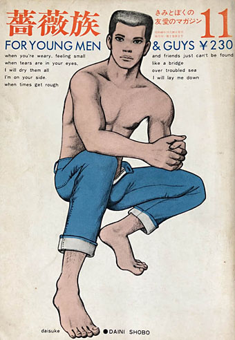
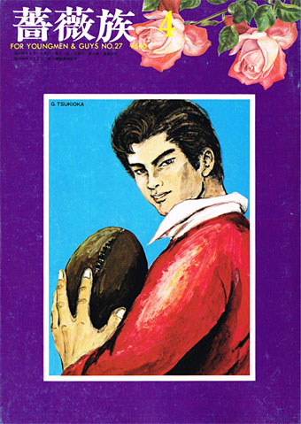
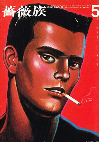
Barazoku covers

barazoku001.jpg

Barazoku (“The rose tribe”) wasn’t the first Japanese magazine for gay men but it was the first such title with a general circulation, as well as the longest running. 400 issues were published from 1971 to 2008. I wasn’t aware until I started reading about the history of this magazine that bara (“rose”) was originally a pejorative term like “pansy”. As with many slang terms, not least “gay”, the meaning and application has evolved over time. Use of “bara” today is confused by its application in the West to almost any form of gay manga that isn’t yaoi, a utilization that some Japanese artists take issue with.

barazoku007.jpg

For Western viewers, the most immediately striking thing about the covers of Barazoku is their reliance on drawings or paintings rather than photographs. This isn’t entirely unprecedented—Physique Pictorial and Fizeek in the US used drawn covers from time to time—but making artwork a consistent cover feature is very unusual. (The first few covers also feature extracts from the lyrics of Bridge Over Troubled Water…) Some of the men who provided covers or interior art have appeared here in the past, among them Ben Kimura, Go Mishima and Sadao Hasegawa. The covers signed “Rune” are the work of Rune Naito (1932–2007), an artist better known in Japan for having popularised the kawaii aesthetic with his drawings of large-eyed girls and panda bears.

barazoku011.jpg

barazoku027.jpg

barazoku040.jpg

Continue reading “Barazoku covers”

Going beyond the zero

gr1.jpg

“But it is a curve each of them feels, unmistakably. It is the parabola. They must have guessed, once or twice—guessed and refused to believe—that everything, always, collectively, had been moving toward that purified shape latent in the sky, that shape of no surprise, no second chances, no return. Yet they do move forever under it, reserved for its own black-and-white bad news certainly as if it were the Rainbow, and they its children….”

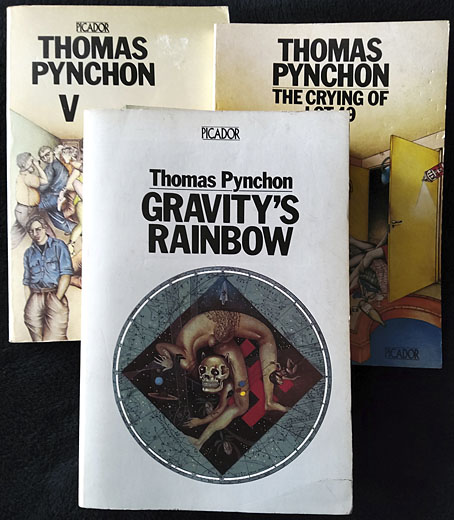
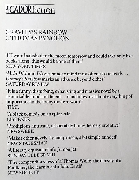
Reader, I read it. It isn’t an admission of great achievement to announce that you’ve reached the last page of a novel after a handful of stalled attempts, but when it’s taken me 36 years to reach this point it feels worthy of note; and besides which, Gravity’s Rainbow isn’t an ordinary novel. Umberto Eco is partly responsible for my return to Pynchon. I’d just finished The Name of the Rose, a book I’d avoided for years even while reading (and enjoying) a couple of Eco’s other novels, and was wondering what to read next. Maybe it was time to try the Rocket book again? The thick white spine of the Picador edition—760 pages in 10pt type—would accuse me every time I spotted it on the shelf: “Still haven’t made it to page 100, have you?” For many people this happens with novels because a book is “difficult” (which I didn’t think it was), or boring (which it isn’t at all), or simply too long (page count doesn’t put me off). Back in 1985 I was looking for more heavyweight fare after reading Ulysses, something I’ve now done several times, so I wasn’t going to be intimidated by a novel which is misleadingly compared to Ulysses on its back cover. If anything the comparison was an enticing one. Pynchon at the time exerted a gravitational pull (so to speak) for being very mysterious, although this was a decade when most living authors, especially foreign ones, were mysterious to a greater degree than they are today, when so many have their own websites and social media profiles. Pynchon’s works were also referred to in interesting places, unlike his less mysterious contemporaries. I may be misremembering but I seem to recall a mention of the W.A.S.T.E. enigma from The Crying of Lot 49 in Robert Shea & Robert Anton Wilson’s Illuminatus!; if it is there then it’s no surprise that a writer so preoccupied with conspiracy and paranoia would find favour with the authors of the ultimate conspiracy novel. (And that’s not all. I’m surprised now by the amount of coincidental correspondence between Illuminatus! and Gravity’s Rainbow. Both novels were being written at the same time, the late 1960s, yet both refer to the Illuminati, the eye in the pyramid on the dollar bill, Nazi occultism, and the death of John Dillinger. Both novels also acknowledge the precedent of Ishmael Reed’s Mumbo Jumbo, another remarkable conflation of conspiracy, secret history, and wild invention.)

gr2.jpg

Pynchon had other connections to the kind of fiction I was already interested in. One of his early short stories, Entropy, had been published in New Worlds magazine in 1969, although editor Michael Moorcock later claimed to have avoided reading any of the novels until much later. And, Pynchon, like Shea & Wilson (and Moorcock…), made pop-culture waves. I think it was Laurie Anderson who put Gravity’s Rainbow in the centre of my radar when she released Mister Heartbreak, an album whose third song, Gravity’s Angel, refers to the novel and is dedicated to its author. As for the novel itself, in the mid-1980s this was still Pynchon’s major work, the one that fully established his reputation. Nothing new had appeared since its publication in 1973; Vineland, and the subsequent acceleration of the authorial production line, was six years away. The final lure was the refusal of the Picador edition to communicate very much of its contents: what was this thick volume actually about? The back cover is filled with praise but doesn’t tell you anything about the novel at all, while the cover illustration by Anita Kunz suggests a scenario connected with the Second World War but little else. (“This was one of the most complicated books I ever read,” says the artist, “and really hard to get the germ of the idea. Pynchon kept going off in tangents. I mixed up the art the same way the writer did and made an image that can be read in all directions.”) It’s only when you start reading the book that you find the connection between the novel’s dominant concerns—the development of the V-2 rockets used by the Nazis to bomb London, and the erotic compulsions of Tyrone Slothrop, an American lieutenant at large in war-ravaged Europe—subtly reflected in the illustration, much more subtly than the cover art on the edition that preceded this one.

Continue reading “Going beyond the zero”

Weekend links 572

poumeyrol.jpg

L’Insolite (1980) by Jean-Marie Poumeyrol.

• “As we move down the ladder of prestige into the world of unvetted tweets, we observe an increasing difficulty, among people with very strong opinions, in exercising that basic critical competence of distinguishing between the authorial creation of a character, and the author’s affirmation of that character’s every moral trait and political view.” Justin EH Smith on the HR managers of the human soul.

• “When is a Didone not a Didone? How far must an exemplar Didone, like a Didot or a Bodoni, be altered before it loses its ‘Didoneness’?” John Boardley on the vexed question of font classification, and the need for an alternative to the present system.

• “Birds with Human Faces and Birds with Human Souls share shelf space with The Book of Owls and Expert Obedience Training for Dogs…” Joanna Moorhead visits the Casa Estudio Leonora Carrington in Mexico City.

“Indolent” is a funny way to characterize her natural state, which seems more like “incisive” to me, but I also have the unshakable sense—for myself—that writing can’t or shouldn’t look like staring into space or feel like not wanting to move from the couch. “A fraud is being perpetrated: writing is not work, it’s doing nothing,” she states in that first essay, from 1992. But she immediately counters with, “It’s not a fraud: doing nothing is what I have to do to live.” Listing a few more pertinent existential options, Diski ends with, “Or: writing is what I have to do to be my melancholy self.” The protoplasmic, chattering, melancholic “I” of these essays is, of course, the collection’s constant, its true subject. I can commiserate with her on every page even if emulation is out of reach.

Johanna Fateman on the incisive long-form criticism of Jenny Diski

• At Spine: Vyki Hendy identifies sunburst as a new trend in book cover design. I often think I overuse these things in my own cover designs which means I may be inadvertently (and fleetingly) trendy.

• At the Magnum Gallery, London: Metamorphoses, photographic studies by Herbert List of male bodies and Greek statuary.

• At Spoon & Tamago: A butterfly sipping moisture from puddles, sculpted entirely in wood by Toru Fukuda.

• At Dangerous Minds: Joseph Lanza on the easy listening side of psychedelic pop.

• At CounterPunch: Louis Proyect on thinking like an octopus.

• Mix of the week: Fact Mix 510 by Britton Powell.

Bye Bye Butterfly (1965) by Pauline Oliveros | Butterfly Mornings (2001) by Hope Sandoval & The Warm Inventions | Butterfly Caught (2003) by Massive Attack

Peter Haars book covers

haars20.jpg

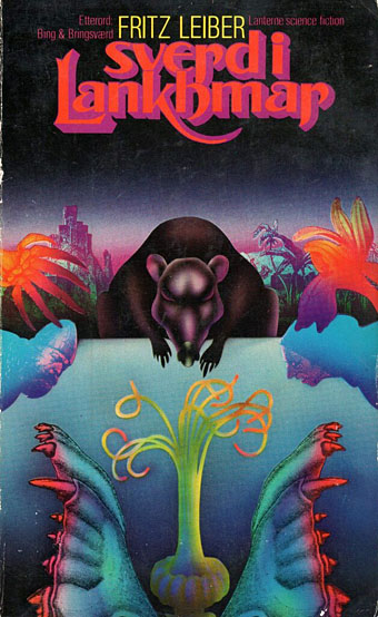
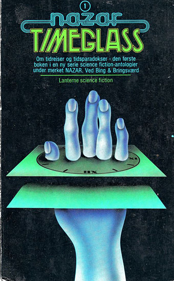
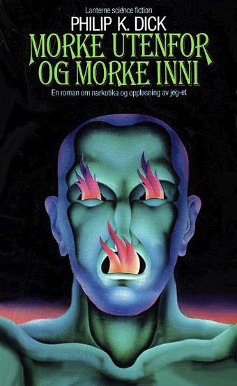
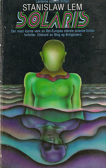
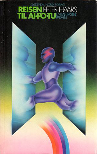
Peter Haars (1940–2005) was born in Germany but moved to Norway in the 1960s where he worked as a graphic designer, art director and illustrator. He also wrote fiction and created Prokon (1971), a one-off publication that looks like a designer’s take on underground comics. Most of the covers that turn up when you search for his work are science fiction, and all painted in that bold airbrush style that was common in the 1970s. Documentation is scarce, unfortunately, ISFDB only lists two titles, so I’ve no idea about the dates, but the Lanterne SF imprint was active throughout the decade.

haars01.jpg

haars21.jpg

haars15.jpg

haars08.jpg

Continue reading “Peter Haars book covers”