Weekend links 611

ltpf.jpg

Let The Power Fall (1981) by Robert Fripp. A postcard included with the original vinyl release of the Let The Power Fall album.

Exposures 1977–1983 is the title of another wallet-busting CD/DVD/blu-ray box which will be released by DGM at the end of May. Unlike the previous King Crimson sets this one will be devoted to Robert Fripp’s first run of solo releases, covering the albums that emerged from the artistic campaign he described at the time as “The Drive to 1981”: Exposure (1979), God Save The Queen/Under Heavy Manners (1980), The League Of Gentlemen (1981), and Let The Power Fall (1981). If you’re as interested as I am in this period of Fripp’s career then this is all very exciting. Exposure has been reissued several times over the years, and exists in three different “editions” featuring alternate mixes and song variations, but the other albums have been unavailable in any form for decades, possibly as a result of the turmoil caused by the mismanagement and eventual collapse of the EG label. In addition to the reissues the box will include live recordings, a League Of Gentlemen Peel session plus a substantial quantity of Frippertronics material, including the loops that were recorded for Eno & Byrne’s My Life In The Bush Of Ghosts. Fripp retained a credit for his contribution to Regiment but the results are so far down in the mix that they’re easy to miss. Related: The Drive to 1981: Robert Fripp’s Art-Rock Classic Exposure.

• Galerie Georges-Philippe & Nathalie Valloisin, Paris, is currently creeping out visitors to Strange Aeons—We will meet you there, an exhibition by Peybak (Peyman Barabadi and Babak Alebrahim Dehkordi) that borrows its title from HP Lovecraft and includes a number of creatures, “neither embryos nor chimeras”, which may be found prostrate and breathing on the gallery floor.

• New music: Sub Zero, in which Kevin Richard Martin returns to the subterranean/subaqueous/subarctic zones he charted on his Isolationism and Driftworks compilations in the 1990s; plus The Carrier by Large Plants, an album of “psych rock belters” coming soon on the Ghost Box label.

• Science fiction as revolution: Joe Banks talks to Iain McIntyre, co-editor of Dangerous Visions and New Worlds—Radical Science Fiction, 1950–1985, about the flourishing of the New Wave of SF in the 1960s and 70s.

• “We know from his letters that Joyce sent a Greek flag to Nutting for him to colour-match. So, he was aiming for ‘Greek’ blue.” It’s that book again. Cleo Hanaway-Oakley on Ulysses, blindness and blue.

• Intermittent Eyeball Fodder: More visual delights gathered by S. Elizabeth.

• Steven Heller’s font of the month is Nicholas.

• Galerie Dennis Cooper presents…Liz Larner.

Let The Power Fall (1971) by Max Romeo | Minor Man (1981) by The League Of Gentlemen ft. Danielle Dax | Heptaparapashinokh (1981) by The League Of Gentlemen

Quay Brothers posters

quays01.jpg

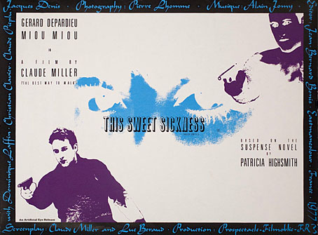
This Sweet Sickness (1977).

Looking around for Quay Brothers designs turned up an item I hadn’t seen before, a poster for the UK release of a French film by Claude Miller, This Sweet Sickness, starring Gérard Depardieu. I’ve not seen the film either, nor have I read the Patricia Highsmith novel on which it was based although a copy of the book has been sitting on my shelves for some time, together with a couple of other unread Highsmiths. The poster dates from just before the Quays started to get serious about their own film-making.

quays02.jpg

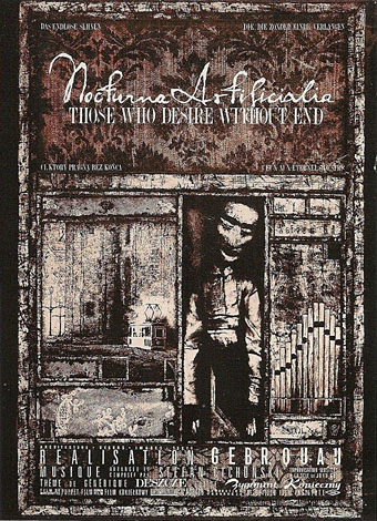
Nocturna Artificiala: Those Who Desire Without End (1979). The organ pipes, which don’t appear in the film, are an allusion to the improvised organ score by Stefan Cichonski.

Being graphic designers as well as film-makers puts the Quay Brothers in a very rare class, one where they not only make the films but also design the posters used to promote their films. Offhand, I can only think of the late Eva Svankmajerová as being in the same company so it’s perhaps fitting that her husband and artistic collaborator, Jan Svankmajer, was the subject of an early film by the Quays.

quays03.jpg

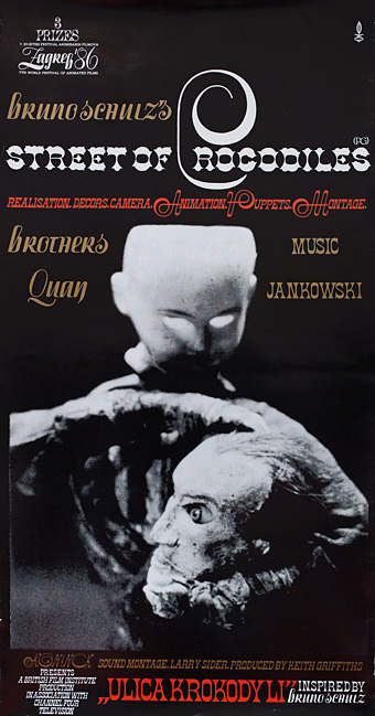
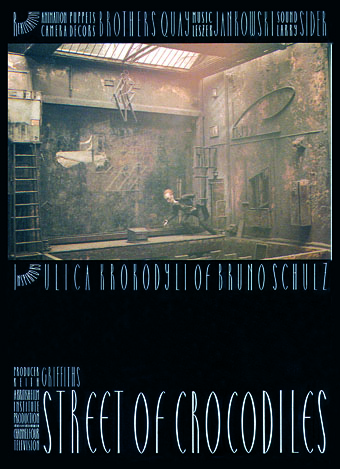
Street of Crocodiles (1986).

quays04.jpg

quays05.jpg

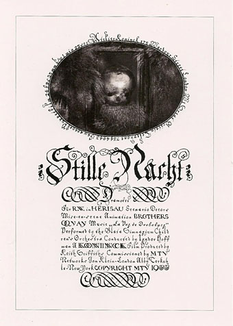
Stille Nacht: Dramolet (1988). An early use of Heinrich Holzmüller’s typographic designs.

Continue reading “Quay Brothers posters”

Hipgnosis interview

hipgnosis1.jpg

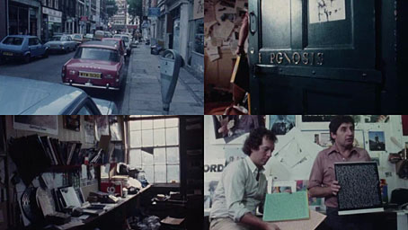
This is a frustratingly short piece of film—a mere 16 minutes—but it’s fascinating all the same for the brief views it gives inside the London studio of the Hipgnosis design partnership at the tail end of their golden decade, the 1970s. Being an occasional album cover designer as well as a minor Hipgnosis obsessive I like to see where so many of the team’s album covers originated. The two Hipgnosis founders, Aubrey Powell and Storm Thorgerson are both interviewed; the third member of the partnership, Peter Christopherson, is absent. The film is also undated but the discussion of the cover photo for Look Hear? by 10cc puts the year at around 1980. The views of the studio aren’t much different from the rather murky shots of the place in the first Hipgnosis book, An ABC of the Work of Hipgnosis: Walk Away René (1978), but the film gives a better sense of the dishevelled actuality: those stairs that Thorgerson runs up at the opening are the same ones that form the background to the melting Peter Gabriel photo used on the cover of Gabriel’s third album. Powell and Thorgerson are such engaging interviewees they really ought to have been profiled at greater length by the BBC or ITV, not given a few minutes to discuss some of their more notable creations by a small French film crew.

hipgnosis2.jpg

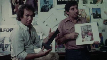
Aubrey Powell shows off the mystery object from the Presence album by Led Zeppelin.

The Hipgnosis studio occupied two floors of a building in Denmark Street, a minor thoroughfare off the Charing Cross Road that used to be a home to music publishers, rehearsal rooms and many of London’s musical instrument vendors. For a few years it was also home to the original and equally dishevelled Forbidden Planet book and comic shop, a place I first visited shortly after it opened in 1978. I always used to visit Forbidden Planet when I was in the capital but the Hipgnosis team had gone their separate ways by the time I found out they’d been based in the same street. Had I known about this earlier I probably would have wandered around for a while wondering which door led to their rooms. With its clutter and blithe disregard for client-flattering furnishings (the reception room, said Thorgerson, had nowhere to sit down) the studio was a long way from anybody’s idea of a well-appointed design business. The place reminds me of the offices occupied for many years by Savoy Books in Deansgate, Manchester: ancient, first-floor rooms whose better days were long past, with tools of the trade littering every surface, recent works-in-progress on the walls and old stickers peeling off the door. In Walk Away René, Thorgerson also admits that the studio lacked a toilet so they had to resort to pissing in a sink, a disgraceful expediency also shared by the Savoy office. In such places was art once made.

Previously on { feuilleton }
Design as virus 16: Prisms
Storm Thorgerson, 1944–2013
Hipgnosis turkeys
Peter Christopherson, 1955–2010
Storm Thorgerson: Right But Wrong

Weekend links 610

durer.jpg

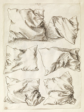
Pillow Studies (1493) by Albrecht Dürer.

• “Without ever writing a song, without ever fronting a group, Khan changed the face of British music.” Michael Hann talks to Morgan Khan about bringing New York Electro to the UK with his Streets Sounds label.

James Balmont offers “an introduction to Japan’s visceral cyberpunk cinema in five cult films”. This reminds me that I’ve not seen Shinya Tsukamoto’s Tetsuo films for years. Time to reacquaint myself.

• At Aquarium Drunkard: 15-minutes of Alice Coltrane from 1970, talking about her music and performing with Pharoah Sanders et al. Amazing.

Clive Hicks-Jenkins presents Beauty & Beast, an animated fairy tale made to showcase his toy theatre design.

• Carl Dreyer’s horror masterpiece, Vampyr (1932), is released on blu-ray by Eureka in May.

• At Wormwoodiana: Mark Valentine explores the mysteries of the Egg Language.

• DJ Food unearths paintings by Syd Mead for a Celcon Steel brochure, 1965.

• Jamie Sutcliffe enters The Strange World of Junji Ito.

• Mix of the week: Isolatedmix 117 by Refracted.

Keeley Forsyth‘s favourite music.

Electrocharge (1980) by Blackbeard | Electrodub1 (1980) by Chris Carter | Ano Electro (Andante) (1993) by The Sabres Of Paradise

Old Marvel versus Sherlock Holmes

oldmarvel4.jpg

Arriving in the post this week, one of the books whose covers I was creating late last year. Work-wise, the past year has been busier than usual which means I’ve fallen behind with the logging of recent commissions. In the past few months I’ve created several album designs, more book covers, an entire book design (cover plus interior), and also been working on two bigger projects at the same time. Things have calmed down a little now so updates will be forthcoming.

oldmarvel1.jpg

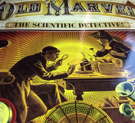
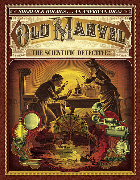
Old Marvel: The Scientific Detective is another design for Mark Williams’ Dark Lantern Tales imprint which once again resurrects a forgotten detective from pulp obscurity, and in a larger format than before. The new volume is significant for presenting a Sherlock Holmes-like character—credited to the pseudonymous “Grip”—who predates Holmes’ first appearance by three years, thereby suggesting a possible inspiration for Arthur Conan Doyle. Holmes collector Joe Rainone provides the details of publication and sets out the available evidence in an informative foreword. The Old Marvel character not only pre-empts Holmes by using his scientific knowledge to solve mysteries but he also pre-empts subsequent generations of spies and investigators with the various gadgets he uses, including what may be the first fictional deployment of an Edison voice recorder. My brief for the cover was to combine the illustration of the character with a vignette showing a shipping disaster from the story plus some of the contents of the detective’s tool kit.

oldmarvel2.jpg

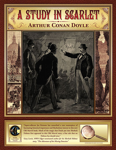
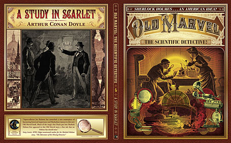
The book is actually two stories in one volume, with the second half being a reprint of the very first Sherlock Holmes novel, A Study in Scarlet. Both stories are presented as semi-facsimiles of their original US printings, together with reproductions of title pages and so on. The Holmes story is reproduced from its appearance in The Illustrated Home Guest in 1892, and includes rare illustrations one of which appears on the cover. Doyle’s first Holmes novel is the most controversial of all his stories—at least if you’re a Mormon—since this is the one where the inhabitants of Salt Lake City are depicted as a murderous religious cult. I filled out the cover with panels showing the two main story locations: a view of London via Ludgate Circus and a canyon in Utah. Finding a period engraving of St Paul’s Cathedral that remained visually interesting when narrowed down in this way took some time.

oldmarvel3.jpg

Previously on { feuilleton }
More detectives
The Joe Phenix Detective Series
Illustrating Sherlock Holmes