VadeMecum by the Brothers Quay

quays1.jpg

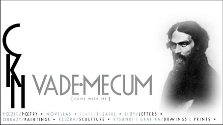
After mentioning the Brothers Quay last week it occurred to me that I hadn’t searched around for a while to see what they might have been up to recently. They continue to be productive, and only a couple of months ago released a new 12-minute short, VadeMecum, which was produced for the Polish Book Institute. This is the Quays in their documentary mode, presenting the troubled life of Polish poet and artist Cyprian Kamil Norwid, together with extracts from his poetry and examples of his drawings. Norwid’s existence was news to me so the piece successfully achieved its goal of informing the unenlightened. Last month the brothers talked to Mikolaj Glinski at Culture.pl about their fascination with Polish art and literature.

quays2.jpg

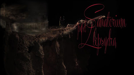
Meanwhile, the Quays are no doubt continuing to work on their third feature film, Sanatorium Under the Sign of the Hourglass, in which they return to the writings of Bruno Schulz. Schulz’s story collection was adapted by Wojciech Has in 1973 as The Hourglass Sanatorium, a film I recommend most highly. The quality of the Quays version may be judged by this six-minute preview which immediately sets itself apart from the Has film with its puppets modelled on Schulz’s illustrations. I’ll be waiting impatiently for this one.

Elsewhere on { feuilleton }
The Quay Brothers archive

Weekend links 595

dunwich.jpg

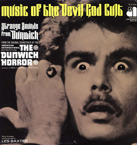
Dig the eldritch letterforms, man. Dean Stockwell as Wilbur Whateley making the High Sign on the cover of Les Baxter’s soundtrack album, 1970. That gesture, incidentally, goes back a long way.

• If you have an abundance of interstellar credits burning a hole in your stillsuit then you may be interested in bidding for the original of the book commonly known as The Dune Bible, the complete set of storyboards by Jean “Moebius” Giraud, together with designs by other artists for Alejandro Jodorowsky’s abandoned feature film. I keep hoping someone might turn this into an animated feature, something like René Laloux’s Time Masters but on a grander scale and with better animation (hello, Japan). 46 pages of scans from a limited printing of the book may be seen here.

• RIP Dean Stockwell. His 1995 interview in Psychotronic Video magazine is much better value than any potted biography.

• Bed-hopping, martinis and self-loathing: Emma Brockes on Patricia Highsmith’s unpublished diaries.

• At Spoon & Tamago: Tracing the footsteps of travelling Ukiyoe artist Kawase Hasui.

• Culture.pl examines the theoretical revolution of Nicolaus Copernicus.

Killian Fox on the cover designs for Penguin’s Modern Classics.

Nick Mamatas on his favourite genre-breaking mysteries.

• New music: HYbr:ID oval p-dance by Alva Noto.

• Mix of the week: Isolatedmix 114 by R.A.D.E.

Justin Robertson’s favourite music.

• At Dennis Cooper’s: Clock.

Jay Babcock at Substack.

The Clock (1968) by Ruth White | Clock Factory (1993) by The Sabres Of Paradise | Internal Clock (2009) by Monolake

Abstract Cinema

abstract.jpg

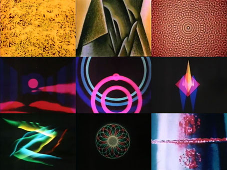
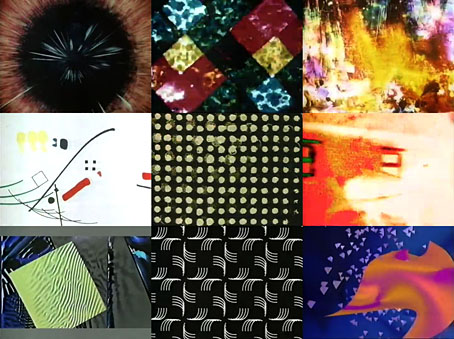
Good to see this documentary turn up at last even if it is on a private YouTube channel affiliated to a site that hosts cinematic rarities. Abstract Cinema was made in 1993 for Channel 4 (UK) at the tail end of the period when the channel could be relied upon to screen resolutely uncommercial fare. The documentary was another production by Keith Griffiths, producer of many films with the Brothers Quay, and producer/director of a number of documentaries such as this, exploring the cinematic zones that television seldom acknowledges.

abstract1.jpg

I’ve mentioned this programme a few times before because I taped it at the time, and still regard it as an excellent introduction to an idiom that many enthusiasts consider to be the purest form of cinema, as opposed to the theatrical storytelling that dominates the medium. Peter Greenaway has complained for years about the formulaic nature of contemporary feature films yet his own films, which are supposed to be an alternative to what he calls “dominant cinema”, aren’t so very different from the Hollywood norm in their reliance on actors, narratives, sets and the like. Abstract cinema avoids all of these things. Stan Brakhage is one of the filmmakers interviewed, and his own productions not only shunned sound, they even shunned the camera when he was painting directly onto the film strip. At the time of Griffiths’ interview Brakhage was doing this again using the comparatively larger canvas of Imax stock.

abstract2.jpg

Griffiths’ documentary runs through the history of cinematic abstraction, from Oskar Fischinger and Len Lye (both the subjects of earlier Griffiths studies) to the 1990s when several of the interviewees had taken to programming computers to create their visuals. Griffiths made his documentary at just the right time. As well as having access to a TV channel that would present such work to an audience (albeit late at night), he was also able to interview a number of the leading practitioners while they were still around; in addition to Brakhage there’s John Whitney, Jules Engel, Pat O’Neill, Malcolm le Grice, Michael Scroggins and Vibeke Sorensen. Notably absent is Jordan Belson, possibly because he’s always been reluctant to discuss the production process that created his ethereal imagery, although film historian William Moritz discusses Belson’s work while guiding us through the history. What you don’t get here is the additional 25 minutes of abstract films that were broadcast after the documentary, an unprecedented event, and one that wouldn’t be repeated.

Elsewhere on { feuilleton }
The abstract cinema archive

Resurrecting R’lyeh

rlyeh-2021.jpg

Then, driven ahead by curiosity in their captured yacht under Johansen’s command, the men sight a great stone pillar sticking out of the sea, and in S. Latitude 47°9′, W. Longitude 126°43′, come upon a coastline of mingled mud, ooze, and weedy Cyclopean masonry which can be nothing less than the tangible substance of earth’s supreme terror—the nightmare corpse-city of R’lyeh, that was built in measureless aeons behind history by the vast, loathsome shapes that seeped down from the dark stars. There lay great Cthulhu and his hordes, hidden in green slimy vaults and sending out at last, after cycles incalculable, the thoughts that spread fear to the dreams of the sensitive and called imperiously to the faithful to come on a pilgrimage of liberation and restoration.

HP Lovecraft, The Call of Cthulhu (1928)

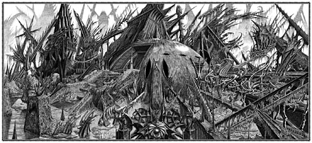
Behold the fruits of a more benevolent pilgrimage of liberation and restoration. It was just over a year ago that I decided to draw an exact replica of the R’lyeh triple-spread from my comic-strip adaptation of The Call of Cthulhu, the intention being to make the picture available as a poster-sized print once I had a print-ordering system in place. The picture may now be purchased here as a giclée print on Hahnemüle Pearl art paper. This is a big picture (870.46 x 401.15 mm or 34.27 x 15.793 ins), and unlike my other Etsy prints I’m afraid there won’t be a half-size version which means the price will remain relatively high. I’m also keeping it as a black-and-white piece despite the temptation to create a tinted version.

And so to the obvious question: why did I want to redraw a large and very detailed piece of art in the first place? Pull up a weed-festooned Cyclopean bollard and I’ll explain…
starrywisdom.jpg

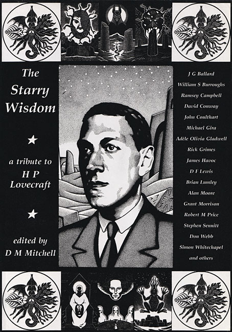
Creation Books, 1994. Cover art by Peter Smith.

I spent 17 months drawing The Call of Cthulhu, from January 1987 to May 1988, using my preferred media of the time, a 0.2 mm Rotring Variant pen on A3 sheets of Daler cartridge paper. The story took its time getting into print but it was eventually published in 1994 by Creation Books as part of The Starry Wisdom, a collection of Lovecraftian fiction edited by DM Mitchell. I was very pleased to be represented in the book but the pleasure turned to dismay when it transpired that all the artwork had vanished after the printing was done. Or almost all the artwork… To this day I don’t know whether the drawings by other artists suffered the same fate, but my Cthulhu pages disappeared along with the anatomical cross-section and the Yuggoth collage that I created specially for the collection. I still don’t know what really happened either, whether the drawings were stolen (possible), thrown away deliberately (unlikely), or thrown away accidentally (also possible). The lack of resolution to the whole business is partly my fault. Losing all that art was a painful thing to consider, and I couldn’t accuse the printer of anything when nobody could say what had happened (I was in the Creation office during one of the phone conversations between publisher and printer). The printer was also located in the middle of a rural county somewhere so journeying there would have been difficult for this non-driver, as well as being pointless if they could only tell me what I knew already. Time passed and I did my best to put the whole episode behind me.
pens.jpg

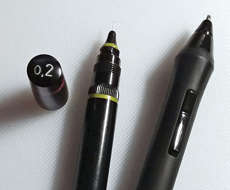
Drawing technology then and now: the Variant pen I used throughout the 1980s and the Wacom stylus I use today. That Variant nib is so fine that I have a faint ink dot tattooed on one of my knuckles from where I accidentally stabbed it into my hand. The Wacom pen looks stubby in comparison but is capable of drawing equally fine lines and much more besides.

On the plus side (there was one), the printer had done a good job of half-toning the artwork, so even though the Starry Wisdom pages are rather small the detail in the drawings is still evident. And I also had a complete set of photocopies of the A3-sized originals. I’d been working for Savoy Books since 1989 during which time making photocopies of new drawings had become second nature. Since 1994 this set of copies has become the original art for the Call of Cthulhu strip, rather like the surviving prints of Murnau’s Nosferatu which are all that anyone can see of his film today. The analogy is an apt one since it also extends to picture quality. Just as silent films always look their best when they’ve been restored from the camera negative, my Rotring drawings really need to be reproduced from the originals. The 0.2 mm pen that I insisted on using throughout the 1980s was too fine for the photocopy machines of the time, especially when my shading was so densely rendered that I might as well have been using a pencil. This isn’t so much of a problem if the pages are being reduced in size but it became one last year when I had the idea of making a print of the R’lyeh panorama that would be the same size as the original drawings. Giclée printing is an ink-jet process that reproduces fine detail with great accuracy, so while I could make full-size prints of the Cthulhu pages they’d never look better than what they were, photocopies that hadn’t fully captured the fine lines of the drawings. This wasn’t the only problem.

Continue reading “Resurrecting R’lyeh”

Weekend links 594

klinger.jpg

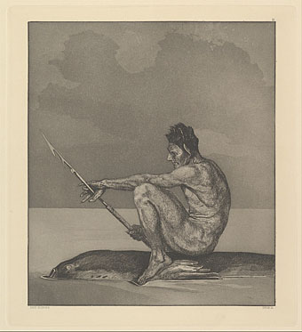
Eva und die Zukunft (1898) by Max Klinger.

• “It is no exaggeration to say that MAD invented the modern, postwar American takedown.” Thomas Larson reviews Seeing MAD: Essays on Mad Magazine’s Humor and Legacy.

• At the Internet Archive: Cartoon Modern: Style And Design In Fifties Animation (2006) by Amid Amidi, a book which has been made available as a free download by its author.

• New music: A preview of Metta, Benevolence by Sunn O))), recorded live in the Mary Anne Hobbs’ radio show in 2019; Veils by Víz; The Mountain (Blakkat Dub) by Ladytron.

• At Public Domain Review: Claude Mellan’s The Sudarium of Saint Veronica (1649), an engraving made with a single continuous line.

• “For Harry Houdini, séances and Spiritualism were just an illusion,” says Bryan Greene.

TheStencil is Steven Heller’s font of the month.

• At Dennis Cooper’s: Derek Jarman Day.

Nicky Mao’s favourite music.

Mad Man Blues (1951) by John Lee Hooker | Mad Pierrot (1978) by Yellow Magic Orchestra | Mad Keys (2002) by Al-Pha-X