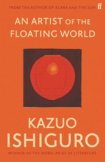
I like seeing an author’s works designed as a set, and so do the bigger publishers for whom redesigns are a useful way to freshen their back catalogue. This month the Faber edition of Klara and the Sun by Kazuo Ishiguro provides the template for a redesign of the author’s previous works, with new editions of the seven other novels plus a story collection, Nocturnes. I’ve not read any of these books so I’ll leave it to Ishiguro’s readers to gauge the suitability of the minimal illustrations, although the one for Nocturnes is the kind of visual pun that designers today often search for. The image is explained by the book’s subtitle, “Five Stories of Music and Nightfall”. I’d have been tempted to go the George Hardie route with the illustrations, flattening the colours, adding outlines, and placing that cassette and shadow at forty-five-degree angles. But Hardie’s bold isometrics might seem a little too cartoony for Ishiguro. Faber designer Pete Adlington recounts the thinking behind his covers here.
Weekend links 612
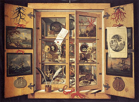
Cabinet of Curiosities (c. 1690s) by Domenico Remps.
• “…the human voice is an astonishing landscape”. Jeremy Allen on Desert Equations: Azax Attra (1986) by Sussan Deyhim & Richard Horowitz, an album which is being reissued by Crammed Discs with bonus tracks and an inexplicably rearranged track list. Good as it is, their follow-up release from 1996, Majoun, is even better, and might be better known if it hadn’t been so thoroughly abandoned by Sony Classical.
• “On view through May 29, By Her Hand: Artemisia Gentileschi and Women Artists in Italy, 1500–1800 showcases masterpieces done by 17 Italian women to make the case for a broader view of women’s participation in the Italian Renaissance.” Nora McGreevy reports.
• “We had a far more profound effect on society than we really understood, and some of us paid for that”: Jane Lapiner and David Simpson of the San Francisco Diggers talking to Jay Babcock in another installment of Jay’s verbal history of the hippie anarchists.
• “Close your eyes and you could almost imagine it’s the muffled screams of a ghost trapped in a bottle.” Daryl Worthington on 25 years of The Ballasted Orchestra by Stars Of The Lid.
• More Dangerous Visions and New Worlds: Mike Stax talks with Michael Moorcock about music, science fiction, politics, and their intersections in the 1960s.
• “Cormac McCarthy to publish two new novels.” Oboy oboy.
• At Dennis Cooper’s: Larry Gottheim Day.
• Metal Machine Music For Airports
• Music For Meditation I (1973) by Eberhard Schoener | Music For Evenings (1980) by Young Marble Giants | Music for Twin Peaks Episode #30 (Part I) (1996) by Stars Of The Lid
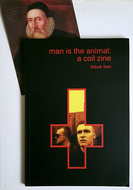
Man is the Animal, issue two
Postcard not included.
In the post this week, the second issue of the Coil zine, Man is the Animal. 64 pages of esoteric exploration, plus a portrait of everyone’s favourite Elizabethan magus, Dr John Dee.
Contents:
A Slip (or a Jump) In Beverley Road by Nick Soulsby
Letter to the Esoteric Order of Dagon by John Balance
Towards a Magickal Appreciation of Coil by Patrick Weir
Agapanthus: Four Poems for John Balance by Jeremy Reed
The Chaosphere by Stephen Sennitt
Shakespeare, Jarman, Coil: A Conversation by Cormac Pentecost
Everything Keeps Dissolving by Sheer Zed
Previously on { feuilleton }
• Man is the Animal: A Coil Zine
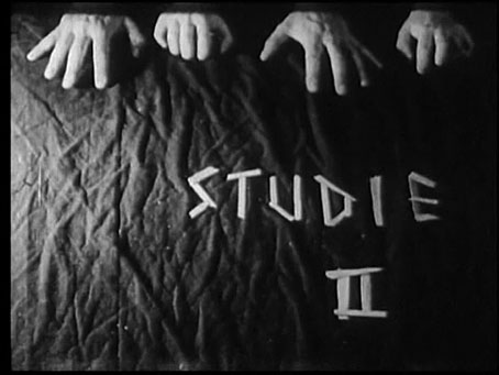
Study II (Hallucinations) by Peter Weiss
If you hadn’t noticed by now, this year is the centennial anniversary of the publication of Ulysses and The Waste Land. It’s also a centenary year for the Surrealist movement although the same could be said of last year and the next couple of years when Surrealism, like most art movements, doesn’t have a definite point of departure. Apollinaire first coined the term in 1917, after which it became attached by a process of accretion to some of the moves being made in the wake of Dada. André Breton and Philippe Soupault’s collection of automatic writing, The Magnetic Fields, was published in 1920 but it would be another four years before the appearance of the first Surrealist manifesto, and there were two of those produced by rival groups within a few weeks of each other as a result of the childish factionalism that plagued the movement from the outset.
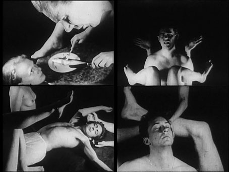
Anyway, Study II (Hallucinations) (1952) is a short film that can be regarded as Surrealist even if it wasn’t intended as such. I didn’t know playwright Peter Weiss had made any films but then I only really know him at all from his extraordinary Marat/Sade. Study II is a long way from Marat/Sade in both form and content, being an attempt to capture the fleeting impressions that enter the mind before the onset of sleep. The juxtaposition of naked figures and isolated body parts is reminiscent of many Surrealist paintings or collages, although filmed tableaux such as these are seldom as effective as still images or animated ones when there’s always the distracting awareness of watching people holding an awkward pose. But Weiss’s film would suit a screening with similar Surrealist shorts, especially Eric Duvivier’s La femme cent têtes, another display of awkward poses and hallucinatory moments.
Previously on { feuilleton }
• The Marat/Sade
Clichés & Gravures
The clichés we have here aren’t the verbal variety but those which the OED defines as:
1. The French name for a stereotype block; a cast or ‘dab’; applied esp. to a metal stereotype of a wood-engraving used to print from. Originally, a cast obtained by letting a matrix fall face downward upon a surface of molten metal on the point of cooling, called in English type-foundries ‘dabbing’.
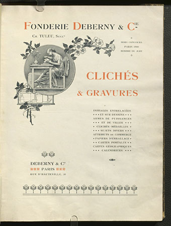
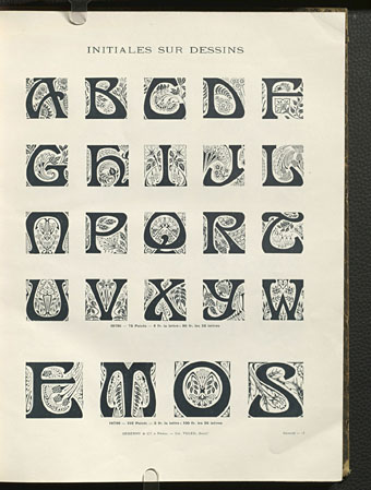
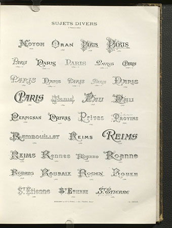
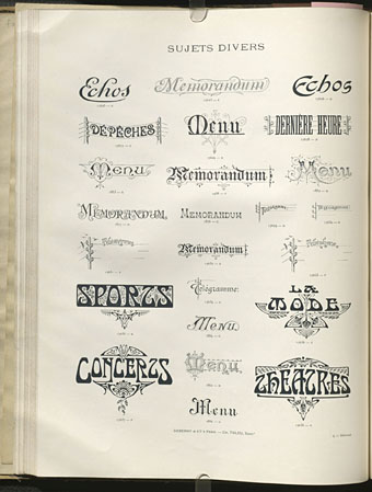
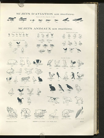
Clichés & Gravures is a two-volume collection (Volume 1 and Volume 2) of emblems, icons, small illustrations, initials, headings, frames and other print details published by the Deberny type foundry in 1912. Carol Belanger Grafton’s 3,800 Early Advertising Cuts is an edited selection of the same images which Dover Publications added to their Pictorial Archive series in 1991. I’ve been borrowing from Ms. Grafton’s book for many years, during which time I’ve wondered what might have been omitted from her selection. Once again the Internet Archive turns up the goods. The Dover reprint gives no indication that Deberny’s collection ran to two volumes and included colour printing in the second volume, plus a few pages of type designs; the Art Nouveau-styled design shown below is one that I can find immediate use for. If all of this somehow wasn’t enough, there are yet more clichés et gravures (and a lot more typefaces) in this type catalogue which Deberny published a few years later.