 Reworking the illustrations of the standard fifty-two card playing deck has become quite a common thing in recent years with numerous themed decks being produced in costly limited editions. The same goes for decks of Tarot cards which have now been mapped across a number of different magical systems and produced in sets that often add little to the philosophy of the Tarot but merely vary the artwork. This wasn’t always the case, and certainly not in the 1940s when André Breton and a group of fellow Surrealists produced designs for a fascinating deck of cards that hybridises the Tarot and the more mundane pack of playing cards in an attempt to create something new.
The Jeu de Marseilles was named after the city of its creation, and it’s no coincidence that one of the most well-known medieval Tarot designs is the Marseilles deck. Breton and his artist friends—Wifredo Lam, Max Ernst, Jacqueline Lamba, Oscar Dominguez, Victor Brauner, Jacques Hérold, André Masson and Frédéric Delanglade—were stranded in the French port along with many other artists, writers and intellectuals attempting to escape Nazi-occupied Europe and gain passage to the America. The creation of the card deck became a way of passing the time during several months of anxious waiting.
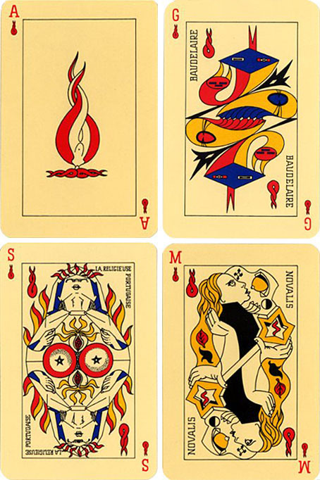
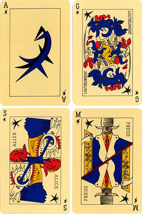
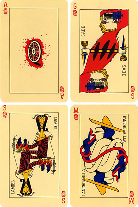
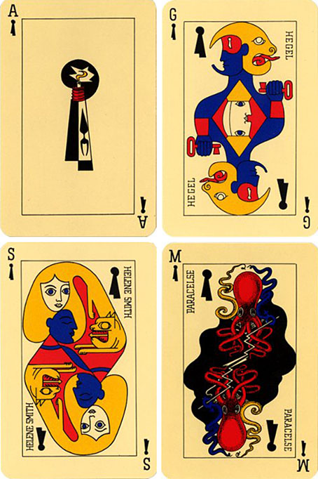
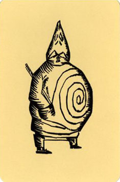
Typically for a group that had already spent a decade analysing and deconstructing all available artistic media, it wasn’t enough to merely redecorate an existing pack of cards, Breton wanted a thorough reinvention along Surrealist principles. So the traditional suits were renamed accordingly: Flames (red) for love and desire, Stars (black) for dreams, Wheels (red) for revolution, and Locks (black) for knowledge. Even though the number of cards was kept at fifty-two, this highly symbolic structure places the deck closer to the Tarot arrangement of Wands, Cups, Swords and Discs, rather than the usual Clubs, Hearts, Spades and Diamonds. Breton’s socialist sympathies meant that having a royal hierarchy of King and Queen lording it over a humble Jack was quite unacceptable; these were subsequently re-named Genius, Siren and Magus. Again, the name Magus here is interesting for the added occult reference it gives to the design. Alfred Jarry’s grotesque Pa Ubu (above) was nominated as the Joker.

Flames: Ace; Genius: Baudelaire; Siren: Mariana Alcofardo; Magus: Novalis.

Stars: Ace; Genius: Lautréamont; Siren: Alice (from Lewis Carroll); Magus: Freud.

Wheels: Ace; Genius: De Sade; Siren: Lamiel (from Stendhal); Magus: Pancho Villa.

Locks: Ace; Genius: Hegel; Siren: Hélène Smith; Magus: Paracelcus.
The Jeu de Marseilles was eventually produced as a proper deck of cards (with the original sketches being reworked slightly) and has been reprinted several times since. Copies can still be found at reasonable prices from specialist card dealers.
Thanks to Eroom Nala for research assistance!



 Reworking the illustrations of the standard fifty-two card playing deck has become quite a common thing in recent years with numerous themed decks being produced in costly limited editions. The same goes for decks of Tarot cards which have now been mapped across a number of different magical systems and produced in sets that often add little to the philosophy of the Tarot but merely vary the artwork. This wasn’t always the case, and certainly not in the 1940s when André Breton and a group of fellow Surrealists produced designs for a fascinating deck of cards that hybridises the Tarot and the more mundane pack of playing cards in an attempt to create something new.