Alex in the Chelsea Drug Store
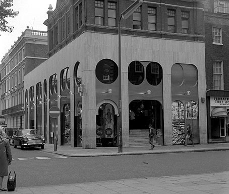
The Chelsea Drug Store, 49 King’s Road, London, circa 1970.
“I went down to the Chelsea Drug Store,”
“To get your prescription filled…”The Rolling Stones, You Can’t Always Get What You Want, 1969
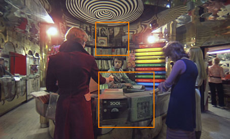
How much Stanley Kubrick trivia can you stand? One of the delights of DVD over VHS tape is the ability to step frame by perfect frame through any given film sequence without the picture being disturbed by noise. This reveals a lot more detail should you wish to scrutinise a favourite scene such as the dolly shot in A Clockwork Orange where Malcolm McDowell makes a circuit of the “disc-bootick” before chatting up a couple of devotchkas.
The scene was filmed in the then very trendy Chelsea Drug Store on the corner of Royal Avenue and the King’s Road, London SW3. In 2001: A Space Odyssey (1968) the world as it might be forty years was created with models and some elaborate and expensive sets. For the more satirical A Clockwork Orange Kubrick adopted the same approach as Jean-Luc Godard in Alphaville, with carefully-selected views of the contemporary world standing for a fictional future. There’s no attempt made in this scene to disguise any of the cultural products of 1970, the year it was filmed.
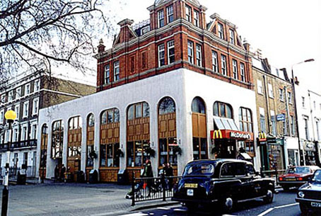
The location as it is today, rendered safe and banal courtesy of McDonald’s.
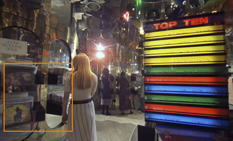
Throughout the 1980s and 1990s A Clockwork Orange was unavailable in Britain in any form due to a bizarre embargo by the director. This means that Kubrick enthusiasts like myself who were too young to have seen the film in the cinema had to rely on bootleg videos of depressingly limited quality (often copies of copies) that did no justice to John Alcott’s superb photography or to Wendy Carlos’s electronic soundtrack. Especially frustrating was spotting Tim Buckley’s Lorca album on one of the shelves in the record shop scene but not being able to make out what else might be there. This might seem like a rather fatuous complaint but there aren’t many places you find such a pristine snapshot of a British record emporium in the early 70s. More to the point, with a clearer view you have a chance here to enjoy some sly Kubrick humour. So what does the DVD reveal?
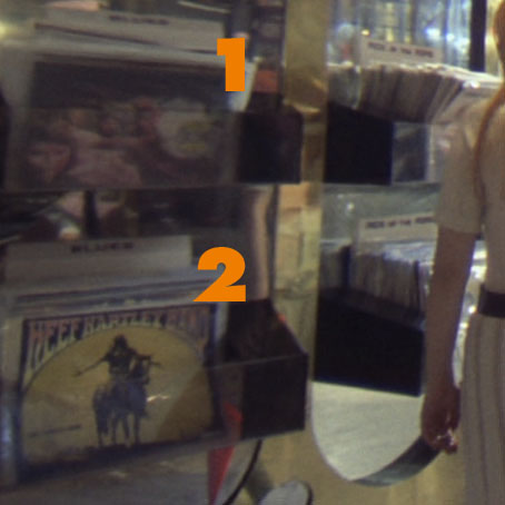
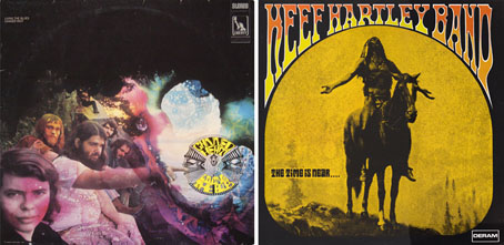
Before Alex appears we can see two albums in the racks, Livin’ the Blues by Canned Heat and The Time is Near… by the Keef Hartley Band.
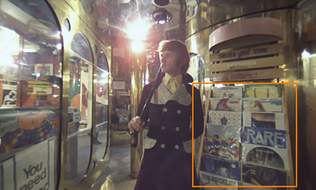
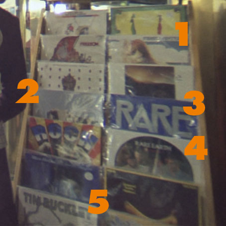
When Alex wanders in he passes a large rack of albums, some of which elude my occasionally sketchy knowledge of 70s’ rock. I can recognise these: 1) U by The Incredible String Band, 2) Atom Heart Mother by Pink Floyd, 3) As Your Mind Flies By by Rare Bird, 4) Get Ready by Rare Earth and 5), the one that started it all, Lorca by Tim Buckley.


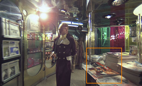
Alex passes a booth stacked with magazines and newspapers. The one at the lower right is a popular film magazine of the time, Films and Filming.
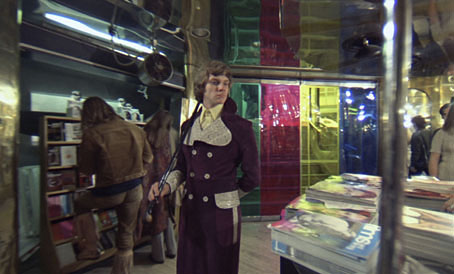
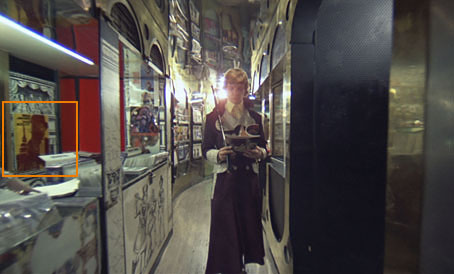
He passes the other side of the magazine booth, selects a magazine and leafs through it while he walks. I’d never paid much attention to this before until I was stepping through the scene again and recognised the cover as a copy of Cinema X (The International Guide for Adult Audiences), an exploitation mag that existed solely to show people stills of nude scenes in current films. This is Kubrick’s first joke since Cinema X is exactly the kind of title that would attract Alex’s attention even though he discards it a few moments later.
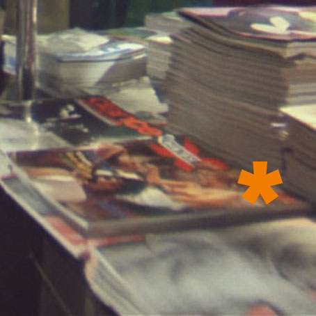
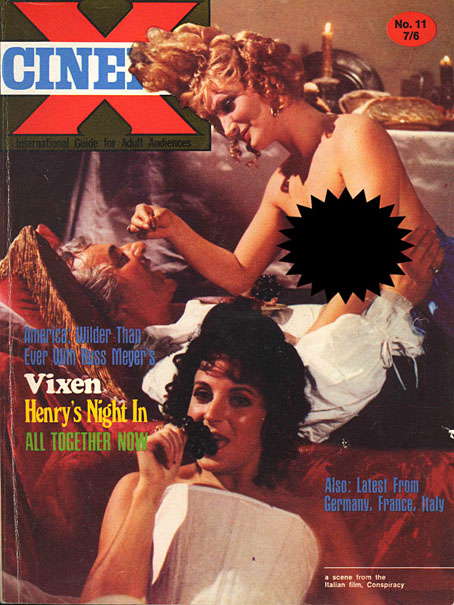
Cinema X, vol. 2, #11 (1970).
The magazine above is the issue Alex selects (minus the censored boobs). The logo was easy to spot because I own the issue (below), volume 4, no. 6, which has as its main feature…A Clockwork Orange.
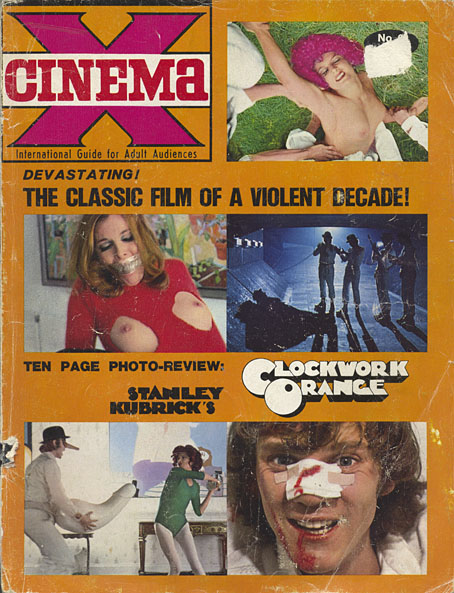
Cinema X, vol. 4, #6 (1972).
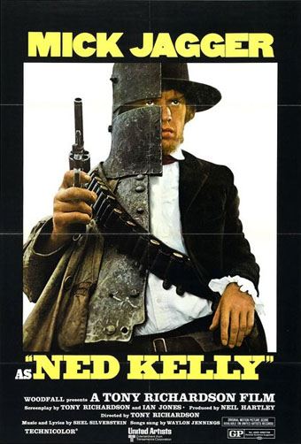
Alex leafs through the mag and passes a poster for Ned Kelly, a film starring Mick Jagger who’d sung about the Chelsea Drug Store only a couple of years before. No idea how I recognised this, it was a lucky guess.
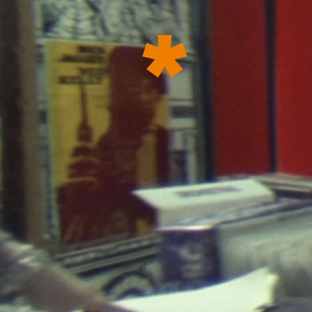
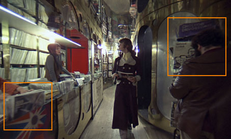
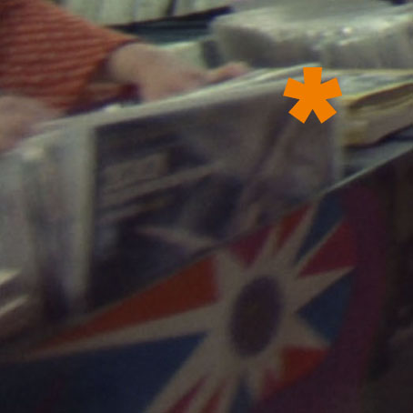
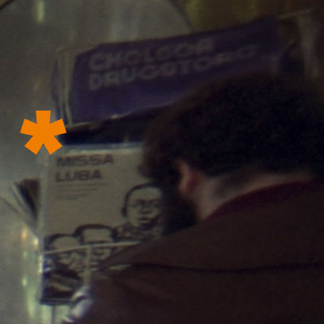
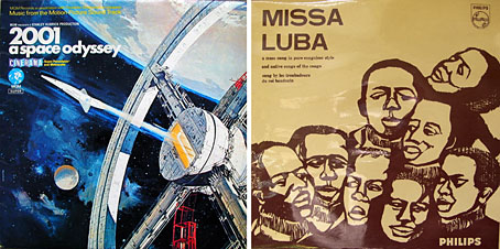
Two more Kubrick jokes: on the left there’s a copy of the soundtrack to SK’s earlier film 2001: A Space Odyssey at the front of the album racks. On the right there’s a gentleman who many people assume is the director although I believe this has been soundly refuted. Besides his face there’s another joke, the sleeve of the Missa Luba album by Les Troubadours du Roi Baudouin, an album of gospel songs sung by an African school choir that was released in 1959. The ‘Sanctus’ song from side two was played throughout Lindsay Anderson’s film If…. which featured Malcolm McDowell in his first major role playing another figure of rebellion. It was this role that landed him the lead in A Clockwork Orange.
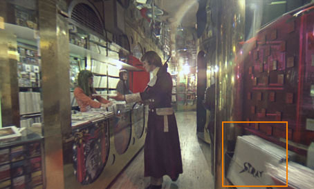
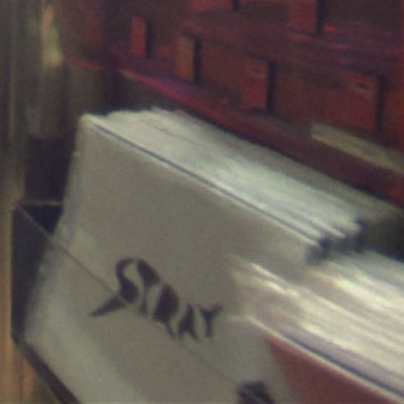
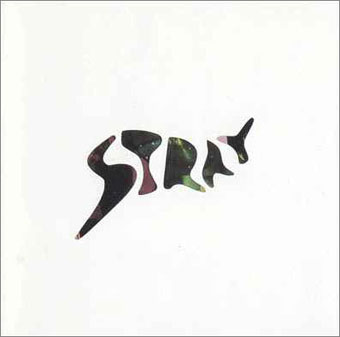
Alex ditches his Cinema X and passes a copy of the debut album by British rock trio Stray.
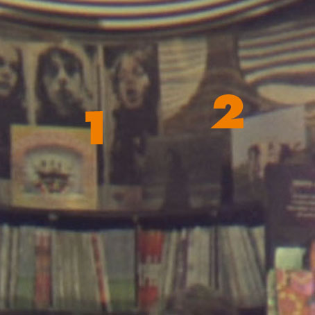
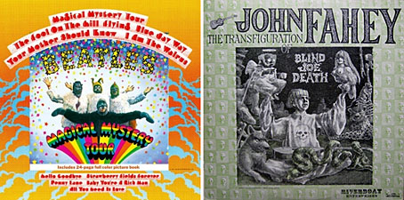
Arriving at the record booth we can see a number of albums on display. On the upper shelves there are copies of Magical Mystery Tour by The Beatles and another copy of Pink Floyd’s Atom Heart Mother. In the racks at the front there’s a more prominently displayed copy of the 2001 soundtrack (in a different sleeve) next to John Fahey’s “fake” blues album, The Transfiguration of Blind Joe Death.
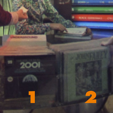
Might there be a reason for placing Fahey’s not-at-all futuristic blues record next to the 2001 soundtrack? How about this: one of the songs on Fahey’s album is Bicycle Made For Two (aka Daisy Bell), the very thing that the HAL 9000 computer famously recites when it’s being shut down.
Lastly, that big graphic swirl above the booth is the symbol of the Vertigo record label.
Places like the Chelsea Drug Store were the magical homes of music before the corporations moved in and turned high street stores into warehouses flogging albums in bulk. In this scene at least A Clockwork Orange serves less as a warning of the future and more as a window on a world that’s disappeared.
Update: All the images have been upgraded from a Blu-ray edition of the film.
Elsewhere on { feuilleton }
• The album covers archive
April moonlight
The art of Peter Milton
From his Hidden Cities series.
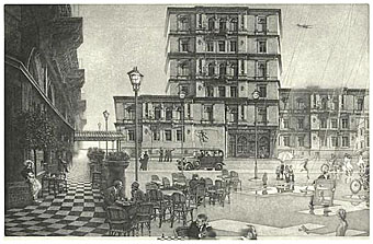
Hidden Cities I: The Ministry (2003).
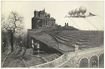
Hidden Cities II: Embarkation for Cythera (2004).
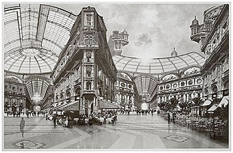
Hidden Cities III: Continuum (work in progress) (2005).
Elsewhere on { feuilleton }
• The etching and engraving archive
Borges in Performance
Favourite book by favourite author in favourite film; does intertextuality get any more heavenly? When are Warner Brothers going to do the right thing and release this on DVD?
