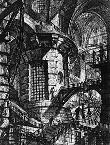
I scanned this essay years ago from a library copy of a 1949 edition of Piranesi’s Carceri d’Invenzione (Trianon Press, London). It’s worth reproducing here since it’s still one of the best analyses I’ve read of these fascinating and enigmatic drawings. Online reproduction quality of Piranesi’s work is dismayingly low for the most part. And nothing matches seeing these etchings in their original printed state, of course. But you can start here then search around for more.
AT THE TOP OF THE MAIN STAIRCASE in University College, London, there stands a box-like structure of varnished wood. Somewhat bigger than a telephone booth, somewhat smaller than an outdoor privy. When the door of this miniature house is opened, a light goes on inside, and those who stand upon the threshold find themselves confronted by a little old gentleman sitting bolt upright in a chair and smiling benevolently into space. His hair is grey and hangs almost to his shoulders; his wide-brimmed straw hat is like something out of the illustrations to an early edition of Paul et Virginie ; he wears a cutaway coat (green, if I remember rightly, with metal buttons) and pantaloons of white cotton, discreetly striped. This little old gentleman is Jeremy Bentham, or at least what remains of Jeremy Bentham after the dissection ordered in his will—a skeleton with hands and face of wax, dressed in the clothes that once belonged to the first of utilitarians.
To this odd shrine (so characteristic, in its excessive unpretentiousness, of that nook-shotten isle of Albion) I paid my visit of curiosity in company with one of the most extraordinary, one of the most admirable men of our time, Albert Schweitzer. Many years have passed since then; but I remember very clearly the expression of affectionate amusement that appeared on Schweitzer’s face, as he looked at the mummy. “Dear Bentham!” he said at last. “I like him so much better than Hegel. He was responsible for so much less harm.” And of course Schweitzer was perfectly right. The German philosopher was proud of being tief, but lacked the humility which is the necessary condition of the ultimate profundity. That was why he ended up as the idolater of the Prussian state, as the spiritual father of those Marxian dogmas of history, in terms of which it is possible to justify every atrocity on the part of true believers, and to condemn every good or reasonable act performed by infidels. Bentham, on the contrary, had no pretensions to tiefness. Shallow with the kindly, sensible shallowness of the eighteenth century, he thought of individuals as real people, not as trivial bubbles on the surface of the river of History, not as mere cells in the brawn and bone of a social organism, whose soul is the State. From Hegel’s depths have sprung tyranny, war and persecution; from the shallows of Bentham, a host of unpretentious but real benefits—the repeal of antiquated laws, the introduction of sewage systems, the reform of municipal government, almost everything sensible and humane in the civilisation of the nineteenth century. Only in one field did Bentham ever sow the teeth of dragons. He had the logician’s passion for order and consistency; and he wanted to impose his ideas of tidiness not only on thoughts and words, but also on things and institutions. Now tidiness is undeniably a good—but a good of which it is easily possible to have too much and at too high a price. The love of tidiness has often figured, along with the love of power, as a motive to tyranny. In human affairs the extreme of messiness is anarchy, the extreme of tidiness, an army or a penitentiary. Anarchy is the enemy of liberty and, at its highest pitch, so is mechanical efficiency. The good life can be lived only in a society in which tidiness is preached and practised, but not too fanatically, and where efficiency is always haloed, as it were, by a tolerated margin of mess. Bentham himself was no tyrant and no worshipper of the all-efficient, ubiquitous and providential State. But he loved tidiness and inculcated the kind of social efficiency which has been and is being made an excuse for the concentration of power in the hands of a few experts and the regimentation of the masses. And meanwhile we have to remember the strange and rather alarming fact that Bentham devoted about twenty five years of his long life to the elaboration in minutest detail of the plans for a perfectly efficient prison. The panopticon, as he called it, was to be a circular building, so constructed that every convict should pass his life in perpetual solitude, while remaining perpetually under the surveillance of a warder posted at the centre. (Significantly enough, Jeremy Bentham borrowed the idea of the panopticon from his brother, Sir Samuel, the naval architect, who, while employed by Catherine the Great to build ships for Russia, had designed, a factory along panoptical lines, for the purpose of getting more and better work out of the industrialised mujiks.) Bentham’s plan for a totalitarian housing project was never executed. To console him for his disappointment, the philosopher was granted, by Act of Parliament, twenty-three thousand pounds from the public funds.
Continue reading “Aldous Huxley on Piranesi’s Prisons”




 Cockfighter