Herald of Ruin

herald1.jpg

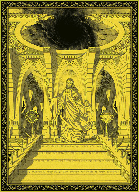
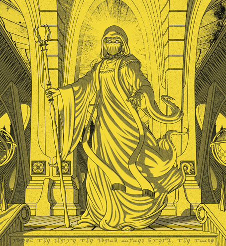
New year, new book cover. Herald of Ruin is my latest for Aconyte, a sequel to Tim Pratt’s The Ravening Deep, which featured my last cover in this series of novels spun from the Arkham Horror games:

Chaos is coming to Arkham, and its herald is Randall Tillinghast. The dapper older gentleman has recently arrived in the city and his establishment of a new occult bookshop draws the ire of Carl Sanford, the head of Arkham’s secret, esoteric order, the Silver Twilight Lodge.

Sanford expects to crush the newcomer like an ant and take what he wants from the wreckage… but Randall Tillinghast isn’t quite as humble and harmless as he seems. In possession of an array of magical artifacts, Tillinghast begins to consolidate his dreams of power before turning his sights on the Lodge.

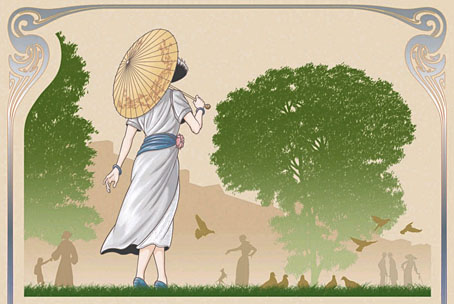
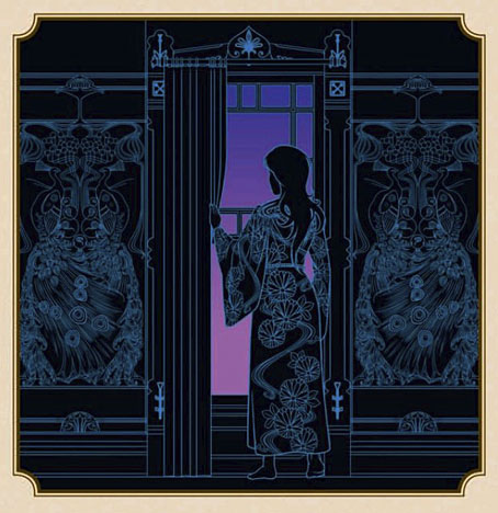
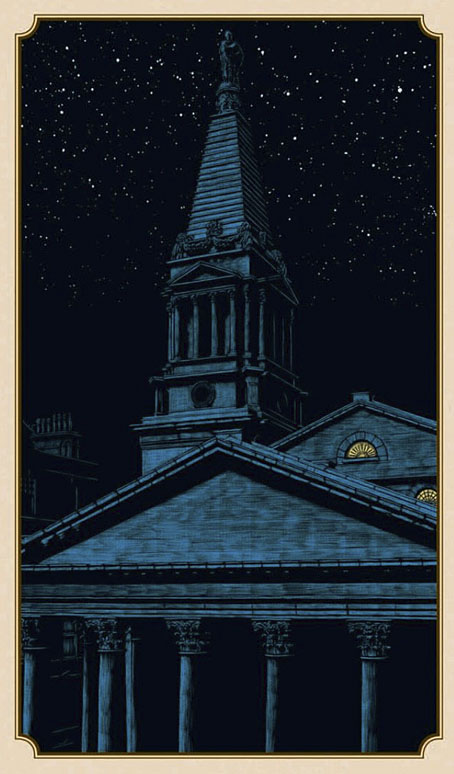
All six covers to date have followed a similar style, combining Art Deco graphics with various kinds of Lovecraftian weirdness, views of significant architecture and pictures of the main characters. With the new book being a sequel the cover was designed as an inverse companion to The Ravening Deep. The general structure is the same but with earth tones replacing the aquarian colours, and with the character shots and interlaced septagram flipped around.

herald2.jpg

That towering edifice in the background is supposed to be the city of Sarnath which I spent some time drawing even though I knew most of it was going to be covered over. The way I work I often have to do this since I like to create all the different elements with only a vague composition in mind, after which I can shuffle things around until they assume a satisfying appearance. I also like to keep my options open in the early stages. This is something you can do more easily in Illustrator than in Photoshop, the Illustrator interface being an artboard upon which you assemble the various components of your design. Vector graphics aren’t always ideal when you’re trying to create something this complex, but the hard edges suit the Deco style and the general appearance which is more of a poster design than a picture window.

herald3.jpg

Among the other details, the eye-in-a-triangle, a device I’ve used a lot in the past, was prompted by the source material for a change. And the woman’s face is based on a photo of Musidora, one of the stars of early silent cinema in her role as Irma Vep from Feuillade’s Les Vampires (1915–16). The visual source for this character wasn’t very informative but she’s a cat burglar, and Feulliade’s serial happens to concern a group of Parisian cat burglars. I think Irma Vep may have been the first cat-burgling woman in cinema history so Musidora was a good choice with the right look for the cover.

Herald of Ruin will be published in July.

Elsewhere on { feuilleton }
The Lovecraft archive

Previously on { feuilleton }
The Ravening Deep
Diamonds
The Devourer Below
Litany of Dreams
The Last Ritual

A Wizard with a Pen

wizard.jpg

The wizard is Mr Alan Moore who celebrated his 70th birthday last month. This piece is my contribution to Alan Moore: Portraits of an Extraordinary Gentleman, a birthday book put together by Smoky Man, curator of the Alan Moore World blog:

This 150-page volume contains short essays, memories and portraits by 50+ contributors including Gary Spencer Millidge (cover), Iain Sinclair (foreword), Peter Hogan (afterword), Paul Gravett, Russell Willis, John Coulthart, Koom Kankesan, Gene Ha, Zander Cannon, Hilary Barta, Jacen Burrows, Eduardo Risso, Hunt Emerson, and more…

100% of the net profits proceed from this book are to be donated to the NGO Doctors Without Borders. (more)

The book is a print-on-demand production via Amazon so anyone interested in a copy should click the above link which will direct you to a regional outlet. I’d have preferred the printing to have avoided Bezos’s feudal empire but the decision wasn’t mine to make.

As for the artwork, after spending the past couple of years looking for examples of the style I refer to as “the groovy look” I’d been itching to do something similar myself. Alan happens to enjoy this look as well—see all those Promethea covers, especially the one for issue 16 which nodded to Peter Max. Alan also likes the Beatles’ psychedelic years so my portrait is a riff on the Yellow Submarine art style: small head, big feet, and the same Kabel typeface they used for the film titles. The garment pattern is the Art Nouveau wallpaper design by André Morisset that I resurrected last year, and which I’ve been using in another project that’s yet to see the light of day. More about that later.

Previously on { feuilleton }
32 Short Lucubrations Concerning Alan Moore
Voice of the Fire by Alan Moore
The Blake Video
The Cardinal and the Corpse
Mapping the Boroughs
Art is magic. Magic is art.
Alan Moore: Storyteller
Alan Moore: Tisser l’invisible
Dodgem Logic #4

Quicksilver

quicksilver1.jpg

Letraset rub-down sheet, 1977.

Work-related research this past week had me looking for old Letraset fonts like Quicksilver here, one of the foundry’s many quirky type designs from the 1970s whose novelty inspired brief flushes of popularity before they were replaced by trendier designs. Quicksilver, which first appeared in 1976, has been lodged in my memory since I first saw it in a Letraset catalogue that was one of only two books lurking in a cupboard in the art room at school. (The other was a much-thumbed copy of The World of MC Escher.) The catalogue fascinated me because it revealed that these unusual typefaces could be identified by name: Data 70, Block Up, Pluto, Shatter, etc. I already knew that typefaces had names, of course, thanks to the occasional notes you’d find in paperbacks telling you that the book was set in 11pt Plantin or similar; but in the days before computers made everyone a lot more familiar with typography the typesetting business was a remote and mysterious world. Information about new type designs wasn’t easy to find unless you had access to the latest design magazines or a well-stocked library. The further realisation, that typefaces were designed by individuals who also had names, came later.

quicksilver3.jpg

Quicksilver was designed by Dean Morris who was only 16 at the time he sent off his design to Letraset:

The name Quicksilver was my second choice, however. Letraset Englishly felt that my first choice, ‘Polished Sausage’, would be ‘rather unpopular in foreign markets’. I designed it as a 16-year-old kid at John Glenn High School in Bay City, Michigan (born in Mercy Hospital 3 months after Madonna), and sent Letraset a xerox of a tight marker sketch of 3″ letters letterspaced with the heavy outlines slightly overlapping as I originally intended. I drew only a skinny S without an alternate, and submitted no punctuation. I knew nothing about submitting typeface artwork and I assumed there’d be, you know, discussion.

But Letraset wanted it, and they must have wanted it REAL FAST (fifties nostalgia and disco were WHITE HOT then, remember), because they sent a letter and contract soon after, and they did the finished art themselves at 5″ high (they can’t have known my age, maybe they had no confidence in my technical skills), starting with the E as did I in the design stage. And what a gorgeous rendering job they did in the pre-Mac days of ruling pens, straight-edges, and compasses (they shunned rapidographs!) — and they hand retouched the curves where they met the straight lines! Letraset sent a 5″ sample E for approval, but I’m sure they had already drawn all the characters. They followed my sketch very closely, designed the punctuation, and suggested an alternate but weird wide S, which I approved, figuring there was probably no other decent way to design it. I don’t know if the thematically wrong heavy-overlap-line on the P came from me or them. (more)

Morris has a collection of Flickr albums which show how popular the design was in the late 70s and early 80s, especially on record sleeves. It’s probably going a little too far to describe this as “the disco font” but it was certainly popular with the disco crowd. The robot book below is one of the few book covers. I expected there to be many others but Morris’s design might have been regarded as too eccentric for use in the publishing world where readabilty is more of an issue.

quicksilver5.jpg

Cerrone 3 (Supernature) (1977) by Cerrone. Silly cover art but Supernature is a great song.

quicksilver2.jpg

Robots (1978).

quicksilver4.jpg

The Message (1982) by Grandmaster Flash And The Furious Five.

Quicksilver also proved distinctive enough but not too weird (like Block Up, for example) to stay around and find further uses years later, often ironically as tends to happen to type designs that become associated with a particular period or idiom. The font’s bold outline is an unusual feature, one that gives it an advantage over similar designs like Letraset’s later Chromium One which doesn’t read so well at a distance. And I like the shape of the letters, the result of Morris’s determination to shape everything with a single shiny bar.

quicksilver6.jpg

One thing that Quicksilver does share with a handful of its contemporaries from that old Letraset catalogue is a lack of an official digital version. The sample above has been created with Neon Lights, a copy afflicted with poor spacing and inconsistent character sizes. It works if you need something in a hurry but Morris’s design deserves better treatment. As to my use of the font that prompted the Letraset search, this is subject to the usual embargoes so you’ll have to wait a while before seeing the results.

Previously on { feuilleton }
Typefaces of the occult revival

Ash

ash.jpg

Cover art by Clayton Welham.

I’ve been doing the design duties on albums and singles by Emptyset since their first self-titled release in 2009. The latest album from the electronic duo, Ash, is also the 50th release on the Subtext label for which I’ve once again provided a minimal layout. I’ve no idea how the images by Clayton Welham were created, and I’m quite happy not knowing. Ash is available for pre-order ahead of its release next month.

Work announcements here have been rather scarce of late, in part because I’ve been working on a major project which is nearing completion and will no doubt be announced soon. Watch this space.

HP Lovecraft: Tales of Horror

hpl.jpg

Cover design by Jo Obaroswki.

More Lovecraftiana (for a change). Today’s mail included the surprise delivery of these books, a very late arrival since the book was published over a year ago. Well better late than never, I was very pleased to be involved with this one which has been published by Fall River Press, an imprint of Barnes & Noble. The plan was to reprint a small number of Lovecraft stories on colour pages accompanied by my artwork. So the book is also a reprint of many of my earlier Lovecraftian drawings, from the comic strips to more recent illustrations, with the pictures carefully cropped and, in some places, reworked a little to match the stories.

The contents:
• Introduction by Stefan Dziemianowicz
The Call of Cthulhu
The Colour Out of Space
The Haunter of the Dark
The Whisperer in Darkness
The Dunwich Horror
The Thing on the Doorstep

hpl2.jpg

The end result is very impressive. The book is solidly bound in hard covers with the cover art featuring metallic silver ink and gloss highlights. The interior design is by Gavin Motnyk who chopped up and tinted my drawings (with my approval) in a very effective manner. Many of the panels at the end of my adaptation of The Call of Cthulhu were presented with this kind of fragmentation so I was happy to see this extended to other drawings. In addition to presenting the artwork in a new way it also helped compensate for some of the shortcomings in drawings that date back to 1986. Not everything is this old, however. I sent Gavin a copy of my redrawn R’lyeh panorama which has been printed across the endpapers.

For now this is the most substantial collection of my Lovecraft artwork in print. And since it’s being distributed by Barnes & Noble it’s also relatively easy to find (although that title, Tales of Horror, is very similar to other collections). Fall River Press will be publishing another classic horror volume featuring my illustrations towards the end of the year. More about this later.

Elsewhere on { feuilleton }
The Lovecraft archive