Weekend links 520

teleplasmiste.jpg

Cover art by Ethel le Rossignol for To Kiss Earth Goodbye by Teleplasmiste.

• I’ve been listening to London Zoo by The Bug this week so two new releases by The Bug’s beatmaster, Kevin Martin, seem well-timed. Martin’s music isn’t all pummelling rhythms and abrasive noise, he also favours doomy ambience, as demonstrated on his landmark compilation album, Isolationism (1994). The new releases, Frequencies For Leaving Earth, Vols 1 & 2, are isolationist in multiple senses of the word, being further products of lockdown life, with the second volume described as reflecting Martin’s “ongoing obsession with scarce sci-fi scores”.

• “It was designed to run counter to formalist & Hollywood Structuralist definitions & expectations.” M. John Harrison in a discussion about his cycle of Viriconium novels and stories. Harrison’s new novel, The Sunken Land Begins To Rise Again, will be published at the end of this month.

• Mix of the week: 31st May 2020 (Lovecraft 2) by French Rock Sampler, a recording of Warren Hatter’s radio show devoted to French underground, synth and progressive music of the 1970s. The current season may be heard each Sunday at 3pm (London time) on Resonance FM.

This is a very important book. It may even be a historic book, one with which gay history can arm itself with more sufficient factual veracity as to start vanquishing at last the devil known as queer studies. Queer studies is that stuff that is taught in place of gay history and which elevates theory over facts because its practitioners, having been unsuccessful in uncovering enough of the hard stuff, are haughtily trying to make do. […] It is not only breathtaking to read this all in a work the likes of which so many Americans long to have written about our own gay history, but when one finishes reading it, one utters an audible huge sigh of relief. Of course this is how it was! Why did we all not know and accept this instinctively without having to create and/or buy into the Foucaultian and Butlerian (to name but two) nightmares with the obtuse vocabularies they invented and demanded be utilized to pierce their dark inchoate spectacles of a world of their own imaginings. Homosexuality did not exist because there was no word for it, say they. What bushwa.

The late Larry Kramer in 2009 reviewing Before Wilde: Sex between Men in Britain’s Age of Reform by Charles Upchurch

• I mentioned in April that I’d designed the CD and vinyl packaging for Roly Porter’s latest album, Kistvaen. It’s another monumental release, and it’s out now. Hear it for yourself at The Quietus.

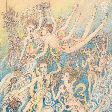
To Kiss Earth Goodbye, the new album from Teleplasmiste, features cover artwork by Ethel le Rossignol, and a previously unheard trance recording of occultist Alex Sanders.

• “It’s impossible to completely quantify the effect of I Feel Love on dance music.” John Doran on Donna Summer and Giorgio Moroder’s finest moment.

• More film lists: 10 great Japanese film noirs selected by Matthew Thrift, and the 15 best Czech horror films selected by Jason Pirodsky.

Mark Blacklock selects a top ten of four-dimensional novels (one of which isn’t a novel at all but a short story by Ian McEwan).

• At Dennis Cooper’s: BDSM.

Angry (2008) by The Bug feat. Tippa Irie | Insane (2008) by The Bug feat. Warrior Queen | Fuckaz (2008) by The Bug feat. Spaceape

The Bomb Squad

bombsquad.jpg

This is the second book cover I’ve designed for Neil Perry Gordon, the first being for The Righteous One which was published in August last year. Both novels have New York City as a location but The Bomb Squad differs substantially from the metaphysical drama of The Righteous One by opening with a real event, the bomb attack in 1916 by German agents on US munitions being stored on Black Tom Island in New York harbour; the bomb squad of the title is the group of men who lead an investigation to prevent further outrages.

Rather than take a figurative approach with this design I opted for a collage of historical details. This seemed a good way of immediately establishing the period and location as well as reflecting the piecemeal nature of police investigations, the accumulation of evidence and so on. Collage also made it possible to include references to some of the locations in the story such as Black Tom Island (from a map at the Library of Congress showing the extent of the bomb damage), the Dakota Building, Ellis Island, etc. The five symbols below the title are from a book of heraldic designs, and relate to the Jungian archetypes which one of the detectives assigns to each member of the squad. The symbols aren’t labelled so the reader can decide which symbol relates to which character.

The Bomb Squad is available now from the usual outlets.

Previously on { feuilleton }
The Righteous One

Hazardous design

watts16.jpg

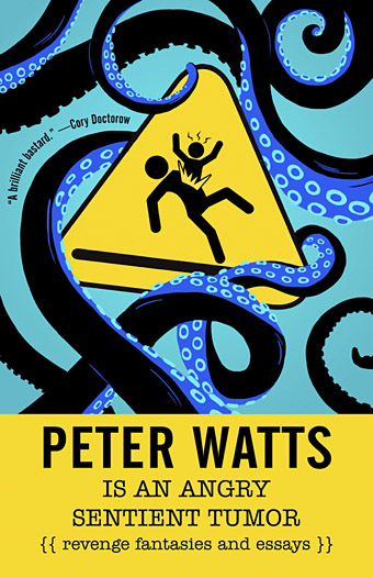
Cover design by Elizabeth Story.

Our present viral moment reminded me that I hadn’t written anything about Peter Watts is an Angry Sentient Tumor, a collection of essays by Canadian science-fiction writer Peter Watts whose interiors I designed for Tachyon last autumn. Watts has a special interest in biology, and several of the pieces in the collection are partly or wholly concerned with pandemics; needless to say, when I was adding a biohazard symbol to one of these pages six months ago I didn’t expect such a situation to be the event that defined the coming year, although for anyone who’s read enough SF (or horror, for that matter), potentialities like this tend to lurk in the back of your mind. Watts’ essays are mostly blog entries—much more substantial ones than the brief things I usually file here—together with a few articles from print sources. The contents range from polemics about police violence and the creeping surveillance state to personal entries covering his late brother, his father’s closeted sexuality, his beloved cats, and a near-fatal experience with a flesh-eating virus. There are also film reviews, scientific speculations and musings/warnings about global calamities, especially the climate variety. His writing is consistently witty, engaging and thought-provoking. The book was a pleasure to read as well as work on.

watts14.jpg

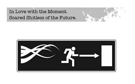
As with other interiors I’ve designed for Tachyon, I took the design cues from the cover, which in this case was the work of Elizabeth Story. The internal graphics are a combination of writhing tentacles and hazard/warning signs, the latter being taken unaltered from public information sets or adapted to suit the content of the piece. In a way they’re a sequel to the Tarot symbols I designed in 2006 based on graphics from the international symbols commonly used in public buildings. The bespoke designs were fun to create, and required some ingenuity in places: how do you show global warming in a simple, wordless symbol? My solution was to put a globe in a frying pan. There are 50 essays in all so the examples shown here represent a fifth of the book.

For an idea of Watts’ writing together with his thoughts about the pandemic, his most recent post is here. He’s not the only person who’s been saying we should expect more events like this one in the future.

watts02.jpg

watts04.jpg

watts05.jpg

Continue reading “Hazardous design”

Double weird

weird1.jpg

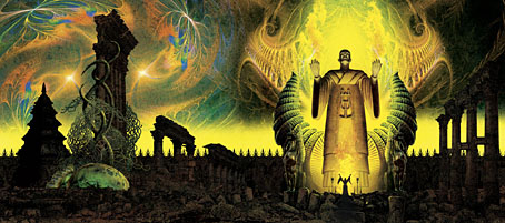
Two of the books whose covers I was working on late last year have been announced so here they are. This is more work for PS Publishing where wraparound covers are the standard, so once again I was able to work in a pictorial, landscape format. (PS also do their design in-house so I only did the art this time. Click on the pictures below for larger views.)

weird2.jpg

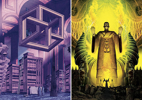
Apostles of the Weird is a collection of contemporary weird fiction edited by ST Joshi:

Weird fiction is an incredibly rich and varied genre, running the gamut from supernatural horror to imaginary-world fantasy to psychological terror. This anthology seeks to exhibit the wide range of themes, motifs, and imagery that weird fiction allows, as embodied in the work of some of the leading contemporary writers in the field. (more)

“Weird” is indeed a very broad category so rather than try and create something that represented a single genre I opted for a weird view instead. The idea was to do something like Borges’s Library of Babel in a space that was a hybrid of Piranesi and MC Escher. I was hoping originally to make this more Escher-like, with a number of gravity-defying staircases, but the underlying drawing took so long that I didn’t have time.

weird3.jpg

His Own Most Fantastic Creation: Stories About HP Lovecraft is also edited by ST Joshi:

HP Lovecraft (1890–1937), the pioneering writer of weird fiction, has himself become an icon in popular culture. Stories, novels, and other works featuring the gaunt, lantern-jawed gentleman from Providence, Rhode Island, have proliferated. These works have been triggered by the incredible amount of knowledge we have on the writer—his family, his friends, his idiosyncrasies and eccentricities—as found in his thousands of surviving letters. (more)

This was much easier to achieve since HP Lovecraft is familiar territory. The idea here was to do a portrait of Lovecraft situated in a Lovecraftian zone, a colossal idol of a type that might be found in some of his Cyclopean ruins. Lovecraft and his Weird Tales colleagues had a habit of referring to each other in their stories and letters as though they were ancient priests or sorcerers so portraying Lovecraft in this manner is fitting. The combination of perspective and lighting worked against creating an accurate likeness, however—it doesn’t help that Lovecraft’s features are weird in themselves—so the “HPL” icon is there to affirm the identity.

Both books will be published next month if Great Cthulhu hasn’t risen from the depths by then.

Elsewhere on { feuilleton }
The Lovecraft archive

Previously on { feuilleton }
Something from Below

A Czech Machen

machen.jpg

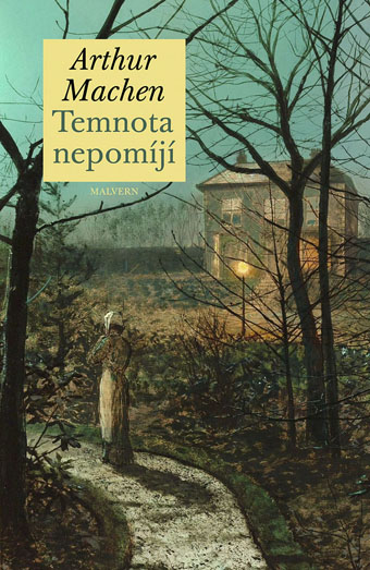
Cover art is a detail from A Woman on a Path by a Cottage (1882) by John Atkinson Grimshaw.

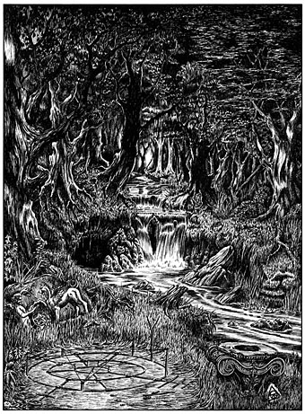
The fiction of Arthur Machen doesn’t inspire a great deal of illustration, probably because his best writing is more concerned with the description of particular places and the feelings those places evoke, rather than the depiction of illustratable scenes or events. I did make the attempt myself, however, when I started a series of illustrations in 1990 that were intended for a Savoy Books edition of The White People. This never materialised for a variety of reasons, and I never finished the series of drawings although the work did yield one picture (below), that I’ve always been pleased with.

whitepeople.jpg

Some of these drawings may now be seen in Temnota nepomíjí, an edition of Machen’s stories from Czech publisher, Malvern, almost all of which are appearing for the first time in translation. I’m told by the translator, Patrik Linhart, that the title in English would be “Darkness is undying”. As for the cover art, I approve the choice of John Atkinson Grimshaw, a painter whose sombre, autumnal views could cover an entire series of Machen books. His work is often seen today in connection with MR James but being a predominantly urban artist his work seems a better match for the Apostle of Wonder.

Previously on { feuilleton }
Ibrahim Ineke’s The White People
The White People
The Bowmen by Arthur Machen
Rex Ingram’s The Magician
The Great God Pan