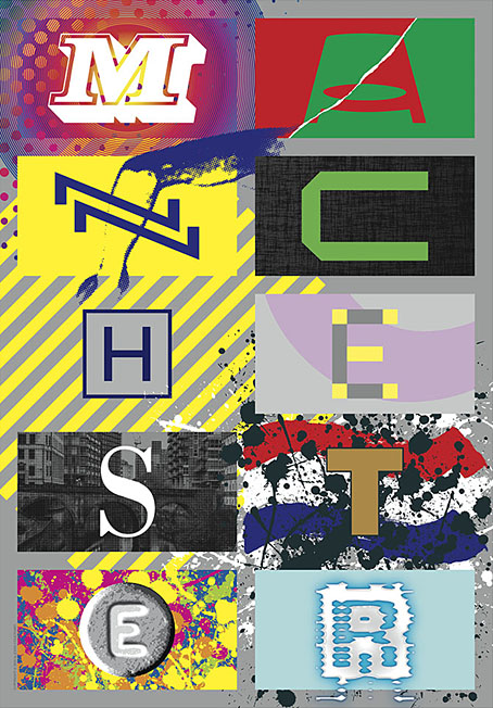
M-A-N-C-H-E-S-T-E-R

manchester.jpg

Presenting a new item for sale at Redbubble. I was intending to upload this quickly then get on with other things, but after examining the artwork it became apparent that the piece would benefit from an overhaul in order to make something that worked well at poster size. The original design dates from 2004 when I was asked by friends at the Manchester District Music Archive to contribute to a limited run of postcards they were putting together based on Manchester’s music history. Since I was working for postcard size I didn’t finesse the artwork as much as I would have done had I been working for a larger printing. What you see here is a replication of the original design at a much larger size, with a couple of details adjusted and a more substantial change in the substitution of the black-and-white photo (see below).

The original postcard set appeared two years before I began writing these posts so I’ve never had the chance to compile a list of all the references. Some of these will be familiar to Mancunians (and many Britons) of a certain age but I was trying to be allusive rather than obvious while also following three simple rules:
1) Ten panels, each one of which contains a different letter of the city’s name in a different typeface.
2) Each panel referring to a different musical trend, a notable group or venue.
3) The whole design to proceed chronologically, from the 1960s to the present day.


M.jpg

The music: Psychedelia.
The type design: Decorated 035.

The first two letters are rather vague attributions since the city didn’t have much of a national musical profile until the late 1970s. Popular Manchester groups of the 1960s included The Hollies, Herman’s Hermits, and The Mind Benders but there wasn’t a discernible Manchester scene the way there was with post-Beatles Liverpool. So “M” stands for the psychedelic era in general, while Decorated 035 is one of the typical mid-century sign fonts that you would have seen around the city.
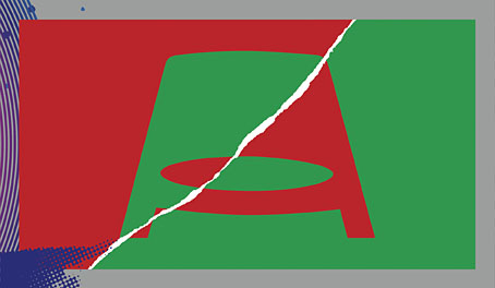

A.jpg

The venue/music: The Apollo Theatre/Punk.
The type design: Jackson.

“A” is for the Apollo Theatre in Ardwick Green, the city’s most prominent music venue in the 1970s, although I doubt that anyone would guess the attribution. The Art Deco building is a good venue but here’s never been anything distinctive about its signage, hence the choice of Jackson, another very decade-specific font which has conveniently wide letterforms. The rip refers to torn posters and punk graphics while the opposed green/red colour scheme is borrowed from one of the Virgin label designs of the late 70s, something that might also be taken as a very tenuous reference to the Virgin Megastore in Market Street.


N.jpg

The music: Buzzcocks.
The type design: A pair of Zs from the cover of Orgasm Addict.

The first Buzzcocks single featured a striking sleeve by Malcolm Garrett (design) and Linder (collage) which provide the graphics here, with the “N” being formed by two letters from the band’s name which was printed vertically on the cover.


C.jpg

The music: Joy Division.
The type design: A letter from the cover of Substance.

Substance
, the first Joy Division compilation, was released in 1988 so this is a little anachronistic but Brett Wickens’ letter is a more recognisable detail than one from the cover of Closer. The textured sleeve of the group’s debut album, Unknown Pleasures, is referred to by the panel background.

Continue reading “M-A-N-C-H-E-S-T-E-R”

Weekend links 768

glitch.jpg

The Mona Lisa as it looks run through the Random Pixelate setting in Glitch Lab.

• “We don’t have enough Dada in this world of too much data. Something is needed to break-through the over-curated simulacrum that is the online world in order to let in a bit of non-artificial light. One way to make a break is through the deliberate cultivation of the glitch.” Justin Patrick Moore on circuit-bending, glitch music and Surrealist composition.

• The seventh installment of Smoky Man’s exploration of The Bumper Book of Magic has been posted (in Italian) at (quasi). There’s an extract in English at Alan Moore World.

• New music: Remember The Clouds by Philippe Deschamp, and Requiem For The Ontario Science Centre by Tony Price.

• Michael Brooke offers suggestions for where to begin with Polish film director Wojciech Has

• At Printmag: A new book shares the artistic odyssey of Iranian designer Farshid Mesghali.

The Letraset Graphic Materials Handbook for the year 1987.

• Steven Heller’s font of the month is Cubo.

• Yet more Polish film posters.

A cat’s eye view of Japan.

• RIP Roy Ayers.

Glitch (1993) by Moody Boyz | Glitch (1994) by Autechre | Glitch (2011) by Brian Eno And The Words Of Rick Holland

Weekend links 766

steam.jpg

The Fantod Pack (1995): a Gorey take on the Tarot deck.

• A happy 100th birthday to Edward Gorey. I was hoping to link once again to Gorey’s appearance on the Dick Cavett Show from 1977 (a rare TV interview) but it’s one of those things that’s no longer available at YouTube. You can always browse Goreyana instead. Meanwhile, there’s this in Scotland: In Gorey Detail: Celebrating An American Friend At Custom House, Leith. A tribute exhibition which is running in Edinburgh for this week only.

• “A blisteringly frank and triple X-rated chat with Peter Berlin”. A blisteringly hyperbolic headline for a discussion between Ted Stansfield and Peter Berlin, the self-invented sex object of the 1970s.

• This week in the Bumper Book of Magic: Smoky Man posts my replies to his questions about the creation of the book’s Rainy Day and Kabbalah sections.

• Tricky’s Maxinquaye was released 30 years ago this month. David Bennun revisited the album five years ago.

• At Colossal: Felines evoke ‘A Floating World’ in Tùng Nâm’s whimsical illustrations.

• New music: Gloam by Emptyset, and The Mount Hibiki Tapes by Mount Shrine.

• Mix of the week: A mix for The Wire by Polonius.

• Steven Heller’s font of the month is Steam.

Last Of The Steam Powered Trains (1968) by The Kinks | Steam Megawatt (1979) by Tod Dockstader | Building Steam With A Grain Of Salt (1996) by DJ Shadow

Kadath and Yog-Sothoth

ys.jpg

Last month I posted an updated version of the Yuggoth collage I created in 1994 for the Starry Wisdom story collection. I didn’t mention at the time that one purpose of the reworking was to freshen the piece for a more ambitious updating of my own Lovecraft book, The Haunter of the Dark, a volume which has now been through two different editions. I’m generally resistant to the temptation to tamper with old artwork, something which is always present when you’re using digital tools. I’d much rather create something new. In the case of The Haunter of the Dark, however, this has felt necessary when the plan for the new edition requires adding a quantity of my more recent Lovecraft-related pieces to the older art. The section of the book titled The Great Old Ones was a collaboration with Alan Moore in which deities and locations from the Cthulhu Mythos were mapped across the Sephiroth of the Kabbalistic Tree of Life. Most of the art for this section was done in 1999 when I’d only been using Photoshop for a couple of years. I was excited by the possibilities the software presented but some of the results look very typical of the period: lots of obvious filtering, and transparent layering of a kind I seldom do today. Since I finished reworking the Yuggoth collage (which happens to be a part of The Great Old Ones section) I’ve also reworked three more pieces: Nyarlathotep, Kadath and Yog-Sothoth. The latter two you see here, Nyarlathotep isn’t quite finished yet. My intention with the new versions has been to retain the idea, and in some cases the composition, of the original, while creating a new piece which avoids the shortcomings of the 1999 versions.

kadath.jpg

Kadath, 2025.

Of the two, the original Kadath was a piece I was never happy with. I hadn’t thought very much about how to represent Kadath beyond having a cluster of buildings in a snowy setting. Lovecraft is evasive about the details but the place is essentially a fantastic palace (or maybe a city) in an icy wasteland. My original version collaged together bits of Indian, Thai and Cambodian architecture which created a definite “exotic” appearance but I was never happy about using identifiable temples in this way. The composition was also rather messy. The new piece also takes the collage route, only this time I’ve used architectural details from some of the pavilions built for the Paris Exposition Universelle of 1900. Several of the themed pavilions built for the exposition were fanciful and fantastic extrapolations of the Beaux-Arts style that don’t resemble anything built before or after. The buildings were also temporary constructions so they’re a lot less identifiable than buildings with a longer history.

yog-sothoth.jpg

Yog-Sothoth, 2025.

As for Yog-Sothoth, this one follows the idea of the original but with better choice of elements and presentation. Once again, details are vague as to Yog-Sothoth’s appearance but I always come back to the description of an inter-dimensional mass of spheres or globes. The original illustration manifested these globes by swiping a variety of globular creatures from Ernst Haeckel’s Kunstformen der Natur, something that worked quite well but the composition could have been better. The new picture follows suit, only this time I’ve borrowed details from another Haeckel book, Die Radiolarien (Rhizopoda radiaria): Eine Monographie (1862), which is less well-known and with illustrations of many more globular or radial organisms than in the other volume.

For the remaining pieces I’m going to be drawing rather than collaging. The results will be posted here in due course.

Elsewhere on { feuilleton }
The Lovecraft archive

Weekend links 761

agate.jpg

• At Bandcamp: Marc Masters on The Curious Case of the Channeled New Age Tape; and Erick Bradshaw’s guide to Nurse With Wound.

• At Public Domain Review: Designing the Sublime – Boullée and Ledoux’s Architectural Revolution by Hugh Aldersey-Williams.

• The fifth installment of Smoky Man’s exploration of The Bumper Book of Magic has been posted (in Italian) at (quasi).

It does not follow that the scientific spirit of empirical inquiry runs against dreaming, and [André] Breton was wrong to think [Roger] Caillois’s investigative methods opposed wonder. Material mysticism led Caillois back to magical thinking, which he expanded further than the Surrealist interest in chance and coincidence as he probed for insights into the order of things. Caillois was equally, perhaps even more, fascinated with magic than the Surrealists, but he wanted to probe what might exist as phenomenally marvelous, beyond the subjective self—he was a scholar of the sacred, and from the episode of the jumping beans onwards, he looked for its character and its workings in actual phenomena. In this sense he was more of a believer—though not in a personal god or a religion. Where Breton exalted the perceiver, Caillois wanted to go beyond these anthropocentric limits.

Marina Warner on the imaginary logic of Roger Caillois

• Mixes of the week: DreamScenes – January 2025 at Ambientblog, and Unrush 093 at A Strangely Isolated Place.

• At Criterion.com: Reincarnations of a Rebel Muse – David Hudson on Delphine Seyrig.

• Old music renewed: Angherr Shisspa (Revisited) by Koenjihyakkei.

• At Dennis Cooper’s it’s Laura Dern’s Day.

Jussi Lehtisalo’s favourite music.

• Lynch music: The Beast (1956) by Milt Buckner | Honky Tonk (Part 1) (1958) by Bill Doggett | Something Wicked This Way Comes (1996) by Barry Adamson