Seeing as we’re living through a period of recurrent paranoia and hysteria, with a whole state of matter being declared dangerous, with people falling under suspicion for not being white, and with events like this a daily occurrence, one can only wonder how we endured thirty years of deadly IRA terrorism in this country without panic in the streets or the nation turning into a police state.
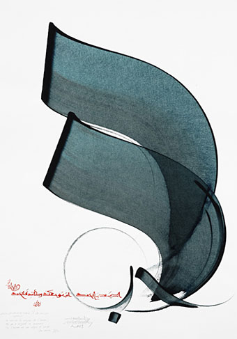
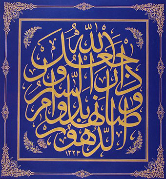
Useful then to be reminded of some of the many positive aspects of Arab culture which is exactly what the Journal of Ottoman Calligraphy is devoted to. This is a new blog so there isn’t much there just yet (although what’s there is gorgeous) but I look forward to seeing what they post in the future.
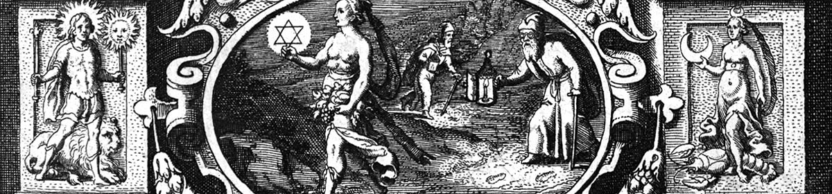
Via the excellent BibliOdyssey.
Previously on { feuilleton }
• Word into Art: Artists of the Modern Middle East