Michael Baurenfeind’s extravagant calligraphy

baurenfeind01.jpg

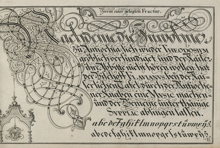
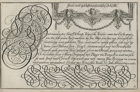
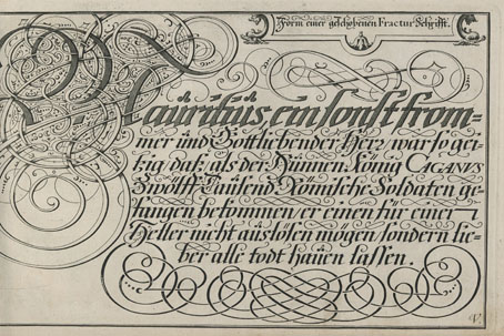
I like extravagant calligraphy, the more extravagant the better, as with these examples from Schreib-Kunst (1716) by Michael Baurenfeind (1680–1753). The book is a recent scan by the Getty Research Institute whose art and design collection includes many similar volumes, although finding the good ones usually means clicking hopefully on blank covers with promising titles. Baurenfeind’s book was published in the middle of the period that extends from the mid-1600s to the mid-1700s when this kind of maximal elaboration of lettering was at its height. Books published later in the 18th century are more devoted to the mastery of careful penmanship, although you still find depictions of calligraphic excess mixed with baroque decoration. These later studies can be very impressive but I prefer the books like Baurenfeind’s which is a demonstration of the calligraphic art pushed to extremes of elaboration and ornamentation. Some of the capitals in this volume are the most excessive examples I’ve seen outside Paul Franck’s Kunstrichtige Schreibart (1655), a book filled with elaborate letterforms which yet seems crude in comparison to many of Baurenfeind’s pages. Baurenfeind goes beyond Franck’s solid black curves to create shaded interlacings that are less examples of calligraphic formation than intricate knotworks that just happen to resemble capital letters.

baurenfeind02.jpg

There’s more of the same in a Baurenfeind book from 1736, also called Schreib-Kunst, which includes several plates that show the construction of the letterforms. Volumes like these are usually showcases rather than instruction guides so this is unusual; Baurenfeind even has a guide to cutting your goose quill before you begin. Having tried writing with a bird’s feather once or twice I wouldn’t recommend it unless you have no other choice. Metal nibs are always better.

baurenfeind03.jpg

baurenfeind04.jpg

baurenfeind05.jpg

Continue reading “Michael Baurenfeind’s extravagant calligraphy”

Weekend links 716

poynter.jpg

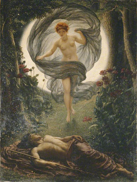
The Vision of Endymion (1902) by Edward John Poynter.

The Art and History of Lettering Comics by Todd Klein. Eight of the pages in the forthcoming Moon & Serpent book have been lettered by Todd.

• At Igloomag: Chang Terhune looks for music to help you sleep. No mention of an obvious (and superior) candidate, Sleep by Max Richter.

• New music: Ghosted II by Oren Ambarchi, Johan Berthling and Andreas Werliin; and The Ship by David Shea.

But unlike macroscopic drugs like cannabis, LSD is so small and so powerful that its consumption almost always requires an inert housing—the water, tablets, sugar cubes, bits of string, or pieces of paper that transport the drug from manufacturer to tripper. In the law, this vehicle is described as the “carrier medium,” an object impregnated with drugs, one that can be sold, seized, presented as evidence, and dissolved into the hearts, minds, and guts of consumers.

When you print images onto a paper carrier medium, you are adding another layer of mediation to an already loopy transmission. Hence, a meta medium, a liminal genre of print culture that dissolves the boundaries between a postage stamp, a ticket, a bubble gum card, and the communion host. This makes blotter a central if barely recognized artifact of psychedelic print culture, alongside rock posters and underground newspapers and comix, but with the extra ouroboric weirdness that it is designed to be ingested, to disappear. Blotter is the most ephemeral of all psychedelic ephemera. It is produced to be eaten, to blur the divide between object and subject, dissolving material signs and molecules into a phenomenological upsurge of sensory, poetic, and cognitive immediacy.

Erik Davis, in an extract from Blotter: The Untold Story of an Acid Medium

• At Wormwoodiana: John Howard on The London Adventure, or, The Art of Wandering by Arthur Machen.

• At Unquiet Things: Hidden Marvels on Your Bookshelf: The Artistic Legacy of Laurence Schwinger.

• “Some intelligent civilizations will be trapped on their worlds”. Evan Gough explains.

• At Vinyl Factory: The Latin-American women of 20th-century electronic music.

• At Dennis Cooper’s: Steve Erickson presents A Black Psychedelia Primer Day.

• At Public Domain Review: Animated Putty by Walter R. Booth.

Vinita Joshi’s favourite music.

Sleepy Theory (1982) by Weekend | Sleep 3 (1995) by Paul Schütze | Sleep Games (2012) by Pye Corner Audio

Weekend links 713

hishida.jpg

Black Cat (1910) by Shunso Hishida.

• “A duck goes quack quack in English but coin coin in French. In Spanish a dog goes guau-guau, not woof woof, while in Arabic it goes haw haw, and in Mandarin wang-wang. In Japanese cats go nyaa, and bees—having no access to the zz sound—go boon-boon.” Caspar Henderson asks “Could onomatopoeia be the origin of language?”

• Coming soon from MIT Press: Blotter: The Untold Story of an Acid Medium by Erik Davis; “the first comprehensive written account of the history, art, and design of LSD blotter paper, the iconic drug delivery device that will perhaps forever be linked to underground psychedelic culture and contemporary street art.”

• At Aquarium Drunkard: The late Damo Suzuki is remembered with a recording of Can playing at the Volkshalle Wagtzenborn-Steinberg, Giessen, October 22, 1971.

• At Unquiet Things: Another collection of Intermittent Eyeball Fodder. I was sorry to hear from that post that artist Dan Hillier had died recently. RIP.

• At Bandcamp Daily: Mouse On Mars discuss 30 years of dynamic electronic music.

• Old music: Rare Soundtracks & Lost Tapes (1973–1984) by Alain Goraguer.

• At Spoon & Tamago: The imaginary architectures of Minoru Nomata.

• Mix of the week: DreamScenes – February 2024 at Ambientblog.

• At Vinyl Factory: Julia Holter on some of her favourite records.

• At Public Domain Review: Wanda Gág’s Millions of Cats (1928).

• Steven Heller’s Font of the Month is Cuatro.

A brief history of London’s gas lamps.

• New music: Pithovirii by Aidan Baker.

Black Cat Bone (2000) by Laika | Black Cat (2005) by Broadcast | Black Cat (2008) by Ladytron

Weekend links 707

genkosai.jpg

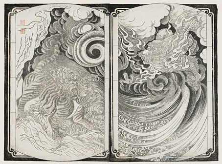
Dragon and Tiger—Designs for Lacquer Inro (no date) by Mori Genkosai.

• “But where have all those copies of Corridor of Mirrors gone? Sometimes I entertain the thought that an obsessive collector has amassed them in his library lined with looking-glasses, so that nobody else can possess the book but he, and he can see them all, multiplied to infinity, as he stalks up and down in his scarlet smoking hat and velvet coat, and gloats.” Mark Valentine on the mysterious unavailability of Corridor of Mirrors (1941), a novel by Chris Massie. The film adaptation made a few years later is one I’ve managed to miss, despite its starring Eric Portman and featuring the first screen appearance of Christopher Lee. Future viewing, I think.

• “The intrepid logician Kurt Gödel believed in the afterlife. In four heartfelt letters to his mother he explained why.” Alexander T Englert explains Gödel’s explanations.

• At Open Culture: Hortus Eystettensis (1613), “the beautifully illustrated book of plants that changed botanical art overnight”.

• Mix of the week: Aquarium Drunkard presents The Secret Hemisphere: New Age, Fusion and Fourth World, 1970–2002.

• New music: Phases Of This And Other Moons by Field Lines Cartographer.

• Why Graphic Culture Matters is a new book of essays by Rick Poynor.

• At Spoon & Tamago: Japanese Designer New Year’s Cards of 2024.

• Steven Heller’s font of the month is Chutz.

• At Dennis Cooper’s it’s Barbara Steele Day.

The Hall Of Mirrors In The Palace At Versailles (1970) by John Cale & Terry Riley | The Hall Of Mirrors (1977) by Kraftwerk | The Room Of Mirrors (2000) by Harold Budd

A Wizard with a Pen

wizard.jpg

The wizard is Mr Alan Moore who celebrated his 70th birthday last month. This piece is my contribution to Alan Moore: Portraits of an Extraordinary Gentleman, a birthday book put together by Smoky Man, curator of the Alan Moore World blog:

This 150-page volume contains short essays, memories and portraits by 50+ contributors including Gary Spencer Millidge (cover), Iain Sinclair (foreword), Peter Hogan (afterword), Paul Gravett, Russell Willis, John Coulthart, Koom Kankesan, Gene Ha, Zander Cannon, Hilary Barta, Jacen Burrows, Eduardo Risso, Hunt Emerson, and more…

100% of the net profits proceed from this book are to be donated to the NGO Doctors Without Borders. (more)

The book is a print-on-demand production via Amazon so anyone interested in a copy should click the above link which will direct you to a regional outlet. I’d have preferred the printing to have avoided Bezos’s feudal empire but the decision wasn’t mine to make.

As for the artwork, after spending the past couple of years looking for examples of the style I refer to as “the groovy look” I’d been itching to do something similar myself. Alan happens to enjoy this look as well—see all those Promethea covers, especially the one for issue 16 which nodded to Peter Max. Alan also likes the Beatles’ psychedelic years so my portrait is a riff on the Yellow Submarine art style: small head, big feet, and the same Kabel typeface they used for the film titles. The garment pattern is the Art Nouveau wallpaper design by André Morisset that I resurrected last year, and which I’ve been using in another project that’s yet to see the light of day. More about that later.

Previously on { feuilleton }
32 Short Lucubrations Concerning Alan Moore
Voice of the Fire by Alan Moore
The Blake Video
The Cardinal and the Corpse
Mapping the Boroughs
Art is magic. Magic is art.
Alan Moore: Storyteller
Alan Moore: Tisser l’invisible
Dodgem Logic #4