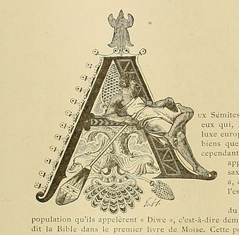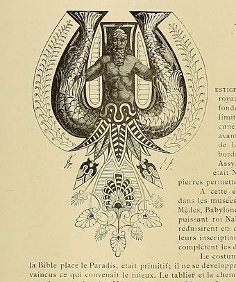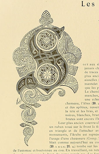
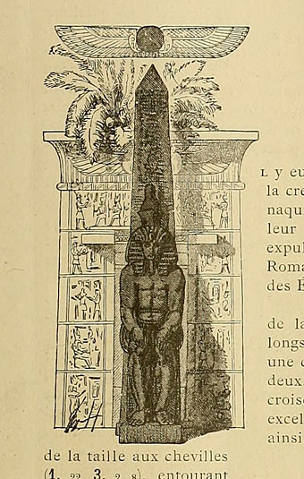
Another gem of a find at the Internet Archive, Le costume, les armes, les bijoux, la céramique, les ustensiles, outils, objets mobiliers, etc. : chez les peuples anciens et modernes (1896) is a lavish two-volume (?) guide to the costumes, artefacts, weapons, etc of various races through the ages. The books were compiled and illustrated by Friedrich Hottenroth (1840–1917) and comprise many detailed coloured plates, but what really caught my attention were the elaborate illuminated capitals used for each of the introductory essays. The common approach in 19th century books is to either have decoration that bears little relation to the content or to apply a single decorative style throughout the book. What’s notable about these designs is the way the style of each letter matches the decorative style of the race or civilisation under discussion. In addition to this feature they’re quite beautifully rendered. The FH initials indicate that they were all Hottenroth’s work. Volume 2 of the set can be found here.
Category: {typography}
Typography
Weekend links 106
Gold Head 2 (2011) by Kouji Oshiro.
• Josef Hartwig’s 1922 Bauhaus chess set. Contemporary copies can be bought from Naef Spiele but they’re not cheap. Related: Bauhaus: Art as Life, a major exhibition at the Barbican, London. Related, related: Art as life by Fiona MacCarthy.
• Rattera is a new font by Barnbrook Design for Fuse 1–20, Taschen’s collection of the experimental typography publication. Related: The Fuse poster explained.
• Genesis (1981), video feedback and computer animation by Ron Hays with an electronic score by Ragnar Grippe.
• Deadly Doris, a recording by Malcolm Mooney-era Can from the forthcoming Lost Tapes collection.
• “How did a pop band end up in a museum” Sasha Frere-Jones on Kraftwerk.
• Philip Glass & Robert Wilson on how they made Einstein on the Beach.
• An astonishing aerial photo of post-quake San Francisco in 1906.
• More electronic music: Buddha Machine’s SoundCloud page.
• My Baby, music and video from Julia Holter & Jib Kidder.
• Homotography‘s photos can now be browsed at Pinterest.
• Deviates, Inc., a Tumblr.
• Raoul Björkenheim live: Apocalypso pt. 1 | Apocalypso pt. 2 | 1-2-11 DMG, NYC
Giovanni Battista Palatino
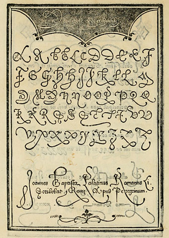
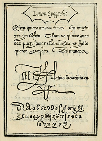
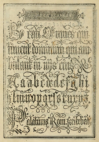
Say the name Palatino today and the only thing it brings to mind for most people is the elegant typeface designed by Hermann Zapf in 1948. Giovanni Battista Palatino (c.1515–c.1575) is the Italian calligrapher from whom Zapf took the name, and the pages here are from a 1550 reprinting of one of Palatino’s sample books, another of those volumes with a sprawling title: Libro di M. Giovambattista Palatino cittadino romano: nel qual s’insegna à scriuere ogni sorte lettera, antica, & moderna di qualunque natione. One of the fascinations for me in going through these old alphabet books is seeing the same designs reprinted down through the centuries until you arrive at the origin of a particular page or design. The third image in this post I have uncredited in a 1997 Pepin Press book of typography; I’ve seen someone wearing it at a gig on a T-shirt, and it turns up in a number of 19th century design books. But this is its origin, and for once the designer receives a credit (although he did sign some of his pages).
Also of interest in this book are the renderings of ancient alphabets. These range from familiar Greek and Hebrew letters to more obscure alphabets some of which resemble a number of occult alphabets that appeared around this time. Agrippa’s Passing the River and the Alphabet of the Magi by Paracelsus in particular look as though they might have been derived from a lettering book such as this.
Weekend links 95
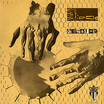
Seven Songs (1982) by 23 Skidoo. Sleeve by Neville Brody.
The first volume of The Graphic Canon will be published in May by Seven Stories Press, a collection of comic strip adaptations and illustrations edited by Russ Kick. The anthology has already picked up some attention at the Guardian—Western canon to be rewritten as three-volume graphic novel—and Publishers’ Weekly—Graphic Canon: Comics Meet the Classics. I know someone who’ll bristle at the lazy use of “graphic novel”. The Graphic Canon isn’t anything of the sort, it’s a three-volume voyage through world literature presented in graphic form with a list of contributors including Robert Crumb, Will Eisner, Molly Crabapple, Rick Geary, and Roberta Gregory. My contribution is a very condensed adaptation of The Picture of Dorian Gray that will appear in volume 2. More about that closer to the publication date.
• LTM Records announces a vinyl reissue for Seven Songs (1982) by 23 Skidoo, an album produced by Ken Thomas, Genesis P Orridge & Peter Christopherson that still sounds like nothing else. Related: an extract from Tranquilizer (1984) by Richard Heslop, cut-up Super-8 film/video with audio collage by 23 Skidoo.
• New exhibitions: Another Air: The Czech–Slovak Surrealist Group, 1991–2011 at the Old Town City Hall, Prague (details in English here), and Ed Sanders – Fuck You / A Magazine of the Arts 1962–1965 at Boo-Hooray, NYC.
• “…we have a situation where the banks seem to be an untouchable monarchy beyond the reach of governmental restraint…” Alan Moore writes for the BBC about V for Vendetta and the rise of Anonymous.
• Announcing Arc: “a new magazine about the future from the makers of New Scientist“. Digital-only for the time being, as they explain here. Their Tumblr has tasters of the contents.
• From another world: Acid Mothers Temple interviewed. Also at The Quietus: Jajouka or Joujouka? The conflicted legacy of the Master Musicians.
• More from Susan Cain on introverts versus extroverts. Related: Groupthink: The brainstorming myth by Jonah Lehrer.
• Ten Thousand Waves, an installation by Isaac Julien.
• Afterlife: mouldscapes photographed by Heikki Leis.
• The book covers of Ralph Steadman. And more.
• “James Joyce children’s book sparks feud”
• Arkitypo: the final alphabet.
• Kundalini (1982) by 23 Skidoo | Vegas El Bandito (1982) by 23 Skidoo | IY (1982) by 23 Skidoo
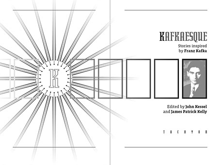
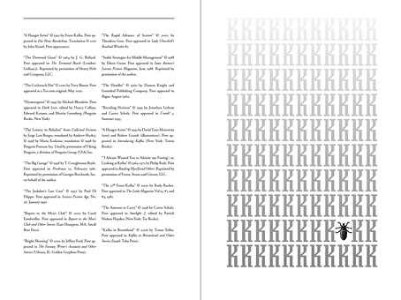
Kafkaesque
Another book design of mine (interiors only) which I completed last September for Tachyon and about which I had this to say at the time:
Kafkaesque [is] edited by John Kessel and James Patrick Kelly. It’s a collection of short stories either inspired by Franz Kafka, or with a Kafka-like atmosphere, and features a high calibre of contributions from writers including JG Ballard, Jorge Luis Borges, Carol Emshwiller, Jeffrey Ford, Jonathan Lethem and Philip Roth, and also the comic strip adaptation of The Hunger Artist by Robert Crumb.
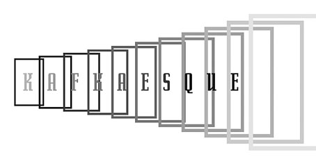
The book gained a positive review at SF Site recently, reminding me that I hadn’t written anything about the design. As with some of my other Tachyon work the interiors take their cue from a pre-determined cover by another designer, in this case Josh Beatman. I followed Josh’s type choices (Senator for the titles and headings) and also extended his use of an insect as a recurrent motif. Before I saw the contents I was fairly determined to avoid any further insect imagery but it became apparent that Kafka’s Metamorphosis is a repeated reference in many of the stories.
As for the recurrent “K”, that seemed inevitable given Kafka’s own use of the letter as well as its presence not only in Kafka’s own name but in the names of the editors. The frames were an idea borrowed from (and referring to) Steven Berkoff’s stage adaptation of The Trial in which portable frames serve on the stage as doorways, windows, corridors, picture frames and so on. I was hoping to do more with this idea but (as is often the case) ran out of time to develop it further.
And while we’re on the subject of Tachyon designs, I don’t seem to have mentioned my interiors for a Joe R Lansdale collection, Crucified Dreams, which also appeared last year. This is a hard-boiled anthology of Lansdale’s favourite stories for which I supplied suitably rough-and-tough graphics comprising scanned scalpel blades and lettering assembled from torn newspaper pages. I’m due to start on some new work for Tachyon this week. More about that at a later date.