Grand capitals

larousse1.jpg

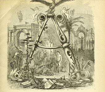
It’s no doubt true to say that they don’t make them like this any more, but it’s also likely that they didn’t make many of them like this in 1866 when the first volume of Pierre Larousse’s Grand dictionnaire universel du XIXe siècle was published. Despite the title this is a 15-volume encyclopedia, each volume of which opens with a spread showing the initial letters of the section that follows. The illustrations fill most of each page, the left-hand side displaying the section initial in letterforms or typefaces from different ages, while the right-hand side embellishes a huge decorated letter with objects or scenes sharing the same initial. These are all in French, of course, so a pig (cochon) sits under the letter C. Illustrated alphabets are an old idea, and still a very common one since they make good teaching aids. Seeing these elaborate examples makes me wonder how far back the idea can be traced.

These pictures are from an incomplete set of the books at the Internet Archive. A more complete set can be found via this Wikipedia page but the scans linked to there are all bitmap images which have lost much of their detail.
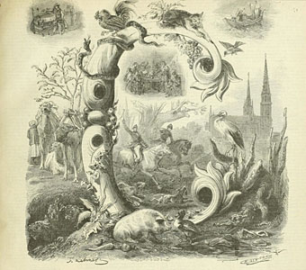
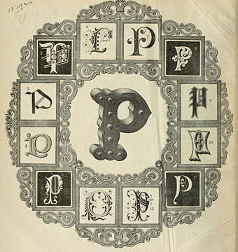
larousse2.jpg

larousse3.jpg

Continue reading “Grand capitals”

Abbeys by MR James

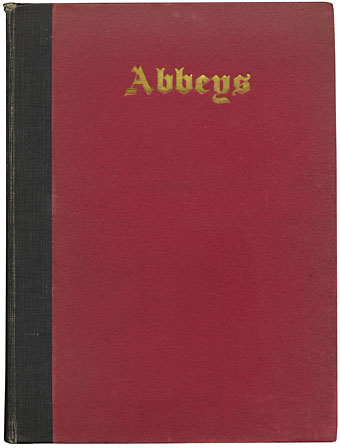
abbeys01.jpg

MR James is remembered today for his ghost stories but the four collections published during his lifetime represent a small percentage of his written work. His scholarly studies inform his stories, of course, but they also contribute to a pair of popular non-fiction books which have peripheral associations with the ghost collections: Suffolk and Norfolk: A Perambulation of the Two Counties with Notices of Their History and Their Ancient Buildings (1930) is a guide to the low-lying eastern counties where a number of the stories are set; Abbeys (1925) is a guide to the monastic ruins of the south-western counties and central England, locations which the author and his characters would enjoy visiting. This is a favourite book of mine, and one I often recommend to James enthusiasts.

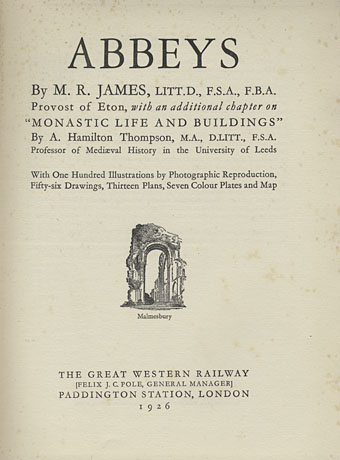
abbeys03.jpg

Abbeys is one of a three-volume set of illustrated guides published by the Great Western Railway company in 1925, (my copy is a second edition from 1926) the other titles being Cathedrals (1924), with no author credited, and Castles (1926) by Charles Oman. The books detail the ancient attractions a traveller in Britain might wish to explore using the services of Great Western Railway. Many of the more celebrated buildings in England and Wales are covered but the lines only travel as far north as Manchester and as far east as London. In addition to photo plates and illustrations, each book contains a removable map of the rail network folded into a pocket inside the back of the book. The coloured boards (red for Abbeys, blue for Cathedrals and brown for Castles) are sturdy enough to withstand the rigours of travel.

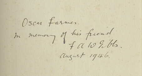
abbeys02.jpg

Another of those poignant inscriptions.

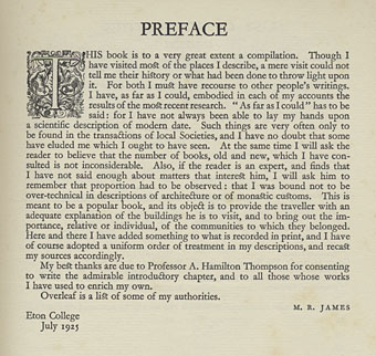
abbeys04.jpg

abbeys05.jpg

Although Abbeys lacks any credits for its photos and illustrations, Cathedrals states that the photos are the work of the railway’s staff photographers while the pen-and-ink illustrations are by William M. Hendy. There’s also a credit for the typographer, William Gordon Tucker, who not only provides many fine illuminated capitals but also uses ligatures for “ct” and “st”. Abbeys has an additional feature in the form of several fold-out plans of the larger buildings.

Continue reading “Abbeys by MR James”

Specimens of Chromatic Wood Type

chromatic01.jpg

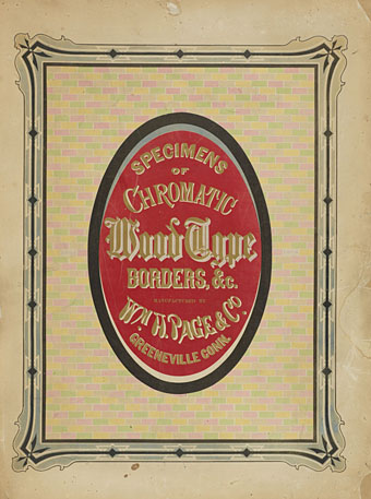
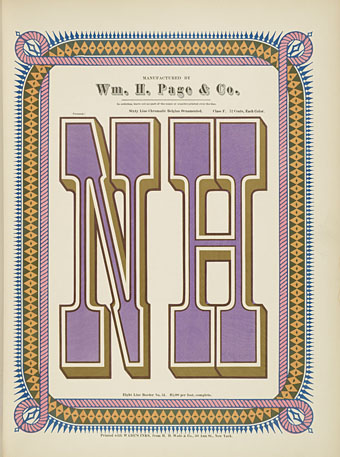
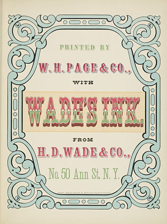
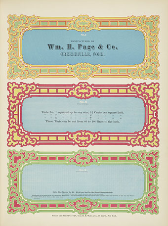
You don’t see many type specimen books in colour; offhand I can’t think of seeing any before this one. Specimens of Chromatic Wood Type, Borders, Etc. Manufactured by Wm. H. Page & Co dates from 1874, and features 100 examples of the very bold typefaces and border designs you find on 19th-century billboards and posters. Very useful if you’re ever called upon to imitate this style. Browse it here or download it here.

chromatic02.jpg

chromatic03.jpg

chromatic04.jpg

Continue reading “Specimens of Chromatic Wood Type”

Harry Willock book covers

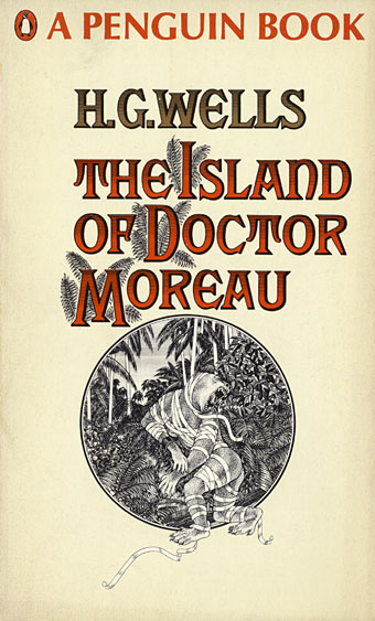
moreau.jpg

This time last year I happened to be re-reading my way through the collected short stories of HG Wells; this year I’ve been reading The Island of Doctor Moreau, not to continue the seasonal trend, I simply felt the urge. More about Moreau tomorrow.

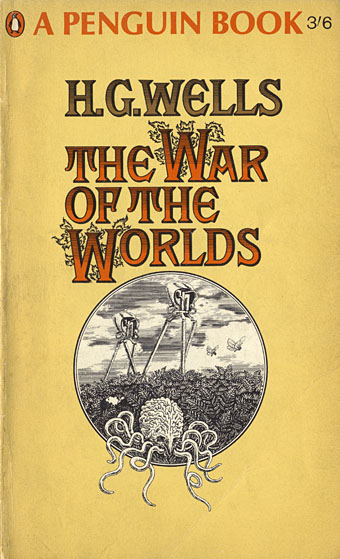
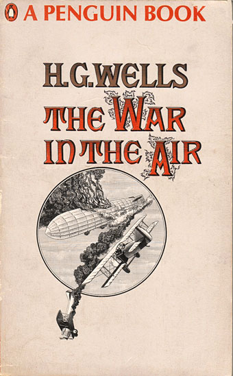
These covers are from a series of Penguin reprints which first appeared in 1967 and went through several editions. Harry Willock was the cover artist, and may also have been the designer of the Wells and Verne titles, other text-only Penguin covers from around this time being credited to Willock. The Penguin Science Fiction site describes the obtrusive “A Penguin Book” legend as the “panic top”, a heavy-handed attempt by Penguin’s management to reinforce their brand. Later reprints dropped this but it’s stamped across most of these editions.

war.jpg

This edition of The War of the Worlds was my first encounter with the novel so the cover has always been very familiar, a factor which probably prevented me from seeing how effectively all the Willock Wells covers work as a set. The Martian war machines aren’t very menacing—especially when they seem to have done little but arouse a pair of butterflies—but I do like the type layouts and the way the illustrations are concentrated into a circle. Willock’s drawings so closely imitate the style of Victorian engravings it’s easy to take them at first glance for the genuine article.

air.jpg

Continue reading “Harry Willock book covers”

Salomé: the font

salomefont01.jpg

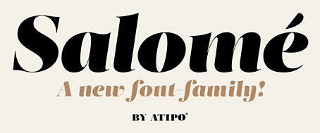
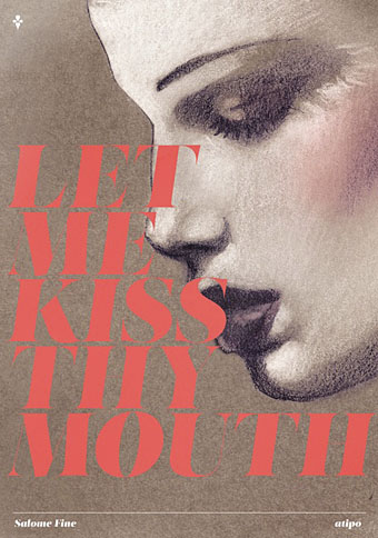
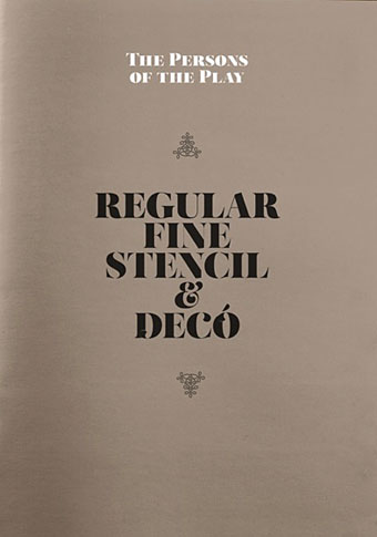
This isn’t the first font that’s been named after Salomé but Salome (without accent) by Rebecca Alaccari and Patrick Griffin was a revival of an earlier design, Cantini, from 1972, whereas Salomé is an original creation by Spanish design studio Atipo. The Atipo design itself owes something to the 1970s being reminiscent of François Boltana’s Stilla (1973), albeit without the eccenticities that make Boltana’s typeface so redolent of the period. Salomé comes in four styles, all of them variations on the extra-bold weights of Didone typefaces.

salomefont02.jpg

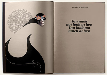
Having a predilection for this look the design appeals to me even without its associations. Atipo add to the attraction by promoting their font family with some gorgeous illustrations juxtaposed against quotes from Oscar Wilde’s play. None of the poster designs or the booklet pages below are credited on the website. The on-screen booklet highlights significant moments from the play with illustrations that manage to be Beardsley-like without going down the pastiche route. This is the way to show off a new font design, it’s just a shame the booklet isn’t available as a pdf. The icing on the cake is that the regular style of Salomé is available for free so long as you help promote it via Twitter or Facebook. The complete family is available for a very reasonable price. Now I have to find something to create that’s worthy of the design.

salomefont03.jpg

salomefont04.jpg

Continue reading “Salomé: the font”