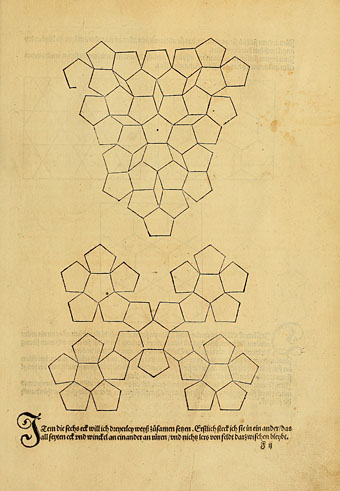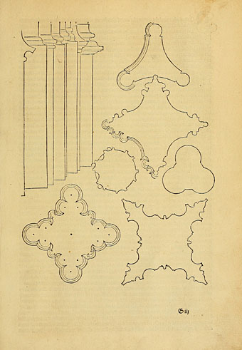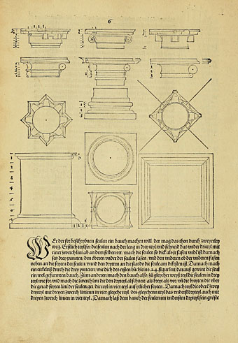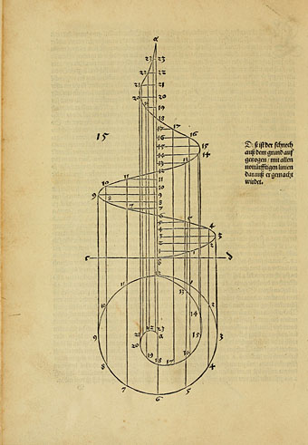
Underweysung der Messung (1525), a book of drawing instruction by the great Albrecht Dürer, predates Hieronymus Rodler’s “useful booklet” by six years. This also includes some perspective work although the lessons here are mostly concerned with the careful construction of various shapes, tesselated patterns and solid figures. Two of the illustrations at the end showing an artist using drawings guides are very familiar from reproduction in numerous art books; once again it’s good to see these pictures in their original context. This is also the book in which Dürer demonstrates the construction of letters of the alphabet. His lettering guides are almost as familiar as the illustrations, they often turn up in histories of typography, and now form the basis of several font designs. Durer Caps from P22, and Durer Initials from GLC, both give you an option of construction lines or solid fills; they also supply the letter U which is missing from the artist’s alphabet. Elsewhere there’s a free font, Duerer (sic) Latin Constructions and Capitals, available from l’Abécédarienne although this design lacks the U. Dürer’s book may be browsed here or downloaded here.
Category: {typography}
Typography
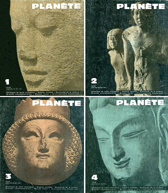
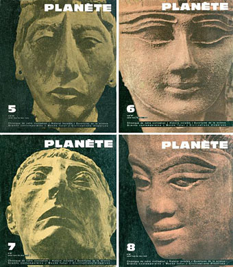
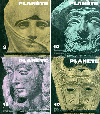
Planète magazine covers
Planète was a French magazine of “Fantastic realism” which ran throughout the 1960s. I’ve never seen a copy but sight of the immediately recognisable covers has always fascinated because this was the magazine established in the wake of the huge success of The Morning of the Magicians (1960), a unique “Introduction to Fantastic Realism” by Louis Pauwels and Jacques Bergier. Rather than enthuse at length about The Morning of the Magicians I’ll simply point you to this piece by the late RT Gault from his now-defunct website.
Pauwels and Bergier’s book was oft-imitated but never equalled during the 1970s. Where later authors such as Erich von Däniken tended to plough a single, narrow furrow, Pauwels and Bergier leapt breathlessly from one subject to another: alchemy in the 20th century, Forteana, a lengthy examination of the occult preoccupations of the Third Reich, speculations about nuclear physics, speculations about biological mutation, Hollow Earth theories, etc, etc, all the time dropping quotes from HP Lovecraft, Arthur Machen and Albert Einstein. It’s a very heady mix which is great fun to read even though there’s nothing like a solid argument that comes out of it all.
Planète continued the blend of Futurology and fringe philosophy while using the magazine format to print translations of science fiction and fantasy stories; among other things it was notable for bringing the stories of Jorge Luis Borges to a wider audience in France. The magazine’s name may have been science fictional but the magazine as a whole is closer to the kind of borderline sf/art magazine that New Worlds became under Michael Moorcock’s editorship in the late 1960s. I’ve never seen Moorcock or anyone connected with New Worlds mention Planète but the covers at least pre-empt the style adopted by New Worlds during its large-format run: consistently bold typography and imagery that only obliquely relates to the contents.
All these covers are from Noosfere where the story contents for each issue are also listed. No credits for the designer, unfortunately. If anyone knows who was responsible for the magazine design then please leave a comment.
Weekend links 199
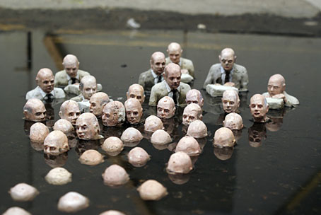
Follow the Leader (London, 2011) by Isaac Cordal.
• “Brutalism is the decor of dystopian films, literature and comics, just as gothic is for horror.” Jonathan Meades‘ A-Z of brutalism.
• Vitaly Shevchenko on the urban explorers of the ex-USSR. Related: Photos by Vitaliy Raskalov from the top of the Shanghai Tower.
• Joe Banks reviews the throbbing, hissing, minatory pulses of the Black Mill Tapes 1–4 by Pye Corner Audio.
Walter Benjamin is the only one among the commentators who attempts to pin down the anonymous, evanescent quality of Walser’s characters. They come, he says, “from insanity and nowhere else. They are figures who have left madness behind them, and this is why they are marked by such a consistently heartrending, inhuman superficiality. If we were to attempt to sum up in a single phrase the delightful yet also uncanny element in them, we would have to say: they have all been healed.” Nabokov surely had something similar in mind when he said of the fickle souls who roam Nikolai Gogol’s books that here we have to do with a tribe of harmless madmen, who will not be prevented by anything in the world from plowing their own eccentric furrow.
Le Promeneur Solitaire: WG Sebald on Robert Walser
• Drink The New Wine, an album by Kris Force, Anni Hogan, Jarboe, Zoe Keating and Meredith Yayanos.
• At 50 Watts: Illustrations by Fortuné Méaulle for Alphabet des Insectes by Leon Becker.
• Lawrence Gordon Clark, Master of Ghostly Horror. An interview by John D’Amico.
• Chapel Perilous: Notes From The New York Occult Revival by Don Jolly.
• Mix of the week: Secret Thirteen Mix 107 by Ernestas Sadau.
• An Occult History of the Television Set by Geoff Manaugh.
• Was Ist Das? The Krautrock Album Database.
• First dérive of the year by Christina Scholz.
• John Waters’ Youth Manifesto.
• Water Music I / Here Comes The Flood / Water Music II (1979) by Robert Fripp & Peter Gabriel | After The Flood (1991) by Talk Talk | Flood (1997) by Jocelyn Pook
Weekend links 198
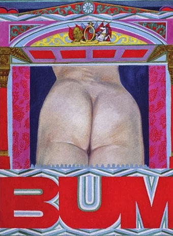
Bum (1966) by Pauline Boty.
• Eleanor Birne on Pauline Boty, “the only prominent female Pop artist among a generation of famous men”. Ken Russell’s Pop Art documentary, Pop Goes the Easel (1962), which features Boty, may be seen here. Two years later Boty was back with Ken Russell playing the part of the prostitute from The Miraculous Mandarin in a film about Béla Bartók. That’s something I’d love to see. There’s more about her painting, and the work of other female Pop artists, here.
• Why Are We Sleeping? Mark Pilkington on the music world’s recurrent interest in the philosophy of GI Gurdjieff. Pilkington’s most recent Raagnagrok release with Zali Krishna, Man Woman Birth Death Infinity, was reviewed by Peter Bebergal.
• Cinematic details: Frames-within-frames in The Ipcress File (1966), and the typography of 2001: A Space Odyssey (1968).
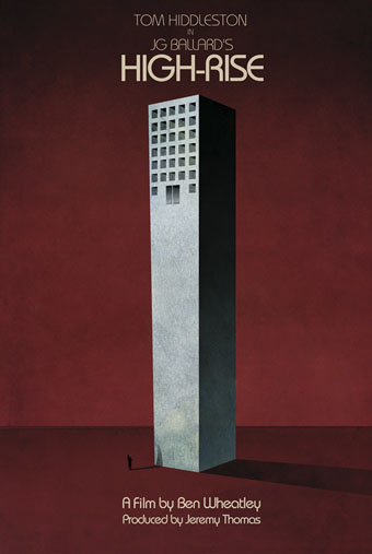
A Jay Shaw poster for Ben Wheatley’s forthcoming film of High-Rise.
• “…a large cavity must be dug in the bird’s shoulder and filled with ball bearings.” Christine Baumgarthuber on the dubious delights of The Futurist Cookbook.
• Why Tatlin Can Never Go Home Again: Rick Poynor on the difficulties of finding a definitive representation of an artwork online.
• Jay Parini reviews Inside a Pearl: My Years in Paris by Edmund White. At AnOther Donatien Grau talks to White about fashion.
• At Bajo el Signo de Libra (in Spanish): the homoerotic and occasionally Surrealist art of Pavel Tchelitchew.
• At 50 Watts: Kling Klang Gloria: Vintage Children’s Books from Austria.
• The motorbike girl gangs of Morocco photographed by Hassan Hajjaj.
• Geoff Manaugh on how LED streetlights will change cinema.
• Stylus “is an experiment in sound, music and listening”.
• Mix of the week: Secret Thirteen mix 106 by Senking.
• At Pinterest: JG Ballard
• This Is Pop? (1978) by XTC | Pop Muzik (1979) by M | Pop Quiz (1995) by Stereolab
Antonio Basoli’s Pictorial Alphabet
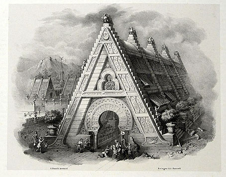
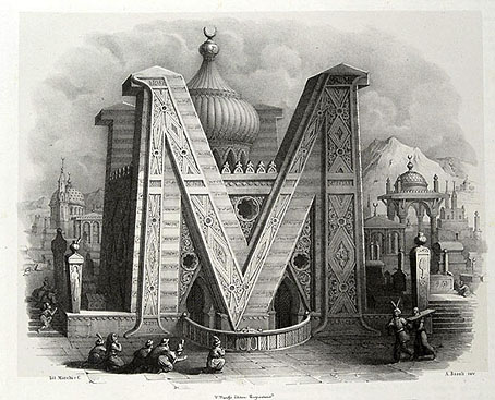
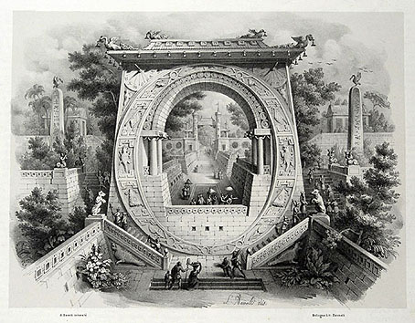
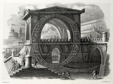
My thanks to Paul Rumsey for reminding me of the Alfabeto pittorico (1839) by Antonio Basoli (1774–1848). This is the same idea as yesterday’s pictorial alphabet but with an architectural theme. Basoli’s series of prints depicts each letter in an architectural style which matches the initial: A is for Arabia but also for aranciera (orangery). The attention to detail and the rendering of light and shade is very Piranesian, and it so happens that Piranesi had earlier designed a small number of capitals for use in books, the letterforms being created by architectural scenes. It’s tempting to see Basoli’s series as an elaboration of this idea done in the manner of Piranesi’s Prima parte di Architettura e Prospettive.
Given how much I enjoy this kind of thing I would have posted something about them by now, but seeing as they’d already been covered by the late-lamented Giornale Nuovo I stayed my hand. Mister Aitch’s post on the subject is still worth a look for the detail he supplies regarding the prints and their creator. For scans of the entire volume, go here.