Holzmüller and the Quays

ib1.jpg

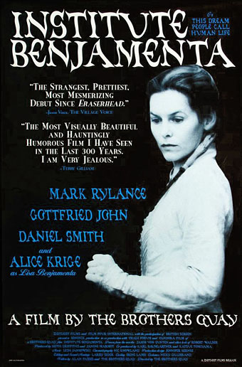
US one sheet (1996).

Heinrich Holzmüller (also spelt Holtzmüller) was a German printmaker and calligrapher active during the 16th century. He may have been dead for centuries but this inconvenience didn’t prevent him from appearing as an interviewer in the catalogue for the MoMA exhibition of artworks by the Brothers Quay that ran throughout the end of 2012.

ib4.jpg

Film tie-in edition of Jakob von Gunten (1995).

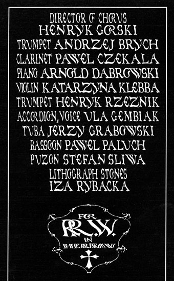
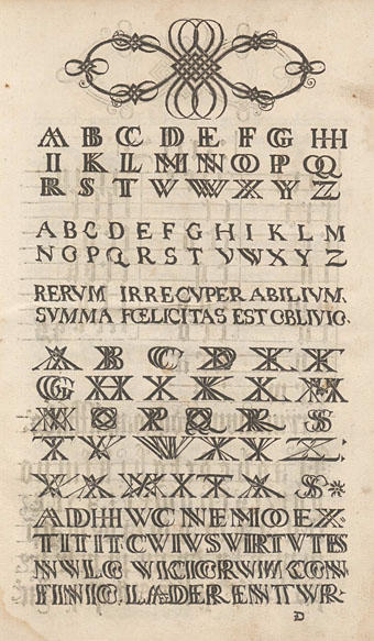
One of the more informative pieces of information to come from that interview concerned the Quays’ resurrection of typefaces designed by Holzmüller in his Liber Perutilis, a book about lettering and calligraphy published in 1553. The Quay versions were most visible around the time of the production of their first feature, Institute Benjamenta (1995): you can see them on the posters, on the cover of the Serpent’s Tail tie-in edition of Jakob von Gunten and also inside the rare soundtrack CD which the Quays designed for Lech Jankowski.

ib2.jpg

Institute Benjamenta soundtrack booklet (1998).

ib3.jpg

Institute Benjamenta soundtrack booklet (1998).

I’ve had the MoMA catalogue since it was published, and more than once had searched half-heartedly for Holzmüller’s book without success. A more recent search turned up the goods, however (sometimes it helps to keep following leads from one page to another): a copy of Liber Perutilis may be found online at the Universitätsbibliothek Basel.

holzmuller.jpg

Liber Perutilis is only a short book compared to some in the field, but it’s also much more varied and original than others I’ve seen. Among the alphabets which the Quays digitised there are sets showing the letters doubled and tripled in the manner of monograms. The Quays have often signed themselves using a double Q so this may explain the attraction. The undoubled alphabet is especially striking for Holzmüller’s distortions of the letterforms which make them seem like characters viewed under rippled glass. At a time when most books about lettering and calligraphy were showing alphabets produced by careful and elegant hands this is a feature which to our eyes seems surprisingly advanced. The Quays have copied the alphabets fairly closely, making minor changes such as rounding off an E and adding the J and U which are always missing in Latin alphabets of the period. Elsewhere in the book there are many examples of calligraphic flourishes and some unusual pieces of decorative knotwork. As for Holzmüller’s posthumous interview, copies of the MoMA catalogue are still available, while the interview itself will be reprinted in the booklet for the BFI’s forthcoming Blu-ray collection, Inner Sanctums—Quay Brothers: The Collected Animated Films 1979–2013.

Elsewhere on { feuilleton }
The Quay Brothers archive
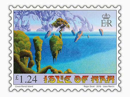
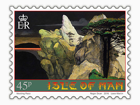
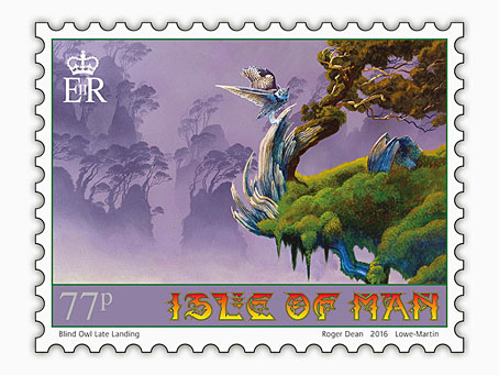
Roger Dean postage stamps

dean11.jpg

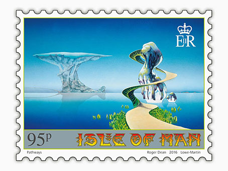
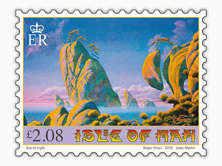
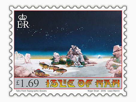
Roger Dean book covers last week; this week it’s postage stamps. These are exclusive to the Isle of Man Post Office, unfortunately, so there’s little chance of buying them over the counter in mainland Britain. First day covers, presentation packs and individual sheets may be ordered from the post office website, however. For those who can visit the Isle of Man there’s also an exhibition of Dean’s art running at the Manx Museum in Douglas until November.

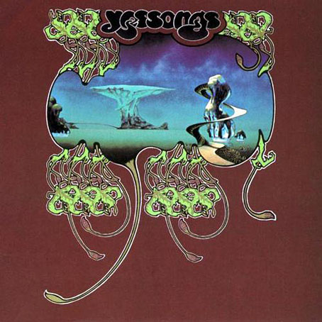
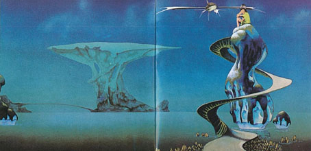
Several of the paintings on the stamps are from the covers for albums by Yes and Asia, including the one above which was used twice on the live Yessongs album in 1973. (The large version inside the gatefold had a figure of a girl and a fish spacecraft added.) The version appearing on the stamp is Dean’s recent reworking of the piece. This removed the airbrushed clouds—added to disguise the footprints of his cats which had walked over the painting when it was drying—and also smoothed the gradients and added a reflection. I’ve been familiar with the album version of this picture for decades so I prefer the rougher original as it is on the cover (and in Dean’s Views book) without the girl and spacecraft.

yessongs.jpg

yessongs2.jpg

One other thing of note is Dean’s lettering design for the stamps. When I wrote about Dean’s art a few years ago I drew attention to the way his design work has been either marginalised or ignored altogether by people who dismiss him as a mere fantasy artist. All of Dean’s album covers have included unique letterforms that are immediately recognisable as his own (so too the logos and lettering he was designing for computer games in the 1980s) but I’ve yet to see this side of his work given any serious attention. (Postage stamp tip via It’s Nice That.)

dean8.jpg

dean9.jpg

dean10.jpg

dean7.jpg

dean12.jpg

Previously on { feuilleton }
Roger Dean book covers
Design as virus 17: Boris and Roger Dean
Roger Dean: artist and designer

Weekend links 315

knights.jpg

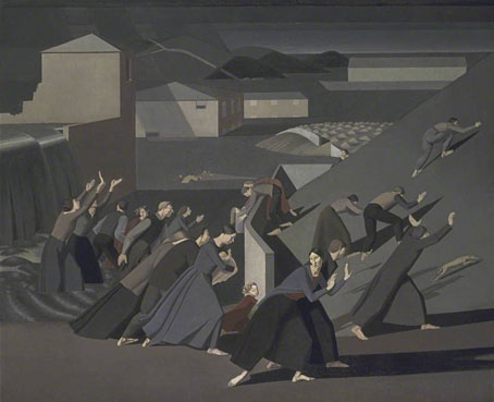
The Deluge (1920) by Winifred Knights.

Dennis Cooper‘s favourite fiction, poetry, nonfiction, film, music, art & internet of 2016 so far. (Thanks again for the nod to this blog!)

• At Literary Hub: Jonathan Russell Clark on Jorge Luis Borges, and Jon Sealy on why indie presses [in the US] are opening bookstores.

• “It’s not just about the music.” A conversation on the occult practices in the arts between poet Janaka Stucky and Peter Bebergal.

• Daisy Woodward talks to Andreas Horvath about Helmut Berger, Actor, a documentary about Visconti’s muse and lover.

• More Fritz Leiber: Brian J. Showers on his decision to republish Leiber’s horror novel, The Pale Brown Thing.

• Mixes of the week: Sextape 4 by Drixxxe, and Radio Oscillations #96 (Richard Pinhas/Heldon) by Iron Blu.

• The 5th Young One: Pay No Attention to the Girl Behind the Sofa; John Reppion on a television mystery.

• More reading suggestions: Cheerless beach reads for gloomsters and saddies by S. Elizabeth.

• Never the same film twice: Seances by Guy Maddin, Evan Johnson, Galen Johnson.

• How painter Winifred Knights became Britain’s “unknown genius”.

• The Journey & The Destination: An interview with Hawthonn.

Robert Latona goes in search of the grave of Constance Wilde.

• Invisible by Day: photos by Mikko Lagerstedt.

• A Queer Lit Q&A with Evan J. Peterson.

• RIP Michael Herr and Bernie Worrell.

Bridget Riley: The Curve Paintings.

• The typography of Blade Runner.

Japanese matchbox labels

SOS by Portishead

A Rainbow In Curved Air (1969) by Terry Riley | The Great Curve (1980) by Talking Heads | Dangerous Curves (2003) by King Crimson

Tomita album covers

tomita01.jpg

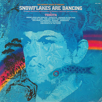
Snowflakes Are Dancing (1974); art direction; Joseph J. Stelmach; artwork: David B. Hecht.

The Japanese composer Isao Tomita died last week so I’ve been listening to some of his early recordings, and thinking—as usual—about their cover designs. Tomita was by far the best of the many electronic musicians in the 1970s who took advantage of the huge success of Wendy Carlos’s Switched-On Bach (1968) to create their own versions of classical music with Moog and other synthesisers. If this makes Tomita sound like an opportunist (and his 1972 collection of electronic pop covers was titled Switched On Hit & Rock), he quickly developed his own approach to electronic composition which ranged from quirky humour to his own brand of cosmic pictorialism. The latter was very different from the equally cosmic meanderings of Tangerine Dream which seldom strayed too far from the rock world. Tomita had a genius for taking very familiar pieces of classical music which he fashioned into synthesizer soundtracks for imaginary science-fiction films. (He also produced actual scores for a number of Japanese films but few, if any, of these were released outside Japan.) This approach is shown to great effect on The Bermuda Triangle (1979), an album that was subtitled “A Musical Fantasy Of Science Fiction”, and which filters Prokofiev and Sibelius through a library of crank paperbacks, with references to UFOs, undersea pyramids, Agharta, the Hollow Earth, Close Encounters of the Third Kind, and the Tunguska Event.

tomita02.jpg

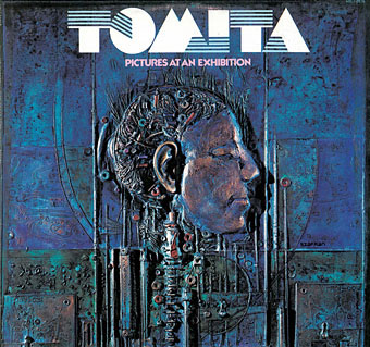
Pictures At An Exhibition (1975); artwork: bas-relief by Gene Szafran. The first appearance of the logo that became a fixture of Tomita’s albums. No designer is credited but I’d guess it was the work of Joseph J. Stelmach. The logo typeface is Sinaloa.

As for the covers, Tomita’s recordings may have been classical music but RCA targeted the albums at a rock audience so there’s no sign of the venerable composers heads that appear continually on the sleeves of orchestral recordings. The examples here are almost all the Western releases which, surprisingly, tended to have better covers than the Japanese originals. This is also a partial selection, favouring Tomita’s own releases (no soundtracks), and mostly the early albums. The later albums aren’t as impressive, and many of them were only released in Japan.

tomita03.jpg

Firebird (1975). No design or art credit. I’d not noticed before that the logo evolves by degrees, here gaining some extensions.

Lastly, I’ll dedicate this post to my old friend Nik Green who died in March. Nik was a session musician of some note, and the first person I knew who owned a synthesizer (an ARP Odyssey). He was also a great Tomita enthusiast who shared Tomita’s sense of humour and relished the quirkier moments on many of these albums. I can’t listen to the opening of the Mars section of Tomita’s The Planets without remembering Nik shouting “That’s a Moog!” when a synthetic fanfare interrupts the sounds of a spacecraft lift-off.

Continue reading “Tomita album covers”

Weekend links 305

marchbank.jpg

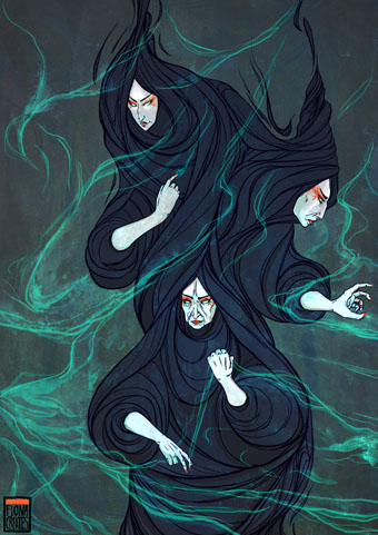
Threads of Fate—The Weird Sisters from Macbeth (2013) by Fiona Marchbank.

• The week in books: Claire Cameron on the difference between US & UK cover designs | Jason Diamond asks “Why do cats love bookstores?” | Alan Moore’s cover art for his forthcoming novel, Jerusalem, has been revealed | Brian Phillips on the typefaces used by New English Library for their Dune covers in the 1970s.

• On writing: Poetry and horror “share a universally human quest toward intimacy” says Evan J. Peterson | “The best work neither shows nor tells: it says by being, not by saying,” says M. John Harrison.

• At the BFI this week: Where to begin with Jerzy Skolimowski, and 10 overlooked British horror films of the 1970s. Both lists include Skolimowski’s excellent The Shout (1978).

Cultures do not, and cannot, work through notions of ‘ownership’. The history of culture is the history of cultural appropriation—of cultures borrowing, stealing, changing, transforming.

Nor does preventing whites from wearing locks or practicing yoga challenge racism in any meaningful way. What the campaigns against cultural appropriation reveal is the disintegration of the meaning of ‘anti-racism’. Once it meant to struggle for equal treatment for all. Now it means defining the correct etiquette for a plural society. The campaign against cultural appropriation is about policing manners rather than transforming society.

Kenan Malik on ill-considered complaints against “cultural appropriation”. Malik isn’t the first to note the intersection of such complaints with those of white supremacists who also want cultural purity and segregation

OUT, DEMONS, OUT!: The 1967 Exorcism of the Pentagon and the Birth of Yippie! An oral history by Larry “Ratso” Sloman, Michael Simmons and Jay Babcock.

• The long-overdue republication of Moebius’s work in English will begin with a new edition of The World of Edena (1985).

• More from radioactive Russia: Nadav Kander’s photographs of Soviet nuclear test sites.

• Comic artist and illustrator Kris Guidio in conversation with Jonathan Barlow.

• Francesca Gavin meets Tadanori Yokoo, “the Grandmaster of Pop-Psych Art”.

• “LSD’s impact on the brain revealed in groundbreaking images”

• Mix of the week: Secret Thirteen Mix 182 by Paul Jebanasam.

• A trailer for Nicolas Winding Refn’s The Neon Demon.

• Tony Conrad: 1940–2016 by Geeta Dayal.

Brian Eno’s favourite records

Neonlicht (1994) by Mitja VS (with Enzo Fabiani Quartet) | On Demon Wings (2000) by Bohren & Der Club of Gore | Shout At The Devil (2002) by Jah Wobble & Temple Of Sound