Llewellyn occult magazine and book catalogue, 1971

llewellyn1.jpg

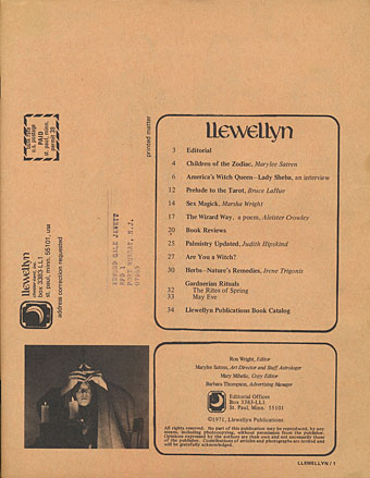
A table of contents that reads like a track list from an album by Blood Ceremony: Children of the Zodiac, America’s Witch Queen, Prelude to the Tarot, Sex Magick, The Wizard Way…

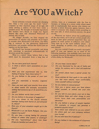
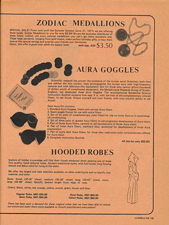
Are you a witch? Maybe you are but you don’t know it yet. You can find out by answering the questionnaire in the Llewellyn occult magazine and book catalogue for 1971, a publication which contains a number of witchy articles among its catalogue pages. This is one of many catalogues and publicity brochures from the Ted Nelson Junk Mail Cartons (6,856 items) at the Internet Archive, and is such a product of its time that it’s a shame there aren’t more like it. In addition to a photo of the hippyish Llewellyn staff there’s an interview with Lady Sheba, “America’s Witch Queen”, reprints of incantations by Aleister Crowley and Gerald Gardner, and headlines set in Davida, one of the typefaces of the occult revival. Among the artefacts for sale are a set of “Aura Goggles” from the Metaphysical Research Group, a company that sounds like something from a Charles Williams novel but which has been trading in the UK for many years, and is still active today. They no longer seem to carry Aura Goggles, however. A shame.

llewellyn2.jpg

llewellyn3.jpg

Previously on { feuilleton }
The Art of the Occult
Calendrier Magique
Typefaces of the occult revival
MMM in IT
The Book of the Lost
The Occult Explosion
Forbidden volumes
The Sapphire Museum of Magic and Occultism
Occultism for kids

Bergling’s Art Alphabets

bergling02.jpg

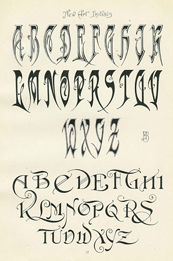
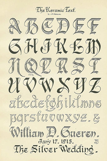
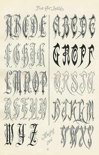
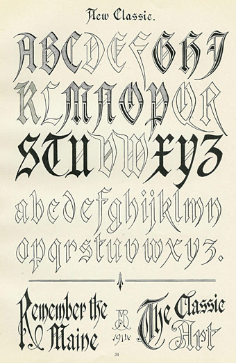
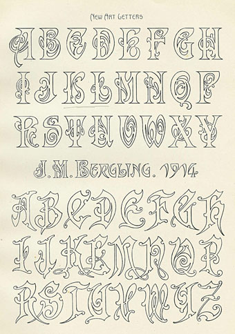
Old type catalogues seldom contain any unusual typefaces so you have to look to craft books for original letterforms. Art Alphabets and Lettering (1914) is an American book for artists and sign painters written and designed by JM Bergling which contains several pages of novel designs among its more familiar typefaces. Bergling evidently had a flair for alphabet design, there are more unique examples here than you’d usually find in a book of this kind, and Bergling’s letterforms are consistently stylish and inventive. In addition to providing a number of spiky variants on the Art Nouveau style (which by 1914 was going out of fashion), he also found time to draw his own version of a 19th-century staple, the Rustic Alphabet. There are two copies of the book at the Internet Archive: a complete one and an incomplete one, the latter volume possibly being a later printing since it contains a number of pages not included in the former.

bergling01.jpg

bergling03.jpg

bergling04.jpg

bergling05.jpg

Continue reading “Bergling’s Art Alphabets”

Jodorowsky times three, or The box that never was

jodorowsky1.jpg

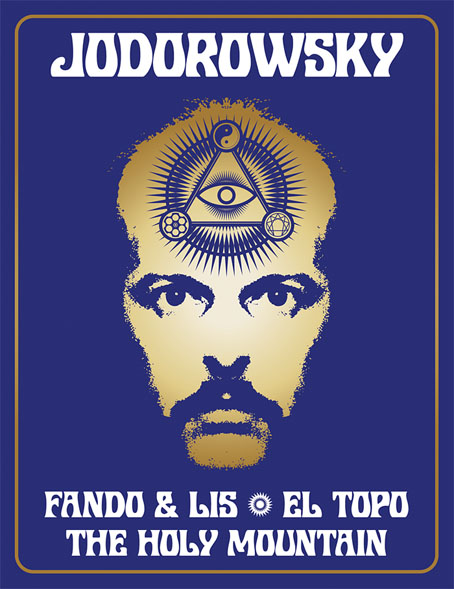
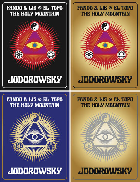
The first three feature films by Alejandro Jodorowsky—Fando y Lis, El Topo and The Holy Mountain—are released this week on Region B blu-ray by Arrow Video, but the box they’re packaged in won’t look like any of the designs shown here. It was almost three years ago that Arrow asked me to create something for this box set, but backstage wrangles meant the project moved out of my hands in the early stages. This was a great disappointment since Jodorowsky’s interests and aesthetics align with my own much more than many other directors whose work has been released by Arrow. And having written the notes for the Arrow release of Henri-Georges Clouzot’s The Mystery of Picasso, I was looking forward to working with the company again.

In preparation for the work I rewatched almost all of Jodorowsky’s films (I still haven’t seen Tusk or The Rainbow Thief), then drew up a detailed proposal with sketches, something I seldom do for commissions. Arrow releases all have double-sided inserts in the boxes that hold the discs, one side of which shows a poster design from the film’s original release, the other a new design. My idea for the new art was to connect the three films using Tarot-like iconography (the director is a Tarot scholar, among other things), with each film also being assigned a symbol of some kind. The Surrealist fable of Fando y Lis lacks any suitable graphics so for this I chose a yin and yang symbol to represent the film’s opposed-yet-connected brother and sister characters; El Topo was to be represented by a cross-section through a revolver chamber, while the seven characters from The Holy Mountain are represented by the enneagram that Jodorowsky himself wears in the film. All three symbols are connected by the eye-in-a-triangle from El Topo, a symbol that worked while a three-film box was being planned but which wouldn’t have worked for the final release which adds Jodorowsky’s most recent film, Psychomagic, A Healing Art. For the box design I suggested metallic inks (or foils) either as highlights or in other combinations. The font was a further suggestion, Roberta being one of the typefaces of the occult revival of the 1970s. The art for each film didn’t go further than the sketch stage although I was asked to work up the El Topo design into a final piece; I wasn’t very satisfied with the end result so it isn’t posted here. One problem with the extended negotiations was they were taking place at a time when I was extremely busy with other projects, including contracted illustration work for Editorial Alma. There was no contract for the Arrow commission so it had to take second place even though it was the work I most wanted to be concentrating on at the time. Collisions such as these are an occupational hazard when you’re working freelance.
jodorowsky2.jpg

As things turned out the stumbling block wasn’t my art and design suggestions (which Arrow liked) but the parties described in communications as “the rights-holders”. These individuals apparently disliked the Arrow Video aesthetic and wanted something more directly connected with the films, preferably photographic material which is what you now see on the discs and the box art. It should be emphasised that the rights-holders are not the director, whose wishes for the presentation of his work were never part of the discussion. Given the previous activities of the rights-holders we should probably be grateful that the first three films have been reissued at all. For details of Jodorowsky’s difficulties with one rights-holder in particular, see this interview by Jay Babcock.

On the upside (there is one!), the box set is a typically high-quality Arrow release, with new transfers of the films approved by the director. The bonuses include Jodorowsky’s short films (including his explanation of Tarot symbolism), Louis Mouchet’s feature-length documentary, La Constellation Jodorowsky (1994), soundtrack CDs of El Topo and The Holy Mountain, a small poster and set of postcards, and a substantial booklet. In the end the most important thing is that the films are available for home viewing once again, not their exterior decoration.

Previously on { feuilleton }
Fabulas Panicas by Jodorowsky
• Alejandro Jodorowsky’s Dune
• Jodorowsky on DVD

Weekend links 531

miller.jpg

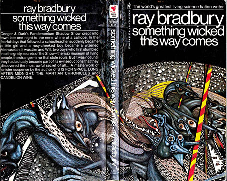
Cover art by Ian Miller, 1979.

• Ray Bradbury was born 100 years ago today. Emily Temple expresses surprise that Truman Capote encouraged the publication of a Bradbury short story at Mademoiselle in 1946. I’m more surprised that Bradbury was paid $400 for his work; no wonder he was so eager to write for the non-genre magazines. Elsewhere: Ray Bradbury—The Illustrated Man: the BBC’s Omnibus arts strand profiled Bradbury in 1980 with enthusiastic assistance (narrating/reading/performing) from the man himself; Ray Bradbury book and magazine covers at Flickr.

Anna Smith asks whether Linda Fiorentino was the greatest femme fatale ever in The Last Seduction (1994). A substantial claim, especially for a neo-noir playing so self-consciously with the theme, but it’s a very good film, and one I’d like to see again.

• “Bad as a work of art, and morally bad…” Vladimir Nabokov’s Lolita being reviewed by Kingsley Amis, a writer who preferred the peerless prose and stainless morals of Ian Fleming. Dan Sheehan looks at other contemporary reactions to Nabokov’s novel.

• At Dennis Cooper’s: Mary Ellen Bute Day, and (how could I avoid it?) ClicketyClack presents…Brothers Quay Day.

• More from The Art of the Occult: S. Elizabeth offers a glimpse of the contents of her forthcoming book.

• Make the letter bigger: John Boardley on the development of the illuminated capital.

• In 1987 Anne Billson talked to Nicolas Roeg about his latest film, Castaway.

• Five controversial arthouse features from Japanese filmmaker Sion Sono.

• It’s that group again: Joe Banks on the strange world of Hawkwind.

C82: Works of Nicholas Rougeux.

Fahrenheit 451 (1982) by Hawkwind | Something Wicked This Way Comes (1996) by Barry Adamson | The Martian Chronicles (2007) by Dimension X

Jean Alessandrini book covers

alessandrini05.jpg

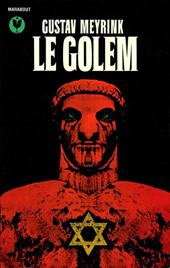
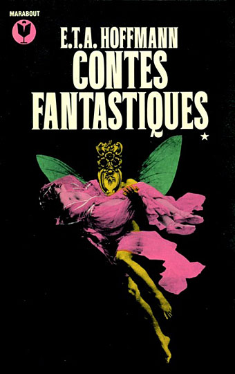
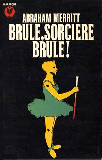
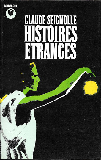
It’s that Golem again, depicted in 1979 by Jean Alessandrini. The publisher was Bibliothèque Marabout, a French fantasy/horror imprint active from the 1960s to the 1990s that was the genre division of Éditions Marabout, itself a division of publishing behemoth Hachette. Bibliothèque Marabout published a wide range of titles, with many familiar names in addition to writers such as Jean Ray, Thomas Owen and Paul Féval whose work receives little attention in the Anglophone sphere. By 1970, many of these covers had a uniform appearance, predominantly painted illustrations on black backgrounds with the titles set in Roberta, one of the Art Nouveau-styled typefaces of the occult revival. All the Alessandrini covers date from the late 70s and early 80s, and show an evolution of the imprint’s style, with the same black livery but a different typeface that I can’t identify (Coliseum is the closest digital equivalent), together with artwork that’s more of a design rather than an illustration of the book’s contents.

alessandrini02.jpg

Jean Alessandrini is a French artist, designer, typographer and author, also the creator of Typomanie, a book of type designs that I’d like to see. He provided cover drawings in the late 1960s for French SF magazine, Fiction, and later worked for the popular comics magazine Pilote, but his Marabout covers look like collage works, with the grainy appearance of photocopied photos that Neville Brody also favoured for his album cover designs. The combination of a simple symbolic graphic in bright colours on a black background is very reminiscent of David Pelham’s designs for Penguin, some of which also used collage elements. French genre titles seldom seem to follow design trends exterior to France so if there was a Penguin influence at work it’s an unusual case.

Jean Alessandrini has a small but well-designed website here.

alessandrini01.jpg

alessandrini03.jpg

Continue reading “Jean Alessandrini book covers”