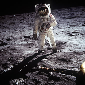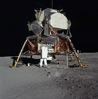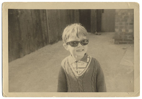
I was a Space Age boy. John Glenn became the first American to orbit the Earth in Project Mercury’s Friendship 7 a month before I was born, and growing up in the 1960s it was impossible to be unaware of the NASA missions. The first encyclopedia I was given in 1967 had a whole chapter about the Mercury and Gemini projects which ran from the late 1950s through to 1966. A subsequent section showed an artist’s impression of how it might look when we were exploring the Moon and the planets. By the time the photo above was taken, in 1968 or ’69, I was obsessed with the Apollo missions and had the names of the astronauts memorised the way others memorised the names of football players. (Everyone knows Neil Armstrong and Buzz Aldrin landed on the Moon; I’ve never forgotten that Michael Collins was the third member of the team, waiting for them in the Command Module.) For a while there was an American boy at school of whom I was deeply jealous; his father was in the USAF and his family had actually been present during the launch of Apollo 8!
Space was everywhere, it became a dominant theme, at least while the Apollo missions lasted. Pop culture of the 1950s had its share of rockets ships and flying saucers but was predominantly filled with Westerns and other Earth-bound adventures. You can see a watershed moment occurring when the hugely popular Gerry Anderson puppet shows went from the cowboy adventure of Four Feather Falls in 1960 to the science fiction of Supercar and, immediately after that, the full-on space adventure of Fireball XL5 in 1961 and ’62. Cowboys couldn’t compete with astronauts; Supercar and subsequent Anderson shows were regularly repeated, Four Feather Falls wasn’t. As well as being enthused by the Anderson shows I enjoyed something called Space Patrol, another science fiction puppet series which few now seem to remember.

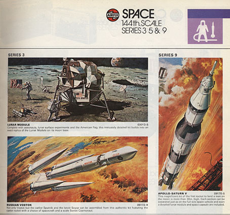
A page from a 1977 catalogue for Airfix model kits. I had the lunar module and the Saturn V. I don’t recall ever being interested in the Russian craft.
I wasn’t watching TV when Neil Armstrong first set foot on the Moon—it was 3.39 am here, I was fast asleep—but that didn’t matter, it was the event rather than the moment which counted. And there were five more landings following Apollo 11, each repeating those first moments and all accepted with the same spirit of innocent enthusiasm. What none of us kids realised at the time was that these events weren’t universally seen as a positive thing. Timothy Leary and Robert Anton Wilson later declared that going into space was the next step in human evolution but you wouldn’t know it looking through the underground press of the period. Appraisal of the NASA missions was filtered through the prisms of the Cold War and the cultural wars of the 1960s, with the entire Apollo enterprise being seen as a spin-off of the US military—the astronauts were all airforce pilots, after all—encouraged by a despised President Nixon and used as a means of embarrassing the Soviet Union. (This latter point tends to forget that the Russians were playing tit-for-tat, and had earlier embarrassed the US with Sputnik and Yuri Gagarin.) No one wanted to support men with crew-cuts who prayed in space and enjoyed country & western music. And few were prepared to concede that a President stoking the Vietnam War might have inadvertently done something worthwhile by continuing Kennedy’s space programme.

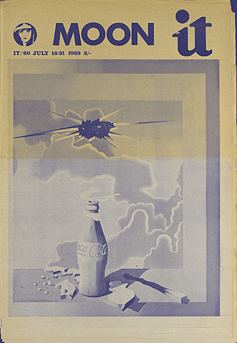
The cover of International Times for July 18, 1969, the Moon mission seen as an exploding Coke bottle which shatters the sky. An editorial within complains about the hoisting of an American flag on the Earth’s satellite.
There was a similar hostility in the attitudes of some of the younger breed of sf writers of the time who saw the Moon missions being praised and supported by the old guard of sf and, like the counterculture freaks, were disappointed by the conservative character of the astronauts. I only know this retrospectively, of course, but the complaints have always seemed rather purposeless; those men were test pilots, what else were people expecting? Equally dismaying was the amount of times throughout the 70s and 80s you’d hear black musicians only referring to the space missions in terms of a waste of money. What happened, I’d want to know, to Sun Ra’s “Space is the place”, to the elegant science fiction of Samuel R Delany, and to Parliament’s Mothership Connection? (For a more positive attitude we now have Afrofuturism.)
My own disappointment came in 1972 when it became evident that the whole show was over. As Tom Wolfe notes, after the Moon landing there was nowhere left to go. I developed a taste for written science fiction which lasted for several years but I’ve wondered sometimes whether that sense of an interplanetary future being brought to a dead stop isn’t the reason why I’ve since regarded all visions of the future as suspect. Everything in the 1960s told us that by 2009 we’d have bases on the moon and probably Mars; some of us might be living in Gerard K O’Neill‘s space colonies. When that future, which for a while seemed not only likely but inevitable, can be so easily short-circuited, why should we believe any others presented to us?
Related links:
• NASA’s pages for the Apollo missions
• Wired: The Moon Landings: Fact, Not Fiction
• Wired: The Science of Apollo 11
• Geeta Dayal on Apollo: Atmospheres and Soundtracks
by Brian Eno with Daniel Lanois and Roger Eno
• Pink Floyd’s Moon-Landing Jam Session
• Armstrong and Aldrin’s “lost Lunar City”
• Julius Grimm’s map of the Moon from 1888
Previously on { feuilleton }
• Apollo liftoff
• Earthrise
• East of Paracelsus

