Men with snakes

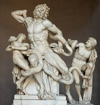
laocoon.jpg

Laocoön and His Sons attributed to Agesander, Athenodoros
and Polydorus of Rhodes (c. 160–20 BCE).

No jokes about snakes in a frame, please. Bram Dijkstra’s Idols of Perversity: Fantasies of Feminine Evil in Fin de Siècle Culture (1986) is a wide-ranging study of the “iconography of misogyny” in 19th century painting. Dijkstra examines the numerous ways that women were depicted in late Victorian and Symbolist art, with one chapter, “Connoisseurs and Bestiality and Serpentine Delights”, being devoted to representations of women with animals, especially snakes. The story of Eve and the Serpent prompts many of these latter images, of course, while scenes with other creatures seem intended to demonstrate the Victorian attitude that woman was closer to the brute beasts than man and could often be found conspiring with them to bring down her masculine masters. Continue reading “Men with snakes”

Masonic fonts and the designer’s dark materials

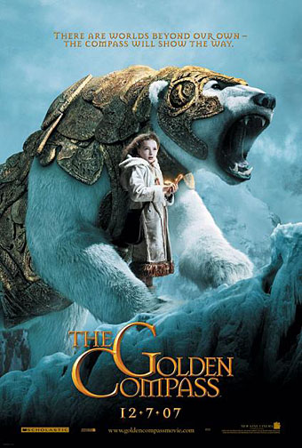
golden_compass.jpg

The trailer for The Golden Compass turned up this week, the first part of Philip Pullman‘s His Dark Materials trilogy, and I can’t help but note that the film’s designers have chosen Jonathan Barnbrook’s Mason font for the titles and the rest of the typography. This isn’t so surprising given that Mason has been used on the covers of several editions of the books already but I wonder if this flush of even greater popularity will spell (as it were) the end of a stylish typeface.

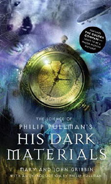
hdm.jpgMason (originally named Manson) was one of Barnbrook’s earliest published type designs, appearing in 1992 via the Emigré foundry, and over the past fifteen years has been widely imitated and become the default font for fantasy works, especially book jackets. The attraction for the genre is obvious in the way the design uses elegant and traditional serif letterforms that have been amended slightly to give them a distinctive quasi-ecclesiastical flavour, with flourishes derived from Greek, Renaissance and Biblical letters. The Gothic arch of the letter A has also helped make the font a popular choice for New Age or occult books. Mason was designed as a set of serif and sans serif variations but it’s Mason Serif Regular which is used the most. (The cover for The Science of His Dark Materials shown here is using both the sans serif variation and Mason Regular Alternate.)

Distinctive fonts take a while to get around and I don’t recall seeing Mason until at least 1994. From 1995 to 2000 it began to appear everywhere, even in newspaper ads for a while, before finding a permanent place in the book world. The trouble with this kind of ubiquity is that the novelty the design once possessed quickly vanishes and it begins to runs the risk of becoming a design cliché. Many typefaces go this way, especially in the publishing world where the choice of typeface is often dictated by genre expectations. So Orbit-B and its variants used to signify “science fiction” or “the future” in the 1970s, Caslon Antique and Rubens have become associated with horror while FF Confidential has been over-used for crime novels.

Continue reading “Masonic fonts and the designer’s dark materials”

The art of Takato Yamamoto

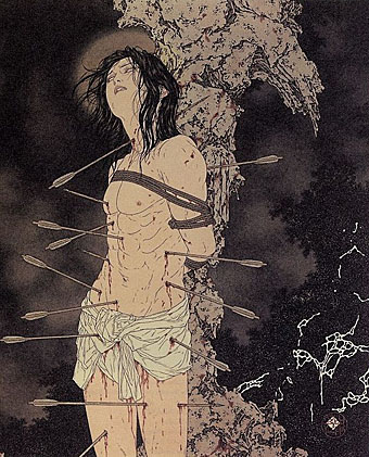
yamamoto1.jpg

Takato Yamamoto was born in Akita prefecture (Japan) in 1960. After graduating from the painting department of the Tokyo Zokei University, he experimented with the Ukiyo-e Pop style. He further refined and developed that style to create his “Heisei Esthiticism” style. His first exhibition was held in Tokyo, in 1998.

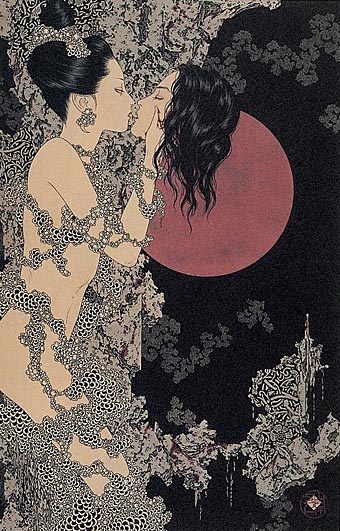
There’s much that’s superficially familiar in Takato Yamamoto’s art—“Boy’s Love” tableaux with fey young men in various states of undress mooning over each other, then the perennial Japanese obsession with naked women bound by ropes. But closer examination reveals a degree of finesse and imagination that elevates his work away from the porn ghetto into the rarified realm of Decadence (as if those favourite Symbolist themes of Saint Sebastian [above] and Salomé [below] weren’t enough of a clue). For a start the drawing style is a great amalgam of influences from Beardsley through to Harry Clarke by way of the finest Edwardian pornographer, Franz von Bayros. Then there’s the curious details of severed heads, claws, sundry bones and eyeballs which decorate the otherwise florid arrangements supporting the figures. So far there don’t appear to have been any books of Takato Yamamoto’s work produced in the west and it’s possible that the sexual content and grotesquery limits that possibility. But you can some galleries here, here and here. His official site is mostly Japanese and has to be navigated from an interior page since there seems to be a file missing from the index.

yamamoto2.jpg

Continue reading “The art of Takato Yamamoto”

The art of Andrey Avinoff, 1884–1949

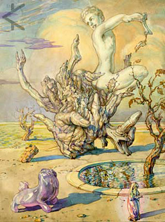
avinoff1.jpg

Man Emerging from a Tree Stump (no date).

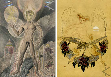
Yet another artist I’d be unlikely to have come across had it not been for the web. Andrey Avinoff’s art manages to be both mystical and homoerotic in equal measure and there’s a good selection of his paintings and drawings to be found in a collection at the Kinsey Institute. Avinoff was an entomologist and worked as director of the Carnegie Museum along with that other famous butterfly enthusiast, Vladimir Nabokov. He was also a friend of Alfred Kinsey’s for many years and the art which Kinsey collected seems (perhaps inevitably) more sexual than the artist’s mystical work or his butterfly pictures. As with other artists discussed here, we learn that “he may have been homosexual”, an equivocation which seems particularly silly when looking at his study of a (naked) young man entitled My Special Longing. He was also a Nijinsky enthusiast and one of his portraits has the dancer as a naked faun bestride an overgrown butterfly.

avinoff2.jpg

left: Standing Nude Man with Figure of Saint (no date); right: Nijinsky (1918).

Continue reading “The art of Andrey Avinoff, 1884–1949”

Fantastic art from Pan Books

larkin_fantastic.jpg

Fantastic Art (1973).
Cover: Earth by Arcimboldo.

I’d thought of writing something about this book series even before I started this weblog since there’s very little information to be found about it online. I can’t compete with the serious Penguin-heads, and I’m not much of a dedicated book collector anyway, but I do have a decent collection of the art books that Pan/Ballantine published in the UK throughout the 1970s. These were published simultaneously by Ballantine/Peacock Press in the US and nearly all were edited by David Larkin, with Betty Ballantine overseeing the American editions. Two of the series, the Dalí and Magritte, were among the first art books I owned. Over the years I’ve gradually accumulated most of the set, and I always look for their distinctive white spines in secondhand shops.

Continue reading “Fantastic art from Pan Books”