Jugend, 1896

jugend-96-05.jpg

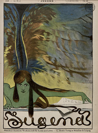
So, then, I’ve now looked through several thousand pages of Jugend magazine and a few things have become apparent. If you’re interested in fin de siècle art and design then all the most interesting material is in the first four years of the magazine’s run, from 1896 on. After 1900 there are still examples of the florid Art Nouveau motifs which filled their earlier pages but the overall style becomes progressively dull, with endless pictures of German towns and hearty country folk. The magazine also begins to reflect an obviously belligerent mood in the country as a whole, pictures of military types and patriotic themes proliferate and the satirical material grows overtly aggressive towards neighbouring nations. Racist cartoons are to be expected—British magazines of the period are much the same—but there’s also a vicious antisemitism boiling away in later issues of Jugend which creates a toxic mix when seen beside the war-mongering on display elsewhere.

jugend-96-01.jpg

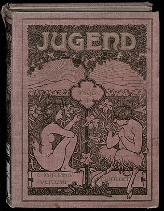
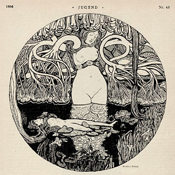
Politics aside, these magazines are still a revelation. Pan magazine was being published at the same time (its entire run is also available in the Heidelberg archives) and is the finer journal if it’s art you’re interested in. But Jugend, being a lighter read, contains a wealth of strange and surprising illustrations. Many are naive or just plain bad, of course, but some are quite remarkable. This is the first of a number of posts I’ll make which highlight illustrations that catch my eye. I’ll also be making some follow-up posts about individual artists as the magazine has been a great introduction to minor illustrators I’ve not come across before. This first post is from the two volumes covering 1896 which can be browsed and downloaded here and here.

Continue reading “Jugend, 1896”

Jugend Magazine revisited

jugend1.jpg

It was just over a year ago that I was wishing there was some way to see whole issues of Jugend magazine, the German periodical launched in 1896 whose Art Nouveau style gave its name to the movement in Germany, Jugendstil. Yesterday’s search for Heinrich Vogeler artwork turned up that very thing, scanned editions of Jugend at the University of Heidelberg’s digital archive. Whole numbers from 1896 to 1925! I am aghast. As well as the scanned pages being very high quality you can download the bound collections as PDFs, each one totalling over 400 pages. Leafing through pages of old magazines in a foreign language doesn’t sound very stimulating if you can’t read German but Jugend was a very visual publication. Each issue is crammed with a variety of drawings in styles which range from black-and-white Art Nouveau motifs and quasi-Symbolist illustration to humorous drawings and cartoons. Each issue also featured a large drawing or painting on a fold-out spread.

jugend2.jpg

Continue reading “Jugend Magazine revisited”

A=P=P=A=R=I=T=I=O=N

apparition.jpg

A=P=P=A=R=I=T=I=O=N is a collaboration between artist Cerith Wyn Evans and Throbbing Gristle, the once notorious Industrial music act now enjoying a resurgence of activity and attention. Evans and TG have an earlier connection via Derek Jarman, for whom Evans worked as an assistant. Given how much I enjoy seeing mirrors used in art, I’m very taken with these, and knowing that they function as drifting speakers transmitting specially recorded TG audio makes them doubly interesting. The mirrors-plus-audio aspect is reminiscent of Josiah McElheny’s recent Island Universes with Paul Schütze but that’s not to imply any influence, both artists have been following their individual paths for some time.

The title of this work comes from a poem by Stephan Mallarmé (1842–1898), a poet closely associated with the Symbolists. Looking at an English translation, the piece ends with the line “a snow of white bouquets of perfumed stars”; that final, impossible flourish—perfumed stars—is a very Symbolist touch. Claude Debussy, who took the title of his Prélude à l’après-midi d’un faune from Mallarmé, set Apparition to music in 1884.

A=P=P=A=R=I=T=I=O=N can be seen at Tramway, Glasgow until September 27, 2009.

A=P=P=A=R=I=T=I=O=N test run on Chris Carter’s Flickr pages.

Previously on { feuilleton }
In the Shadow of the Sun by Derek Jarman
The art of Josiah McElheny

L’Androgyne

seon.jpg

L’Androgyne by Alexandre Séon (1890).

Related to yesterday’s post, I’ve been re-reading various books this week for details of the most curious character associated with the French Symbolist movement, novelist and occultist Joséphin Péladan (1859–1918), also known as Sâr Peladan, a Babylonian title he bestowed upon himself as more befitting his adopted role as Rosicrucian mystic. Péladan’s writings and occult art theories spurred many of the painters who banded together as part of his Salon de la Rose+Croix, a kind of anti-salon intended to stand in opposition to what the Sâr saw as the drab realism of the Impressionists and the staid historicism of academic painters. One gets the impression reading about Péladan that he was probably a rather preposterous figure—his obsession with androgyny caused him to change his forename from Joseph to Joséphin yet he kept his length of bristling beard. But, like Oscar Wilde in London, his presence in the pool of fin de siècle art creates considerable ripples. Alexandre Séon, whose frontispiece above was created for Péladan’s semi-autobiographical essay, L’Androgyne, was particularly devoted to him, as was Carlos Schwabe. Séon’s picture depicts “the androgyne Samas, stupefied by the sexual enigma”, a character with whom Péladan fully identified as he describes his youth and its apparent state of androgynous grace.

mitchenko.jpg

One doesn’t need a Rosicrucian salon today for examples of creative androgyny, of course, all you have to do is go to Flickr where you’ll find creatures such as the boy above from Roman Mitchenko’s photostream. The photos there are at the fashion end of the spectrum; for more of an amateur or semi-professional perspective there are groups like the Androgyny pool, and the Mommy, I want to be androgynous! pool, the latter featuring many striking boyish girls and girlish boys.

Previously on { feuilleton }
Arthur Tress’s Hermaphrodite
Carlos Schwabe’s Fleurs du Mal
Czanara’s Hermaphrodite Angel

Delville, Scriabin and Prometheus

delville1.jpg

Another striking design found by chance. Symbolist artist Jean Delville (1867–1953) created this sheet music title page for Promethée by Scriabin in 1912, and the pair are well-matched given their shared predilection for mysticism (Theosophy in Delville’s case). Delville had also dealt with Prometheus in a typically dramatic, if sexless, picture a few years earlier (below). Once again it’s unfortunate that one of the really great artists of the Symbolist period is so poorly-served by the web that one has to discover his work by accident. There’s a dedicated site here but the gallery pages are only harvesting what’s already scattered around. Delville had a long and consistently high-quality career; he deserves better.

delville2.jpg

delville3.jpg

Prometheus (1907).

Update: Dave C reminds us of another Delville site with a better selection of pictures including a photo of the artist at work.

Previously on { feuilleton }
The faces of Parsifal
Masonic fonts and the designer’s dark materials
Angels 4: Fallen angels