Odilon Redon and Magazine

magazine1.jpg

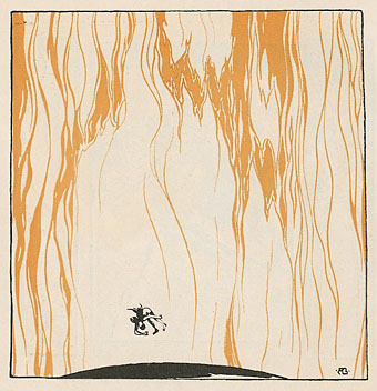
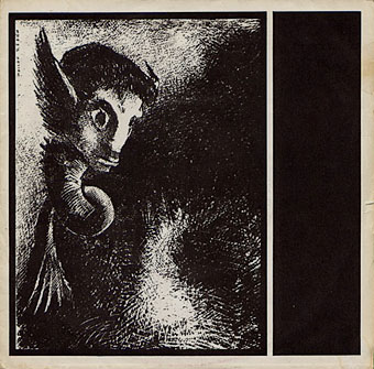
Shot By Both Sides (1978). Design by Malcolm Garrett. Art: La Chimere regarda avec effroi toutes choses (1886) by Odilon Redon.

The first two albums by British post-punk band Magazine have been soundtracking the inner landscape here for the past couple of weeks. Looking at some of their cover art on Discogs reminded me that two of their early singles came dressed with drawings by Symbolist artist Odilon Redon (1840–1916) so these covers may well have been the first place I saw any of Redon’s work at all. This was an unusual choice at the time which makes it typical of a group that stood slightly apart from much of the music around them, often being regarded as too proficient and too clever. (Pop music and politics are the only places where incompetence and stupidity are virtues.)

magazine2.jpg

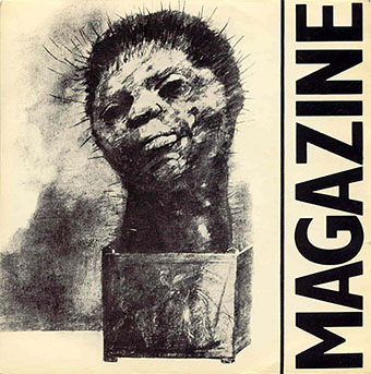
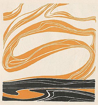
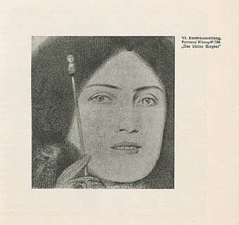
Give Me Everything (1978). Design by Malcolm Garrett? Art:The Cactus Man (1881) by Odilon Redon.

Magazine’s golden era runs from 1978 to 1980 and for me their music and that of fellow Mancunians Joy Division remains inextricably connected to memories of Manchester in the late 1970s, a place I visited sporadically before moving here in 1982. The city then was a lot more grimy and run-down, filled with the disused mills and warehouses of the collapsed cotton industry, blighted by the failed architecture of the 1960s and polluted by endless convoys of orange buses. This photo from 1978 fixes the mephitic ambience, as does some of M. John Harrison‘s fiction from the period, notably his short story Egnaro. Unlike Joy Divison, Magazine haven’t been burdened with an increasingly inflated reputation which makes revisiting their works all the more enjoyable. They pull you back to those gloomy times then take you off elsewhere, into the cajoling and neurotic imagination of that Nosferatu-in-a-leather-jacket, Howard Devoto.

magazine3.jpg

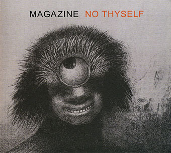
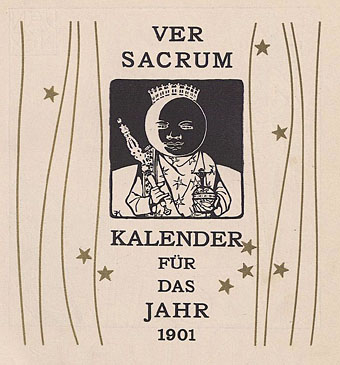
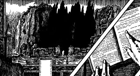
No Thyself (2009). Designer unknown. Art: Le polype difforme flottait sur les rivages, sorte de cyclope souriant et hideux, Les Origines (1883) by Odilon Redon.

The band reformed in 2009 although I’m not convinced the current incarnation is for me, I’m generally sceptical of such moves and the absence of ace guitarist John McGeogh (who died in 2004) and bassist Barry Adamson means it won’t be the same. No Thyself did refer back to their origins, however, literally so in the title of the Odilon Redon picture on the cover, while the Chimera from the first single turned up on a recent tour poster. Howard Devoto talked late last year to The Quietus about the recent album.

Elsewhere on { feuilleton }
The album covers archive

Previously on { feuilleton }
Odilon Redon lithographs
The eyes of Odilon Redon

Ver Sacrum, 1902

vs-1902-01.jpg

Continuing the series of posts about Ver Sacrum, the art journal of the Viennese Secession. The volume of issues for 1902 maintains the same format as the previous year, beginning with a series of calendar pages then proceeding to showcase art, sculpture and graphics from Austria and elsewhere. The Secession exhibitions in Vienna were a highlight of this year, something explored in greater detail in the pages of Deutsche Kunst und Dekoration. Also in these issues is more Symbolist art, this time from Jan Toorop and Franz Stuck. Among the latter’s drawings and paintings there’s a version of his popular temptress-with-serpent theme here entitled The Vice. (Stuck’s The Sin is the most reproduced of this series.) I hadn’t seen this one before which is surprising seeing as it’s his only (?) horizontal treatment of the theme.

As before, anyone wishing to see more can browse all 412 pages or download the entire volume here.

vs-1902-02.jpg

vs-1902-03.jpg

Continue reading “Ver Sacrum, 1902”

Ver Sacrum, 1901

vs-1901-01.jpg

Continuing the series of posts about Ver Sacrum, the art journal of the Viennese Secession. After a somewhat lacklustre collection for 1900 the journal finds its vitality again, the painters of happy Teutonic peasants having been dropped in favour of more remarkable prints and graphics from Vienna’s finest. The contents for this year parallel some of the works being featured in Deutsche Kunst und Dekoration for the same period. Gustav Klimt is given a great deal of attention, beginning with the calendar piece below. There’s also work from the Symbolist sculptor George Minne and a feature on the Glasgow School artists Charles Rennie Mackintosh and Margaret MacDonald. Throughout the year each issue tends to concentrate on a single artist or exhibition. There’s so much good stuff in this year it’s not possible to present more than a small sample. Those interested are encouraged to browse all 432 pages or download the entire volume here.

vs-1901-02.jpg

vs-1901-03.jpg

Continue reading “Ver Sacrum, 1901”

Ver Sacrum, 1900

vs-1900-01.jpg

Continuing an occasional series of posts about Ver Sacrum, the art journal of the Viennese Secession. The collected issues for 1900 undergo a change of design, and not necessarily for the better. Gone are the decorative covers of previous years, replaced by small emblem-like vignettes for each issue. The one above is a design by Gustav Klimt whose work is featured throughout this year. Other familiar names include the Belgian Symbolist Fernand Khnopff, Ludwig von Hofmann and Marcus Behmer. The page design is generally less interesting, unfortunately, although the magazine did retain its square format and there are many impressive examples of Art Nouveau graphics. The complete set of pages for this volume can be viewed or downloaded here.

vs-1900-02.jpg

vs-1900-03.jpg

Continue reading “Ver Sacrum, 1900”

A Picture to Dream Over: The Isle of the Dead

iod_basle.jpg

The Isle of the Dead (second version, 1880), Kunstmuseum, Basel.

In the sudden flares of light over the water, reflected off the sharp points of his cheeks and jaw, a harder profile for a moment showed itself. Conscious of Sanders’s critical eye, Father Balthus added as an afterthought, to reassure the doctor: “The light at Port Matarre is always like this, very heavy and penumbral – do you know Böcklin’s painting, ‘Island of the Dead’, where the cypresses stand guard above a cliff pierced by a hypogeum, while a storm hovers over the sea? It’s in the Kunstmuseum in my native Basel –”

The Crystal World (1966) by JG Ballard.

rachmaninov.jpg

A 1982 recording.

Today’s post is another guest piece over at Tor.com where I run through a history of some of the works in different media inspired by Arnold Böcklin’s The Isle of the Dead (1880–1886). The four versions of Böcklin’s painting are favourites of mine so I’ve touched on this subject a couple of times before but this is the first time I’ve gone into any detail examining their influence. Many artworks have become highly visible in the past century via copies, parodies and imitations: think of Leonardo’s Mona Lisa and The Last Supper, or Michelangelo’s David and The Creation of Adam. What’s fascinating about The Isle of the Dead is that it’s not one picture but four versions of the same scene, and they’ve all been very influential not as parodies but as direct inspirations for other artworks—musical compositions, feature films, a novel—yet few people would recognise the artist’s name. My post only scratches the surface by running through some of the more well-known works but there’s a whole website devoted to the subject for anyone wishing to investigate further.

coc.jpg

The Call of Cthulhu (1988).

Modesty prevented me from mentioning my own work in the Tor post but I’ll do so here. Among the many references ladled into my adaptation of The Call of Cthulhu there’s the 1886 Leipzig version of Böcklin’s painting in the background of a panel. A prefiguring of the end of the story and also an excuse to add to the list of works acknowledging one of the great Symbolist paintings.

Previously on { feuilleton }
The Isle of the Dead in detail
Arnold Böcklin and The Isle of the Dead