Sherbet and Sodomy

ebbing.jpg

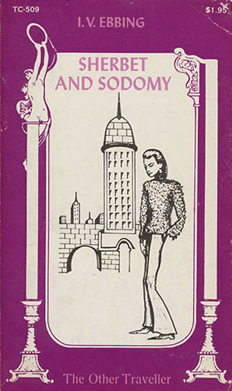
Cover art by Coker.

We had Shock Headed Peters walking through Sodom yesterday so this novel from 1971 seems like a fitting follow-up. The eye-catching title is no doubt an allusion to Byron’s description of Turkish baths as “marble palaces of sherbet and sodomy”, an epithet which one imagines sent generations of sweet-toothed Uranians trekking to Constantinople throughout the 19th century. I’d seen the cover of this book before on sites which collect the gay fiction of the late Sixties and early Seventies—that doubly-phallic tower makes a good match for the cover of Bugger Boy—but I don’t recall reading a description of the contents before. Homobilia has an extract from the opening page:

My name is Jud. I am eighteen and a half. I was born from the felicitous conjunction of an anthropologist and an ethnologist under the sign of Capricorn. I have been called cute, handsome, pretty, and good-looking; actually, I am beautiful… my nose is classically English, along the line of Reynolds, maybe with a little Caravaggio thrown in around the nostrils. My athletic adolescence on the swimming team at Sterling High has given me a slender muscular body… my eyes are South Pacific blue. I have read Hesiod. I masturbate regularly. I have no concept of money or its value. I try to keep my farts silent. I have juvenile down on my ass. I have read the minor Elizabethan poets and I have looked at my anal sphincter in the mirror. Until last week I considered myself heterosexual…

Four art and literatures references in a single paragraph…yes, I’m intrigued. The book is out of print, unfortunately, but searching at Abebooks reveals copies for sale and an additional description:

How does a handsome young cat, newly out and grooving on the gay scene of Greenwich village, suddenly find himself in the silken clutches of El-Dahabi, an Arab sect which celebrates the attainment of perfect love through pain and submission?

So now the Byron reference makes sense. Many of these gay paperbacks were written under nommes de plume and IV Ebbing may well be another of these, there’s certainly no other reference to he (or, indeed, she…) on the web aside from this title. There’s a notable dearth of information about the fiction which emerged in a flood after the first flush of liberation in the late Sixties, when numerous titles for lesbians and gay men were published as cheap paperbacks. Strange Sisters and Gay on the Range document the cover art but I’d like to see a site which told us more about the writers and, where possible, the books themselves. The history of all kinds of pulp fiction has been extensively chronicled; isn’t it time that someone did the same for gay erotica?

Elsewhere on { feuilleton }
The book covers archive

Previously on { feuilleton }
Bugger Boy
Gay book covers

The Mask of Fu Manchu

fumanchu1.jpg

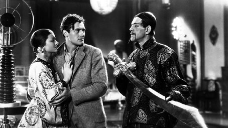
Myrna Loy, Charles Starrett and Boris Karloff.

Los Alamos ranch school where they later made the atom bomb and couldn’t wait to drop it on the yellow peril. The boys are sittin’ on logs and rocks eating some sort of food there’s a stream at the end of a slope. The counsellor was a southerner with a politician’s look about him. He told us stories by the camp fire culled from the racist garbage of the insidious Sax Rohmer. “East is evil, west is good.”

William Burroughs

More pulp, and yes, it’s still racist garbage but Charles Brabin’s 1932 film which stars Boris Karloff as Sax Rohmer’s Oriental super-villain has its pleasures if you look past the severely dated attitudes. Together with The Black Cat (1934), where Boris plays a Satan-worshipping Modernist architect (!), this is one of the best non-Frankenstein Karloff films of the 1930s, as I was reminded this weekend when re-watching it along with several Sherlock Holmes episodes.

fumanchu2.jpg

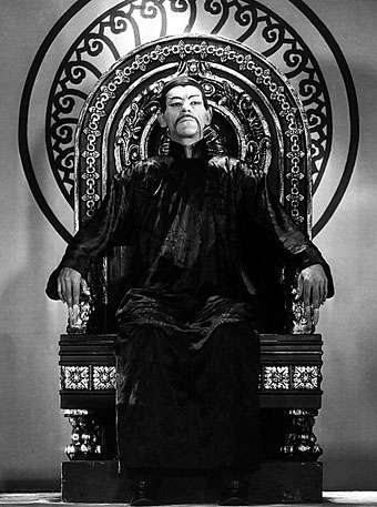
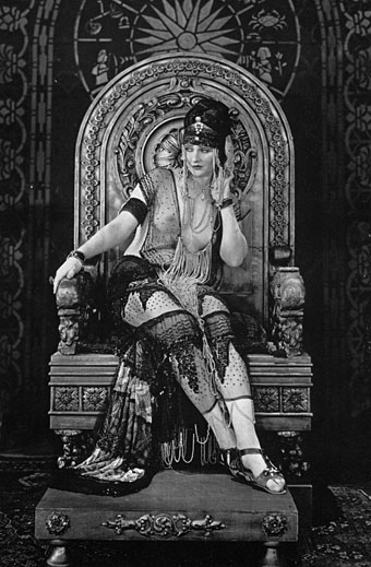
Christopher Lee is elegantly diabolical in the later Fu Manchu films but their cheap budgets force him to skulk around in dismal underground lairs. Karloff’s Doctor has a lavish Art Deco pad whose huge rooms are furnished with a noisy Van de Graaff generator and other scientific apparatus, plus a series of torture rooms where his guests may endure death by encroaching spikes (the “Slim Silver Fingers”), being lowered into an alligator pit, or driven mad by the incessant tolling of a giant bell. I happened to notice that the Doctor’s throne is quite possibly the same one (with a fresh coat of paint) as was used a decade earlier by a notoriously unclad Betty Blythe in The Queen of Sheba (1921), a lavish silent epic which is now unfortunately lost.

sheba.jpg

Betty Blythe as the Queen of Sheba.

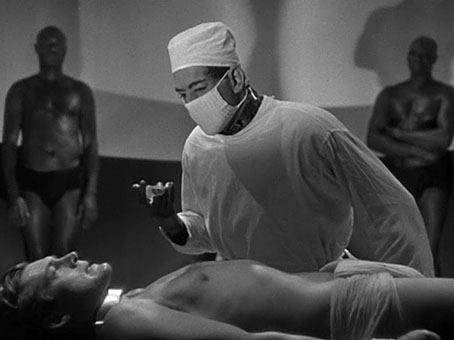
The flaunting of Ms. Blythe’s breasts were one of the many occurrences which led to Hollywood’s adoption of the Hays Code in the 1930s, although the Code’s full effects weren’t felt until later in the decade. The notable scene in The Mask of Fu Manchu where hunk Charles Starrett appears strapped to a table dressed in nothing but a skimpy loin cloth (having previously been thrashed by Fu’s lustful daughter) would have been toned down considerably had the film been made a few years later. All the more reason to watch it today, such scenes only add to the fun.

fumanchu3.jpg

The Doctor prepares to inject his captive with a serum which will turn the man into a compliant slave.

The Mask of Fu Manchu | A page about the original serial, the subsequent novel and its illustrators.

Previously on { feuilleton }
Wladyslaw Benda

The Dark Ledger

ledger1.jpg

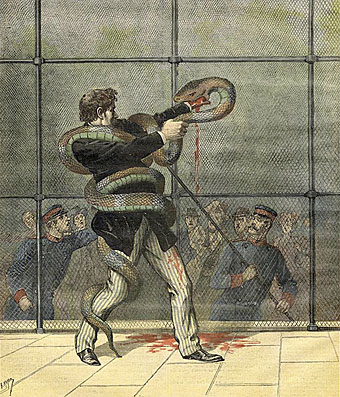
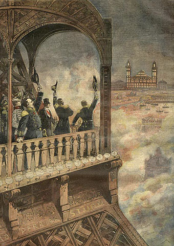
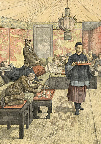
The boundless depths of Chris Mullen’s VTS site continue to yield treasures. The documentation for these pictures is somewhat vague but they seem to be illustrations for Fantômas stories which Mullen has grouped under the title The Dark Ledger, part of a larger selection of pages devoted to the Lord of Evil. The depiction of the Eiffel Tower is of interest here for its showing a view over one of the Paris expositions, possibly the Exposition Universelle of 1900. The opium den, on the other hand, seems remarkably overlit and well-appointed compared to the more customary renderings of such places.

ledger2.jpg

ledger3.jpg

Previously on { feuilleton }
Exposition Universelle publications
Exposition cornucopia
Return to the Exposition Universelle
The Palais Lumineux
Louis Bonnier’s exposition dreams
Exposition Universelle, 1900
The Palais du Trocadéro
The Evanescent City
Judex, from Feuillade to Franju
Fantômas

Design as virus 11: Burne Hogarth

mighty_baby.jpg

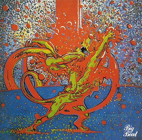
Mighty Baby (1969). Illustration by Martin Sharp.

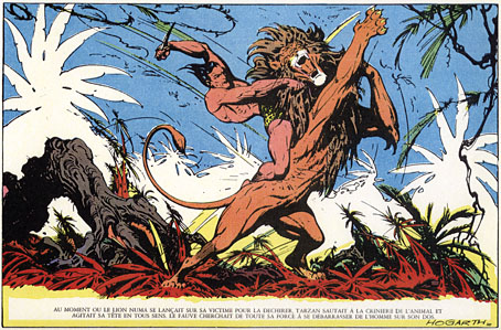
Yet another album cover prompts this post, part of an occasional series. Mighty Baby were a British rock band who formed out of psychedelic group The Action in the late Sixties, and their music is fairly typical of the period, being “heavy” without any of the psych trappings which—for me—often make everything from that time a lot more interesting. This was a journey undertaken by many groups at the end of that lurid decade, a junking of the playful and evocative side of what was now called rock music in favour of a denim-clad earnestness. This album isn’t one I like very much—I’d rather listen to their earlier incarnation—but the cover painting by psych artist Martin Sharp is certainly a startling piece, being a violent mutation of one of the most famous Tarzan drawings by comic artist Burne Hogarth.

hogarth.jpg

Tarzan by Burne Hogarth (194?).

Hogarth was drawing Tarzan for much of the 1940s and this particular panel showing the Ape-Man attacking Numa the lion dates from the latter part of his run on the series. I wish I could pin this to an actual year but I don’t have a complete set of the comics and that detail eluded me. If anyone knows the date, please leave a comment.

Continue reading “Design as virus 11: Burne Hogarth”

Peake’s Pan

pan1.jpg

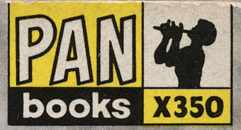
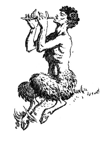
Another charity shop book-raid this week netted me a copy of Ian Fleming’s On Her Majesty’s Secret Service in its 1965 Pan Books edition, one of the Bond series with great covers designed by Raymond Hawkey. The sight of the tiny Pan silhouette above reminded me that this logo was based on drawings commissioned from Mervyn Peake when the company was launched at the end of the Second World War. The design persisted for many years, usually printed on a yellow background.

pan2.jpg

I wasn’t sure I had a copy of Peake’s original version to hand but G Peter Winnington‘s Peake biography, Vast Alchemies (2000), includes a reproduction, one of two drawings Peake produced for the publisher. The other can be seen on this Pan Books site which also reveals that Peake’s Pans were printed at quite large size on the initial run of books. The design model may have been the early Penguin style which nearly always had the famous bird prominently placed in the lower third of the cover. In book terms at least, the Penguin has proved to be the more powerful god, having survived virtually unchanged since 1935. Peake’s Pan is long gone, dropped in favour of two red squiggles.

Elsewhere on { feuilleton }
The illustrators archive

Previously on { feuilleton }
Buccaneers #1
Recovering Bond
Mervyn Peake in Lilliput
James Bond postage stamps
Wanna see something really scary?
T&H: At the Sign of the Dolphin