Lennon, Manson and me: the psychedelic cinema of Alejandro Jodorowsky
Category: {psychedelia}
Psychedelia
A Journey Into Vision & Sound
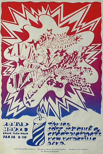
The Million Volt Light & Sound Rave (1967).
More psychedelia as Paul Gorman at The Look alerts me to an exhibition of work by Pop artist Dudley Edwards running this month at 3345 Parr St, Liverpool. Edwards was a part of the Binder, Edwards & Vaughan design collective in the 1960s, renowned for their light shows and psychedelic murals. BEV were Beatles favourites for a while, the photo below shows Edwards painting the piano upon which Paul McCartney wrote Getting Better. They also painted vehicles, including a Cobra sports car for doomed Guinness heir Tara Browne whose crash death was immortalised in A Day in the Life. And their Million Volt Light & Sound Rave event at the Roundhouse was distinguished by a unique Beatles sound collage, Carnival of Light, which McCartney was talking up last year, saying it ought to be given a proper release.
A Journey Into Vision & Sound will focus on Edwards artistic output from this halcyon period and will feature a selection of images that have been archived for over forty years including photography by Lord Snowdon and the mural Edwards painted for Ringo Starr in 1967. (More.)
A Journey Into Vision & Sound runs until November 30, 2009. There’s more about the work of Dudley Edwards and BEV at The Look.
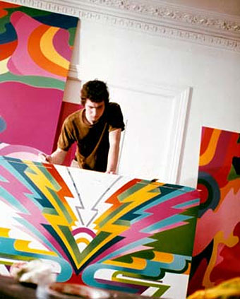
Dudley Edwards painting Paul McCartney’s piano.
Previously on { feuilleton }
• Through the Wonderwall
• Psychedelic Life
• Psychedelic vehicles
Through the Wonderwall
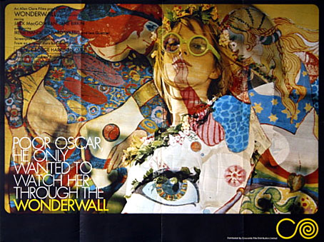
It’s taken me years but the recent obsession with UK psychedelia led me to finally watch Joe Massot’s piece of cinematic fluff from 1968, Wonderwall, a film distinguished primarily for its score by George Harrison (with Ringo Starr and Eric Clapton playing pseudonymously), and its title which was swiped years later by a bunch of Rutles-imitators from Manchester. The story is so slight it would have barely sustained an hour-long TV film: absent-minded scientist (Jack MacGowran) becomes intrigued by his glamorous neighbour (Jane Birkin playing “Penny Lane”; yeah, right…) and knocks holes in the walls of his flat in order to scrutinise her modelling, partying and frequent undressing. Unlike Blow Up (1966, and also featuring Jane Birkin) and the later Performance (1970), both of which attempted to accurately pin down some of the modish aspects of the period, this is a very kitsch piece. That wouldn’t be so bad if it was entertaining kitsch like, say, Smashing Time (1967), but Massott has to resort to scenes of limp comedy and some rather dull dream sequences in order to pad the thing out. Between the handful of actual dialogue scenes there’s a lot of gloating over Ms Birkin’s flesh which no doubt satisfied one half of the audience but by today’s standards is hardly thrilling. Iain Quarrier plays Penny’s duplicitous boyfriend (with a fake Liverpool accent) in his last screen role before he quit acting. Quarrier and MacGowran had appeared together in two of Roman Polanski’s British films, Cul-de-sac (1966) and Dance of the Vampires (1967). In the latter, MacGowran again plays an absent-minded scientist while Quarrier is cinema’s first (?) gay vampire.
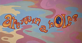
An interjection from The Fool.
Of chief interest for me in Wonderwall was the decor and title card decorations by Dutch psychedelic collective, The Fool (who also appear in the party scene), famous for their earlier Beatles associations including the inner sleeve for Sgt Pepper and designs for the short-lived Apple Boutique in London’s Baker Street. I was also curious about the distinctive decor of MacGowran’s flat which contrasts with the psychedelia next door, all dark green walls embellished with Victorian murals and a Tennyson poem—very fittingly a piece called The Daydream—which circles the room.
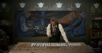
The professor prepares to attack the wall.
This was particularly interesting in that it made another connection between the psychedelic era and Victorian arts movements, especially from the Aesthetic/Arts & Crafts end of things, but it wasn’t at all obvious whether the connection was an intentional part of the film’s production design or an accident of location and budgetary convenience. Aside from the old-fashioned appearance of MacGowran’s rooms there seemed no reason why his otherwise cultureless character would have any interest in decorating his living space in this way.
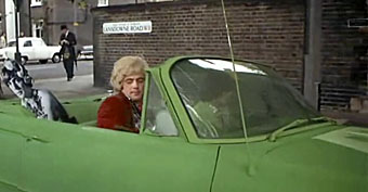
The street corner then…
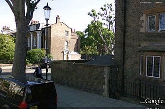
…and now.
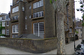
The building itself is equally distinctive and an exterior shot conveniently shows a street sign placing the location in Lansdowne House, a Victorian apartment block on the corner of Lansdowne Road and Ladbroke Road in the Notting Hill/Holland Park area of London.
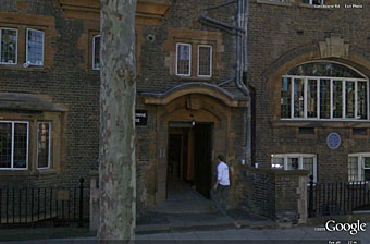
Lansdowne House.
What did the building look like today, I wondered? Google Earth proves indispensable at times like this and it was easy to find, in a street which looks more cramped than it does in the film. The presence of a blue plaque on the wall proved intriguing, a sign that the place once had famous residents. Googling for that revealed this photo which was a real surprise: Lansdowne House at one time contained studios for artists who included Charles Ricketts and Charles Shannon, a gay couple and leading lights of London’s fin de siècle art scene (also friends of Oscar Wilde), and another artist, James Pryde, who with William Nicholson worked as The Beggarstaffs. So my suspicion about the Arts & Crafts decor was correct, which means that MacGowran’s flat may have been decorated that way originally and remained untouched since the 1890s. I haven’t seen Rhino’s special edition of Wonderwall which contained additional information about the making of the film, so have no idea whether the history of the building is mentioned there. If anyone does know, please leave a comment. For now I’m quite happy to have stumbled upon another minor link between two of my favourite art decades.
For more visuals, this page has a host of screen grabs from the film as well as some gif animations, all of which manage to make Wonderwall seem more interesting than it is when you’re watching it.
Previously on { feuilleton }
• Charles Ricketts’ Hero and Leander
• Images by Robert Altman
Eyecandy
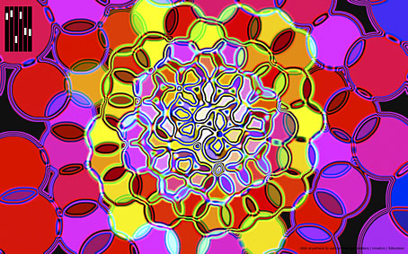
Continuing a rather psychedelic week, Eyecandy is another of those groovy web toys, this time putting you inside a kaleidoscopic sphere of coloured circles whose parameters you can change with sliding controls. Fun to mess with when the right music is playing.
And while we’re on the subject, my new calendar has been selling very well thanks to some generous linkage from Arthur Magazine, Jeff VanderMeer, Boing Boing, Trendhunter, and others. Thanks to everyone who’s bought one, I’ll definitely be following this with something similar, not least a set of illustrations for Through the Looking-Glass. And Jabberwocky, yes, have to do something special for that…
Previously on { feuilleton }
• The Kaleidoplex
• Colorscreen
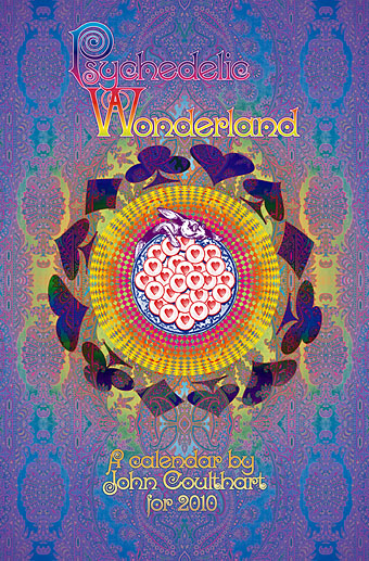
Psychedelic Wonderland: the 2010 calendar
So I had a bright idea at the end of September… Instead of rehashing old work for a CafePress calendar design, I thought I’d try something new. I hadn’t done any artwork for myself all year, everything I’d been working on was a commission of some sort. In addition to that, I’d spent a large portion of the year delving deeper into the psychedelic music of the late Sixties, especially the wealth of obscure British bands to be found on the seemingly endless series of compilations which have trickled out over the past two decades. Everyone is familiar with Jefferson Airplane’s White Rabbit but, as I’ve noted before, themes from, and allusions to, the Alice books run through British psychedelia to an even greater degree. The Beatles put Lewis Carroll in their pantheon of influences on the cover of Sgt. Pepper, and Wonderland’s atmosphere of Victorian surrealism chimed perfectly with a resurgence of interest in Victorian art and design.
So at the end of September, mulling over ideas, I picked up one of my Lewis Carroll volumes and looked at the chapter list: 12 chapters…12 months…I could do a psychedelic Alice in Wonderland! The only drawback was being weighed down by ongoing work which meant that anything I did would have to be created quickly and easily. I reckoned it was manageable if I put a few rules in place first: try and rough out a chapter a day; make copious use of clip art decoration and scanned engravings; keep things bold and florid without worrying too much about fidelity to minor story points. In theory I could do the whole thing in about two weeks if I kept on schedule. As it turns out the whole thing took me three weeks as I got increasingly involved with illustrating the story. You can see the results below and larger copies of the pictures here. Two years ago I was saying I probably wouldn’t ever illustrate Lewis Carroll. That was true at the time since I couldn’t find an approach to the stories that would sustain my interest and (possibly) bring something new to the books. Seeing Alice’s adventures through the psychotropic prism of the late Sixties showed me the way into Wonderland. What’s needed now is to do the same next year for Looking-Glass Land. Watch this space.
Some notes on the pictures follow below.
Update: By popular demand, this calendar is now available again.
Continue reading “Psychedelic Wonderland: the 2010 calendar”

