Weekend links 620

varo

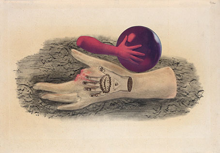
Premonition (1953) by Remedios Varo.

• “Classical mythology, Arcadian idylls, occult speculation, and an interest in cultural curiosities coexisted in the grotto, allowing for the playful exploration of a new tension emerging between Nature and Artifice.” Laura Tradii explores the artificial grottoes of the Renaissance and beyond.

• “Some of the symbols and signs seem like bridges to nowhere, and perhaps Nabokov was lovingly teasing our endless quest to find patterns and generate meaning.” David M. Rubin on writing a response to a Nabokov short story.

• New music: “KMRU & Aho Ssan erupt in post-apocalyptic extremity with Resurgence“. I did the layout for this latest release on the Subtext label but I still haven’t got round to updating my web pages so you’ll have to take my word for it.

• Powell & Pressburger’s Black Narcissus “unleashes a level of eroticism that’s surprising for 1940s British cinema,” says Adam Scovell.

• “Premonitions are impossible, and they come true all the time.” Fiona Sturges reviews The Premonitions Bureau by Sam Knight.

• Between Hell and Paradise: paintings by Hieronymus Bosch and his followers at the Museum of Fine Arts, Budapest.

• At The Collector: Olivia Barrett on the Voodoo Queens of New Orleans.

• Steven Heller’s font of the month is Astronef Super.

• Mix of the week: Isolatedmix 118 by Pan American.

TMP-01 Vintage Synth TV Series from Benge.

• Vale, A Year In The Country.

Premonition (1979) by Simple Minds | Premonition (1980) by Cabaret Voltaire | Premonition (Giant Empty Iron Vessel) (1987) by David Sylvian & Holger Czukay

Led Zeppelin IV: Jimmy Page versus Little Bo-Peep

lz4.jpg

Background graphics by Aubrey Beardsley, 1893.

You’d think by now that everything would be known about an album with a Godzilla-sized cultural footprint like Led Zeppelin IV. I certainly thought so until last week when I turned up the source of something that the more obsessive Zepp-heads have been pondering for years. If this puts a bustle in your hedgerow then read on.

symbols.jpg

Led Zeppelin’s fourth album has been around now for half a century which means there really is a lot known about every detail of its production. Mysteries that used to confound friends of mine when we were teenagers have long been solved, questions such as what the hell the four symbols assigned to each member of the group actually signified; not only do we know the origin and meaning of those symbols, the enigmatic “Zoso” sigil chosen by Jimmy Page has an entire website dedicated to its various manifestations. We know where the photo on the cover was taken (Birmingham), and why the sleeve is devoid of identification (Page was annoyed with the press reaction to the previous album); we know that the hermit painting inside the gatefold is based on the Tarot card by Pamela Colman Smith, and we also know a great deal about the writing and recording of Stairway To Heaven. Erik Davis logged much of this in his 33 1/3 study of the album, and while he examines the band symbols in some detail he doesn’t say much about the rest of the hand-written inner sleeve beyond this comment:

Is there a meaning to the nifty Arts and Crafts typeface that Page lifted for the Stairway To Heaven lyrics on the other side of the sleeve? Or just a vibe?

The source, if not the meaning, of this script has been intriguing Zeppelin fans for many years, but I wasn’t aware of this until I happened to be reading the Wikipedia entry about the album and found myself equally intrigued. The game was afoot, Watson.

soh1.jpg

It makes them wonder: the hand-lettered lyrics.

A persistent question you see in fan circles is “What font was used to create X?” People will ask this question even when the design is a one-off, like Syd Mead’s logo for Tron, or something that’s obviously been lettered by hand. Led Zeppelin IV is an album guaranteed to raise the “What font?” question because the lyrics of the group’s most famous song, Stairway To Heaven, cover an entire side of the inner sleeve. On one of the fan forums I was reading someone was eager to identify “the font” because they wanted to apply the words to a bedroom wall. Many more people must have copied out those lyrics since 1971; I once had to do this myself for a female friend who was so besotted with Jimmy Page that she wanted the lyrics in a frame on her own bedroom wall.

tracks.jpg

According to the Wikipedia entry, Page revealed the source of the lettering to be an issue of The Studio, the British art and design magazine which helped launch Aubrey Beardsley’s career and did much to develop and promote the Art Nouveau style in the 1890s. I’m very familiar with The Studio, many posts here refer to it, and I happen to have a complete collection of issues downloaded from the journal archive at Heidelberg University. Seeing the magazine mentioned in this context immediately made me want to find the design that Page had adopted, but before I started flicking through thousands of pages I looked around to see if any of the Zepp-heads had tried searching for the magazine themselves. Evidently not; all the discussion I’ve seen about the inner sleeve tends to recycle the Wikipedia entry, nobody seems to have bothered looking for copies of the magazine. Okay then…

Continue reading “Led Zeppelin IV: Jimmy Page versus Little Bo-Peep”

Weekend links 619

schulze.jpg

A Moog on the Moon by P. Praquin, 1977. And a space helmet reflection to add to the list being accumulated by 70s Sci-Fi Art.

• RIP Klaus “Quadro” Schulze. I’ve owned many of his solo albums over the years, and while they’re historically important for the part they played in developing the kosmische sound in the 1970s I’ve never been very enthusiastic about the music. The albums I prefer are the ones where he was working with others, whether as a drummer in Ash Ra Tempel, an inadvertent member of the fake Cosmic Jokers supergroup, or part of the genuine Cosmic Couriers supergroup that made Tarot. The Tonwelle album credited to “Richard Wahnfried” benefits considerably from the presence of Manuel Göttsching and Michael Schrieve (also a rumoured Carlos Santana); I recommend it. For a taste of the synth-doodling Schulze, here he is in analogue heaven.

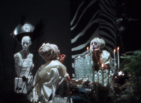
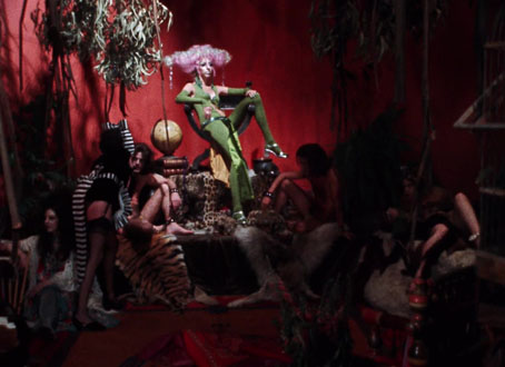
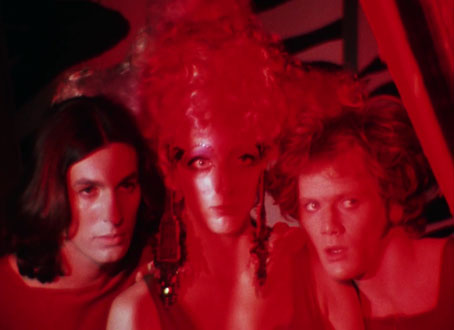
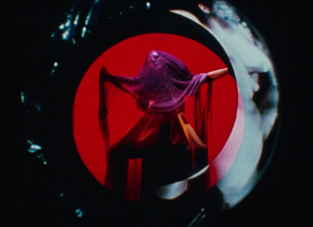
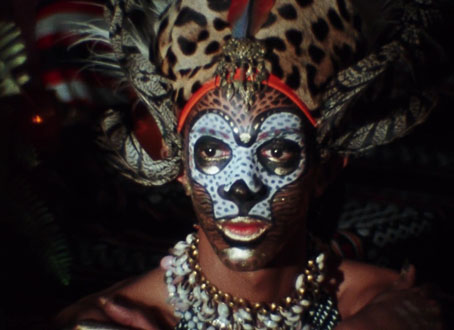
• Next month, Luminous Procuress, a film by Steven Arnold (previously), is released for the first time on blu-ray by Second Run: “Exploding out of San Francisco’s vibrant late-60s counter-culture, Luminous Procuress is a psychedelic odyssey of unabashed hedonism. The only feature film by artist, mystic and polymath Steven Arnold, the film celebrates gender-fluidity and pan-sexuality in a voyeuristic phantasmagorical journey towards spiritual ecstasy.”

• “Whereas [Bernard] Herrmann worked predominantly with strings and [John] Carpenter with synths, Anderson wanted to evoke a similar atmosphere with guitars.” Greg “The Lord” Anderson talks to Dan Franklin about making an album of night music.

I am troubled by how often people talk about likability when they talk about art.

I am troubled by how often our protagonists are supposed to live impeccable, sin-free lives, extolling the right virtues in the right order—when we, the audience, do not and never have, no matter what we perform for those around us.

I am troubled by the word “problematic,” mostly because of how fundamentally undescriptive it is. Tell me that something is xenophobic, condescending, clichéd, unspeakably stupid, or some other constellation of descriptors. Then I will decide whether I agree, based on the intersection of that thing with my particular set of values and aesthetics. But by saying it is problematic you are saying that it constitutes or presents a problem, to which my first instinct is to reply: I hope so.

Art is the realm of the problem. Art chews on problems, turns them over, examines them, breaks them open, breaks us open against them. Art contains a myriad of problems, dislocations, uncertainties. Doesn’t it? If not, then what?

Jen Silverman on the new moralisers

• “The website is colorful and anarchic, evoking the chaotic sensory experience of exploring a crammed, dusty shop.” Geeta Dayal explores the Syrian Cassette Archives.

• New music: The Last One, 1970 by Les Rallizes Dénudés; Untitled 3 by Final; Blinking In Time (full version) by Scanner.

• Why was erotic art so popular in ancient Pompeii? Meilan Solly investigates.

• You’ve been reframed: Anne Billson explores the history of split-screen cinema.

• At Spoon & Tamago: Japanese era names illustrated as logos.

• Mix of the week: XLR8R Podcast 745 by Wilted Woman.

Fun type

Split, Pt. 4 (1971) by The Groundhogs | Split Second Feeling (1981) by Cabaret Voltaire | Splitting The Atom (2010) by Massive Attack

Weekend links 618

anderson.jpg

O Superman (1981), a seven-inch single on One Ten Records. Design by Laurie Anderson and Perry Hoberman.

• “…I was painting a picture of a garden at night. It had a lot of black and this green kind of coming out of the black, and I sat back, probably to take a smoke, looking at this painting, and I suddenly heard a wind coming from the painting, and the green started to move. And I thought, ‘Oh, a moving painting.’ And that experience led to cinema.” David Lynch talking to Josh Hitchens about living in Philadelphia.

• “This is the time and this is the record of the time.” Big Science, the album that propelled Laurie Anderson from performance artist to pop star, is 40 years old this month. Mat Colegate recalls his confused impression that the album was the work of a West Country folk singer, while Studs Terkel talked to Laurie Anderson about the album shortly after its release.

• At Public Domain Review: Kensy Cooperrider explores a millennium of “hand mnemonics”, “the variety of techniques practised by Buddhist monks, Latin linguists, and Renaissance musicians for remembering what might otherwise elude the mind.”

Ghosts in the Machine is an exhibition being hosted by Bower Ashton Library, Bristol, for World Book Night, 2022. 93 participants contributed ghost-related images for an accompanying artist’s book [PDF].

• “Sixty years after Seattle’s Century 21 Exposition, world’s fairs have largely fallen out of fashion in the US.” Grant Wong charts the rise and fall of world’s fairs.

• A trailer for Ennio: The Maestro, a feature-length documentary about Ennio Morricone by Giuseppe Tornatore.

• “The film Putin doesn’t want the world to see: Firebird, a gay love story about fighter pilots.”

• At Dennis Cooper’s: Andrei Tarkovsky Day.

• New music: Intersections by Specimens.

Schöne Hände (1977) by Cluster & Eno | Hands 2 Take (1981) by The Flying Lizards | Red Hand (1996) by Paul Schütze

Weekend links 617

parent.jpg

Diane (1977) by Mimi Parent.

Richard Pinhas expounds upon his favourite musical choices for Warren Hatter. The influence of Robert Fripp has always been to the fore in the Pinhas oeuvre—an early track by Heldon is titled In The Wake Of King Fripp—so there was bound to be a King Crimson album on the list. But which one? Click through the selections to find out.

• Vinyl is the product of a toxic manufacturing process, as well as being difficult to recycle without releasing yet more toxins, but you seldom see these issues discussed by today’s quality-conscious vinyl fetishists. Jono Podmore talks to some of the people trying to create an eco-friendly disc.

• “…these Renaissance images shock us because they are so frequently ithyphallic: Christ has risen, but not in the way we have come to expect.” Hunter Dukes on ostentatio genitalium in Renaissance art.

• At Wormwoodiana: Mark Valentine on those music projects that used to be described as “hauntological”, with an emphasis on The Machinery of the Moment, a new release from The British Space Group.

• “Like Delia Derbyshire jamming with This Heat.” Jesse Locke tours the Broadcast discography.

• 50 Watts announces the birth of 50 Watts Books, a publisher of strange and/or unusual art books.

• “Black lights turn this North Carolina mine into a psychedelic wonderland.”

• At Dennis Cooper’s: Bill Morrison Day.

Black Lightening Light (1968) by The Shy Guys | Black Light (1994) by Material | Transmission Nine: Black Light (2013) by Pye Corner Audio