Brian Eno at the Baltic Centre.
The Constellations (77 Million Paintings).
Category: {music}
Music
The Angelic Conversation
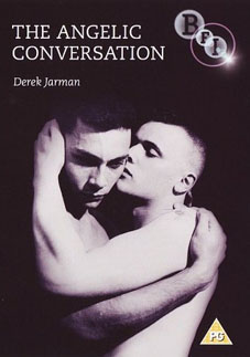
Title by John Dee, words by William Shakespeare, narration by Judi Dench and music by Coil; Derek Jarman’s oneiric film/poem is released on DVD, along with two other works.
The BFI releases three Derek Jarman films together—Caravaggio (1986), Wittgenstein (1993) and The Angelic Conversation (1985)—all digitally restored and re-mastered for DVD and each with extensive and illuminating extra features.
The films were made with the BFI Production Board, whose aim was to foster innovation in British filmmaking, thus providing a natural home for Jarman’s artistic sensibility. These three films represent highpoints in his career and are perhaps the most enduring in their appeal and relevance to contemporary audiences.
Intense, dreamlike, and poetic, The Angelic Conversation is one of the most artistic of Derek Jarman’s films. With his painter’s eye, Jarman conjured, in a beautiful palette of light, colour and texture, an evocative and radical visualisation of Shakespeare’s love poems.
Of the 154 sonnets written by Shakespeare, most were written to an unnamed young man, commonly referred to as the Fair Youth. Here, Judi Dench’s emotive readings of 14 sonnets are coupled with ethereal sequences; figures on seashores, by streams and in colourful gardens. The disruption of these magical scenes with images of barren and threatening landscapes echoes perfectly the celebration and torment of love explored in the sonnets.
Shot on Super-8 before being transferred to 35mm film, the unique technical approach results in a striking aesthetic, with Coil’s languorous soundtrack completing the intoxicating effect.
Previously on { feuilleton }
• James Bidgood
• Kenneth Anger on DVD…finally
• Un Chant d’Amour by Jean Genet
Trinity rendezvous

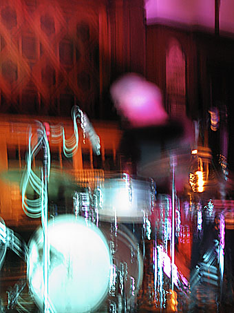
The thundering virtuosity of Chris Corsano’s drums lured me out again this evening. The venue this time was the old Sacred Trinity Church in Salford which has been deconsecrated (heathens that we are) and turned into a space for music and other events. A very good space it was too, with subdued lighting and decent sound. Corsano was on magnificent form, playing another storming improvised set; Mick Flower of the Vibracathedral Orchestra provided chiming drones of unknown provenance. (I still haven’t worked out what peculiar string instrument it is that he plays.)
The photo above is another blurry product of my poor old Canon as it struggles with low light conditions and no tripod. But even in good light I’d challenge any photographer to adequately capture Corsano’s performance. The stuttering incoherence of this picture goes some way towards showing how it feels to watch him play.
Update: Gav advises that the church is still consecrated and that Mick Flower plays a shahi baaja or, as he prefers (after Klaus Dinger), a “Japan banjo”.
Previously on { feuilleton }
• Chris Corsano again
• Chris Corsano
Perfume: the art of scent

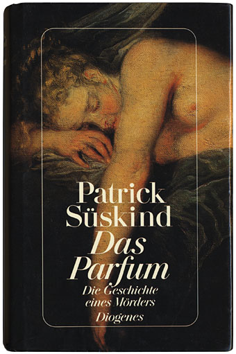
I’ve yet to see Tom Tykwer’s film of Patrick Süskind’s novel, Perfume—The Story of a Murderer, and remain reluctant to do so; it’s a rule in cinema that good books make bad films and vice versa. Perfume is a good book and a favourite of mine which makes the prospect of film adaptation even more worrying. (As an aside, Tykwer dispels the persistent rumour that Stanley Kubrick dismissed Perfume as an unfilmable novel.)
Reservations apart, I’ve been listening to the tremendous soundtrack all week after a recommendation from a friend (hi Philip!). The music is credited to Reinhold Heil, Johnny Klimek and the director, and features the near unprecedented involvement of conductor Simon Rattle and the Berlin Philharmonic, an orchestra that rarely stoops to the level of the film soundtrack. This prompted speculation about the distinct challenge Süskind’s book presents to a designer: how best to represent the entwined strands of Grenouille’s career as a perfumier and a murderer of young women?
Patrick Wolf interviewed
‘There was a fire inside me’
His life was made a misery at school, but all that bullying just fuelled Patrick Wolf’s ambition to become a pop star. Looks like he will have the last laugh, says Maddy Costa.
The Guardian, Friday, February 9th, 2007
PATRICK WOLF was 11 when he saw his first dream shatter. Aged six, he had vowed to become a solo violinist. “I’d heard a violin solo by Rachmaninov on the radio,” he recalls, “and it was so divine my little brain thought: that’s what I want to do.” His parents had booked him piano lessons but he told them: “I don’t like this piano, it’s like playing a calculator.” Sadly, his orchestral career didn’t unfold as planned. “I was always second violinist. They do good harmonies, but I wanted to play that solo.”
To most people, playing second violin would be a fine achievement. But Wolf—a singer, songwriter and multi-instrumentalist—isn’t most people. You can tell by the way the 23-year-old is dressed for an average day ambling about central London. His gangly frame is clad in a checked shirt, knitted hoodie and tattered rabbit-fur jacket, his trousers rolled high above his thin gold shoes. His ash-brown hair is dyed burnt orange. Clearly, this man was born to be a pop star. And at the age of 11, disillusioned with his violin prospects, that’s what he decided to become.
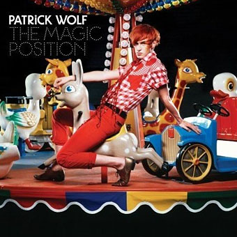
It has taken 12 years and two uncompromising albums but Wolf is finally on the verge of the success he craved. Recently signed to a major label (Polydor subsidiary Loog), he’s about to release The Magic Position, an album of rapturous songs designed to soundtrack summer days and sunny adverts in which strangers hug in the street. The sleeve art captures the mood: it pictures Wolf posing on a carousel. Which hasn’t gone down too well in some quarters. “People think I’m trying to be Gary Glitter,” he says.
The trouble is that, whereas Wolf describes The Magic Position as “the most honest representation of how I live my life and what I want out of life”, the album couldn’t be more different from its two predecessors, Lycanthropy (2003) and Wind in the Wires (2005), both troubled testaments to his difficult youth. Wolf’s tale is one of bullying and depression, rebellion and melodrama, and he prefers to narrate it “with the music”. He’s been known to fabricate details: in early interviews, “I would make up stories about my life, until this legend emerged that I had been born in a lighthouse in Cork. It got out to my relatives in Ireland and I couldn’t live it down.” Since then, he admits: “It sounds quite arrogant, but I realised my life was more interesting than the fantasy.”
(Continues here)


