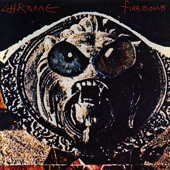
Chrome: Firebomb single (1982).
I seem to have spent the past twenty-five years introducing people to Chrome. The world remains stubbornly resistant to their splendour, so here we go again…
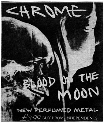
Chrome were a San Francisco rock band born in the mid-Seventies, primary members Damon Edge and Helios Creed, ostensibly part of the punk thing but their sound is most aptly characterised by shorthand descriptions such as “Cabaret Voltaire meets Amon Düül II”. A newspaper ad for their Blood On The Moon album bore the legend “New Perfumed Metal”, and Perfumed Metal (the name of a track from Blood On The Moon) is how I tend to think of their blend of chugging riffs, synth squall, distorted vocals and tape collage. Those diverse and contradictory characteristics—perfume, metal—were embodied in the name of their record label, Siren, which encapsulates in a single word reference to erotic mythology and industrial noise. Chrome are/were a difficult band to categorise and describe, so I’m fortunate that Julian Cope has risen to the challenge already with this great potted history and a look at their finest musical moments. Cope’s site also features a lengthy appraisal by another reviewer of their unhinged masterpiece, Half Machine Lip Moves.
Chrome’s covers were almost all the work of Damon Edge, usually collages with titles hand-scrawled in Edge’s angular script. The Firebomb single above (also the cover art of the 3rd From The Sun album) became the band’s defining image, a lion-head door-knocker transformed into some bug-eyed alien organism by the simple addition of a pair of oversize eyes. Their second album was titled Alien Soundtracks so this is entirely appropriate. As Julian Cope puts it in his usual inimitable style:
So the vibe created is definitely very Sci-Fi, but no gleaming clean surfaces from Beyond The Year 2000 here. It’s a bit like in the original “Alien” movie (also from 1979 coincidentally), where the technology is “advanced” but the space ships are dank & dirty and all the equipment keeps breaking down. Science will not only bring forth smiling nuclear families with robot maids flying around in hover cars, but also ever-more-crowded metropolitan slums and squalor and new designer chemicals to help stave off (or feed?) dread and paranoia. To borrow a term coined nearly a decade later, Chrome’s is a “CYBER-PUNK” vision of the future.
The vision didn’t last for long but then most bands have a golden period of four or five years which is then dissipated in personnel splits or changes in musical direction. Chrome’s golden period ran from 1978 to 1982; longer than most and definitely worthy of your attention.
• Official website
• Damon Edge | Helios Creed
• Chrome on YouTube: Meet You In The Subway (1979) | New Age (1980)
Select discography:
Alien Soundtracks (1978)
Half Machine Lip Moves (1979)
Subterranean Modern (1979) (compilation album with other artists)
Read Only Memory (1979) 12″ EP
Red Exposure (1980)
Blood on the Moon (1981)
3rd from the Sun (1982)
No Humans Allowed (1982)
The Chronicles I (1982)
The Chronicles II (1982)
Previously on { feuilleton }
• Barney Bubbles: artist and designer
• Metabolist: Goatmanauts, Drömm-heads and the Zuehl Axis
• Maximum heaviosity